
*The photos in this blog post are unedited to show the true colors of the icing.
Natural food dyes are rising in popularity in the cookie decorating world lately, so naturally I decided to buy several brands to swatch and review the way they performed in royal icing.
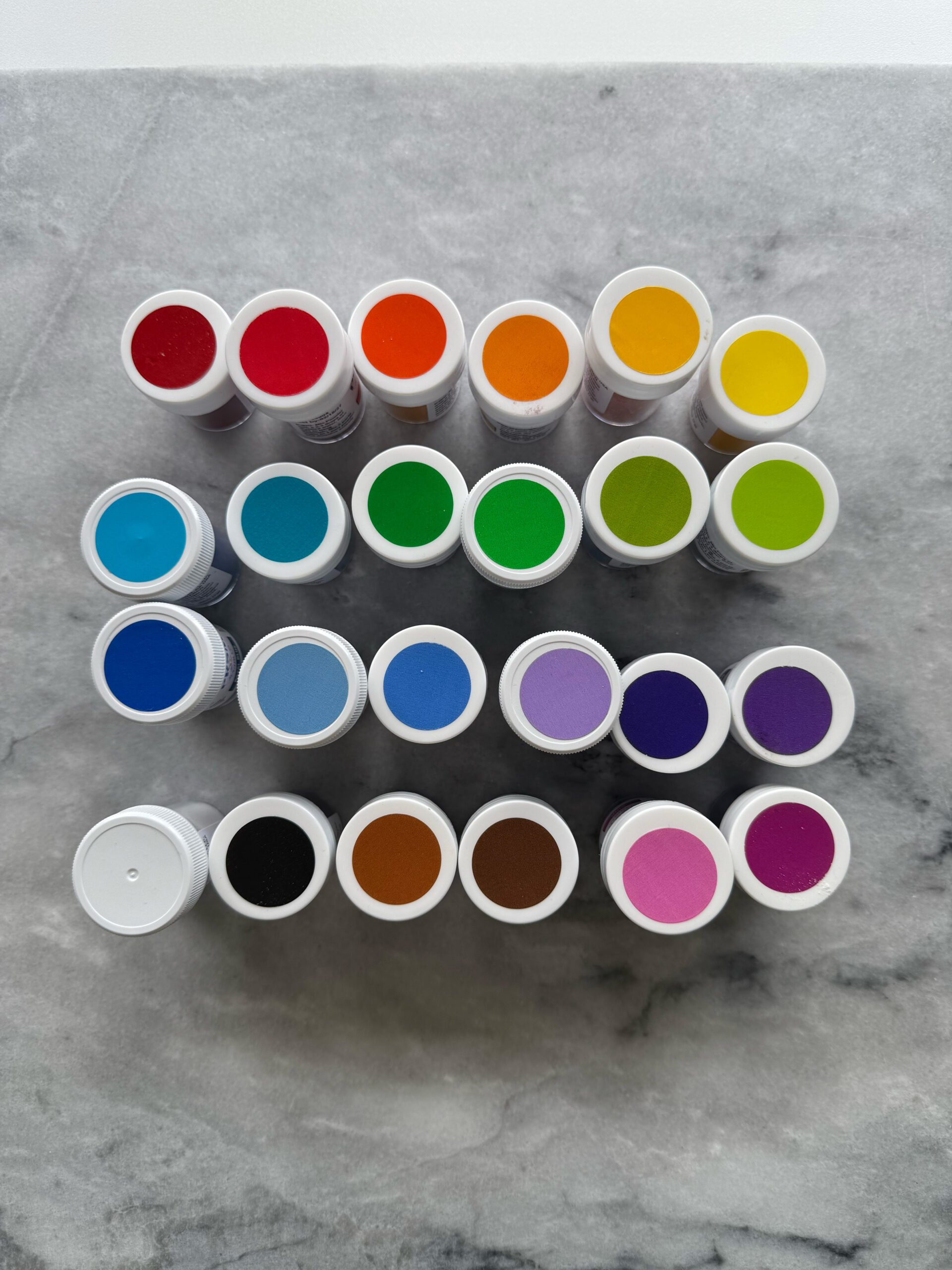
The most popular brand of natural food coloring seems to be PRSM Sugar Co. They offer powder coloring, liquid gel coloring, baking gel coloring, and metallic powders. For my experiments, I bought the full set of 24 powder colors and the full set of 10 liquid gel colors, but for this post, I will just be focusing on the powder colors.
the cost
The set of 24 powder colors costs $190, and individually, each color costs $8. Each little jar is 7g, which is a little shy of two tablespoons of powder. For context, I used about 1/16 of a teaspoon for pastel shades in ½ cup, or 150g, of thick royal icing. For medium shades, I used 2/16 of a teaspoon (yes, that’s ⅛, but I was using a 1/16 measuring spoon), and for deep shades I used 3/16 of a teaspoon. That means that each little jar has approximately 96 1/16 sized scoops of powder, and one jar of powder will color approximately 48 cups of royal icing in pastel, 24 cups of royal icing in medium, and 16 cups of royal icing in deep. My royal icing recipe makes about 6 cups of icing, which covers a little more than three dozen cookies.
Now that all the math is over, my point is: these jars are tiny and seem expensive, but when you consider how much icing they are able to color, they are not as costly as you may originally think. The coloring is very concentrated, and the color of the icing deepens even further overnight.
the method
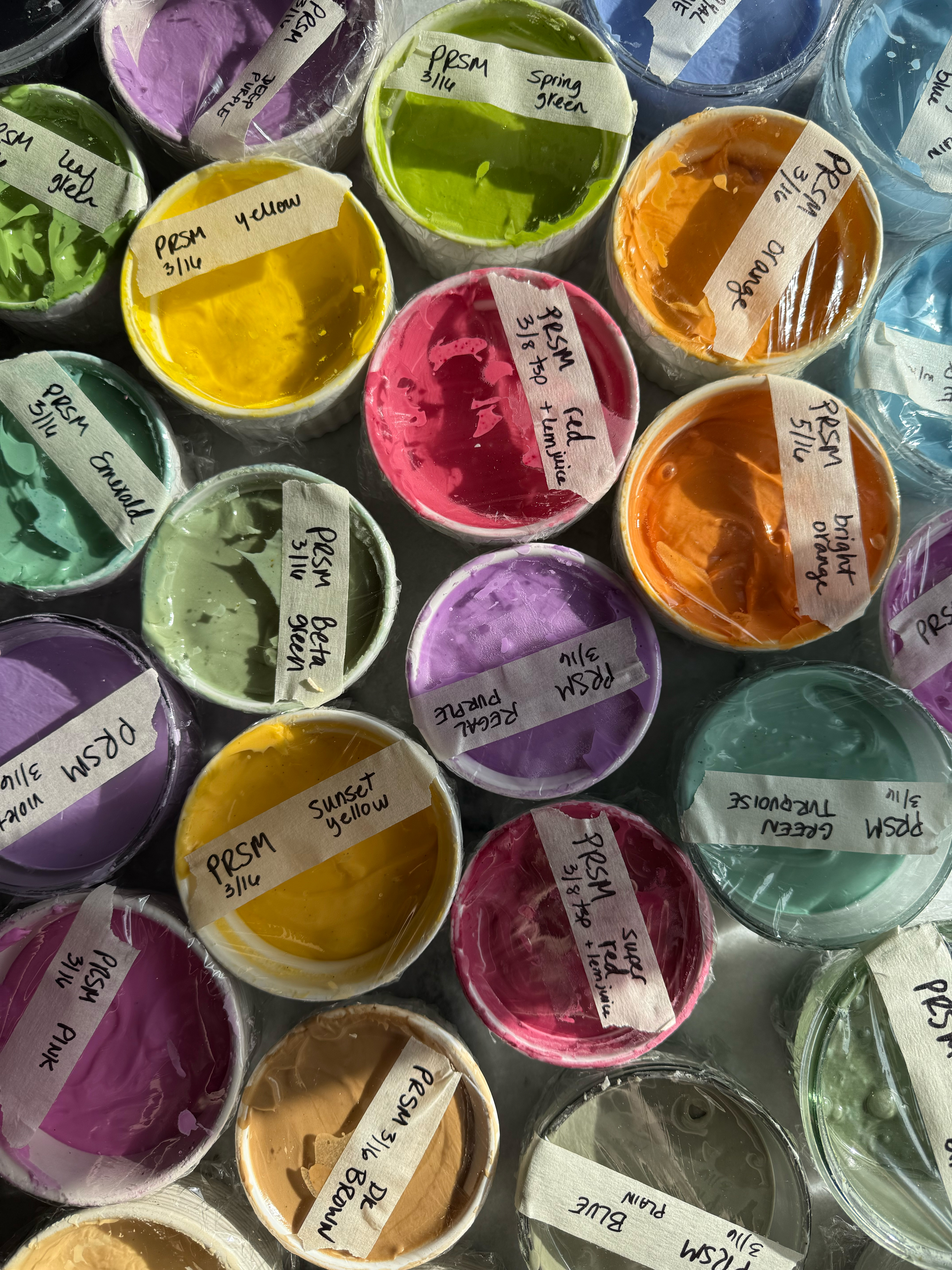
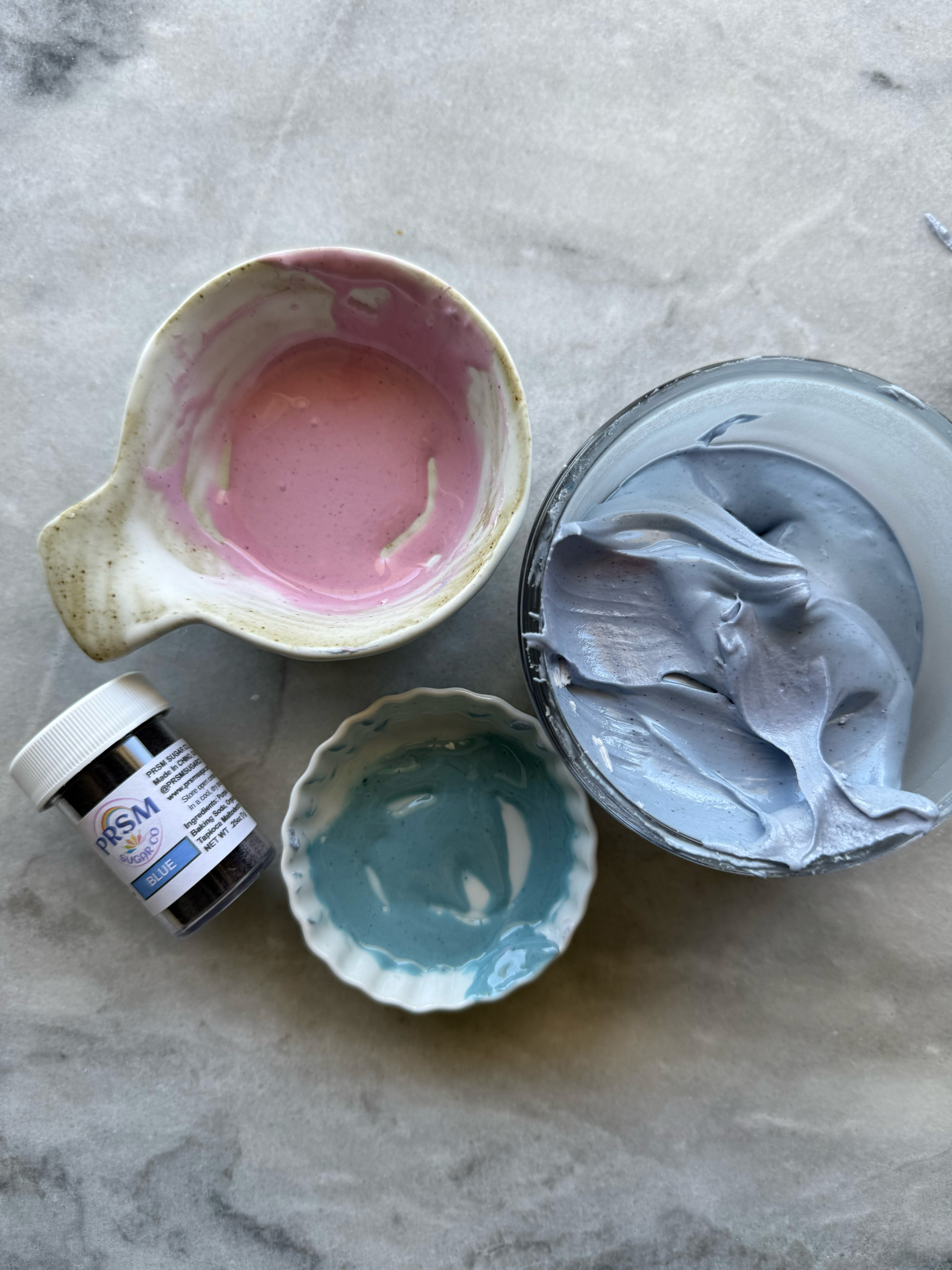
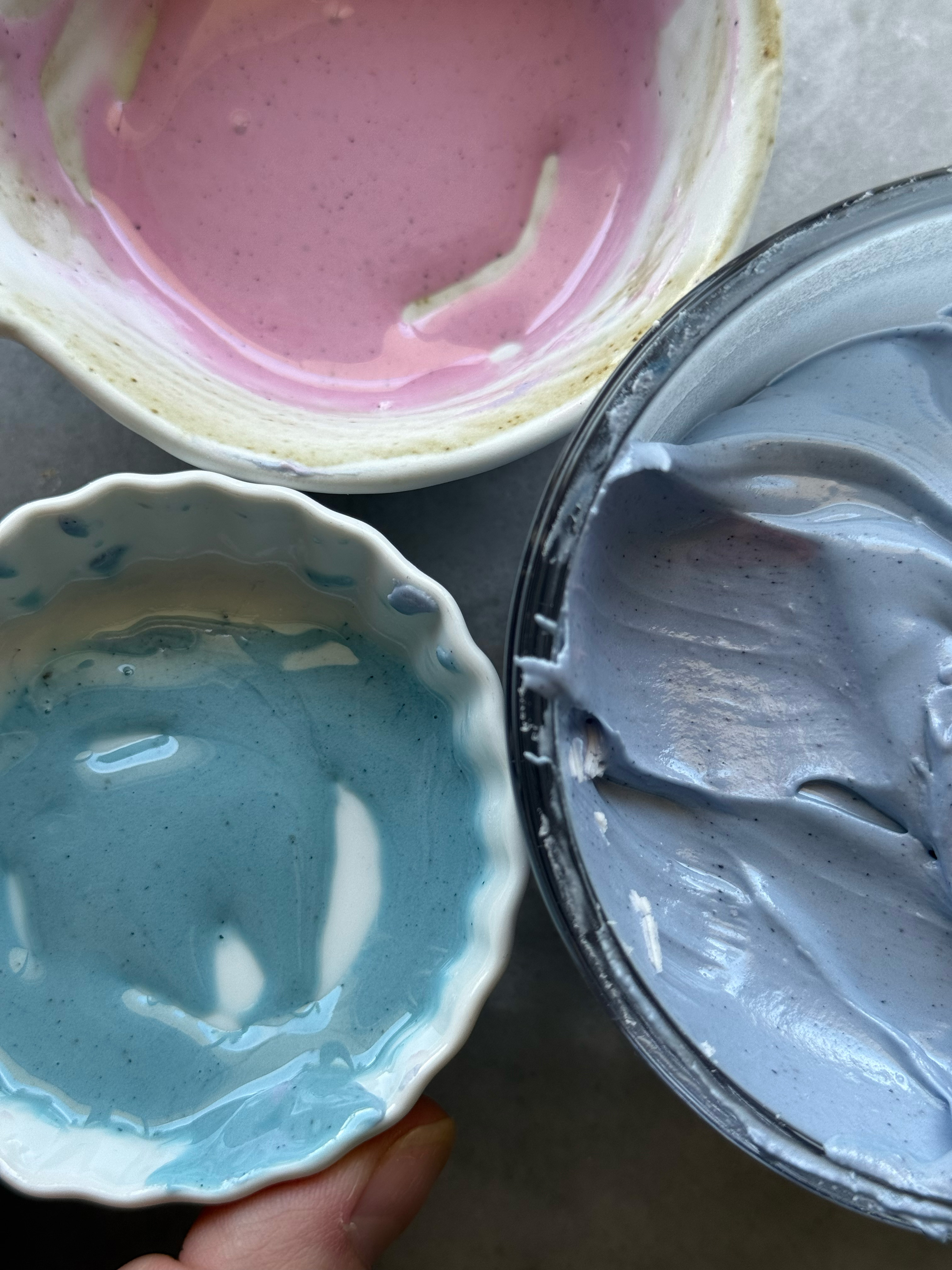
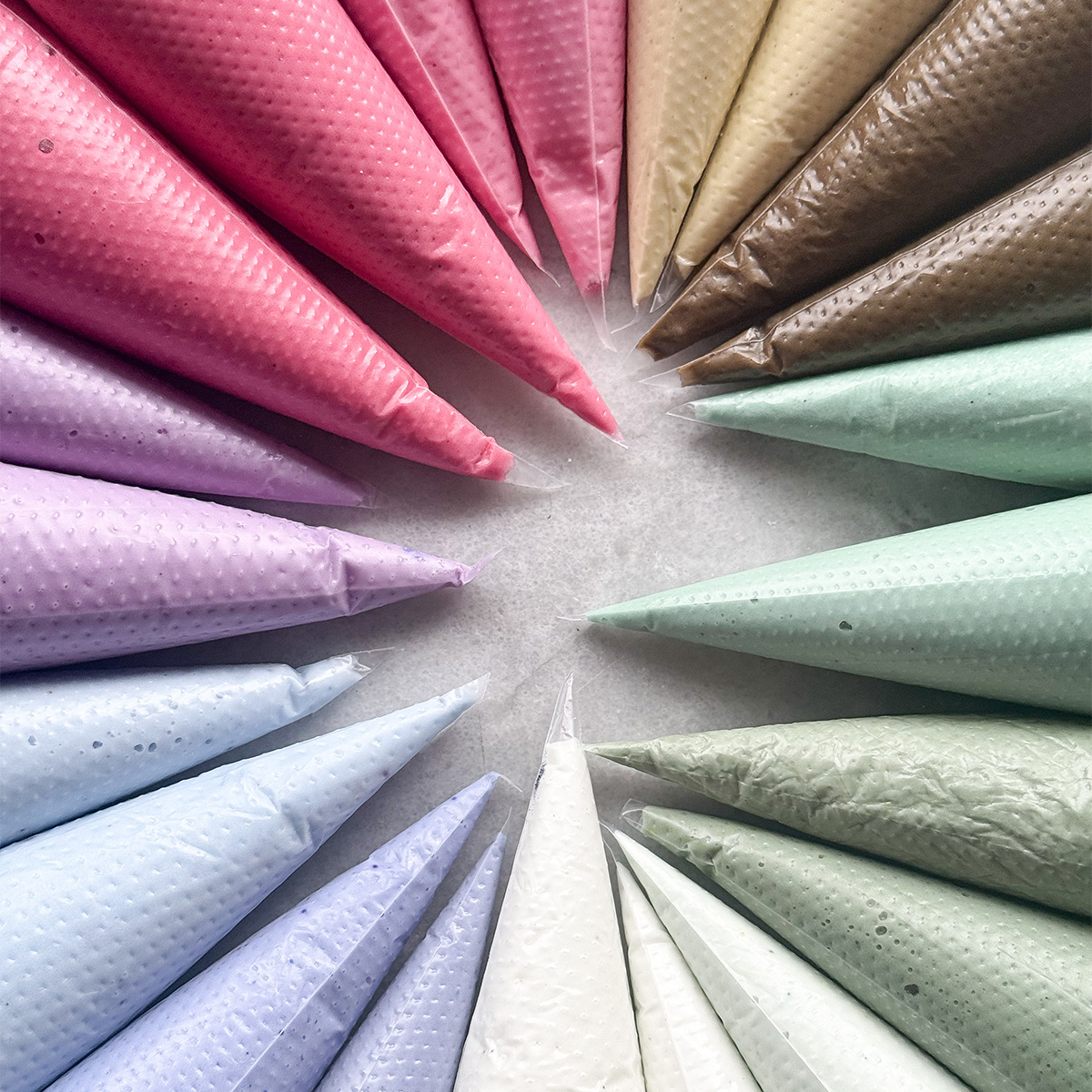
This particular food coloring is in a powder form. That means it needs to be hydrated before it is mixed into royal icing. Some people prefer to fully mix the powder with a little distilled water in a tiny bowl before transferring it to the royal icing and mixing it in. Some people mix the powder straight into the royal icing. Some people make a well in the surface of the royal icing, put the powder in it, add a little water to hydrate it, and then stir it in. I personally prefer this method to the other two. The powder doesn’t mix as well as it would if it was fully hydrated first, and this does lead to more speckling in some colors, but I also found that I prefer to mix the icing colors the day before I plan to use them to allow the colors to fully develop. After I mix the colors in a small bowl, I cover them with Saran Wrap, label them, and let them sit overnight before I stir them again the next day to mix any remaining powder speckles into the icing. Then I bag them as usual.
the colors
Each of these colors were mixed into ½ cup, or 150g, of thick royal icing.
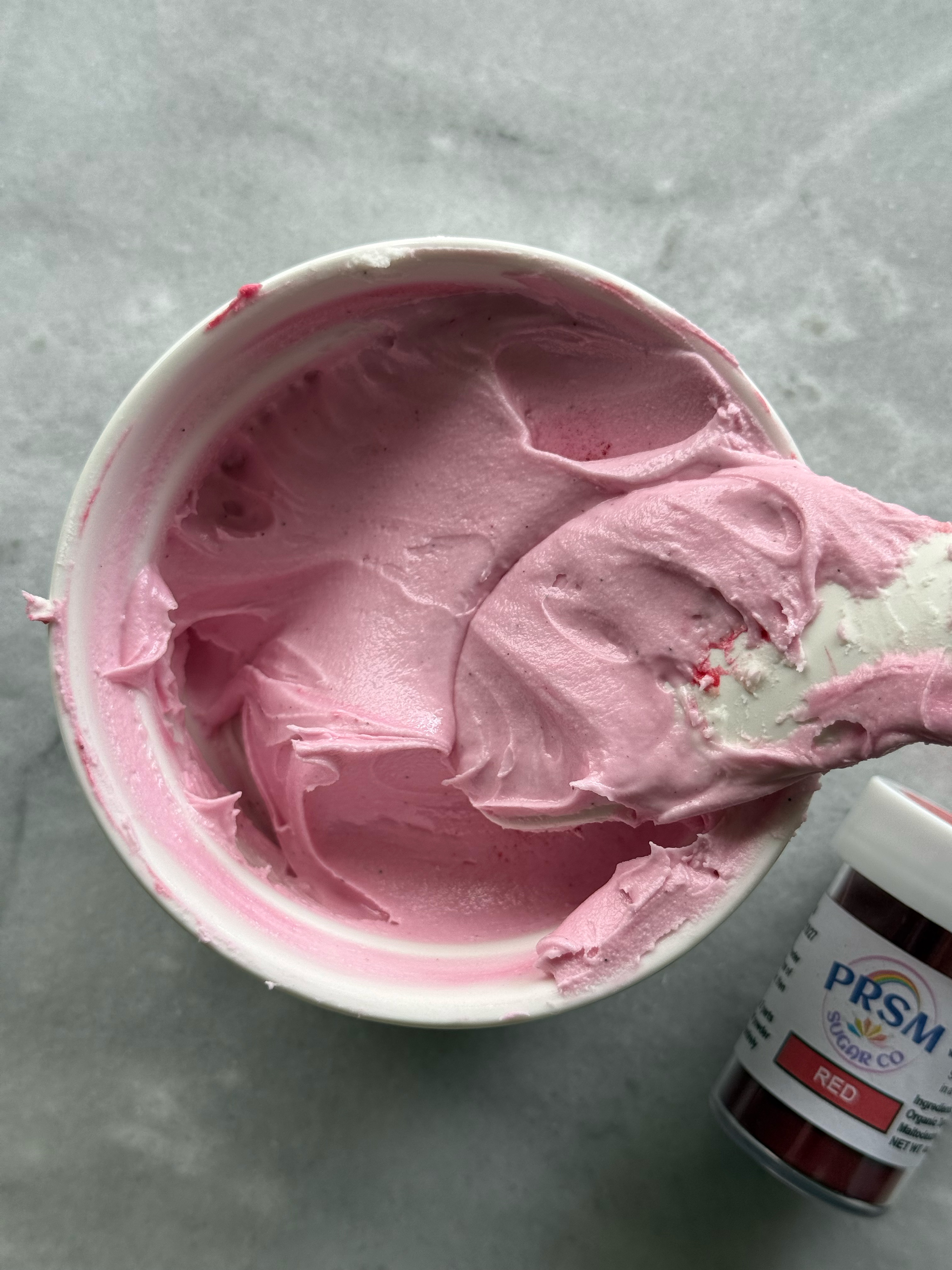
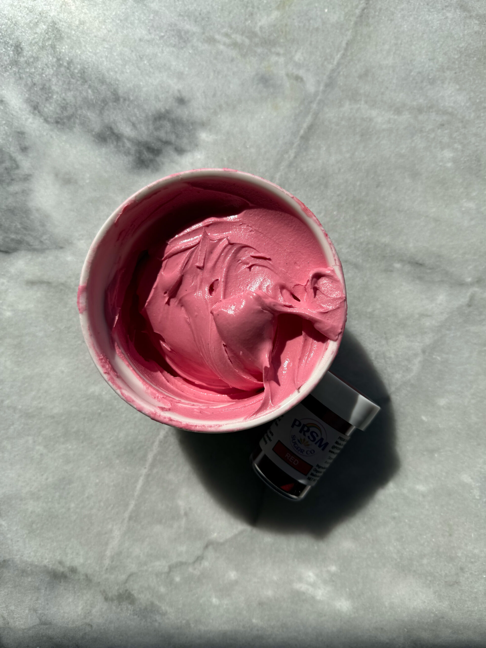
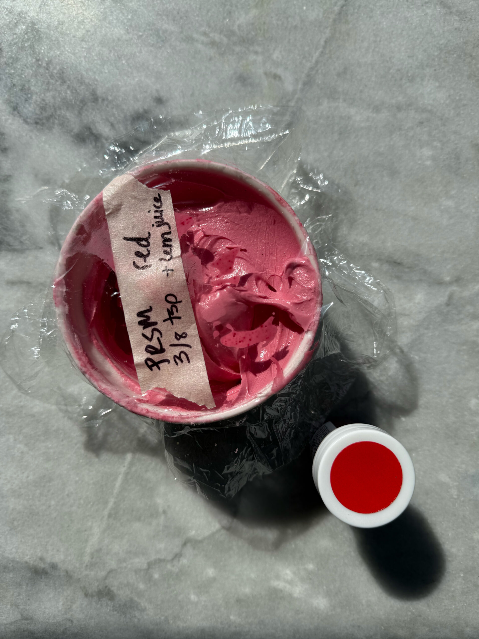
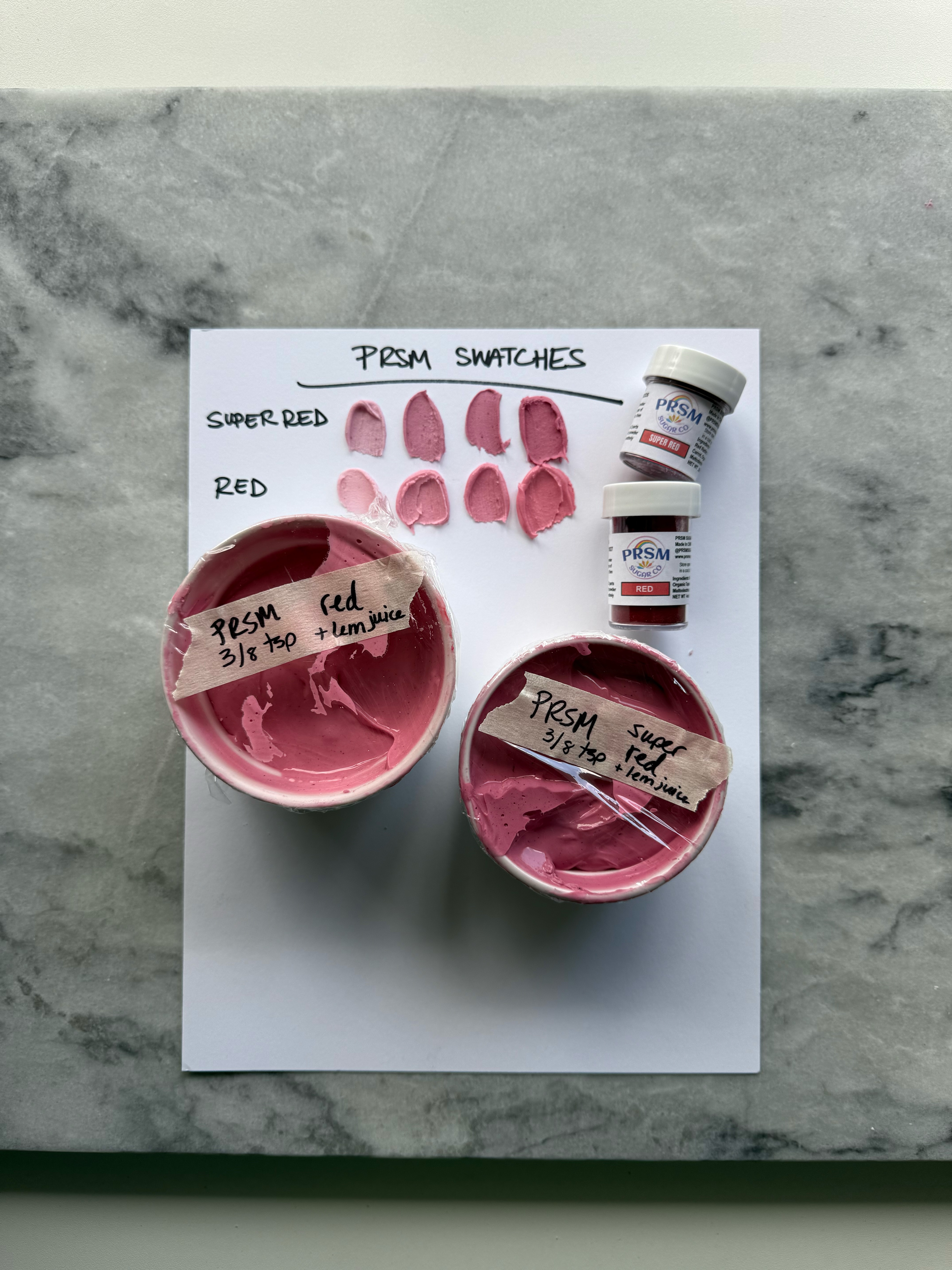
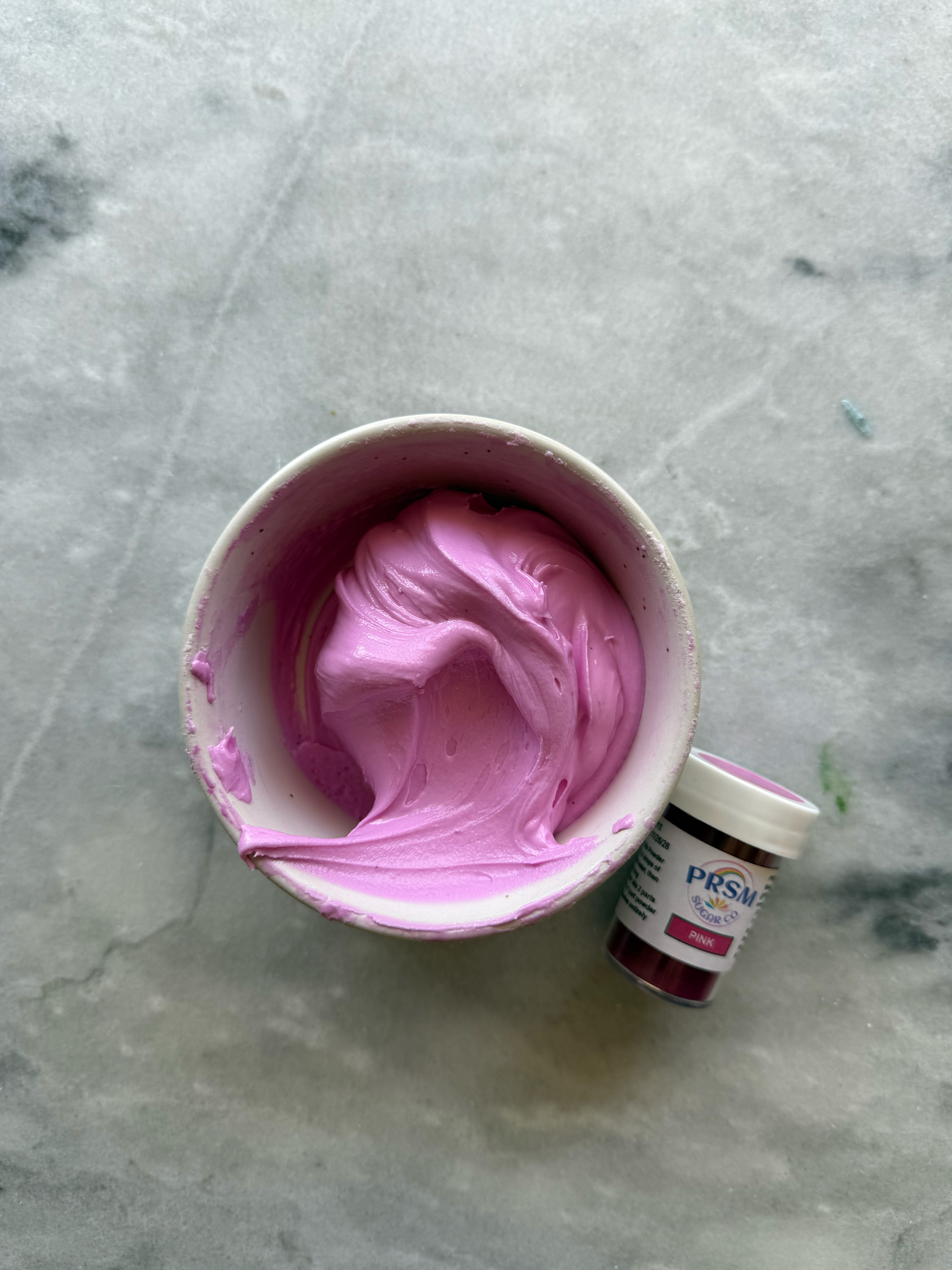
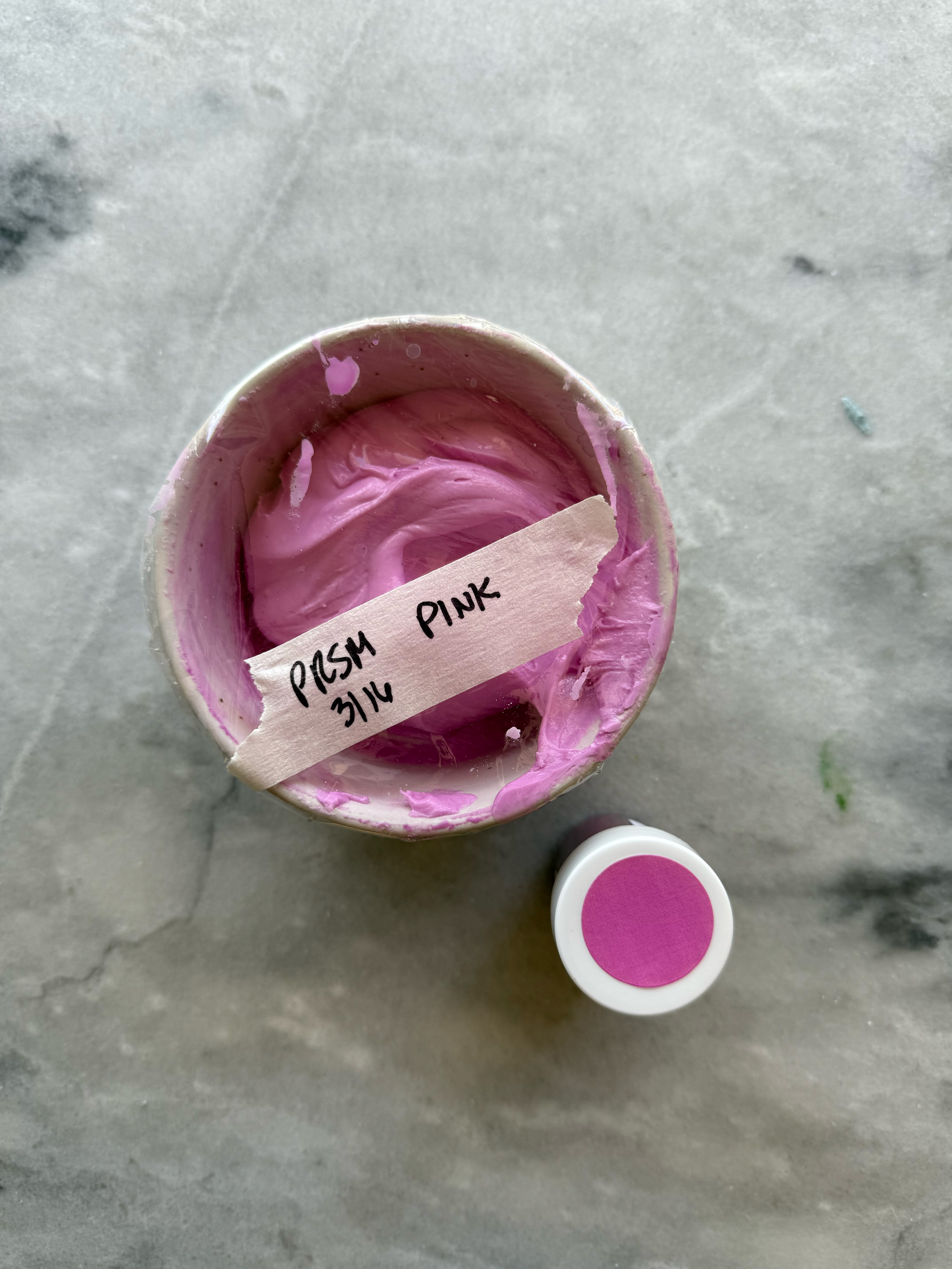
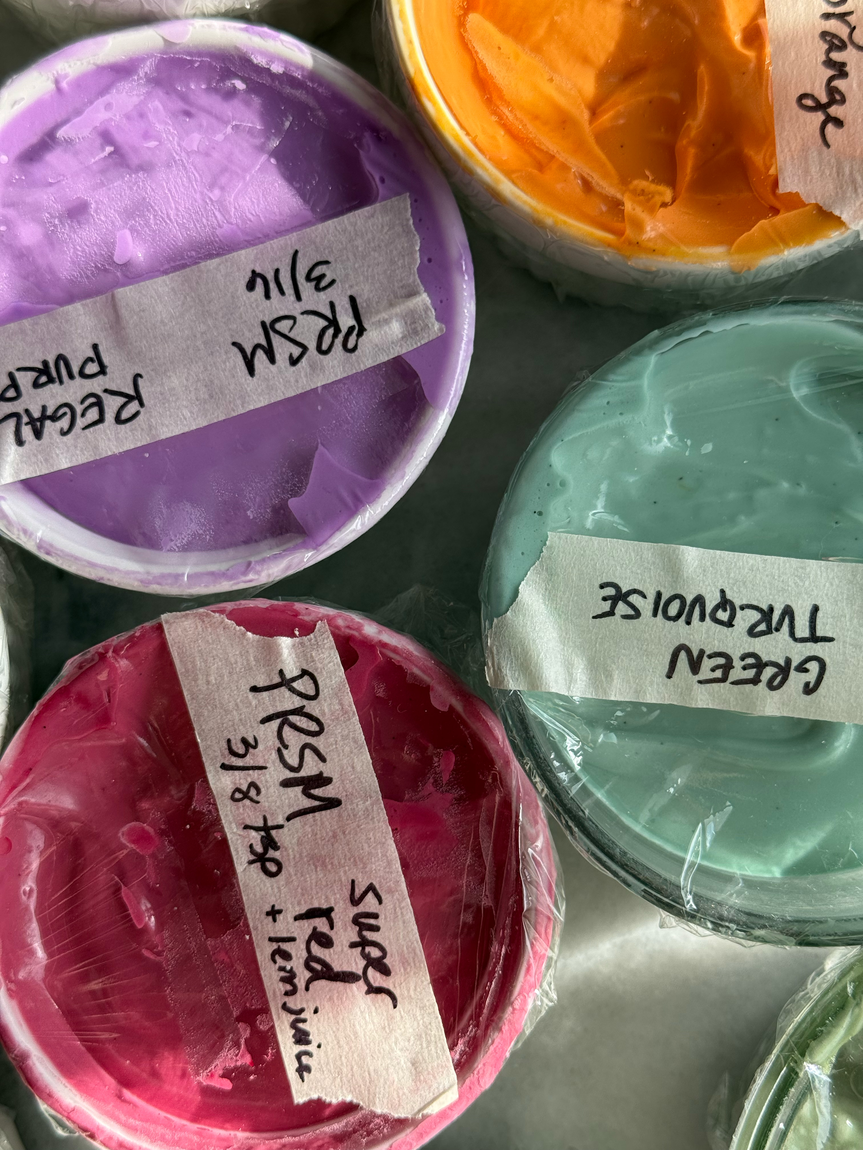
– super red
This color has a more raspberry/wine/maroon tone than a true red. It is a beautiful color, and I will be keeping it in my dye-free color kit to use as a deep berry pink or even a cooler-toned pastel pink. For this one, I used ⅛ teaspoon increments- ⅛ teaspoon for light, 2/8 teaspoon (which is ¼ tsp) for medium, and ⅜ teaspoon for deep. This is as much as I would use if you don’t want any strange flavors. You may be able to add a little more if you also add even more extracts to mask the flavor. This color does have a bad taste if you add too much powder.
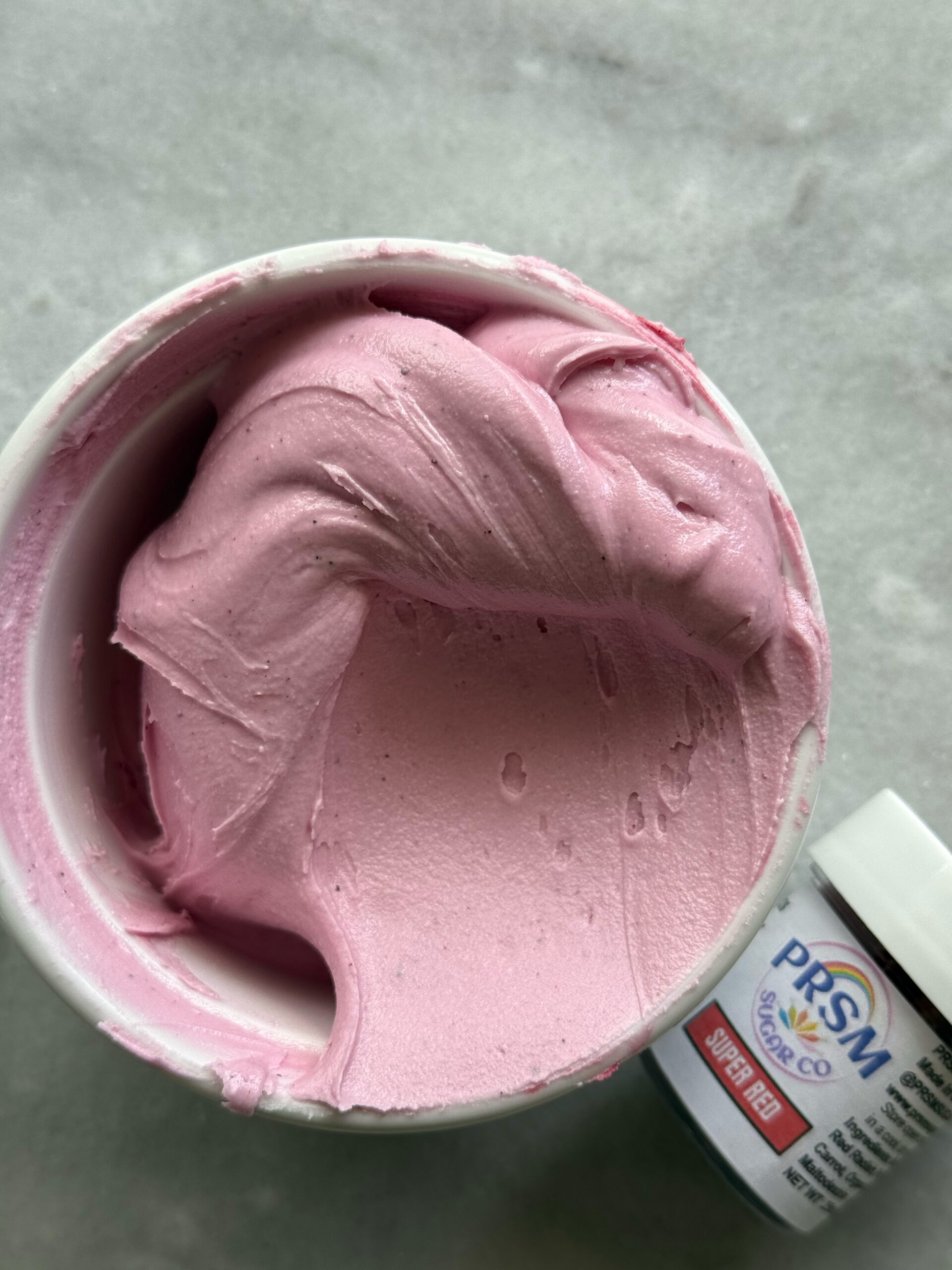
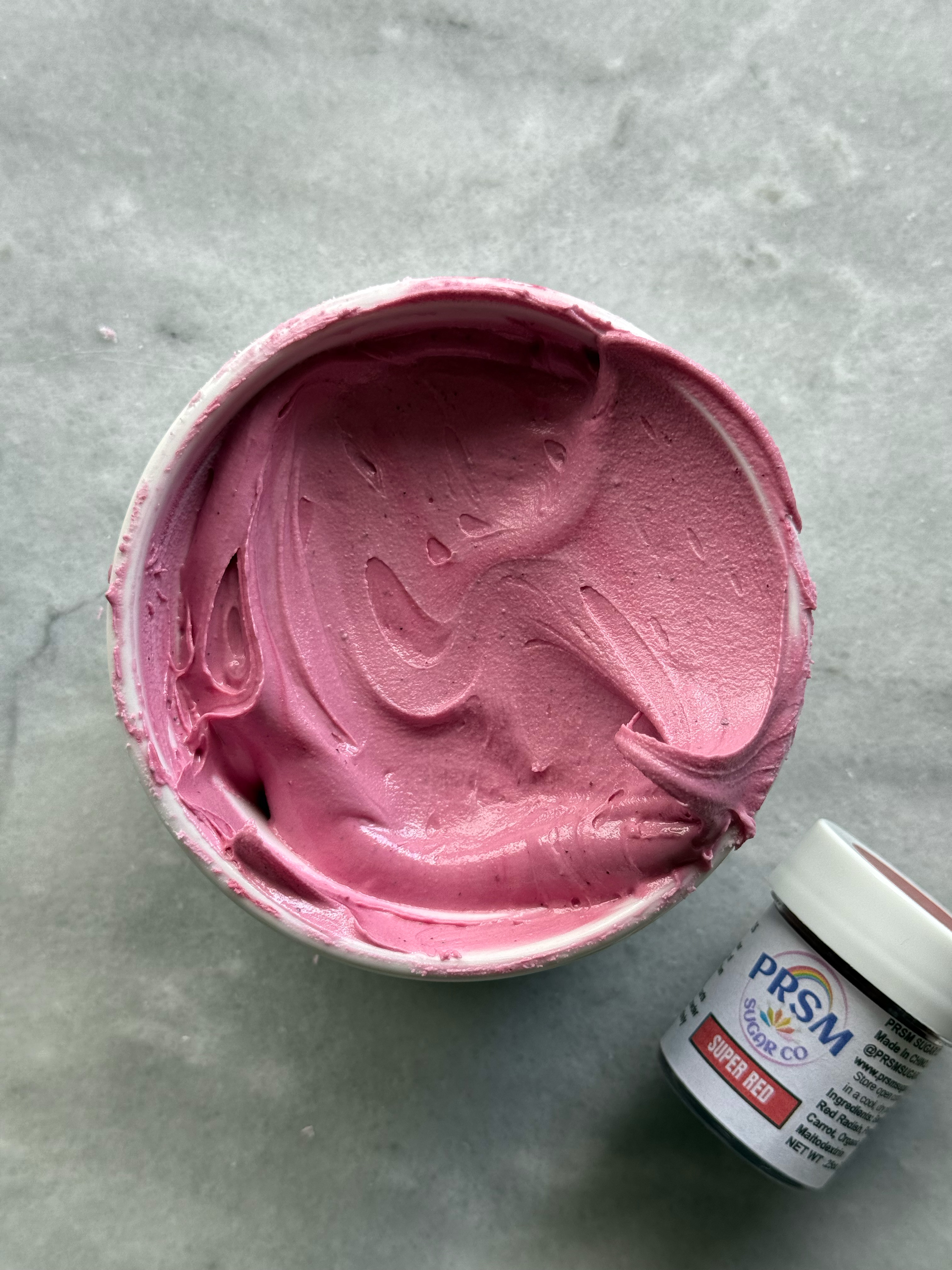
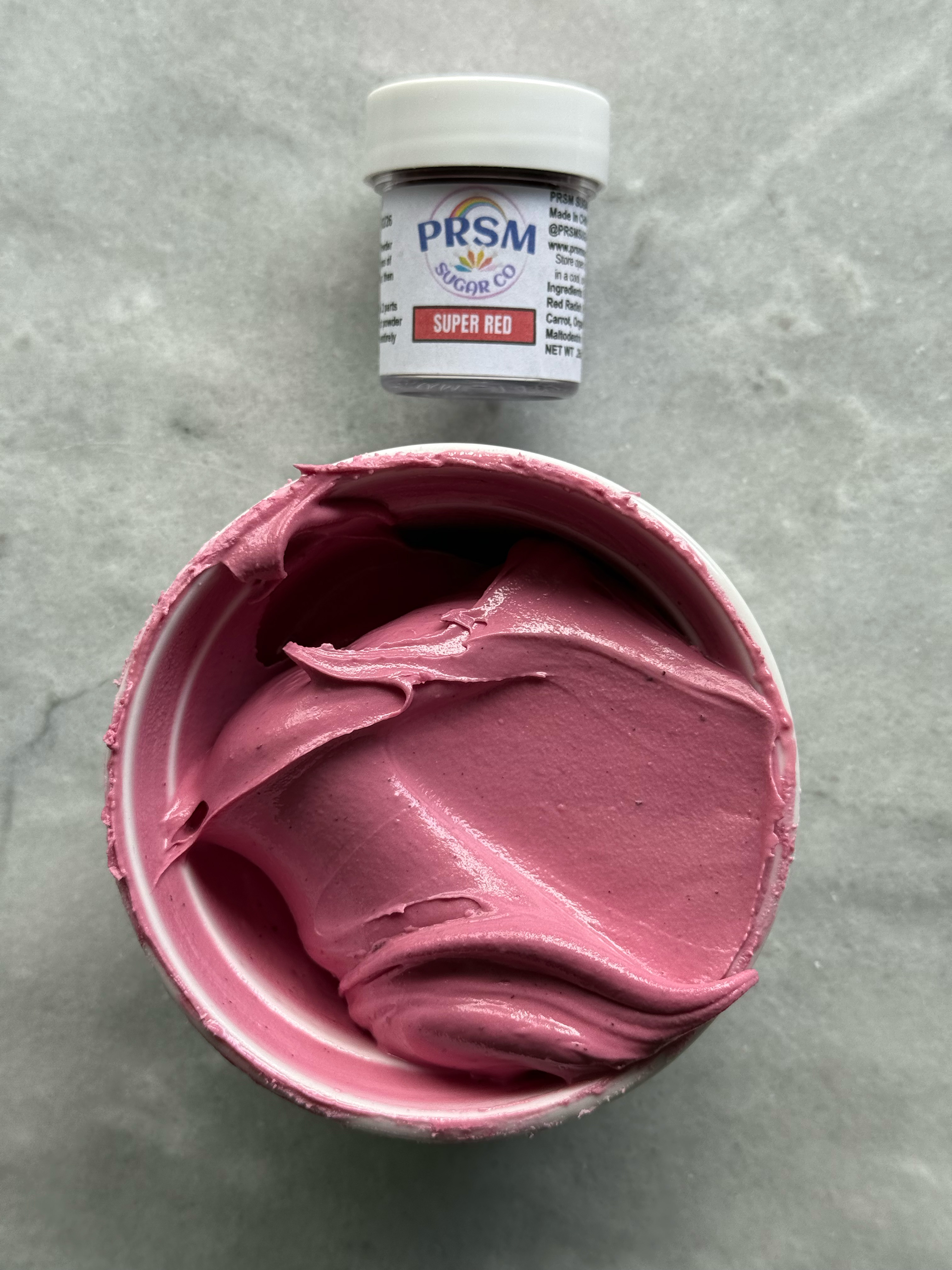
I added ¼ teaspoon of lemon juice, and I do think it brightened and warmed the color a little bit, although it wasn’t extremely drastic like some colors are. After 24 hours of developing the color in the bowl, it did deepen quite a bit.
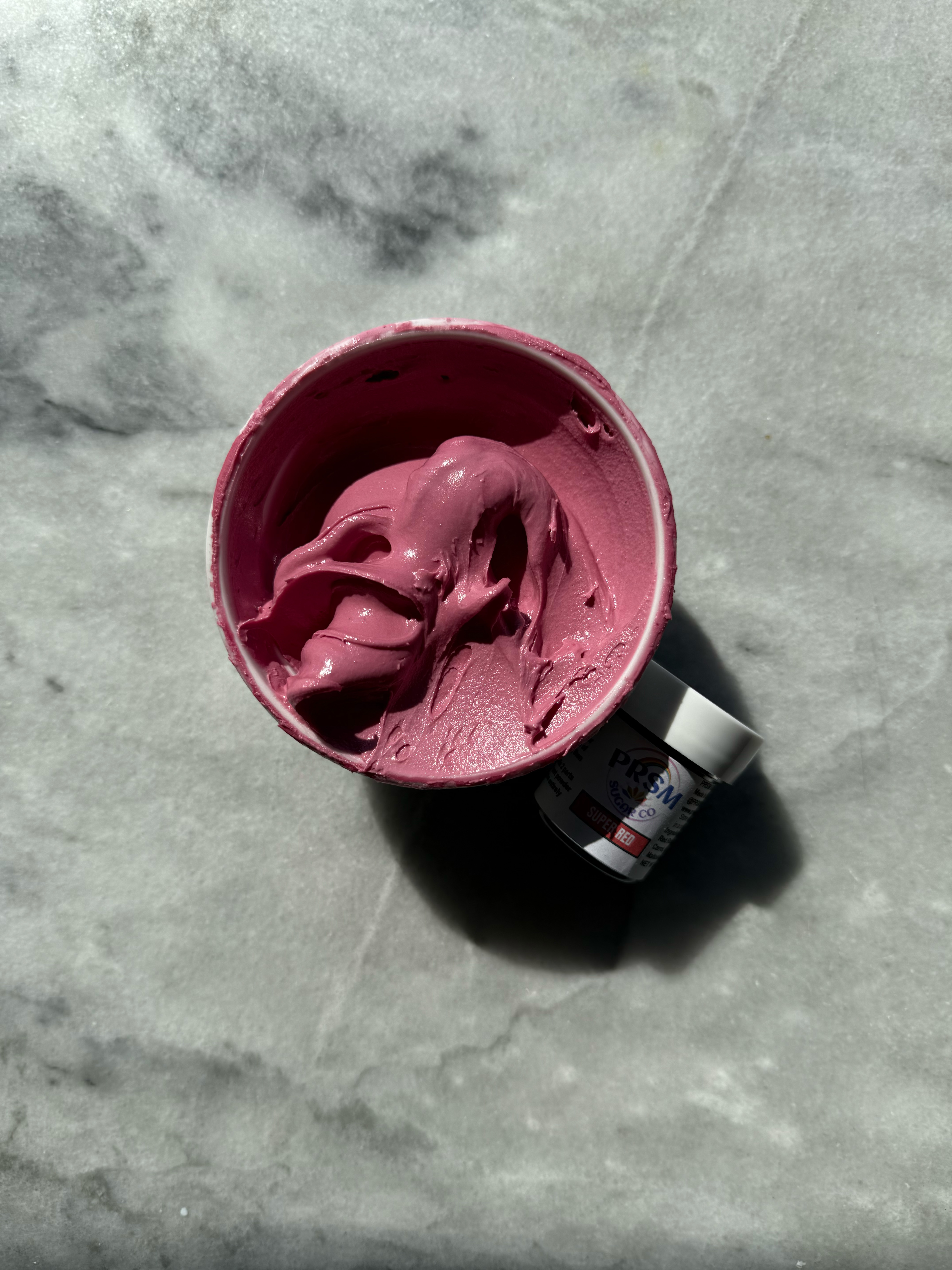
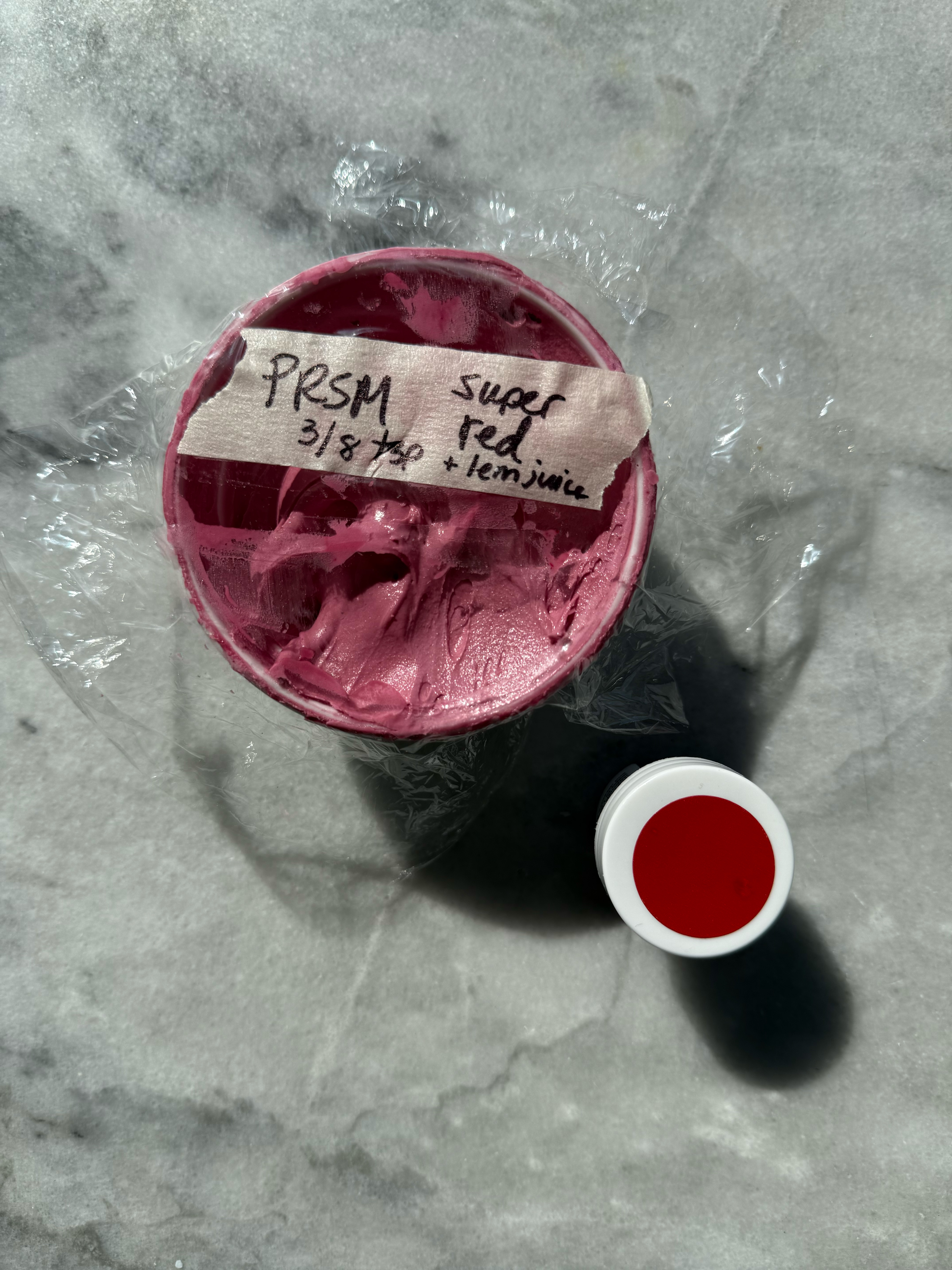
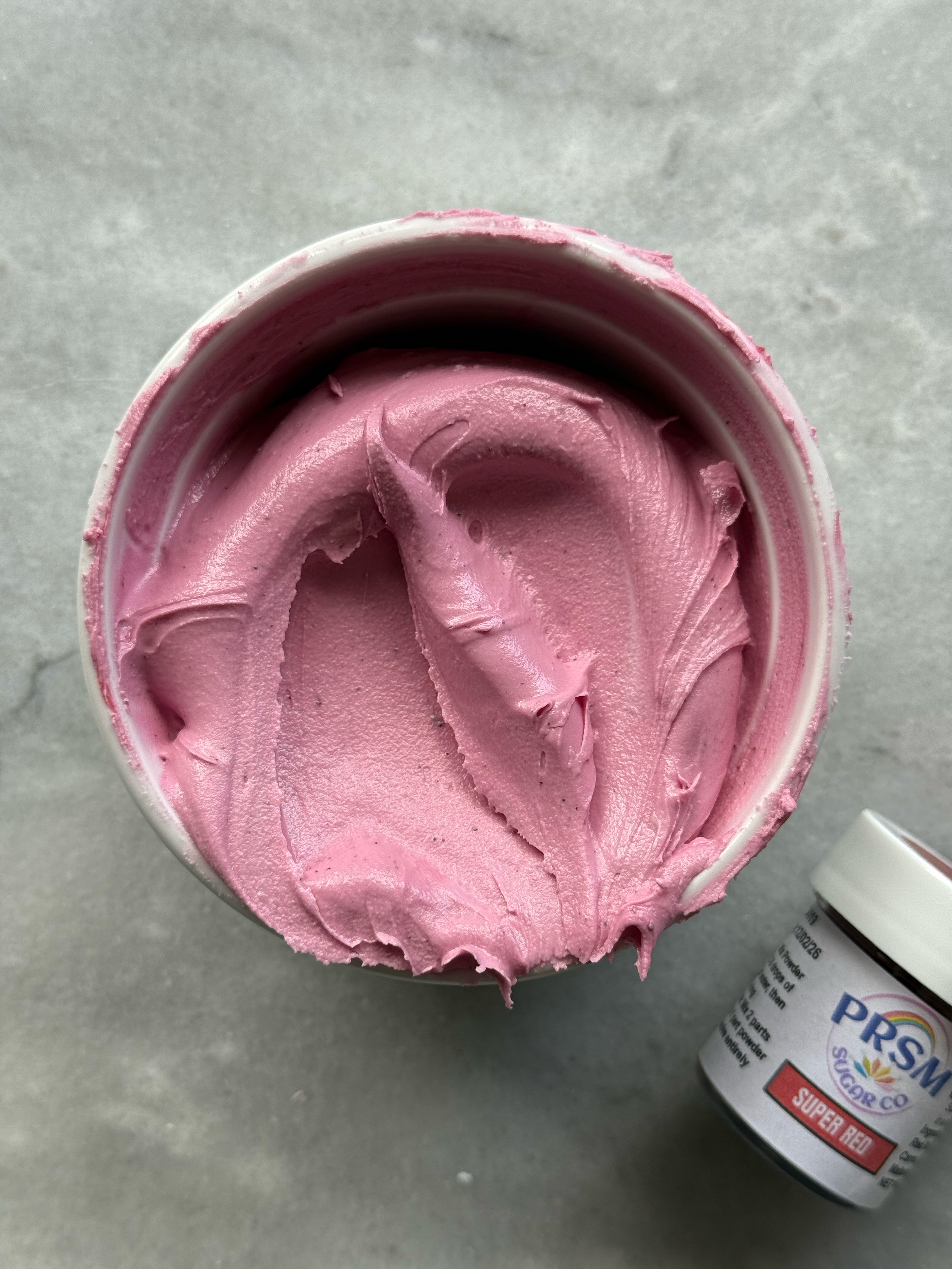
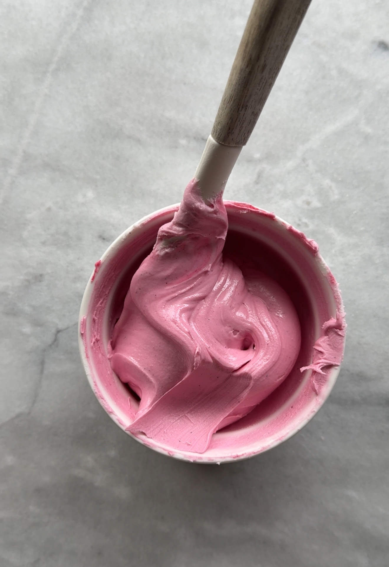
super red after developing 24 hrs
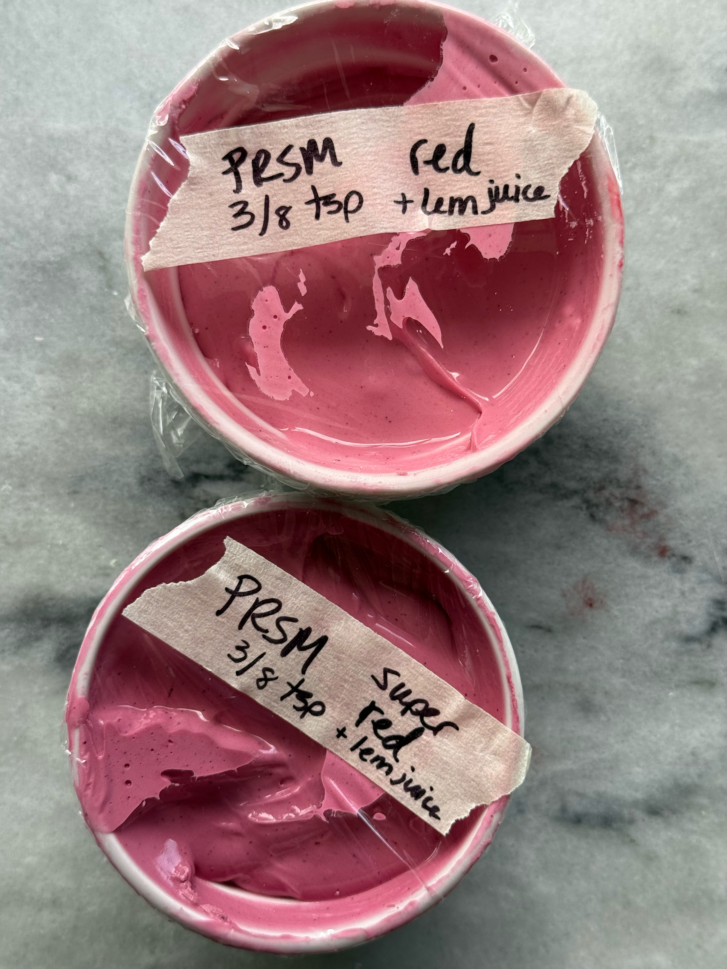
– red
This red is a little warmer than super red, and it also makes a beautiful pink icing. I used the same amounts for this one- ⅛ teaspoon for light, 2/8 teaspoon for medium, and ⅜ teaspoon for deep. There is a taste, but it isn’t extreme and does fade quickly on the tongue. Any more than this, however, and the taste would be too noticeable. I added ¼ teaspoon lemon juice, and the color did brighten and warm up. After 24 hours of developing the color in the bowl, it did deepen quite a bit.
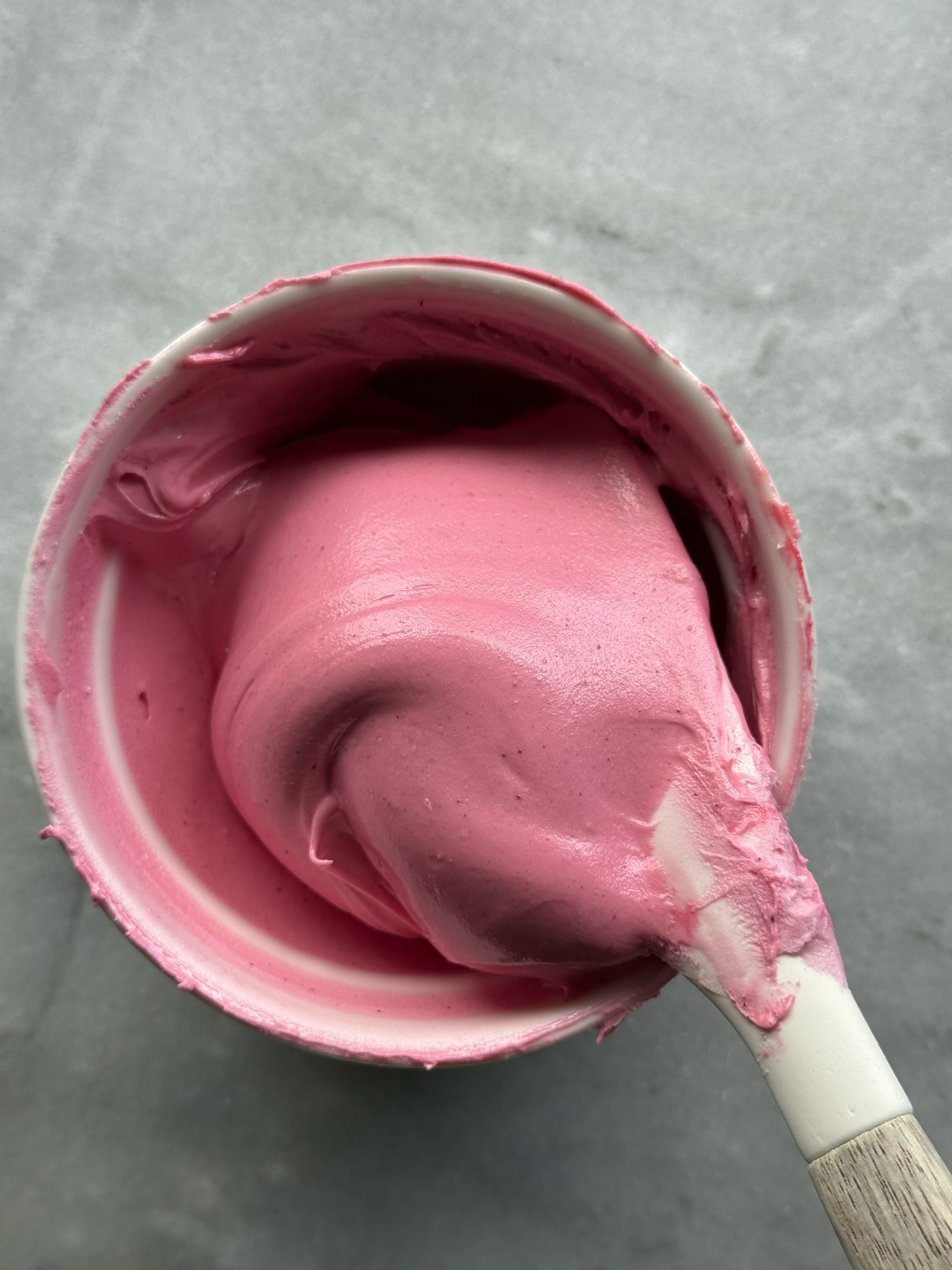
red after developing for 24 hrs
comparison of the reds:
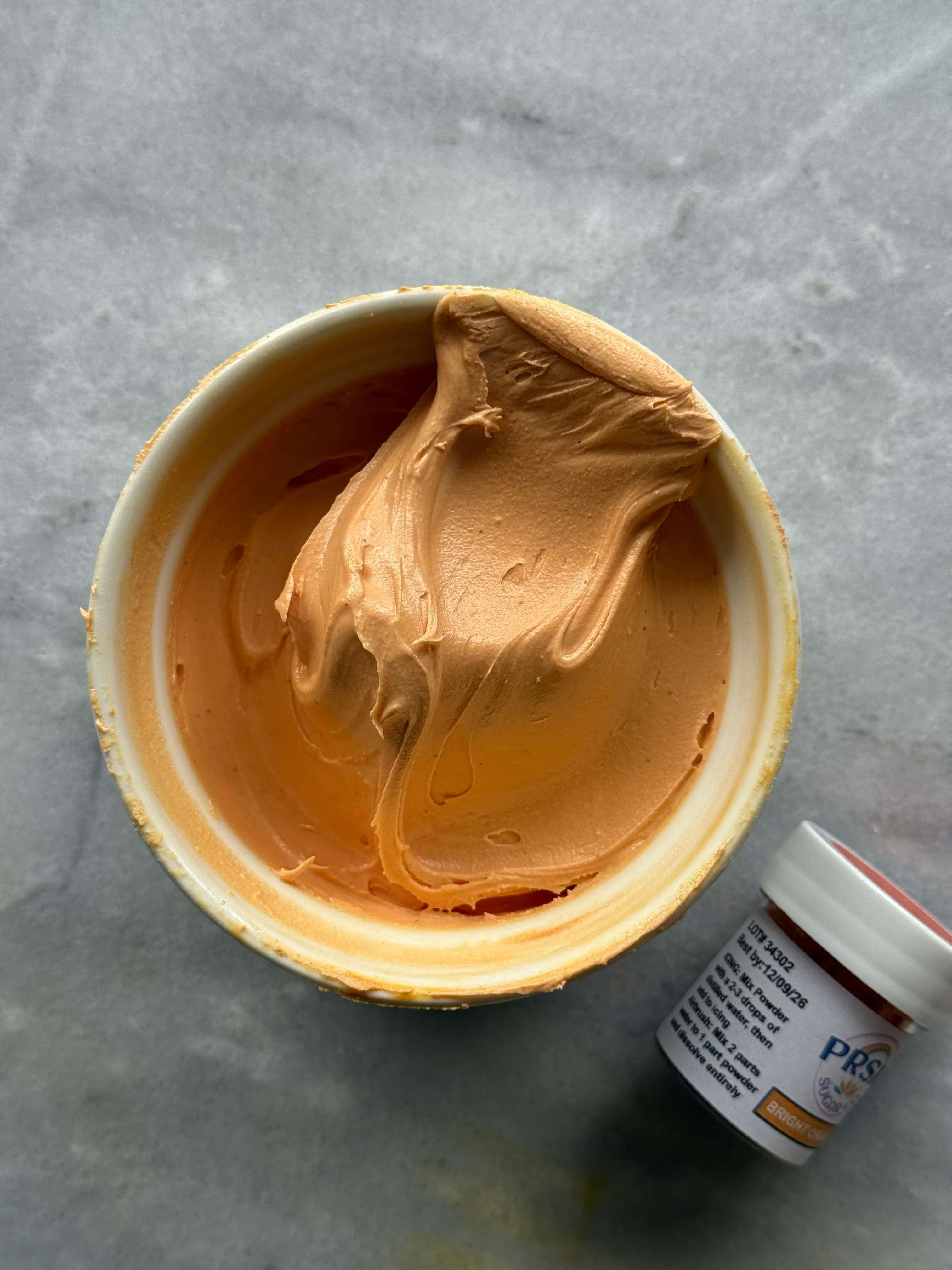
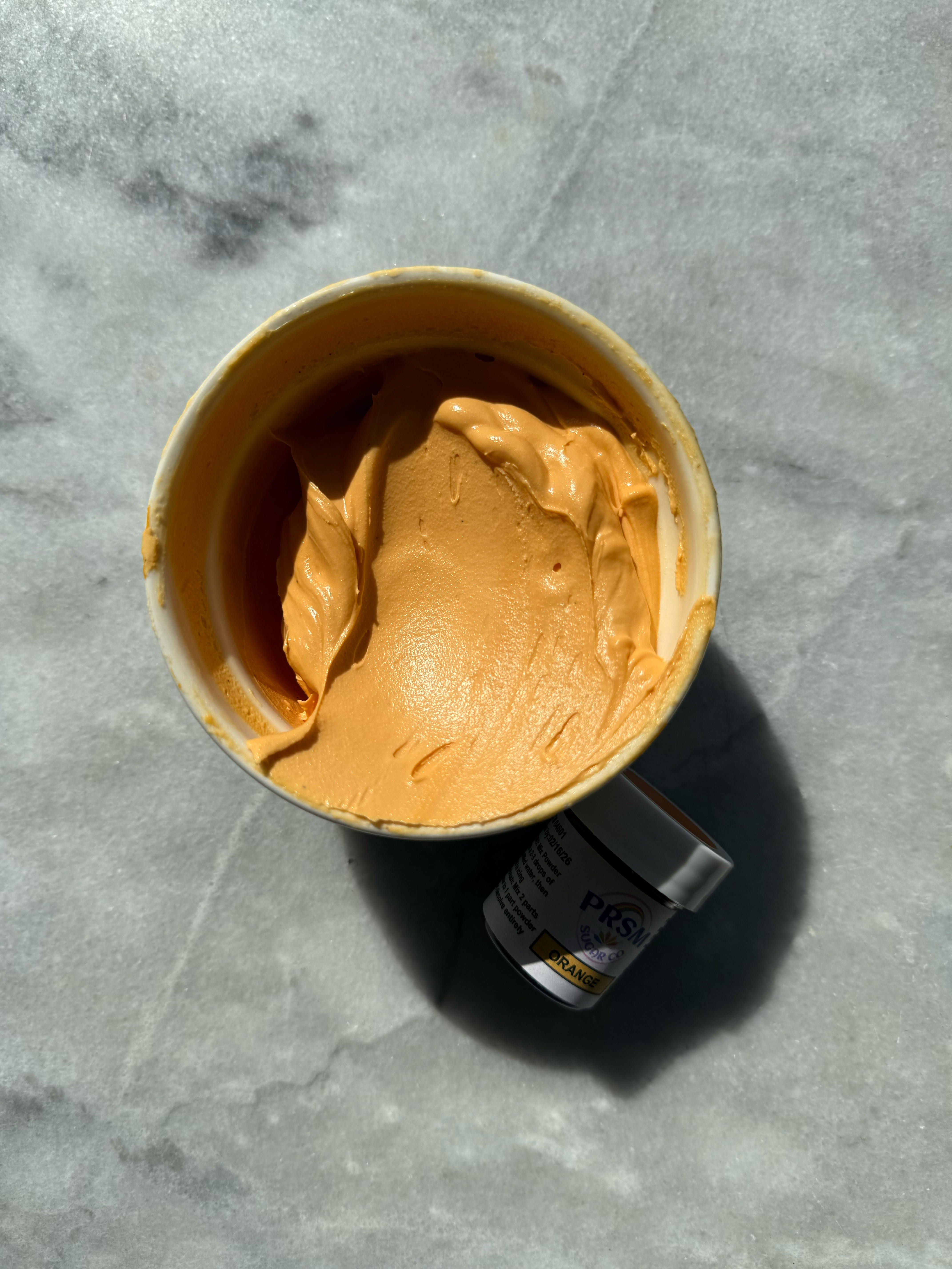
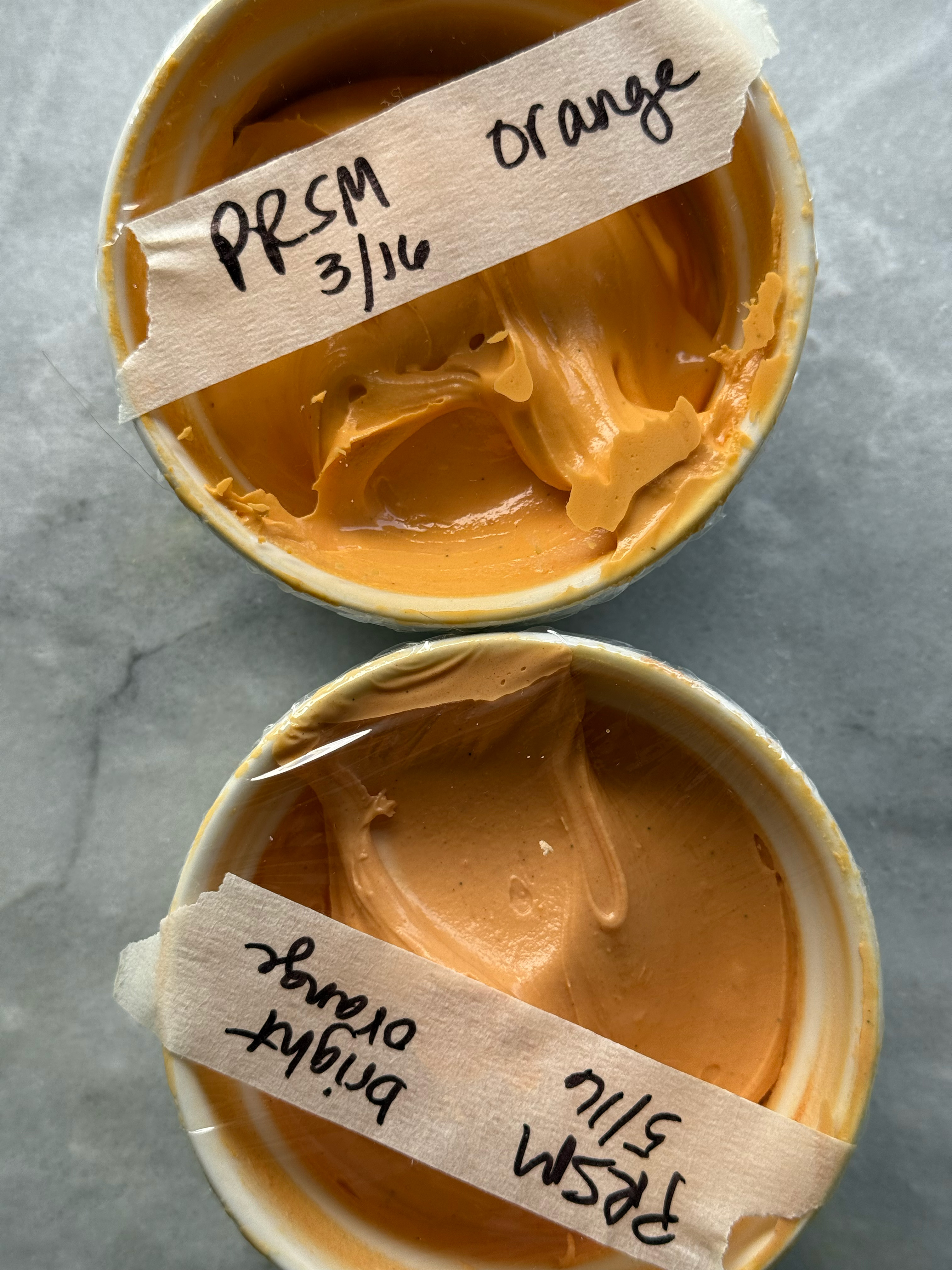
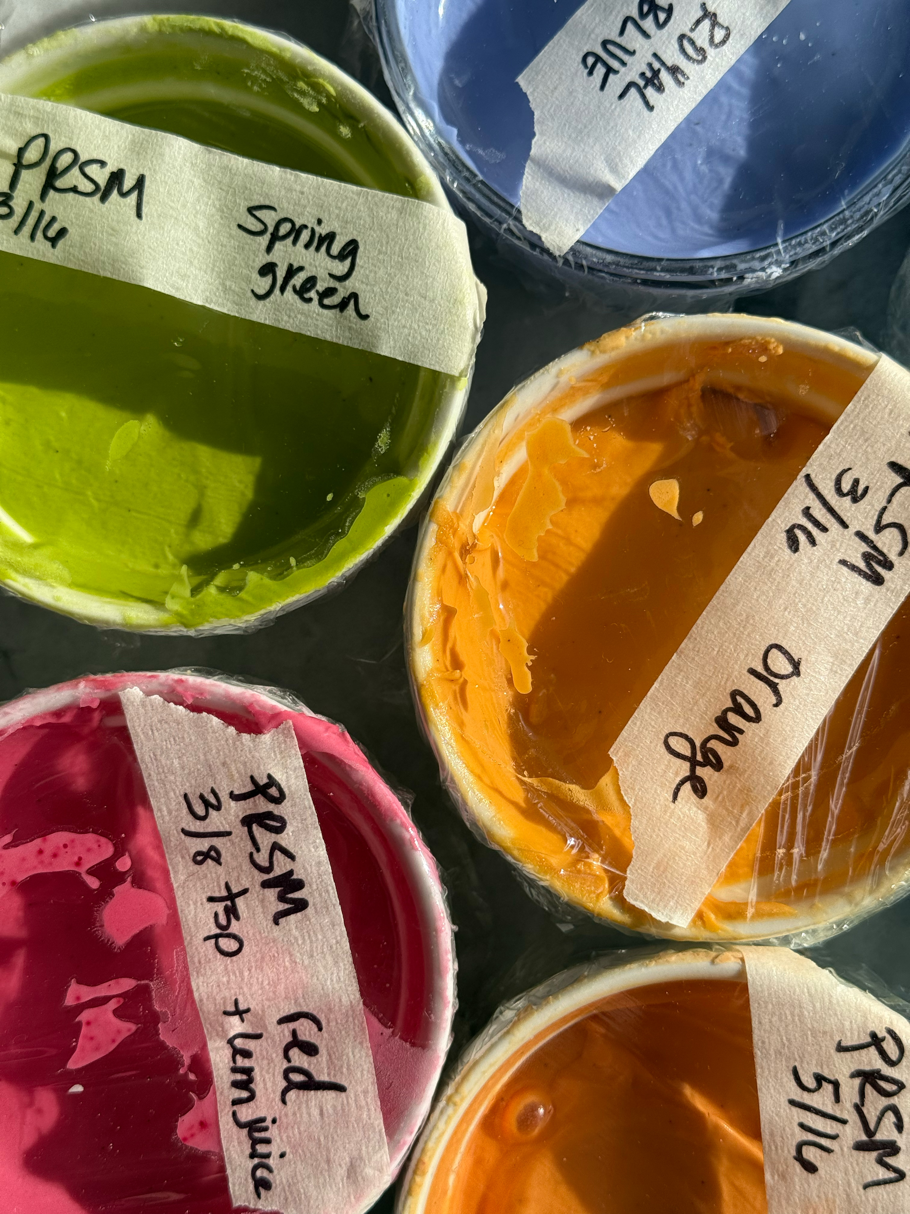
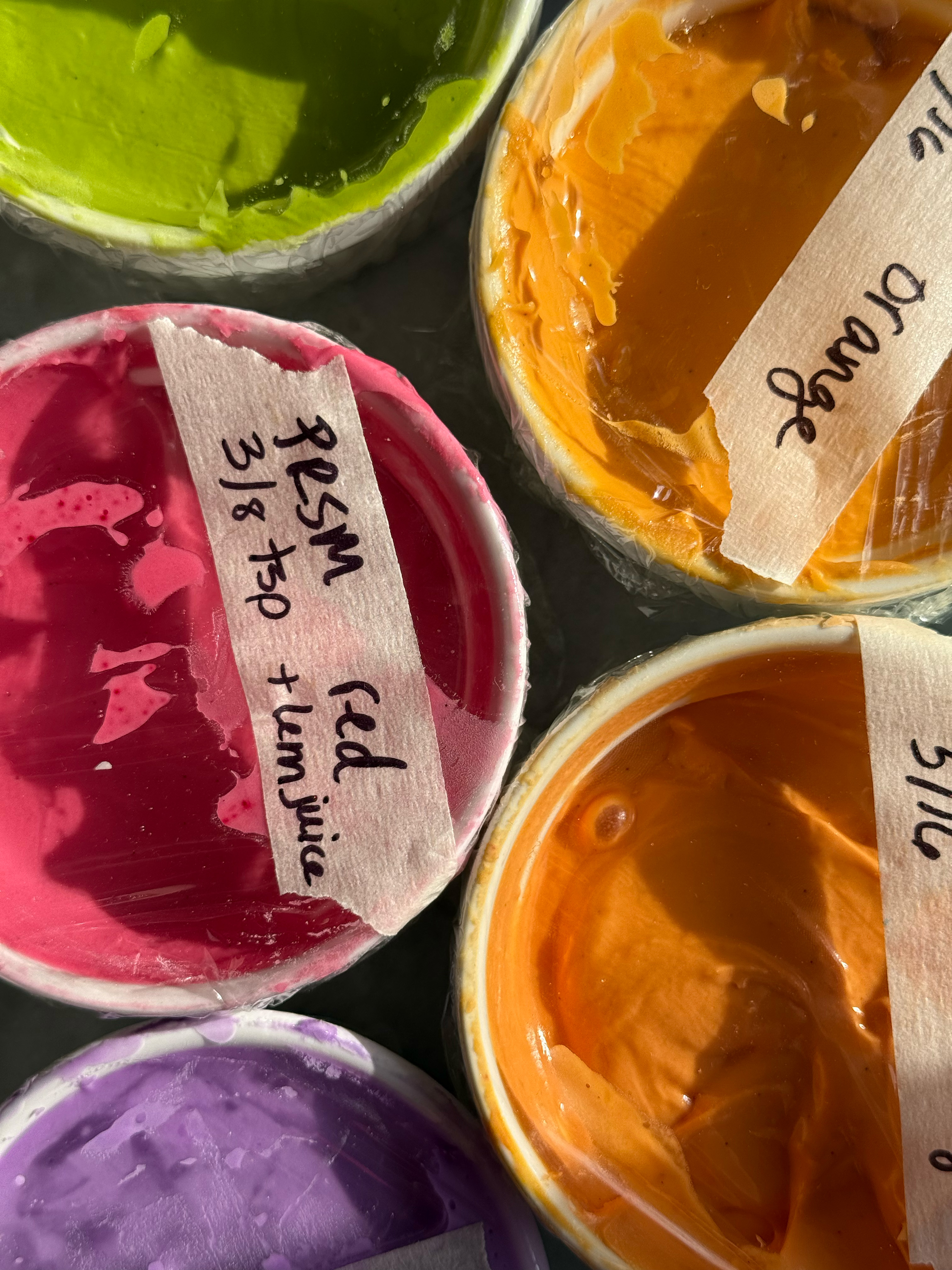
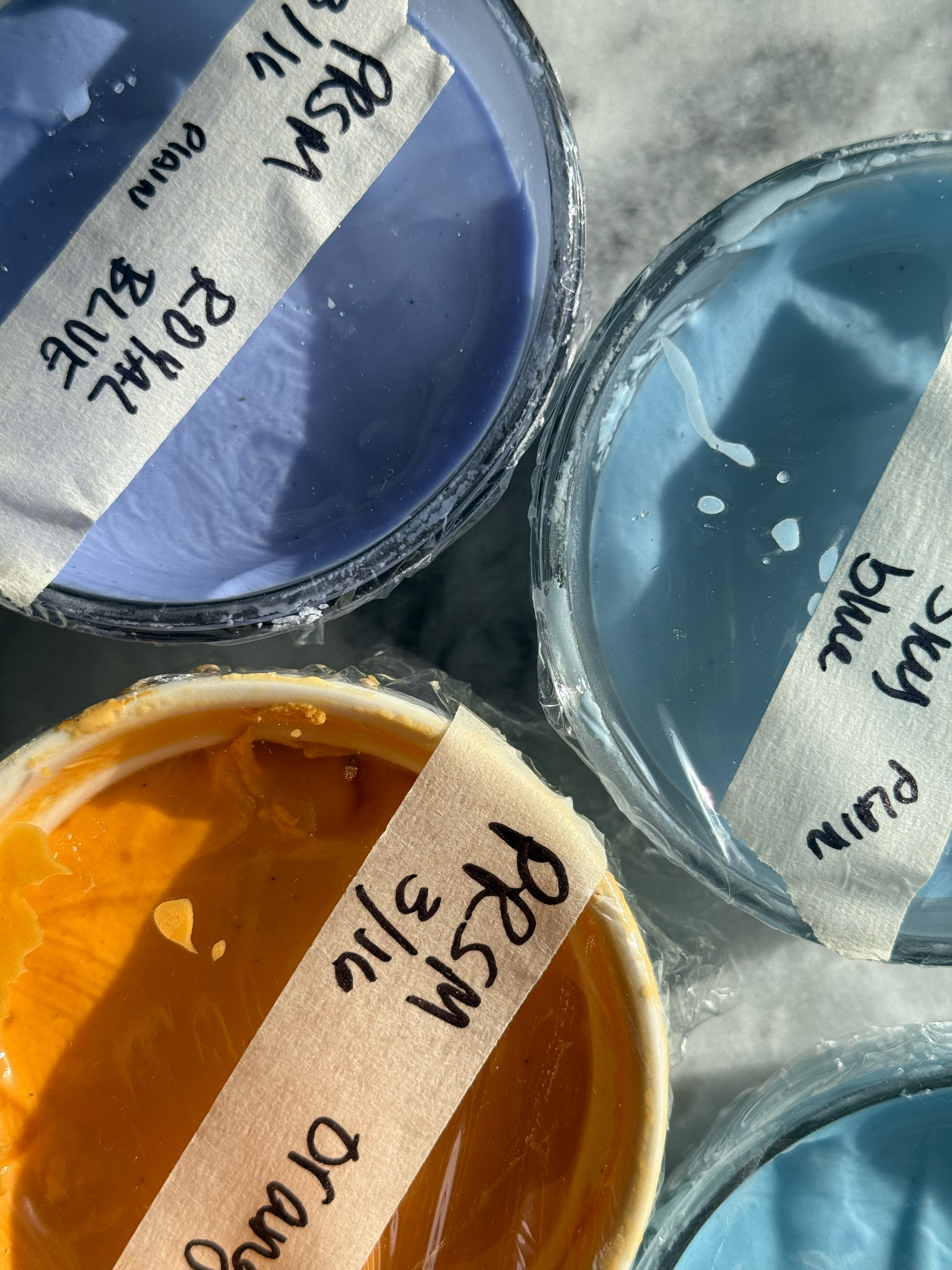
– bright orange
Bright orange is gorgeous. A very warm, peachy orange. The powder does have a smell, but it doesn’t linger in the icing and doesn’t leave a noticeable taste, even with the darkest shade. For this color, I used 1/16 teaspoon increments for a light, medium, and dark.
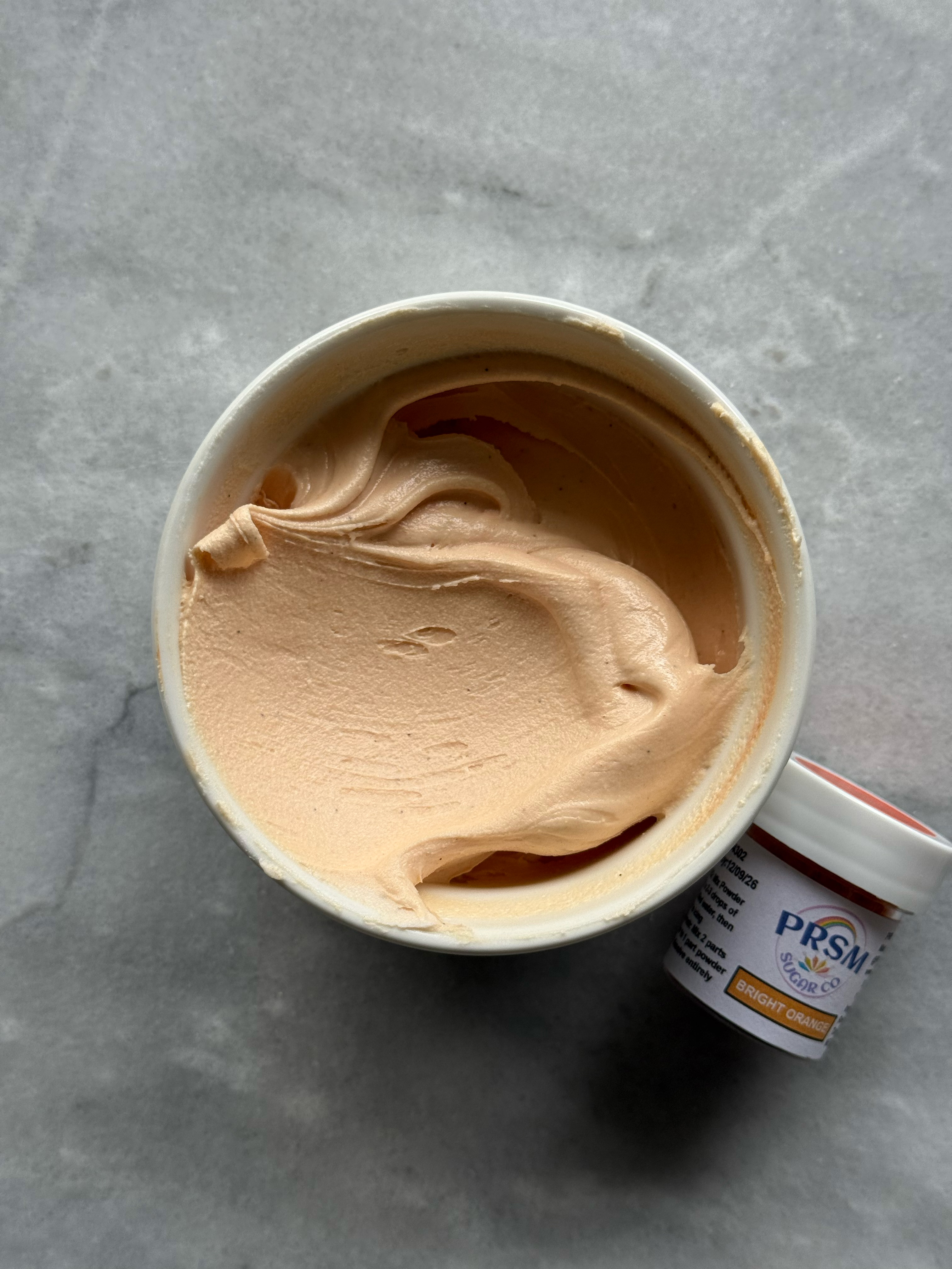
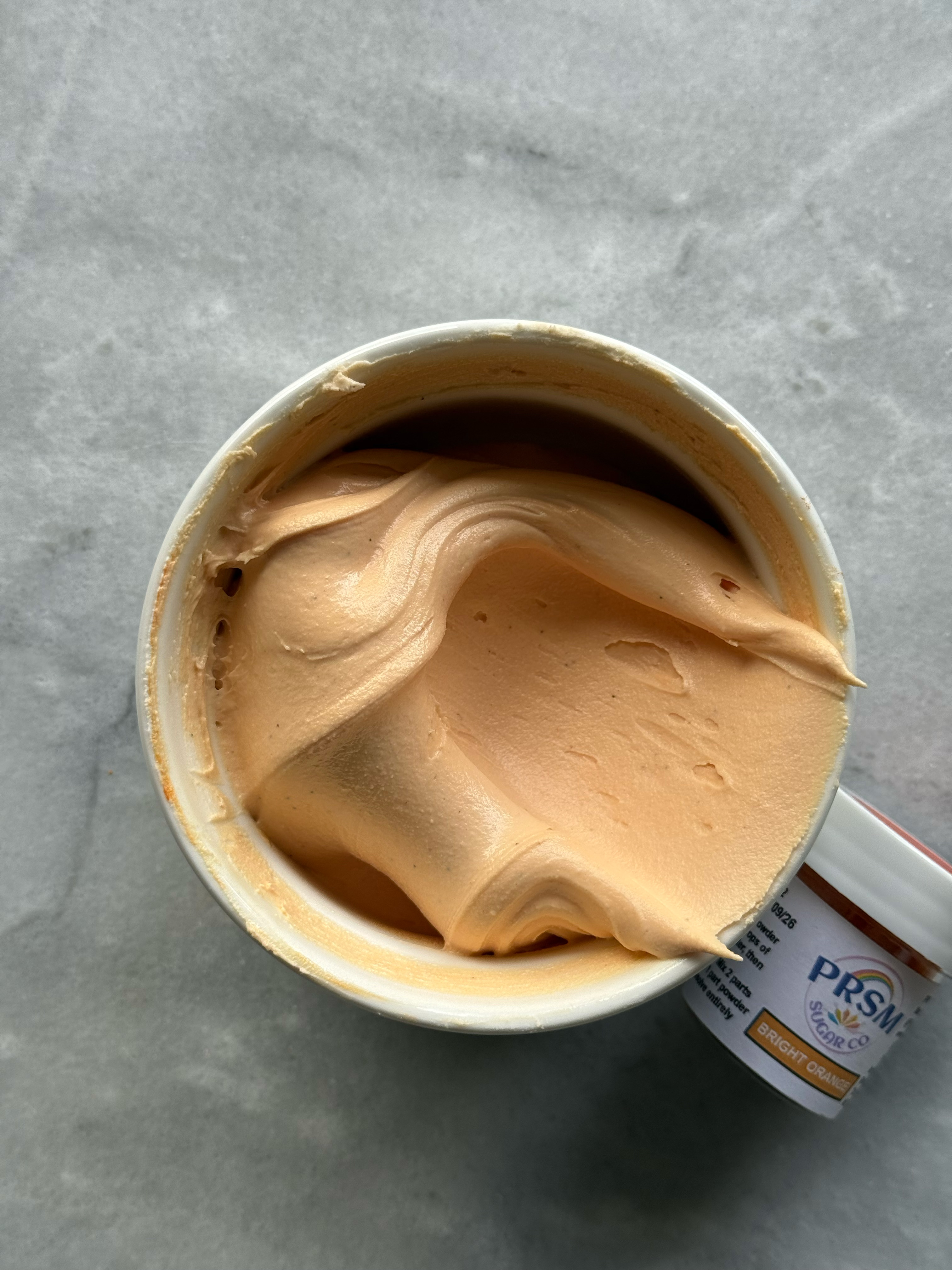
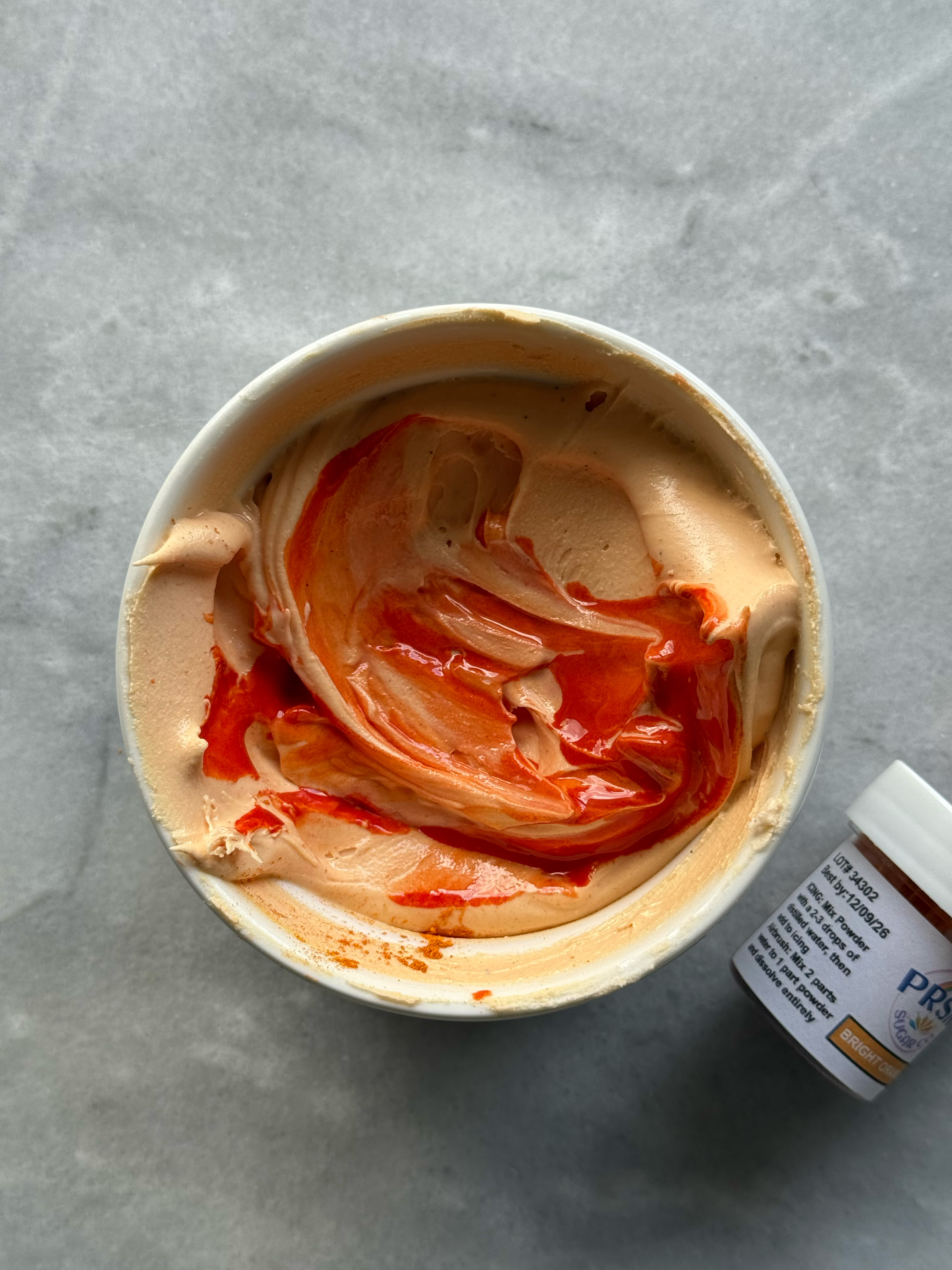
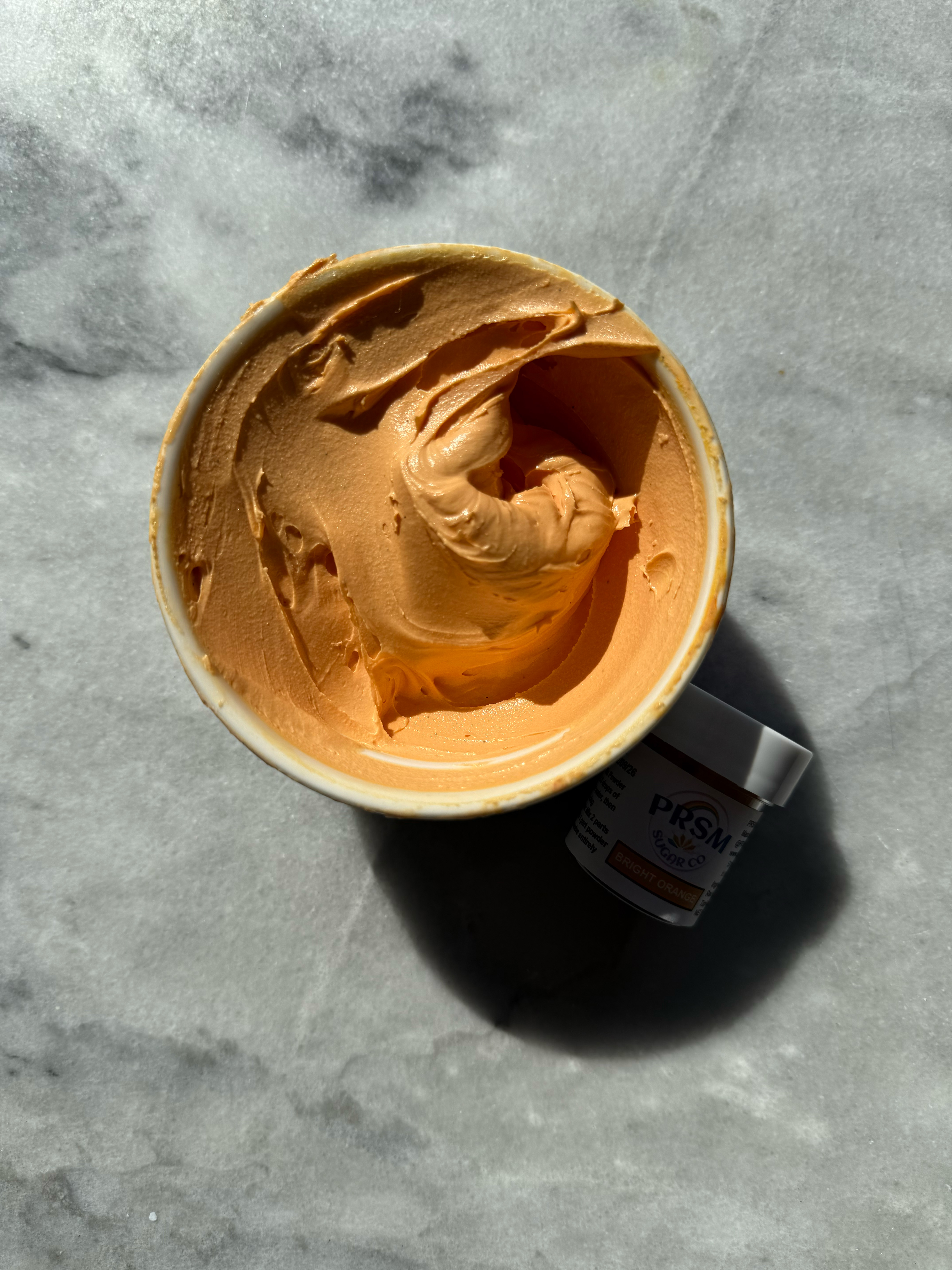
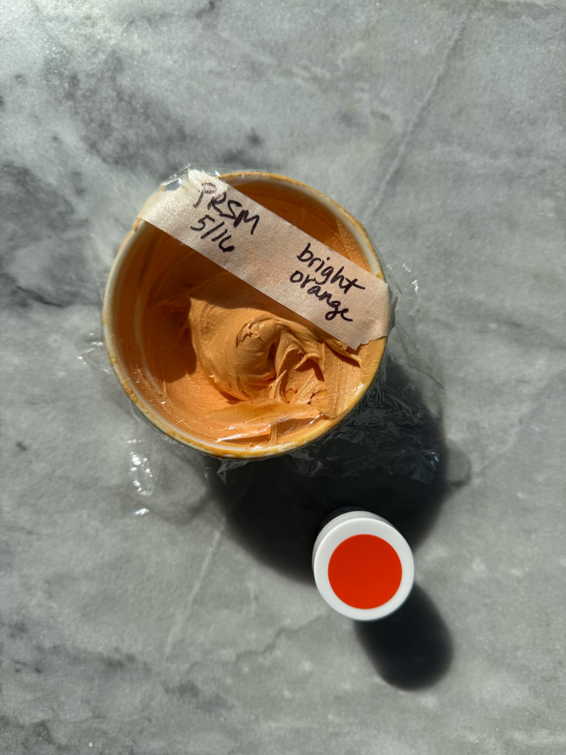
bright orange after developing 24 hrs
– orange
This orange is more the classic orange shade. It also did not flavor the icing, despite the strong smell of the powder in the jar. If you had this orange, but wanted it to look more like bright orange, you could warm this color up a bit with a red or pink shade.
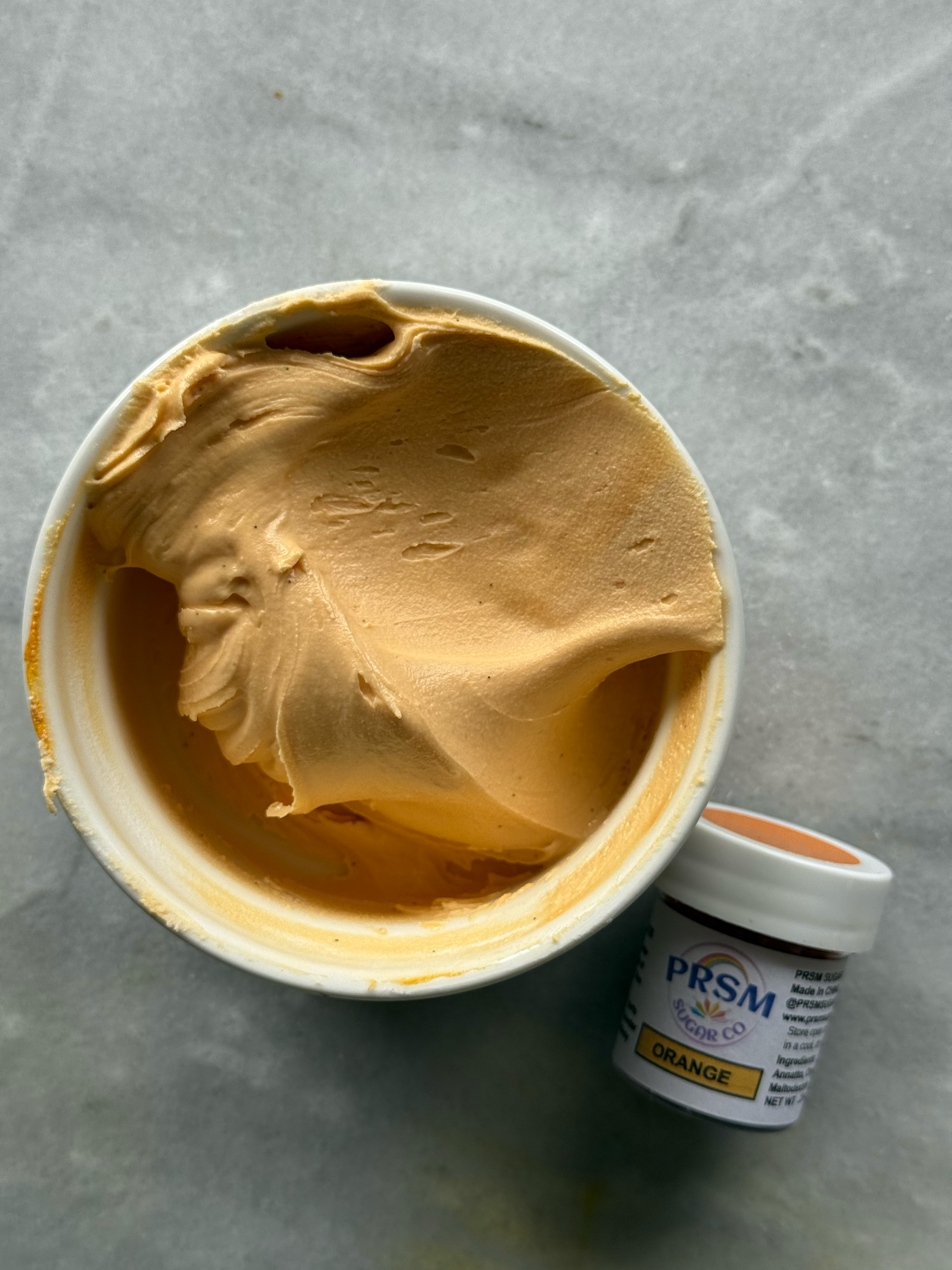
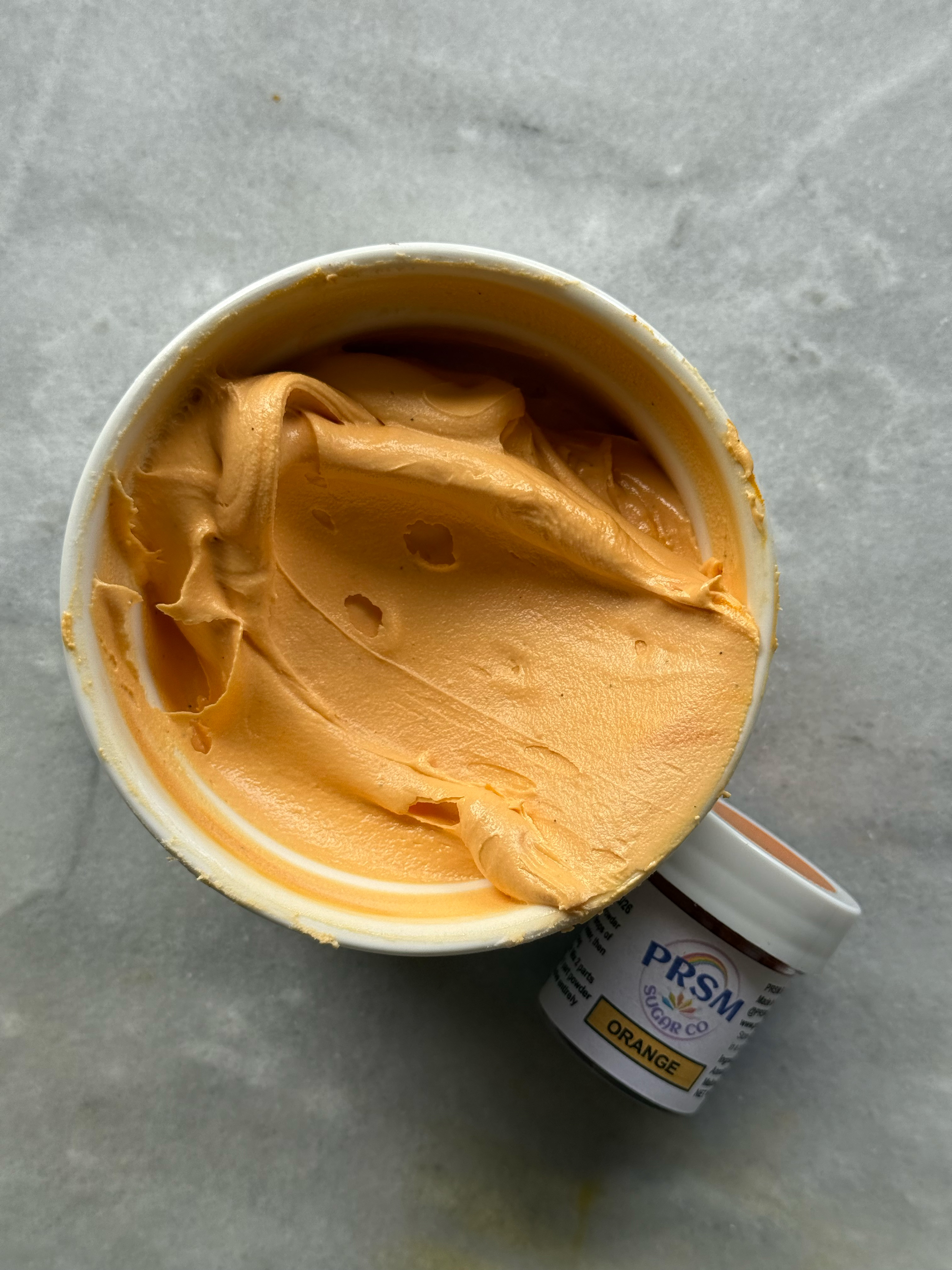
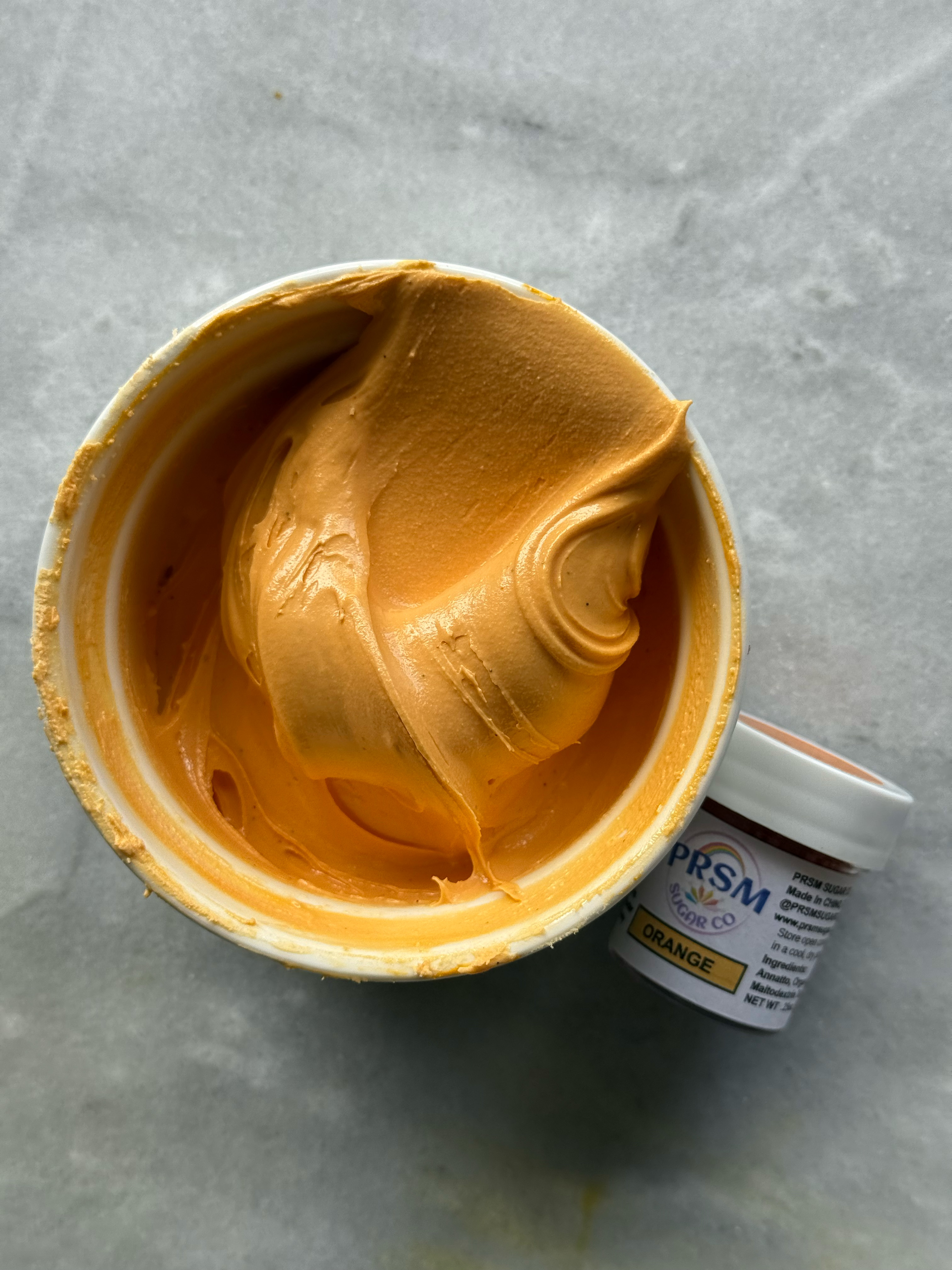
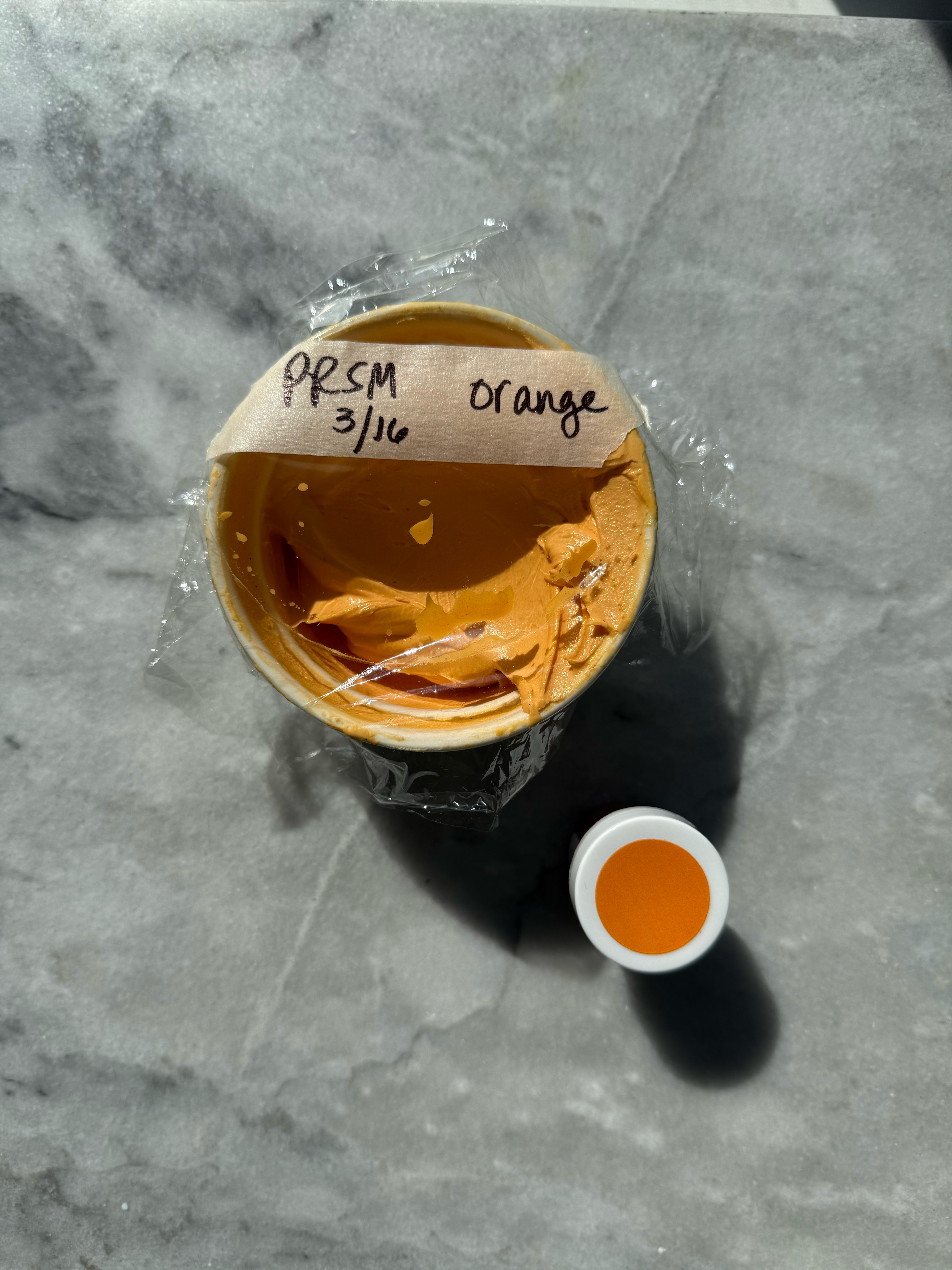
orange after developing for 24 hrs
comparison of the oranges:
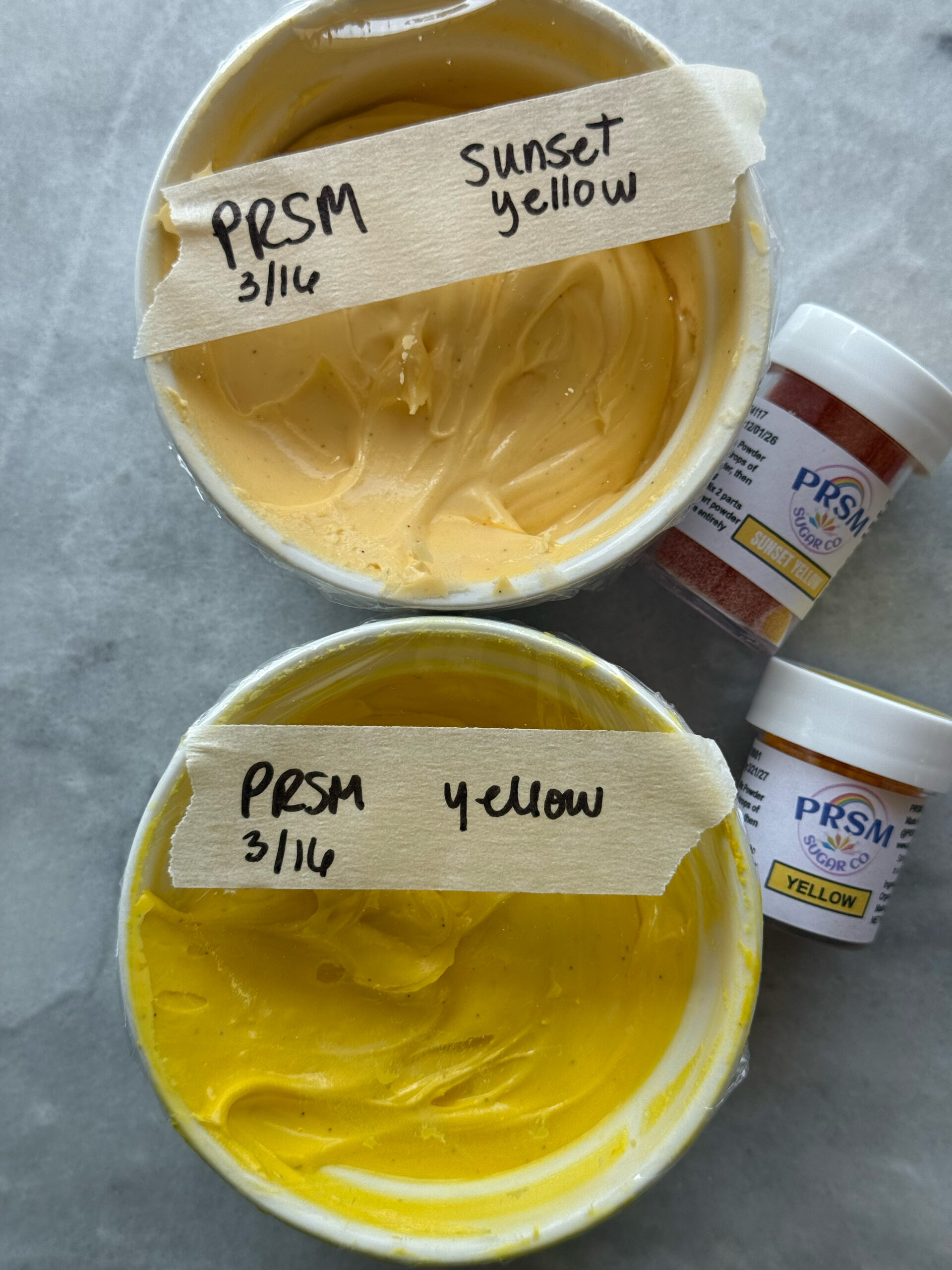
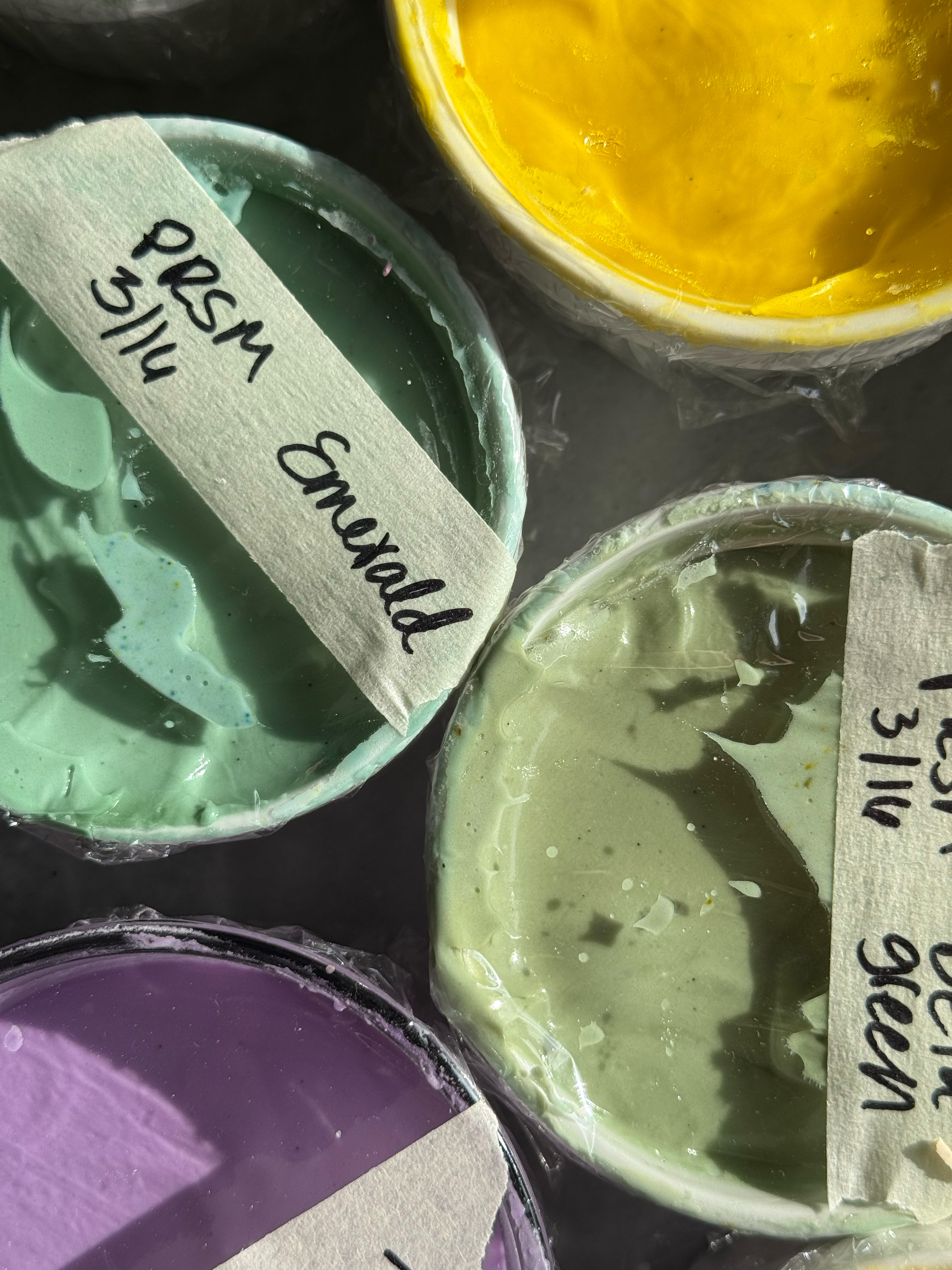
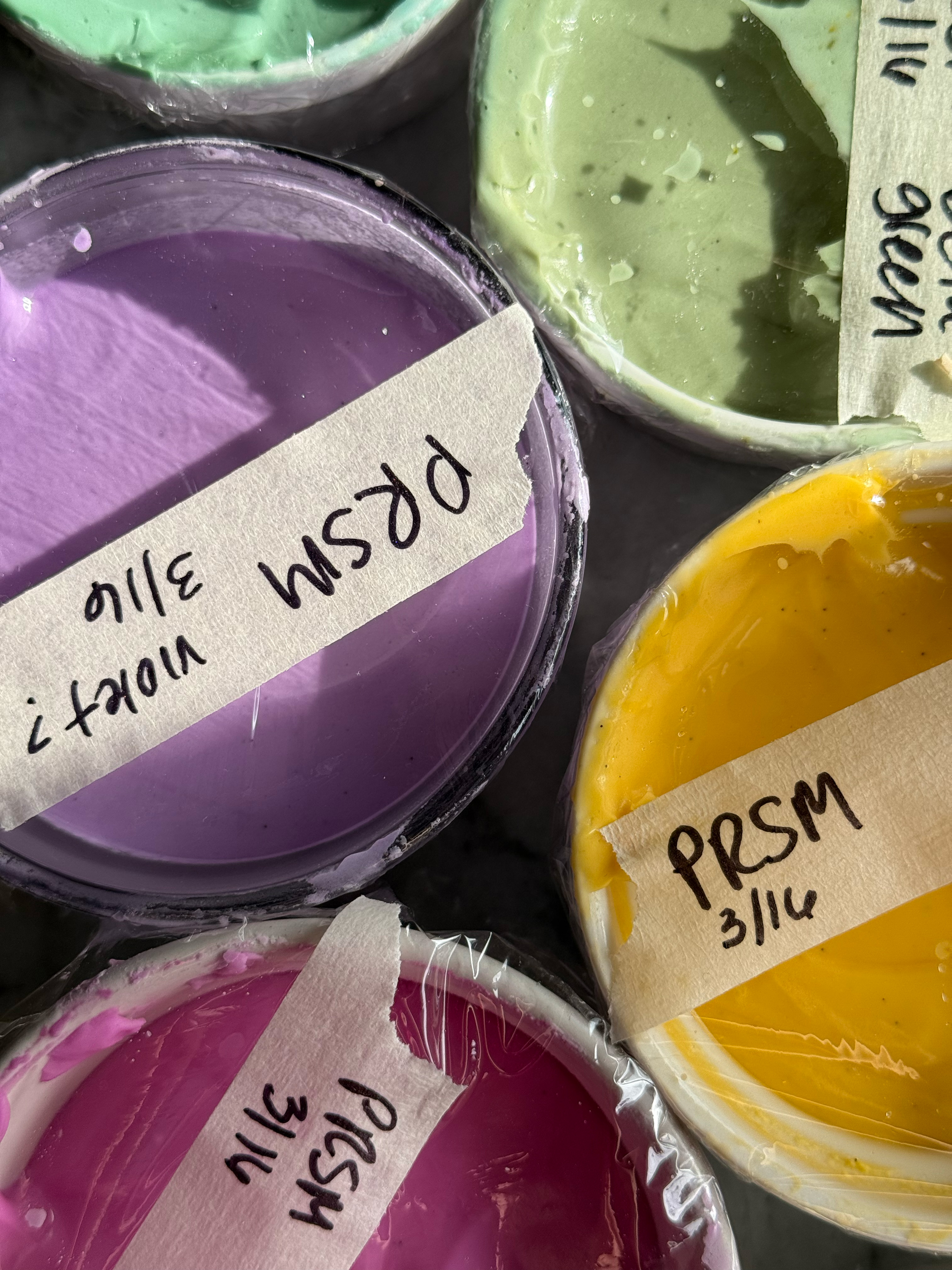
– sunset yellow
This color had a surprising fruity flavor that made the icing taste delicious. I love this shade of yellow- it is the perfect buttery yellow and a shade of yellow I use most often. It’s very similar to Americolor gold.
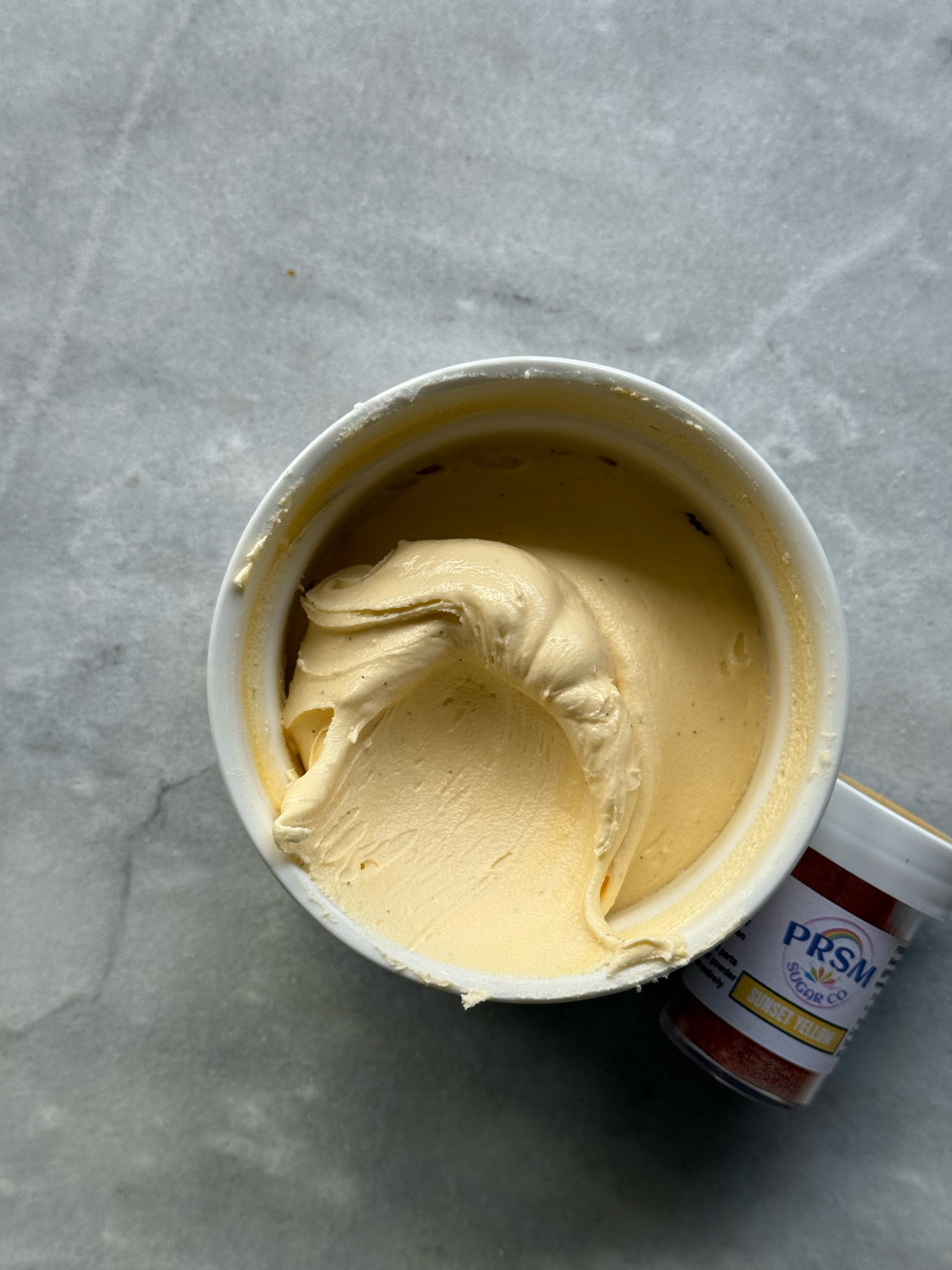
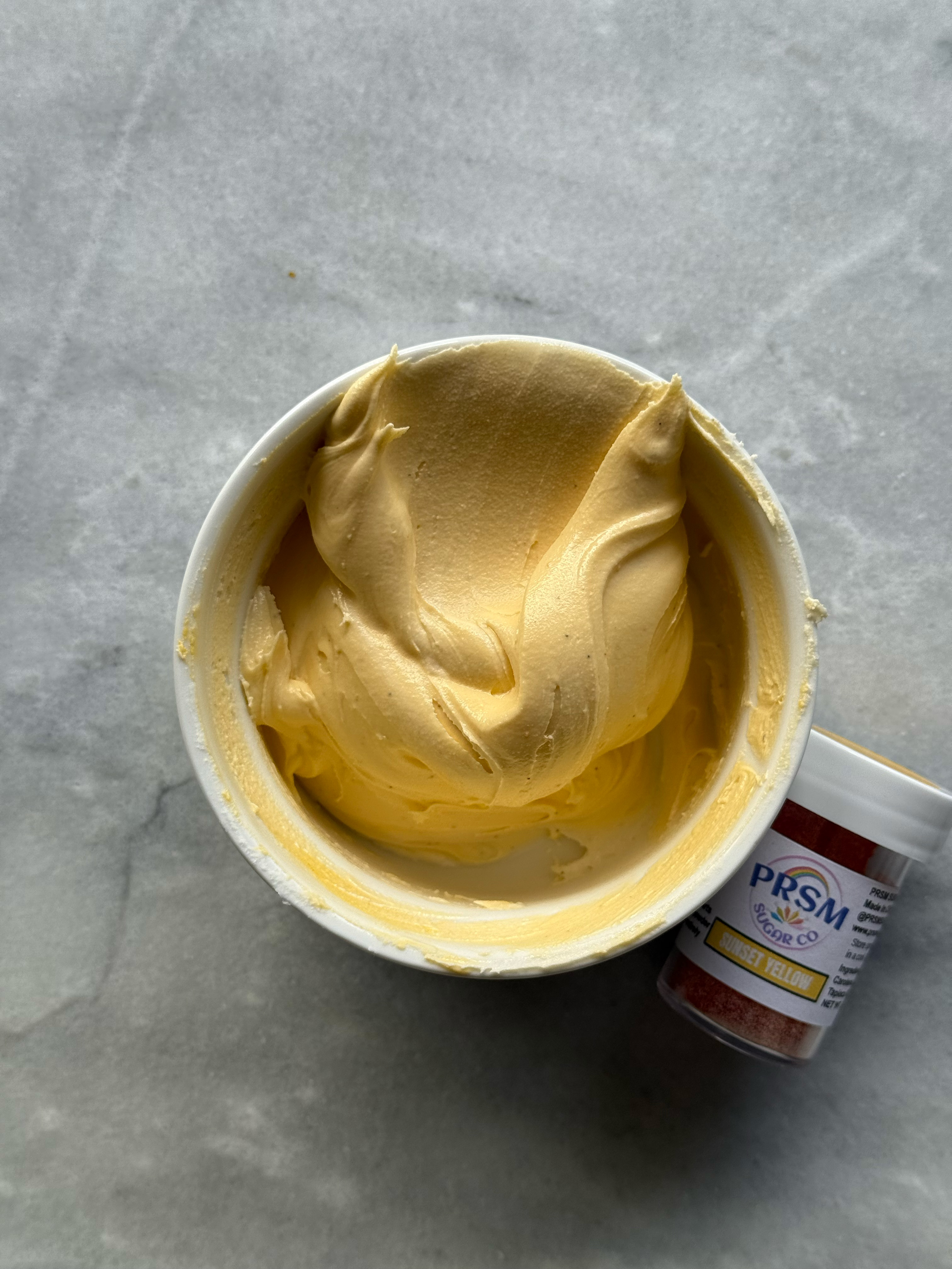
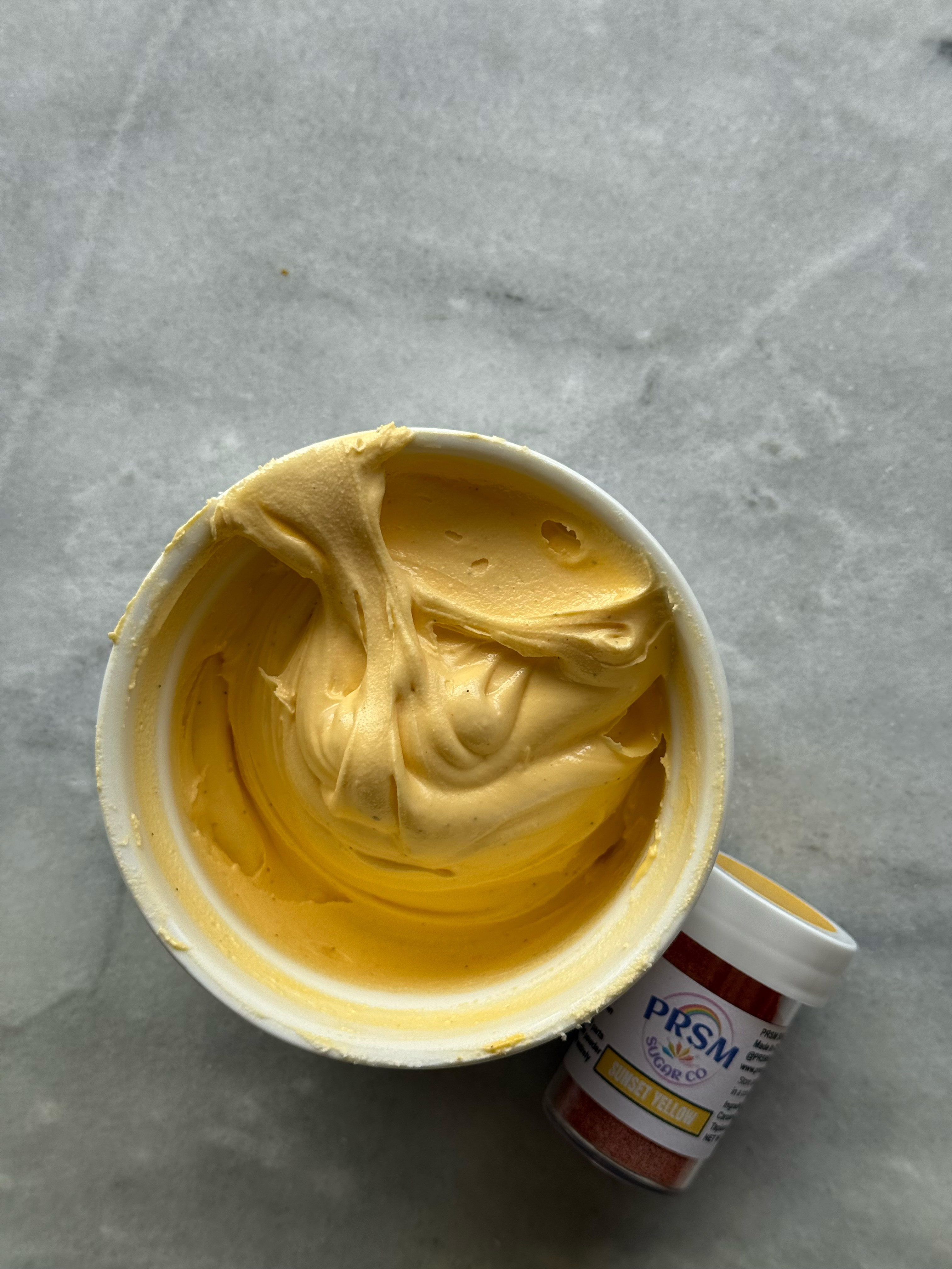
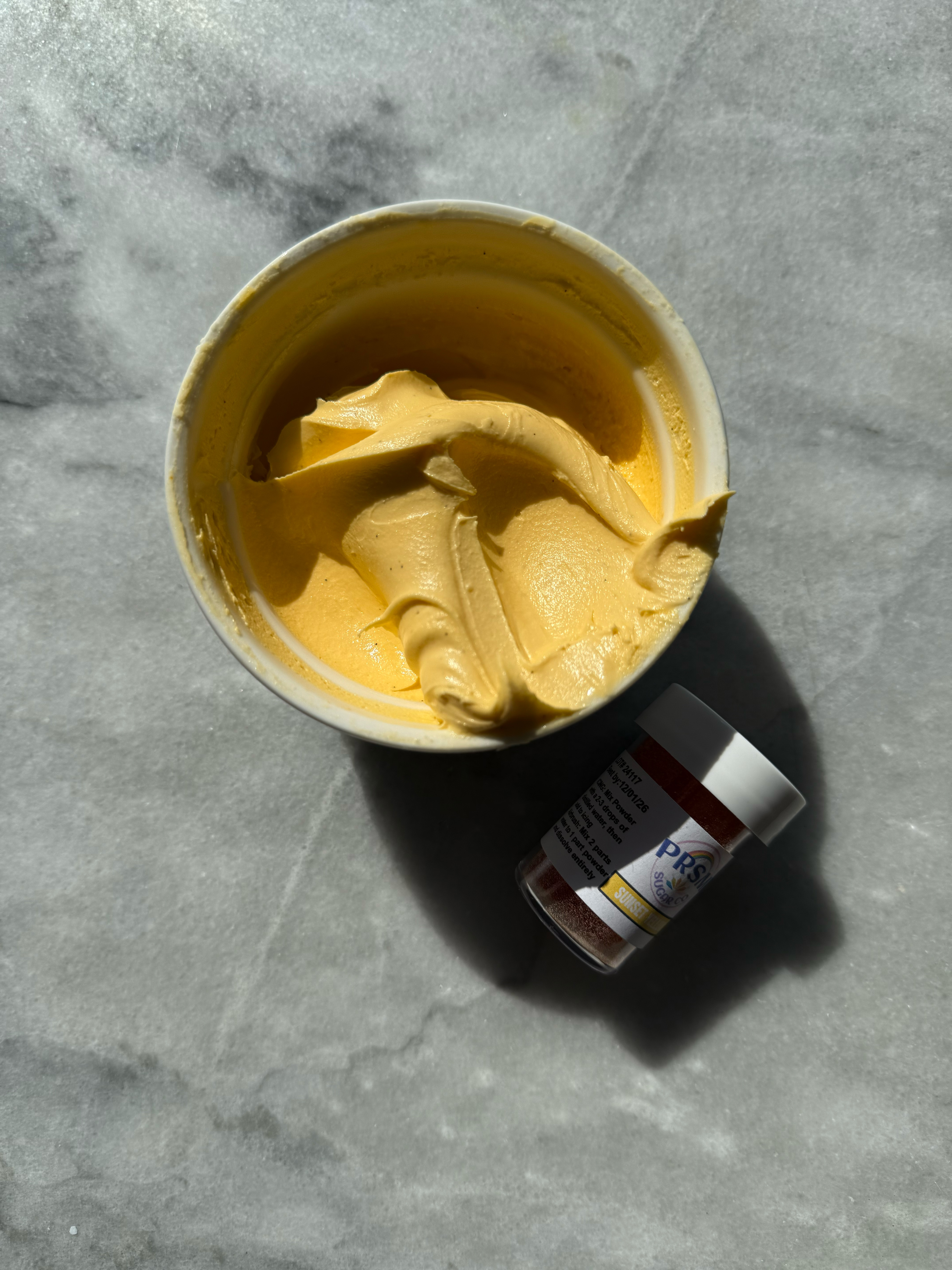
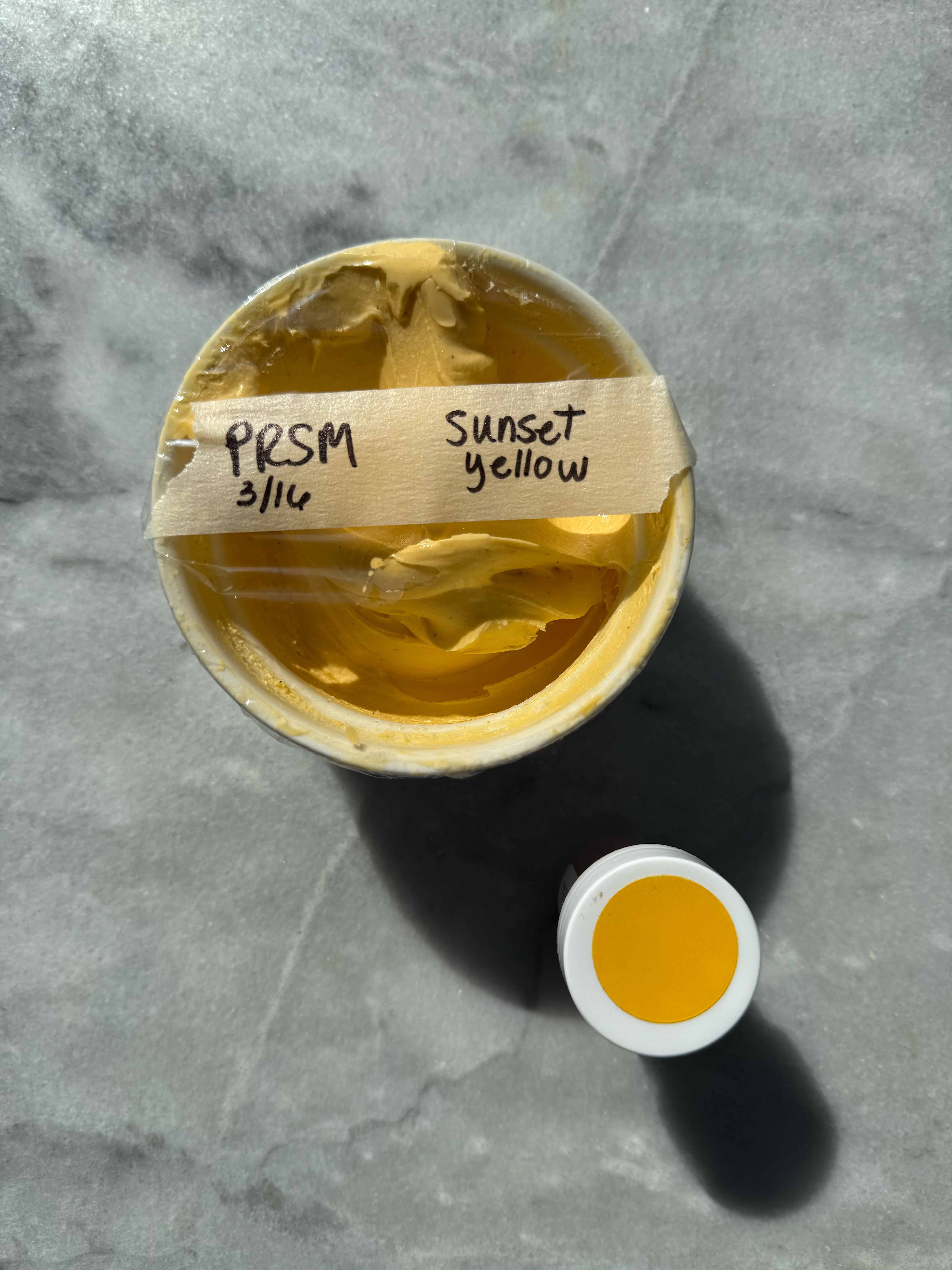
sunset yellow after developing 24 hrs
– yellow
This is a perfect classic yellow shade. Very much sunshine and lemons. You could easily warm this shade up to be similarly toned to sunset yellow with a little orange, pink, or red.
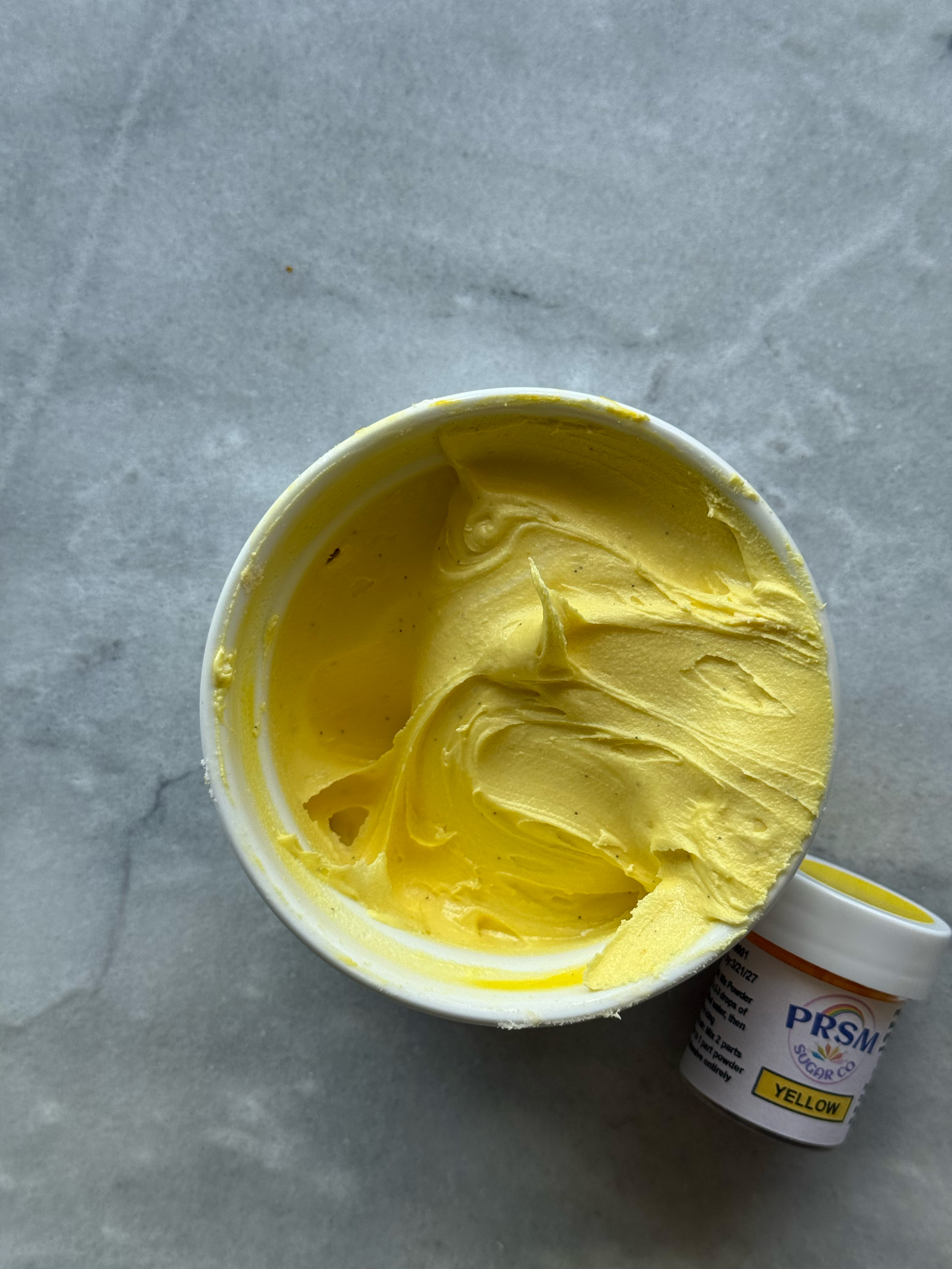
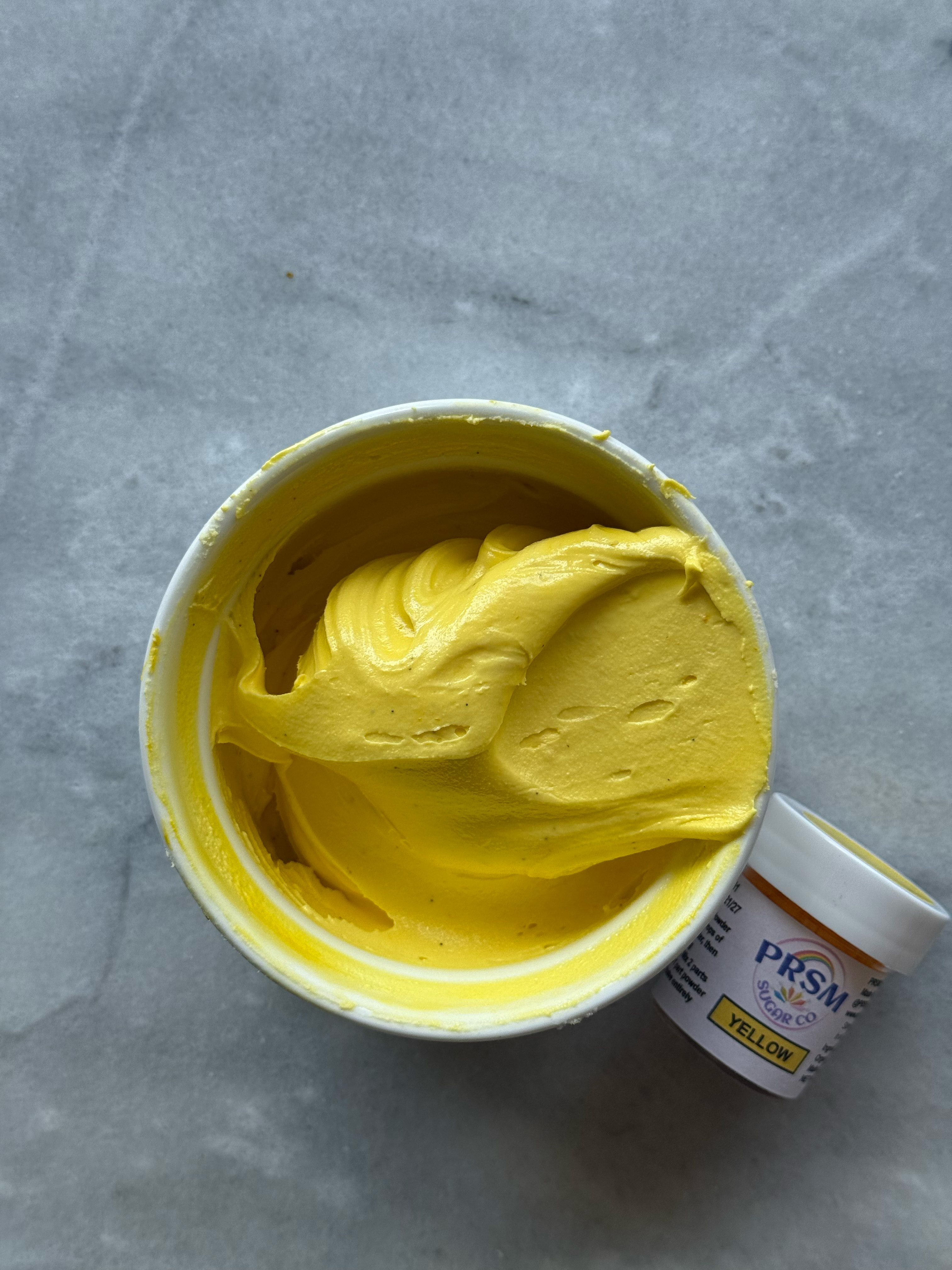
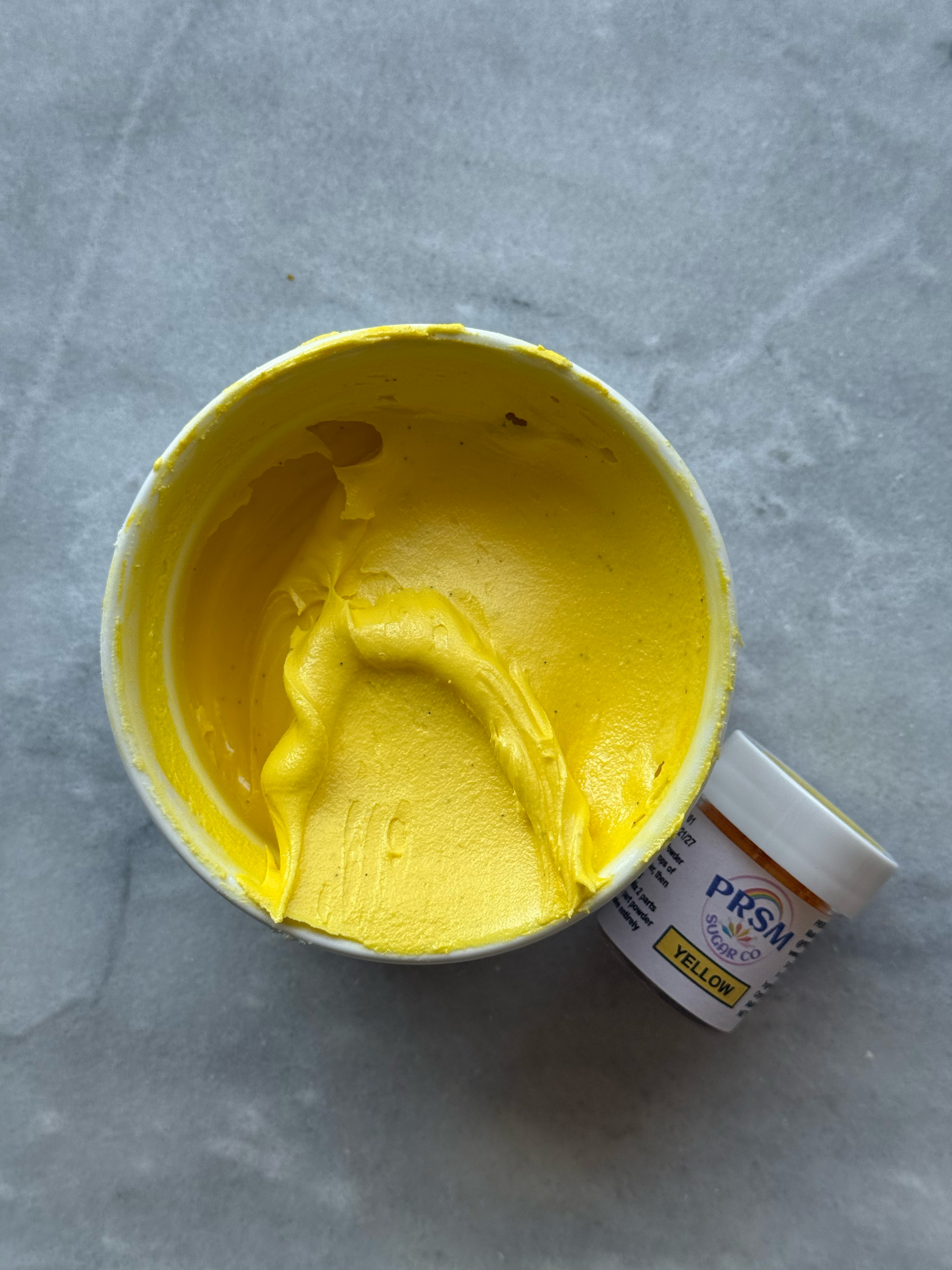
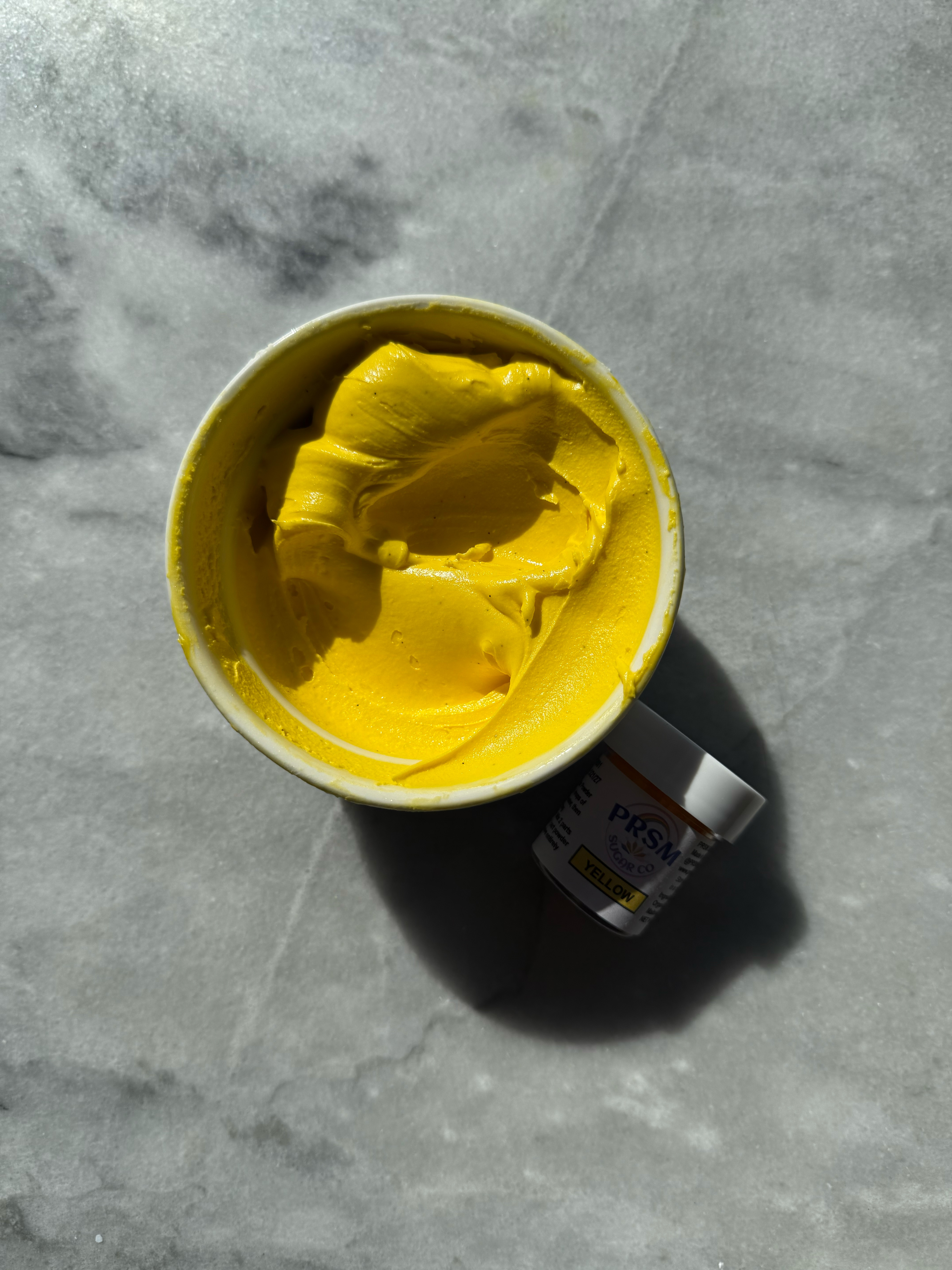
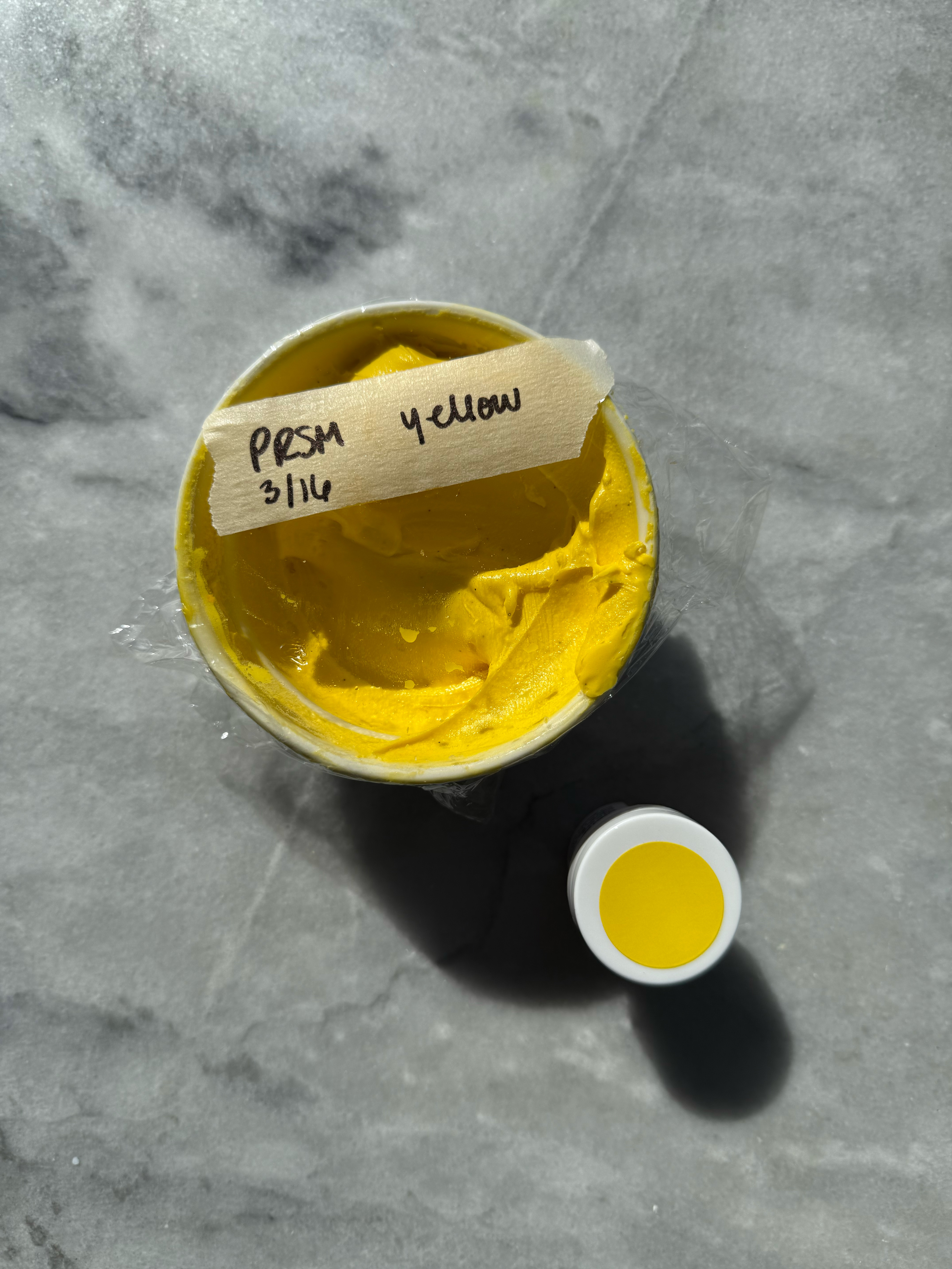
yellow after developing 24 hrs
comparison of the yellows:
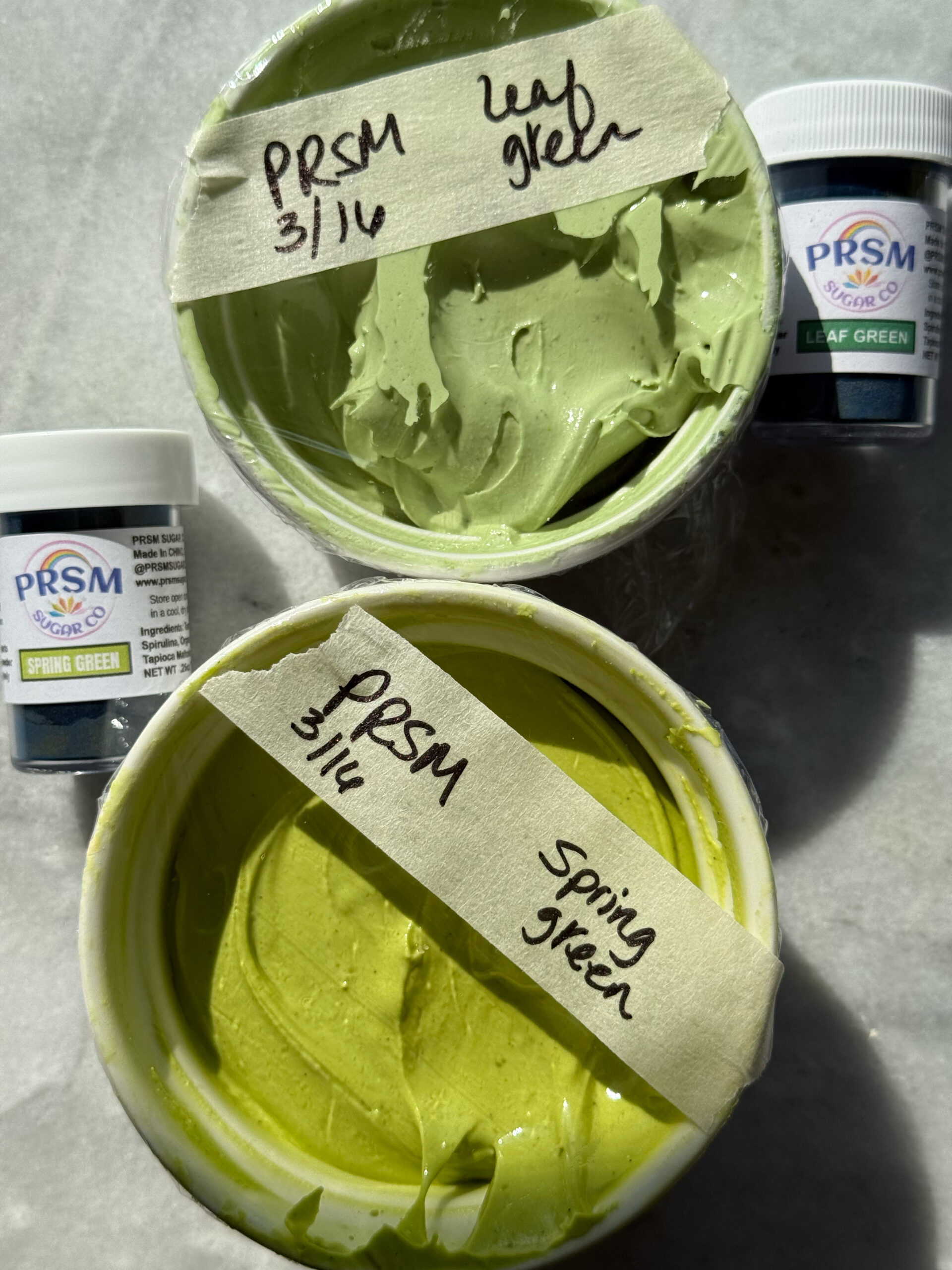
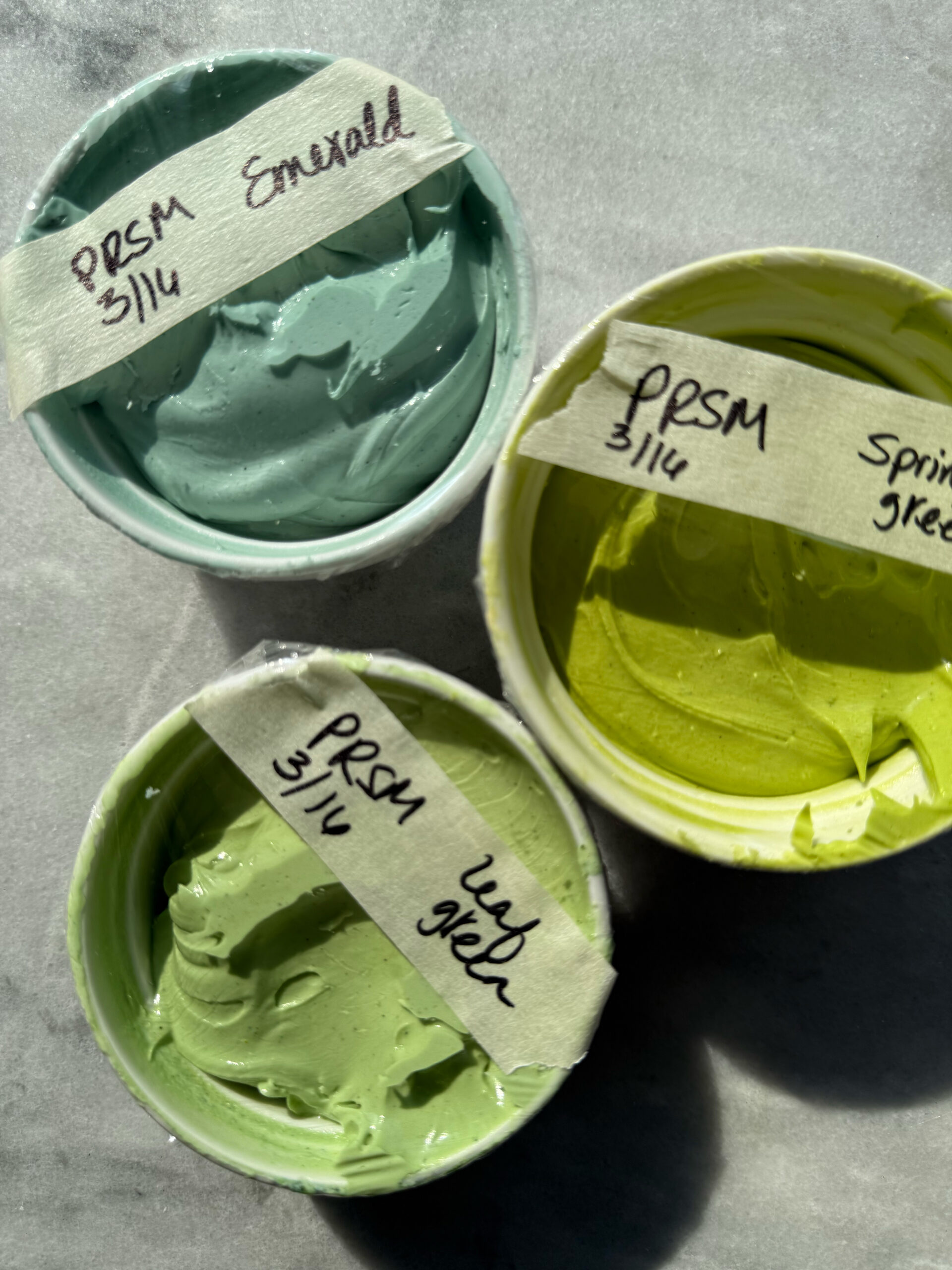
– spring green
This is a very bright, yellow-toned green that doesn’t get very deep.
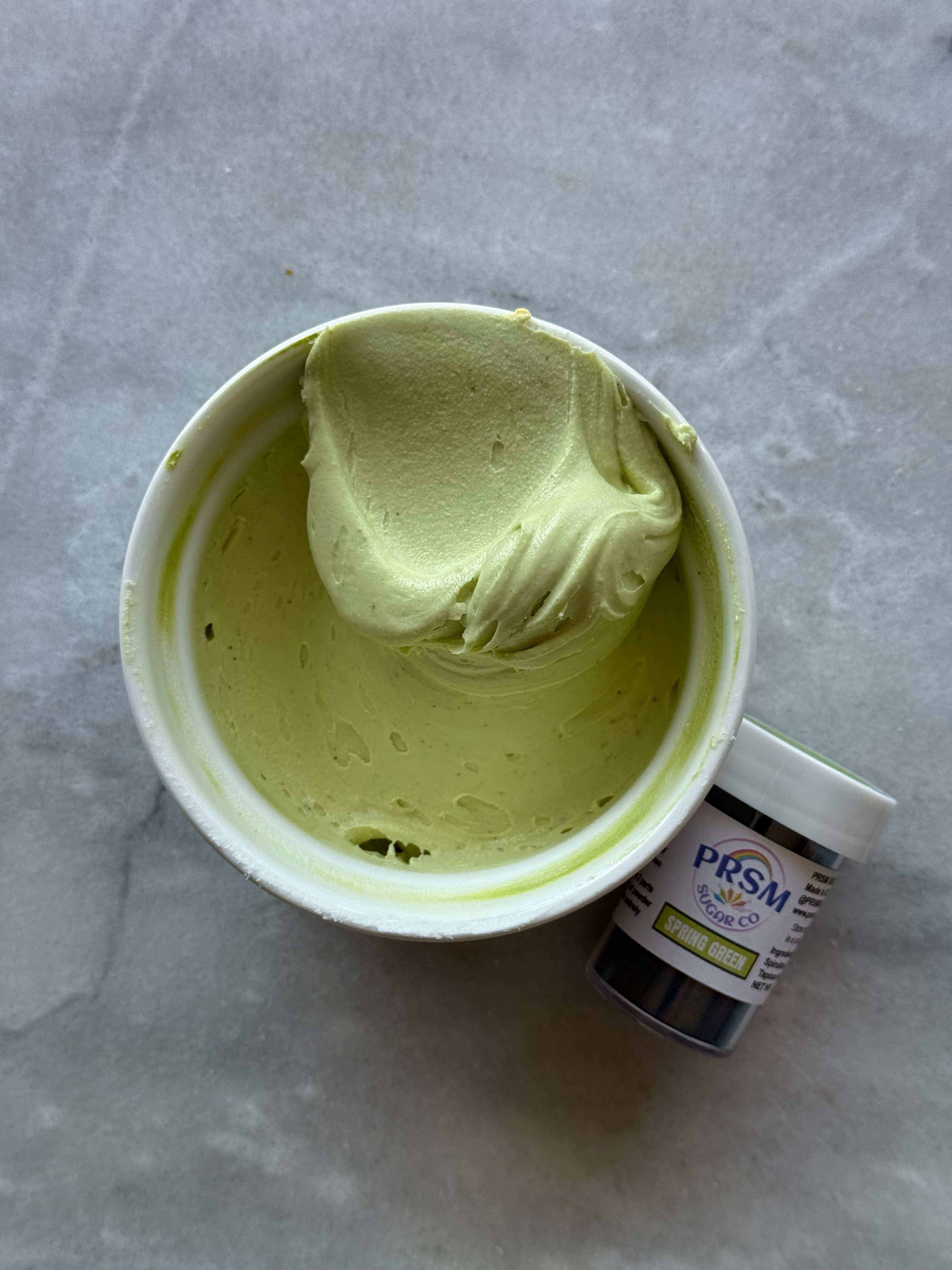
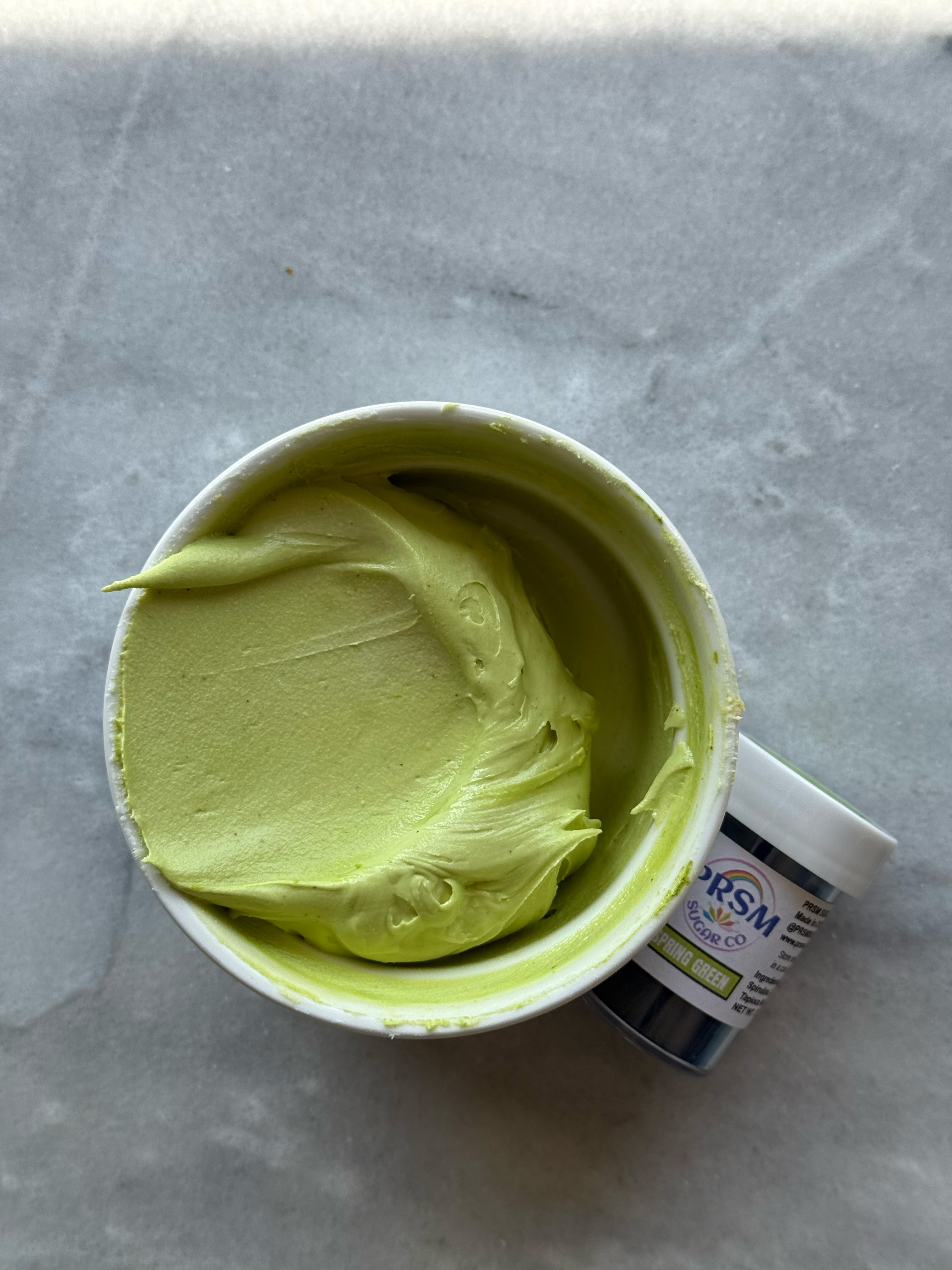
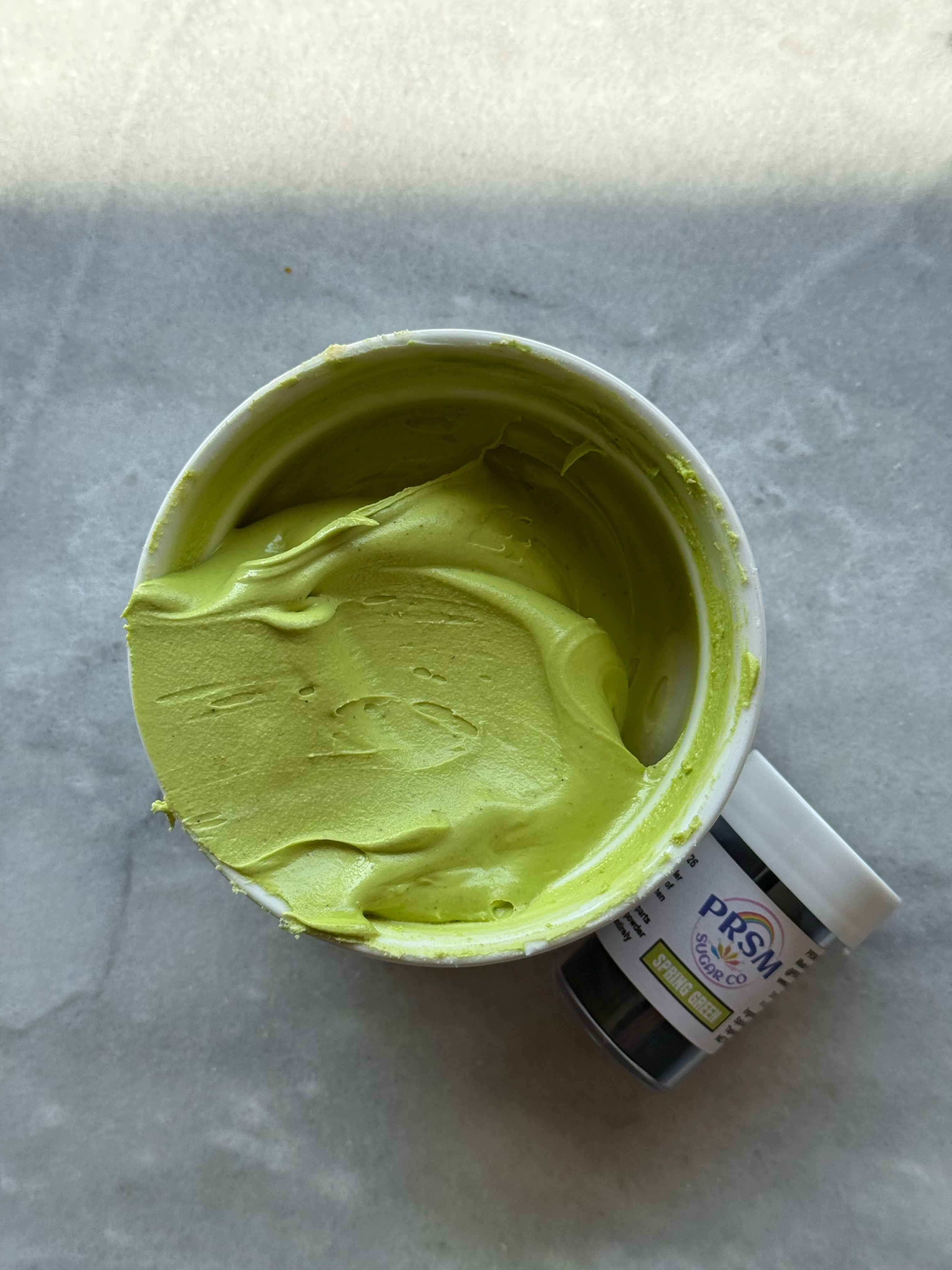
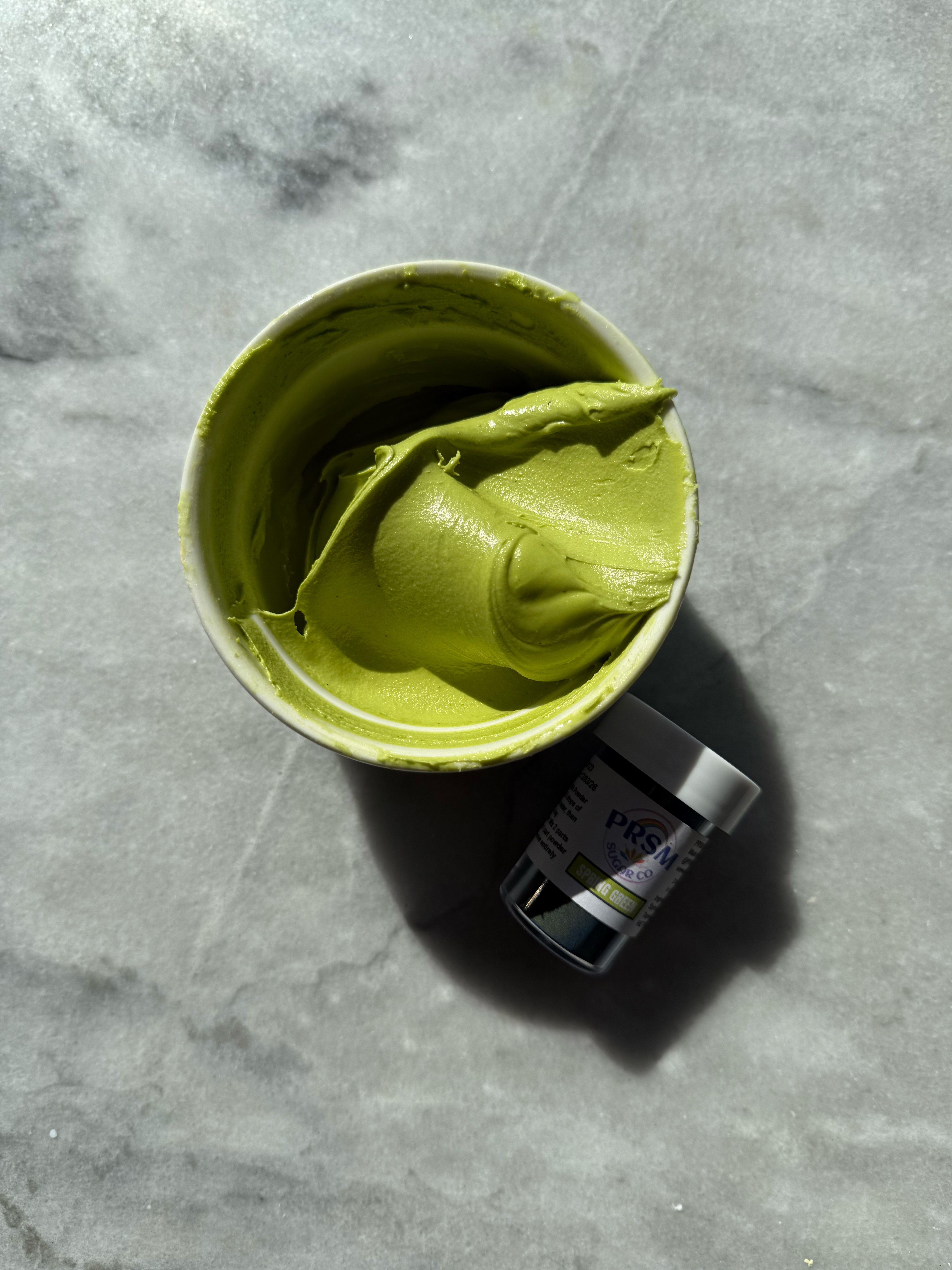
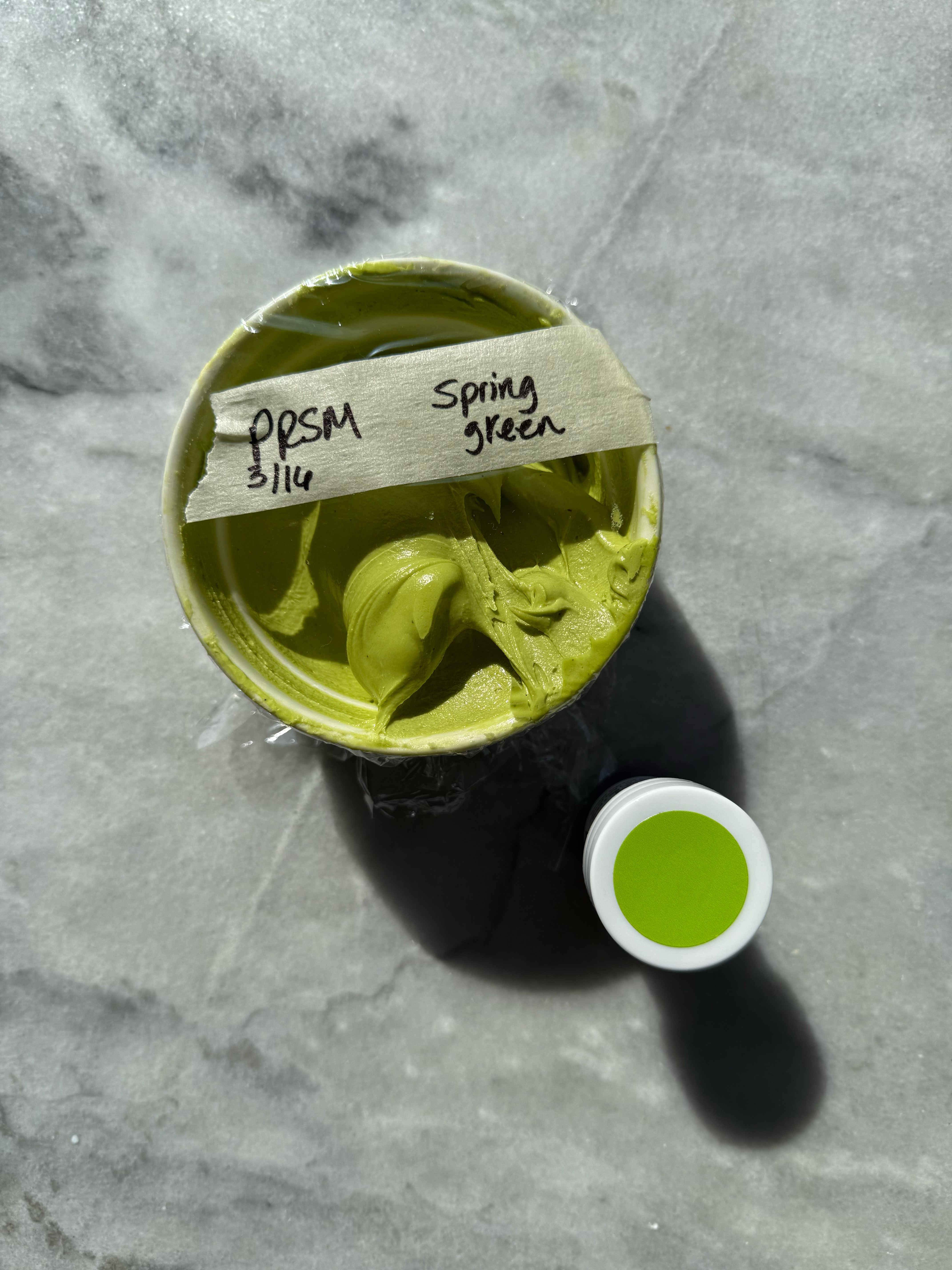
spring green after developing 24 hrs
– leaf green
This is more of a classic, grassy green. I would definitely keep this one on hand as a basic dye-free green. Because it’s a good basic green, it can easily be changed with color theory to make it more yellow-toned like spring green or more of a forest green or sage green with a little blue.
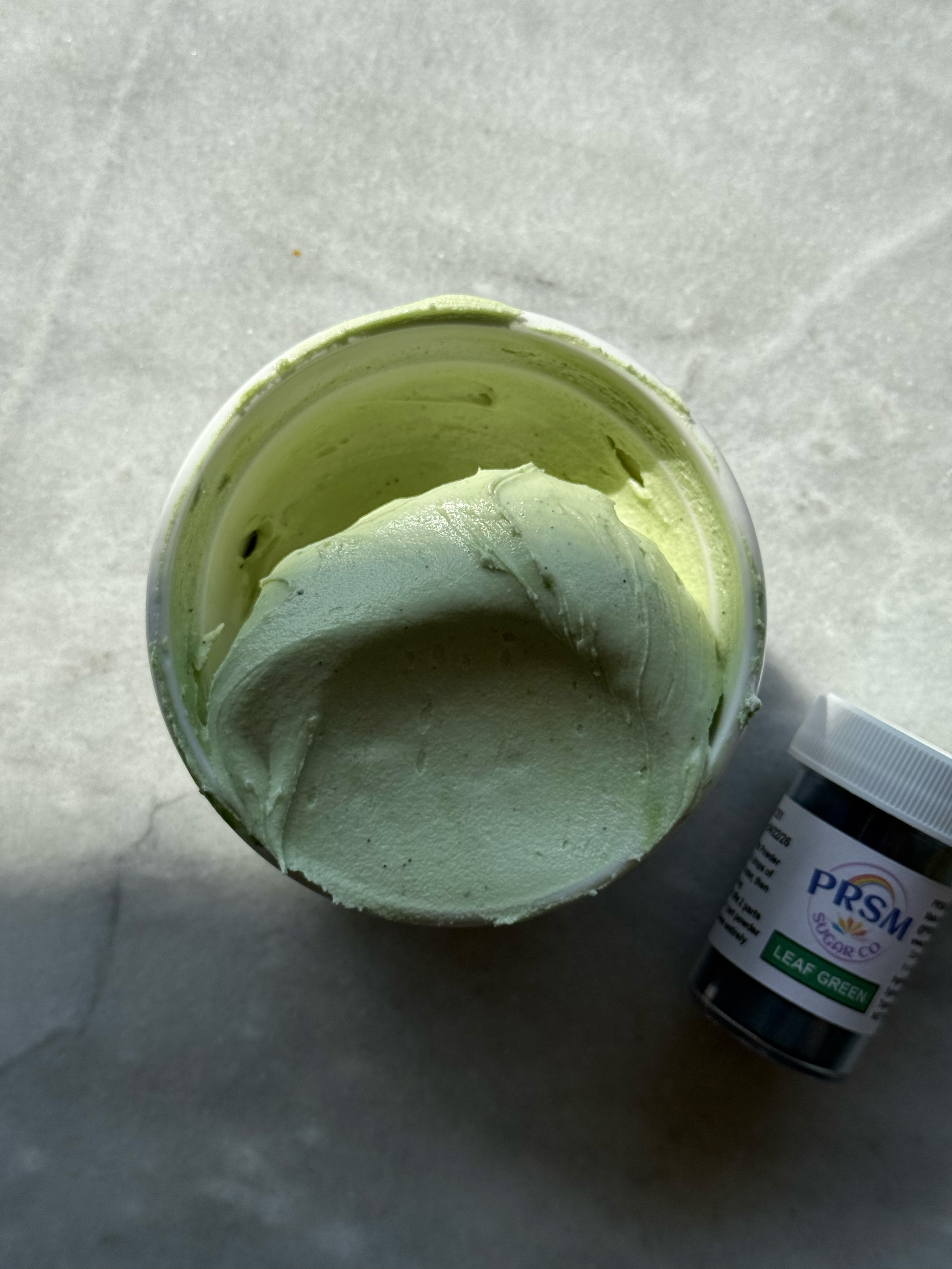
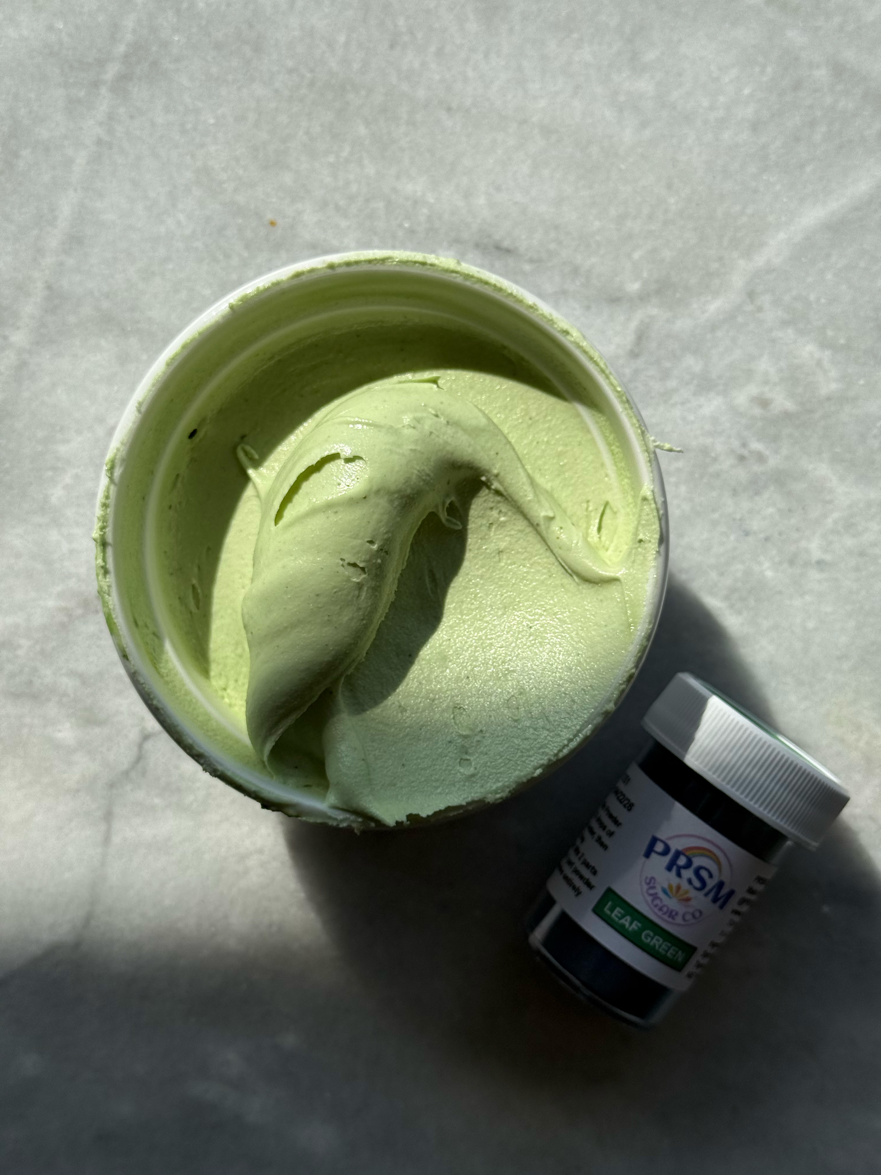
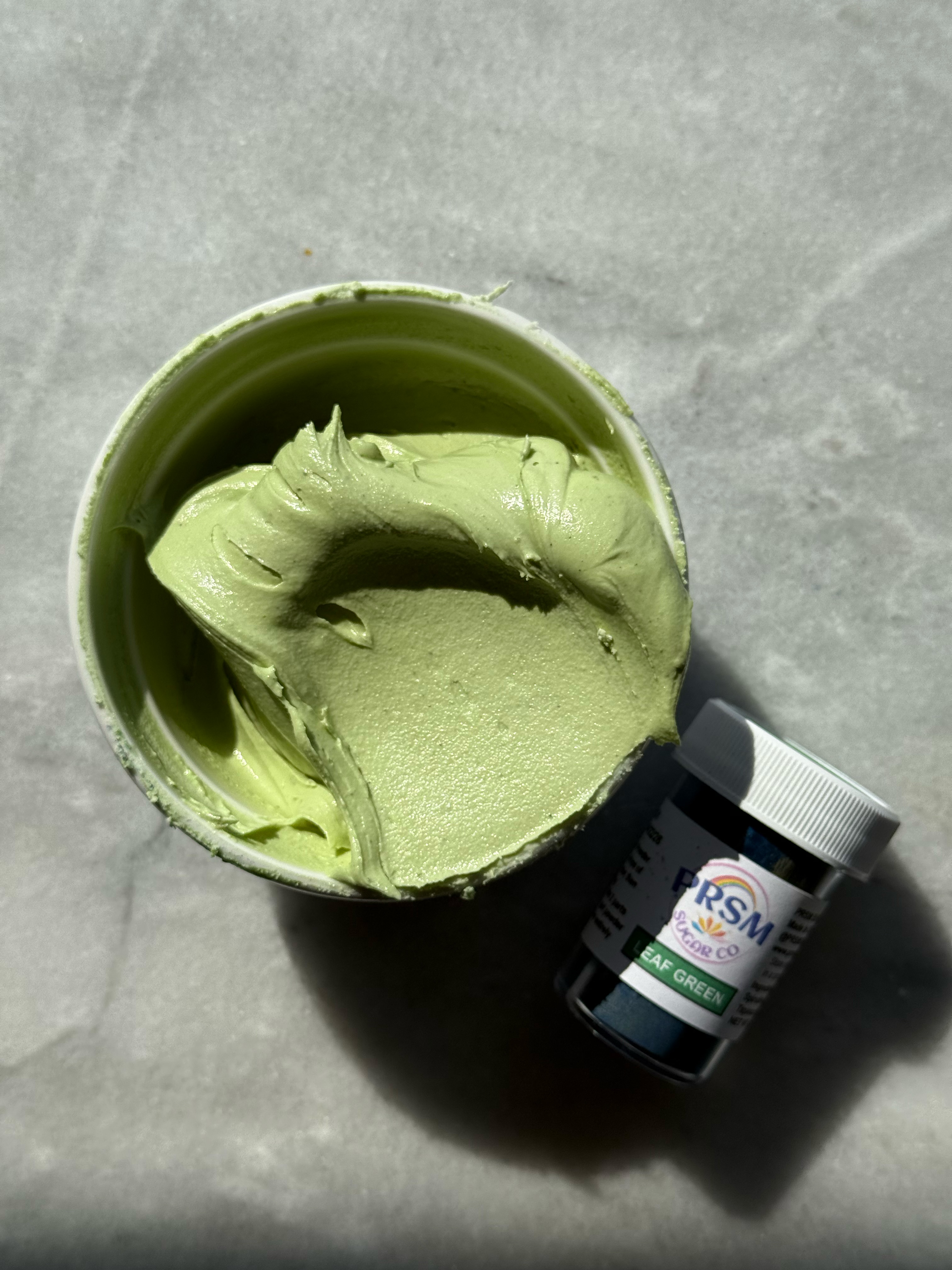
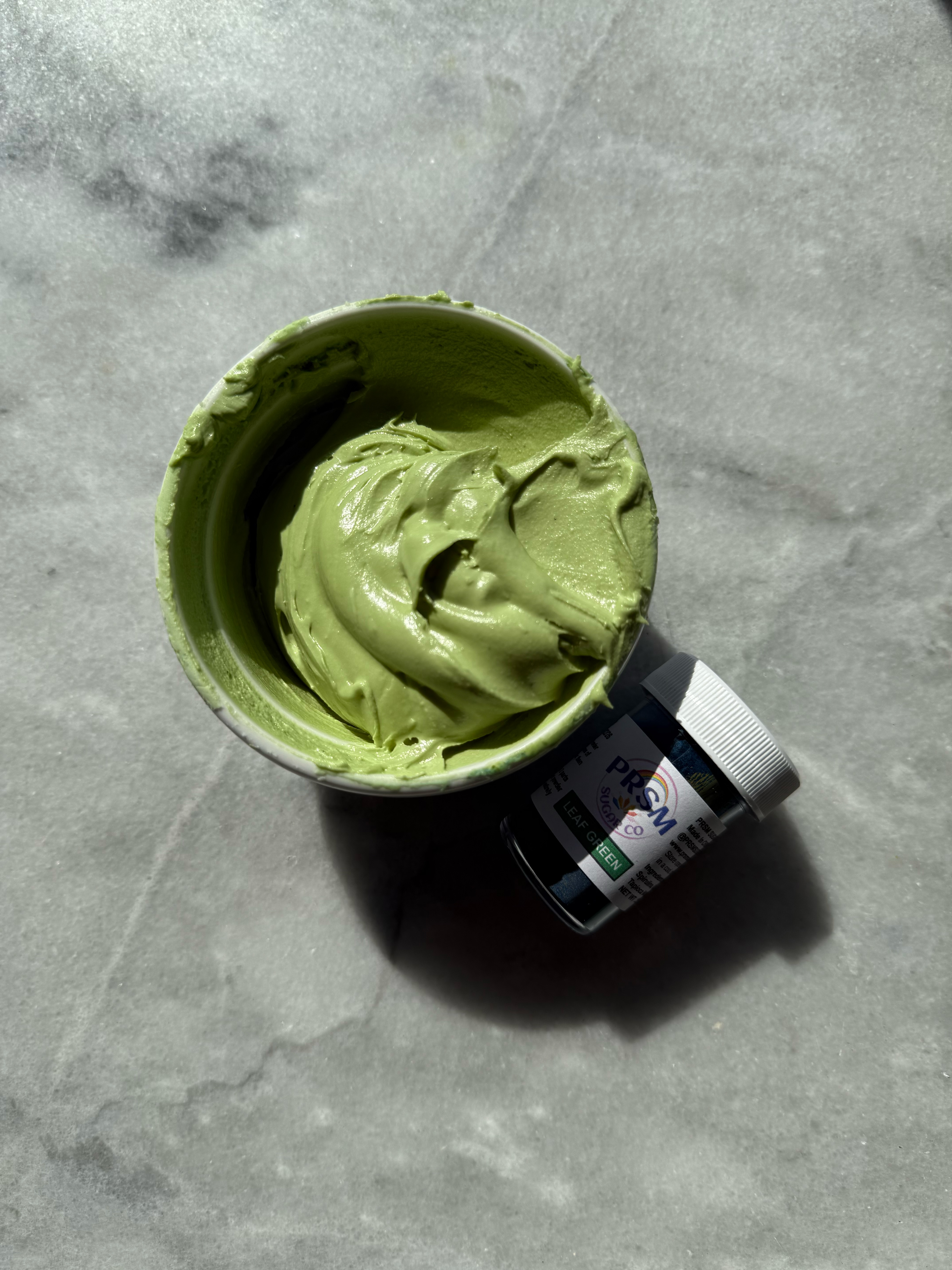
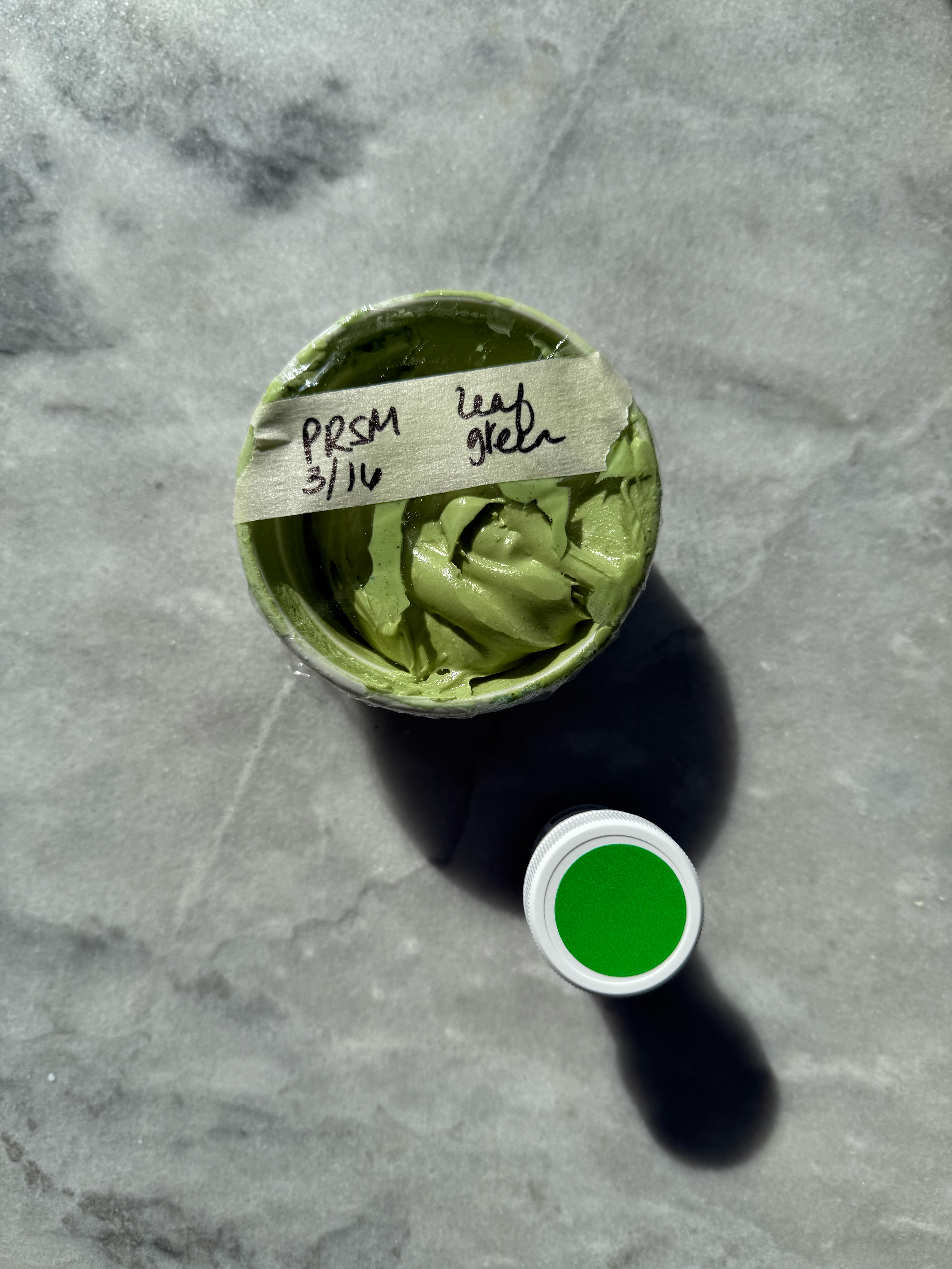
leaf green after developing 24 hrs
comparison of the greens:
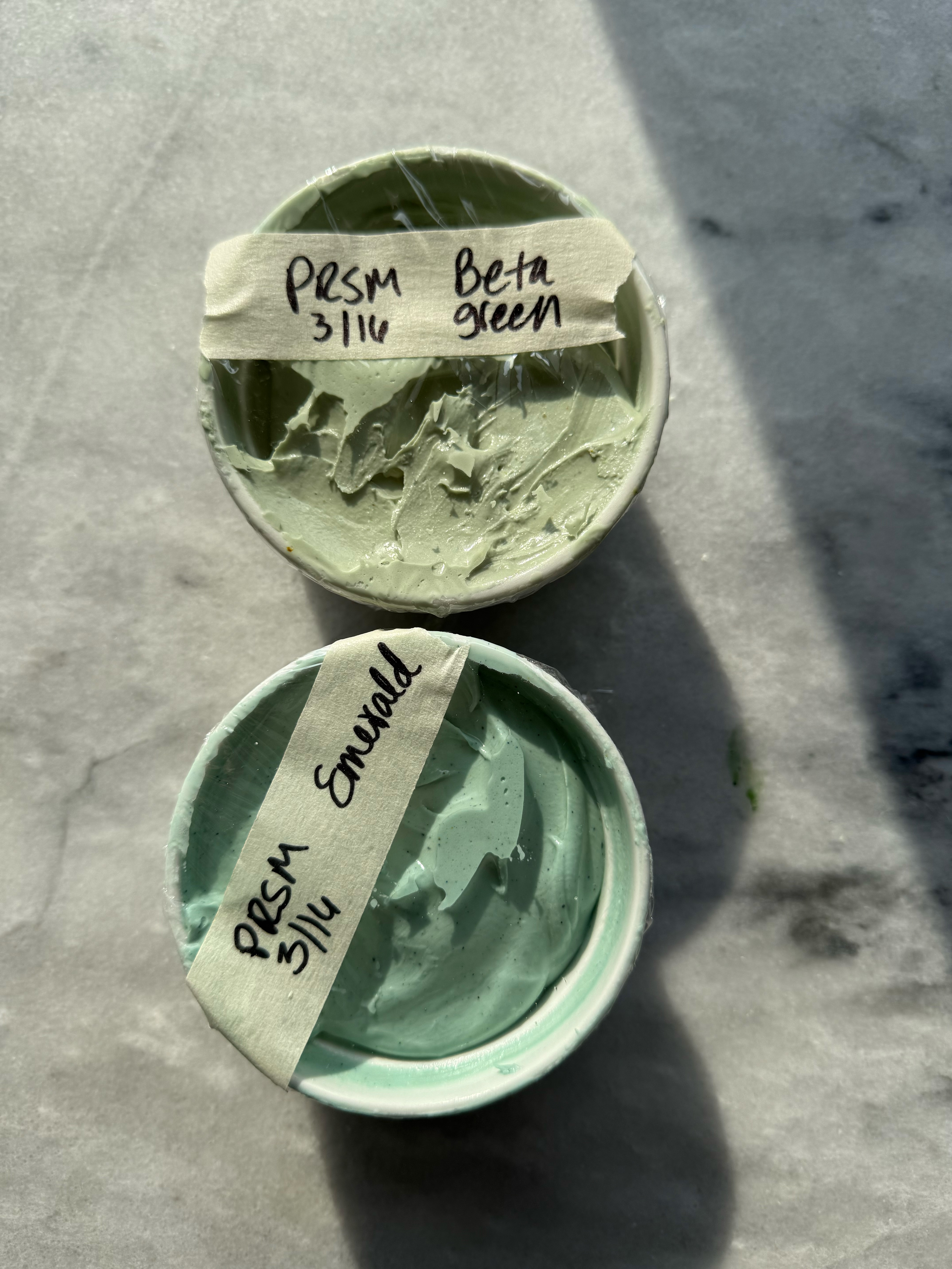
– emerald
This green is so unique and special, and it makes me think of that 90’s green. I love how unique it is. It’s more blue-toned, and it could easily be toned down with a little brown to not be as bright if you wanted a more muted green.
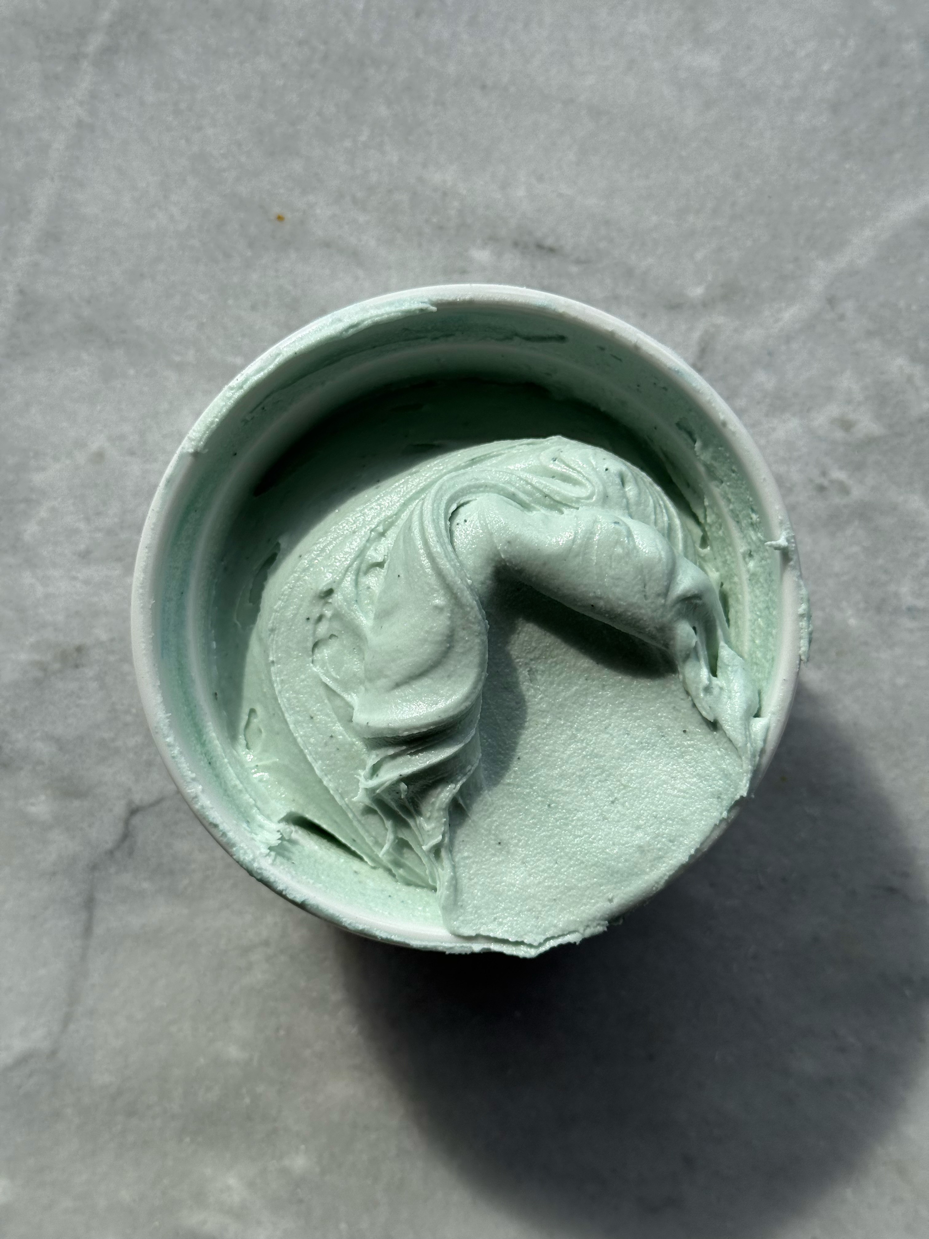
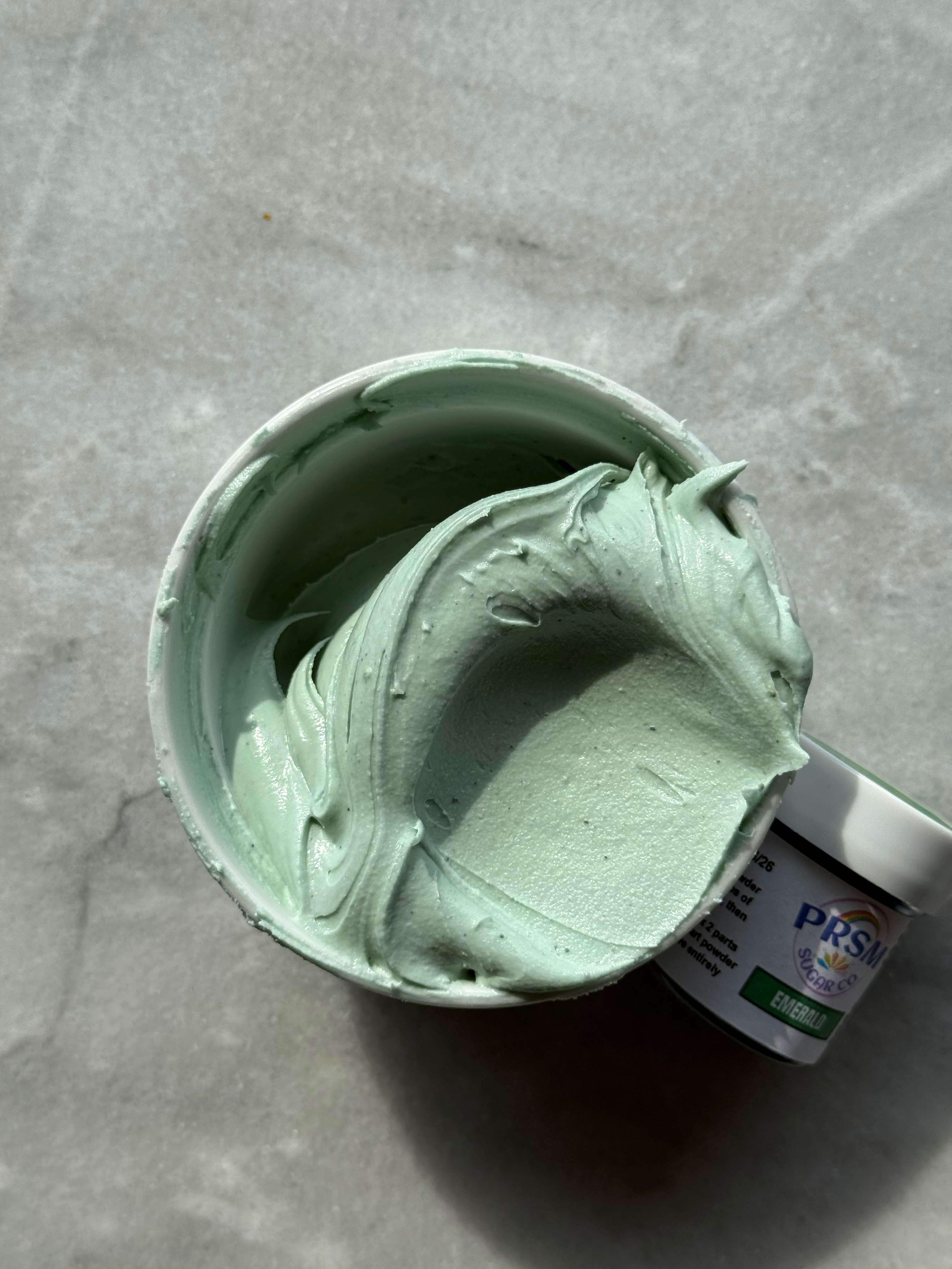
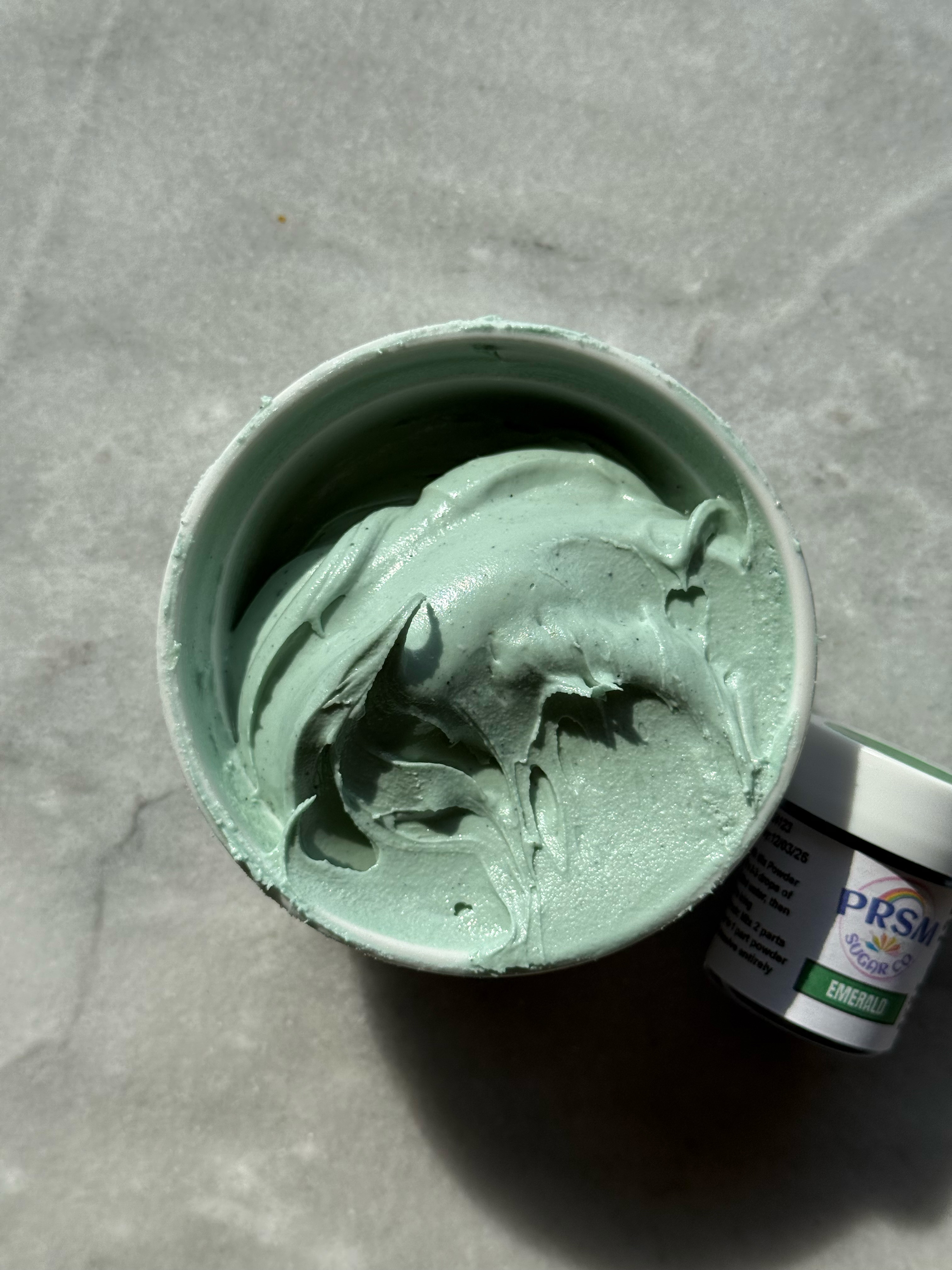
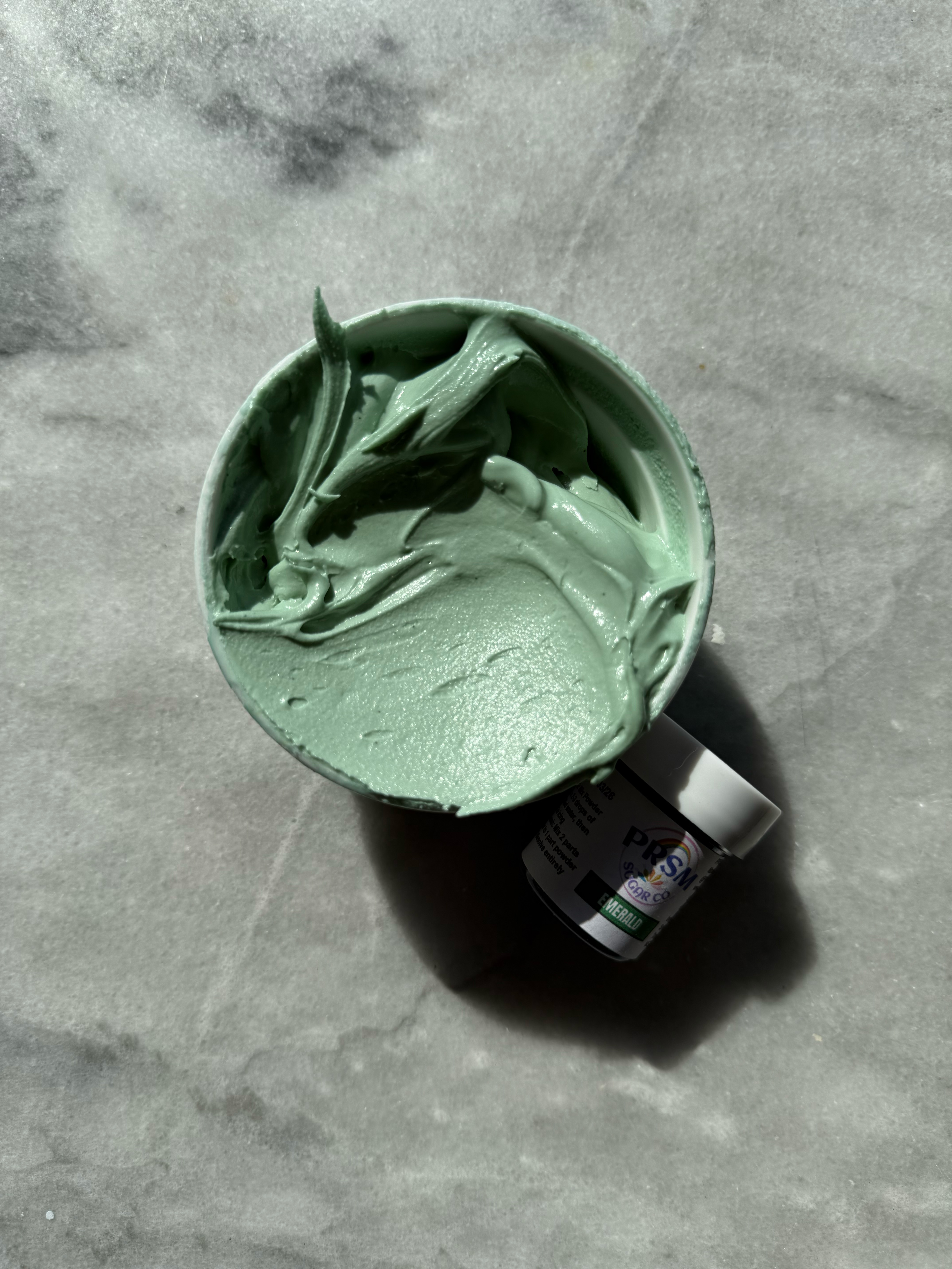
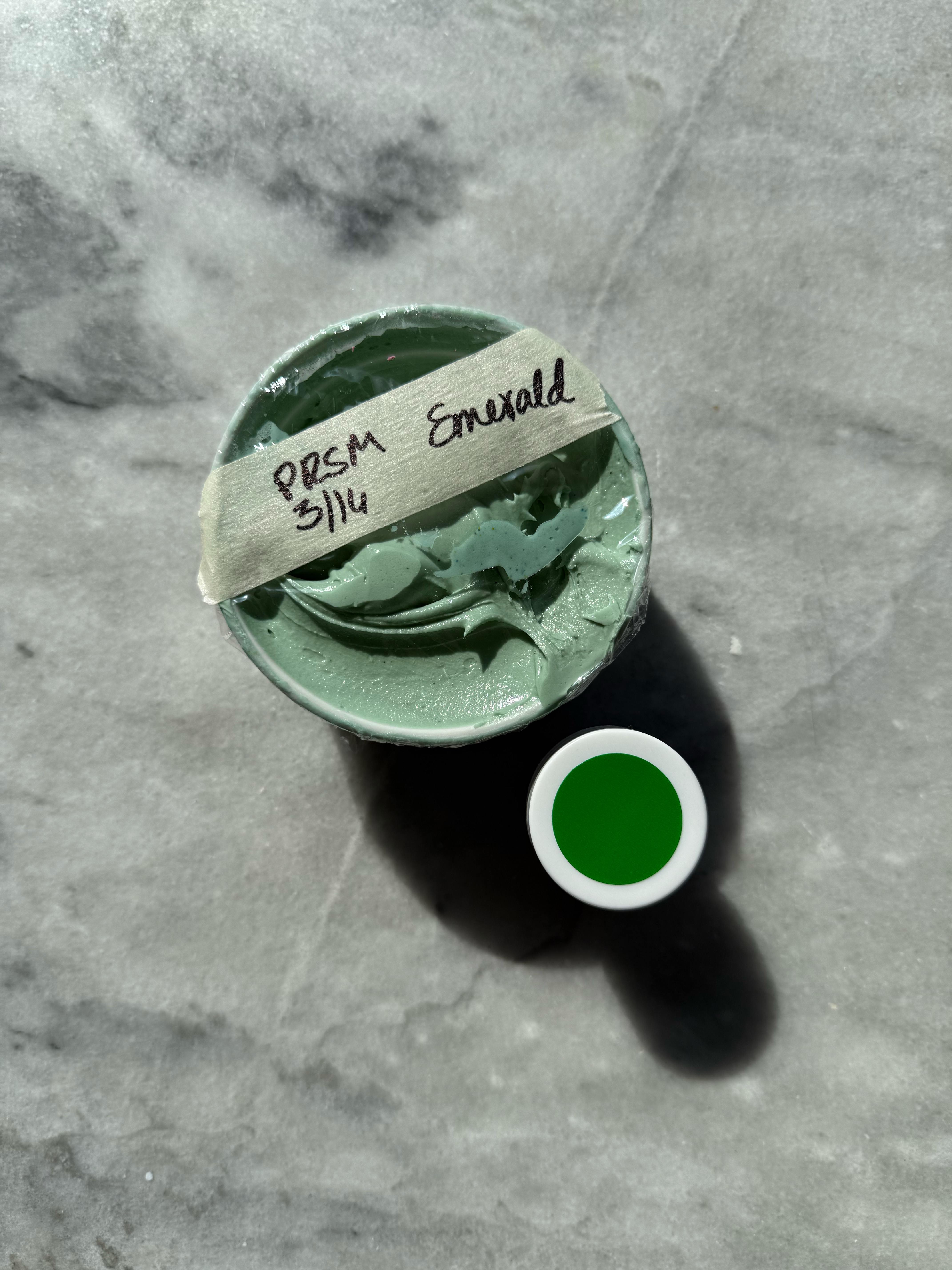
emerald after developing 24 hrs
comparison of the greens:
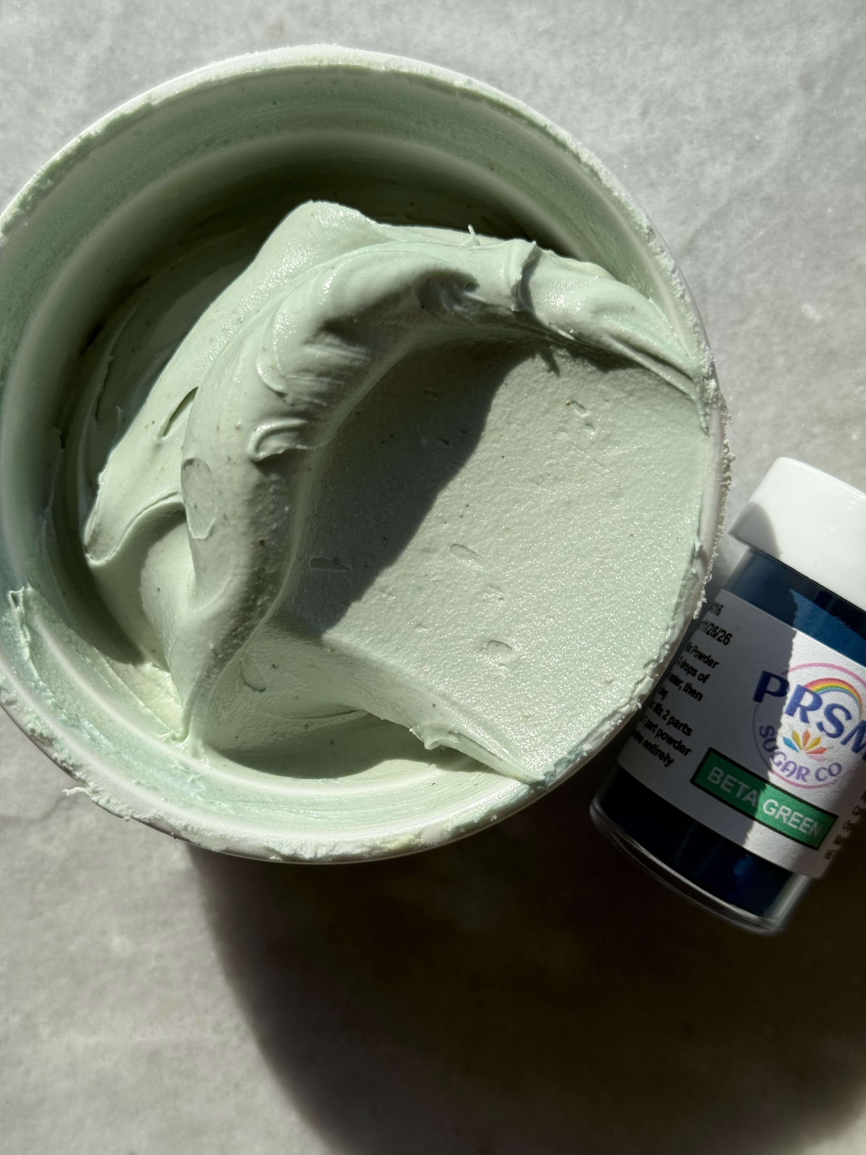
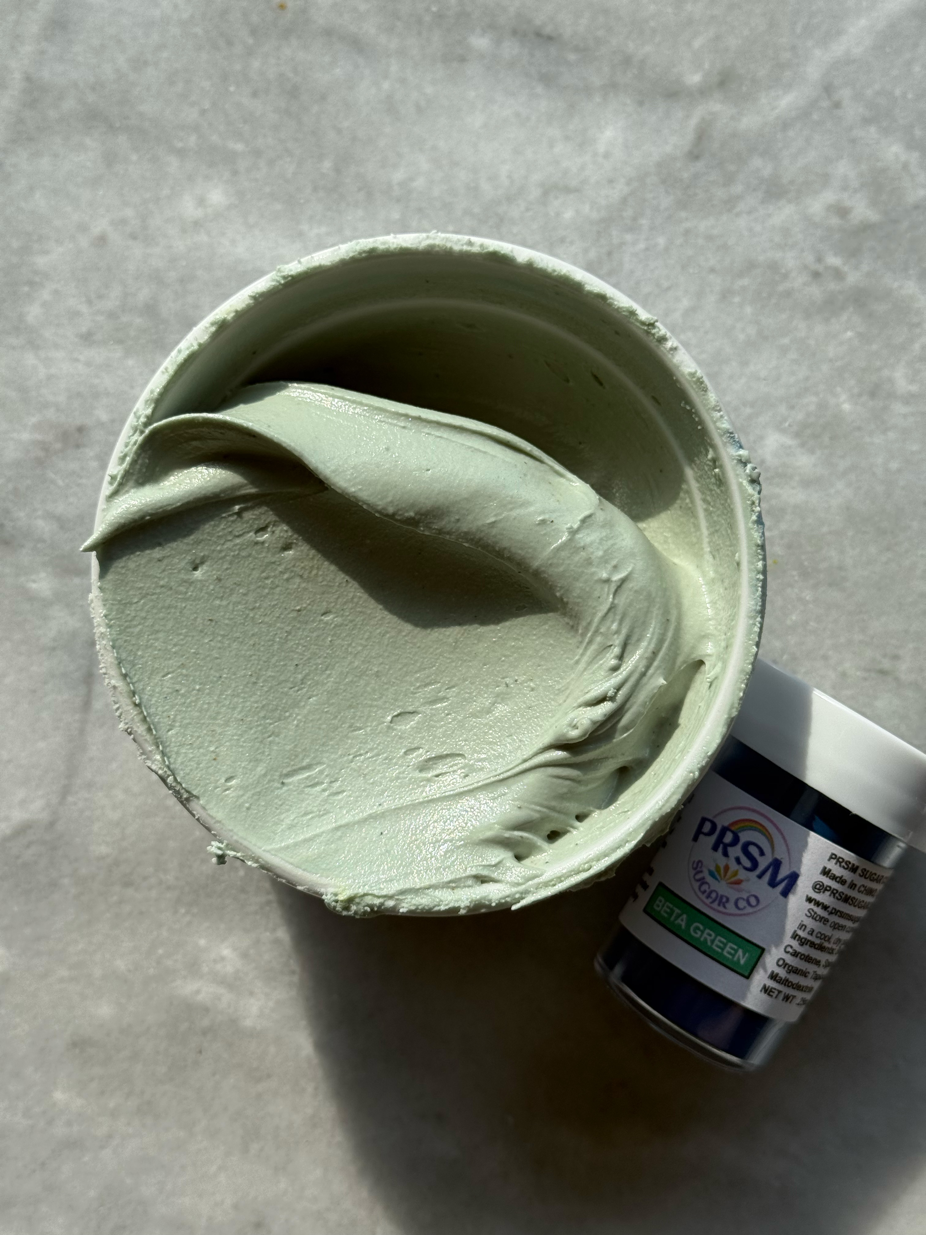
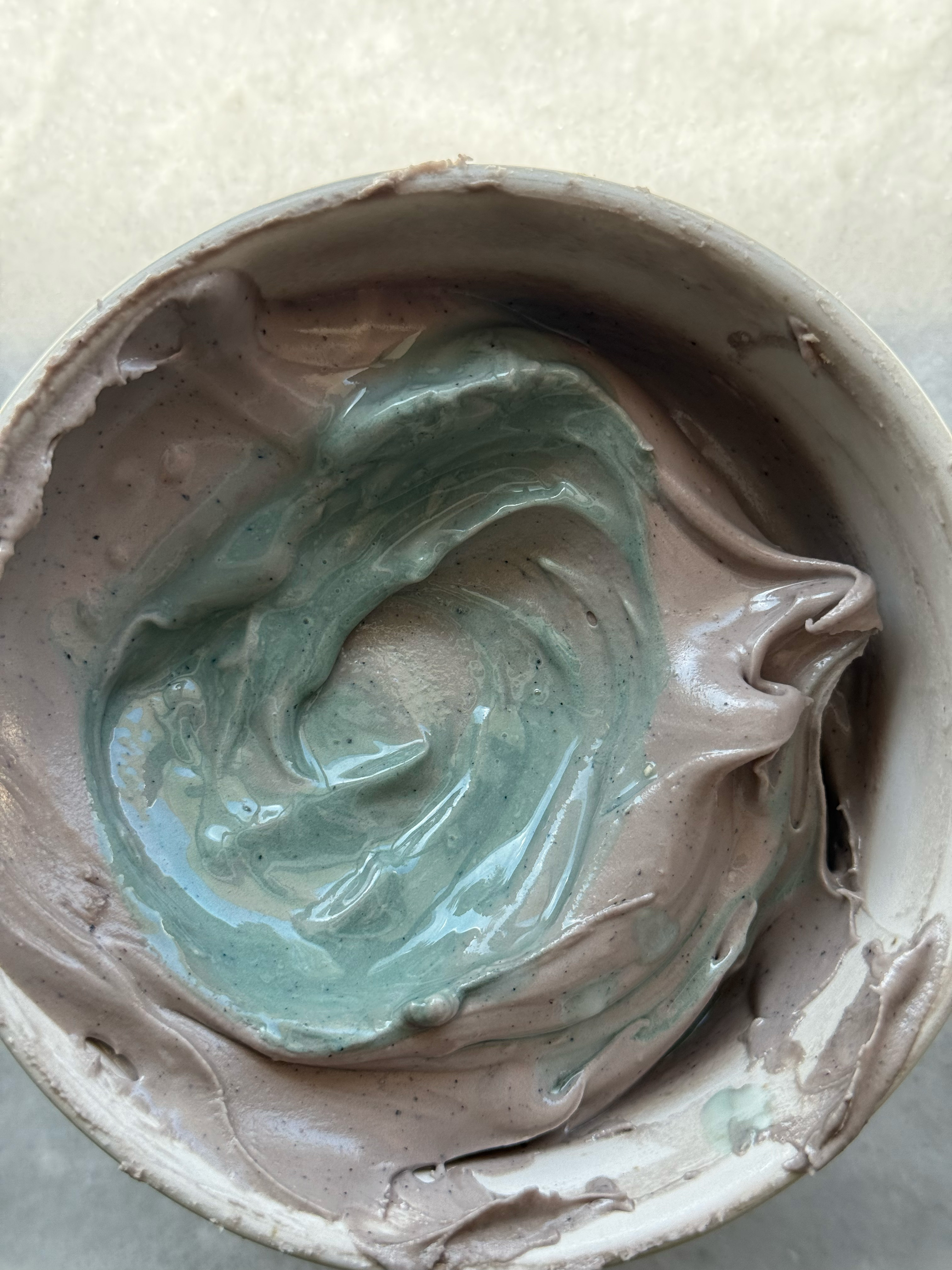
– beta green
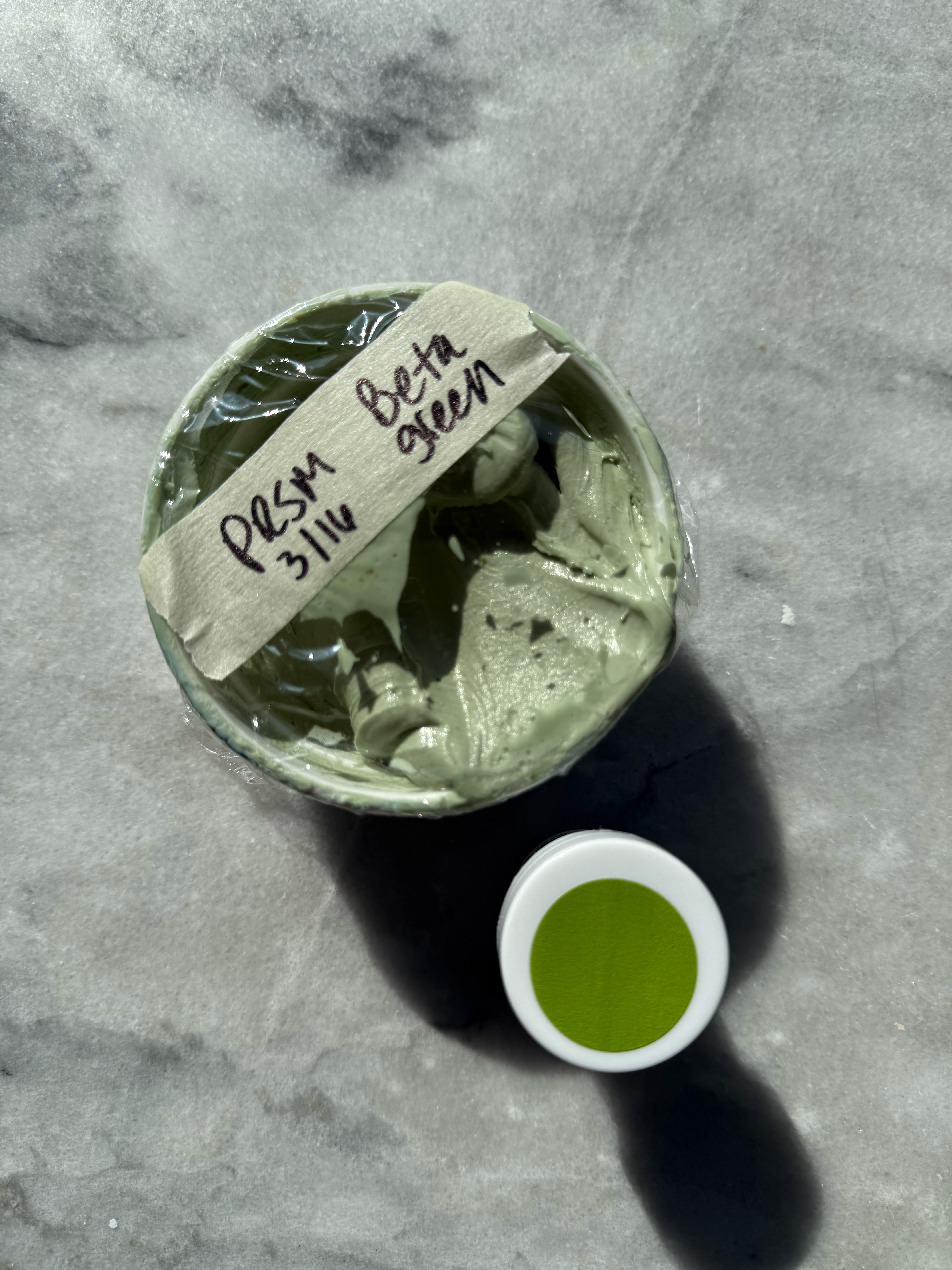
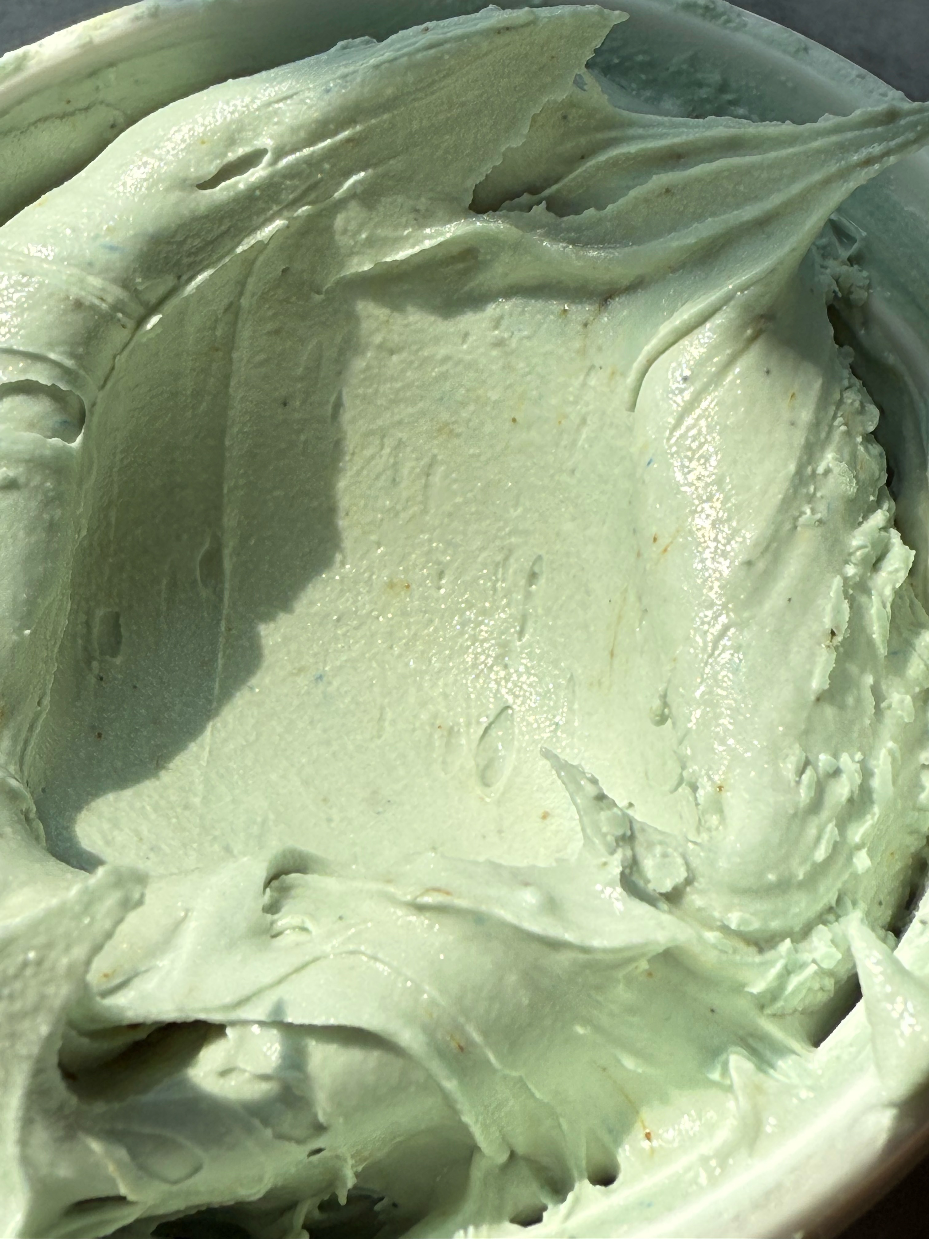
This green is unique and gorgeous. The perfect sage green. I noticed while mixing this color that the yellow granules do not hydrate as quickly, so as this color sits and develops, those yellow granules hydrate. This means that the color turns more green as it sits. It starts out very blue-toned, and gradually turns into a more true green, while still being blue-toned and muted. Stunning.
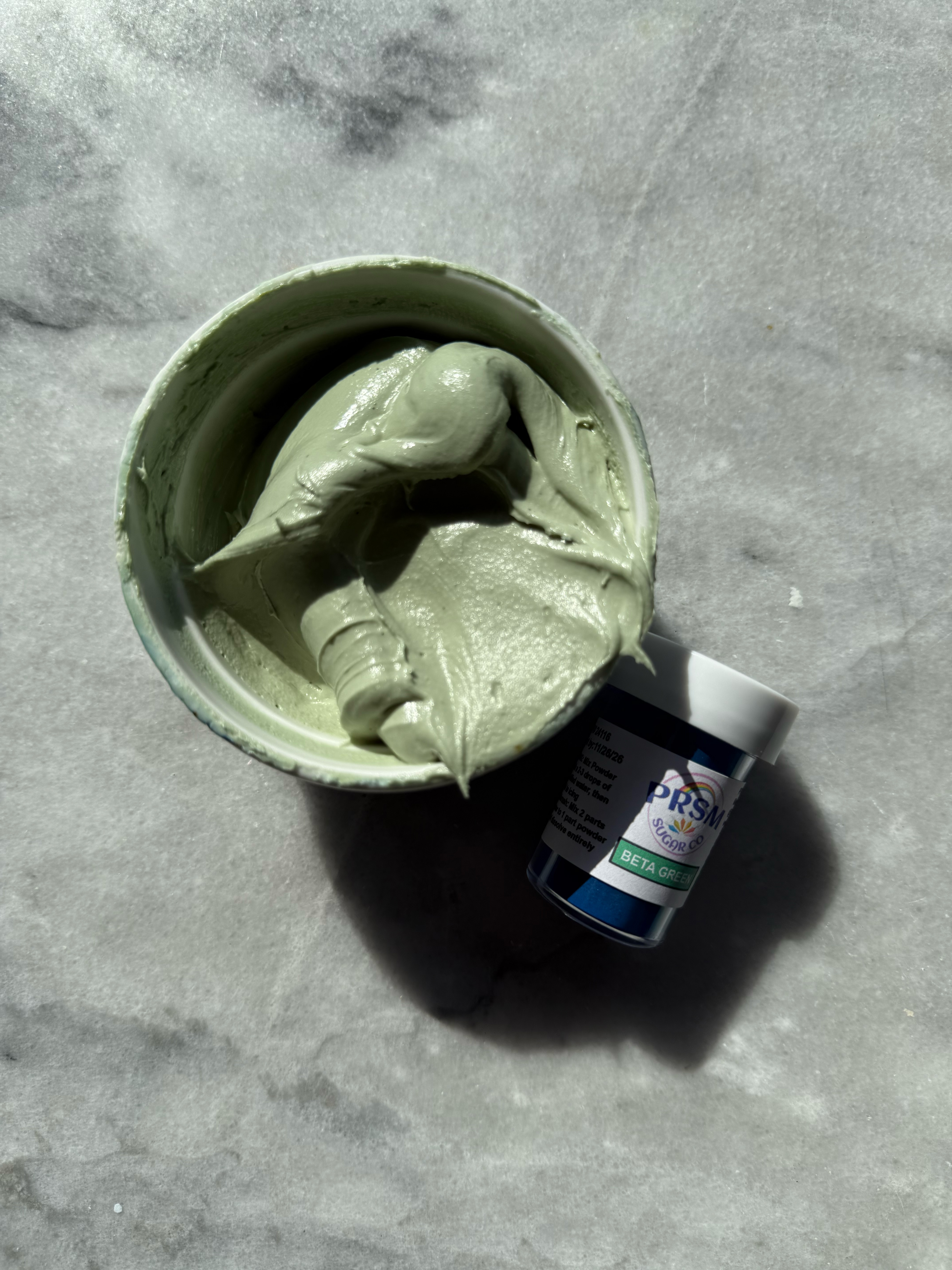
beta green after developing 24 hrs
In this photo, you can really see those yellow granules that have not been hydrated yet.
comparison of the greens:
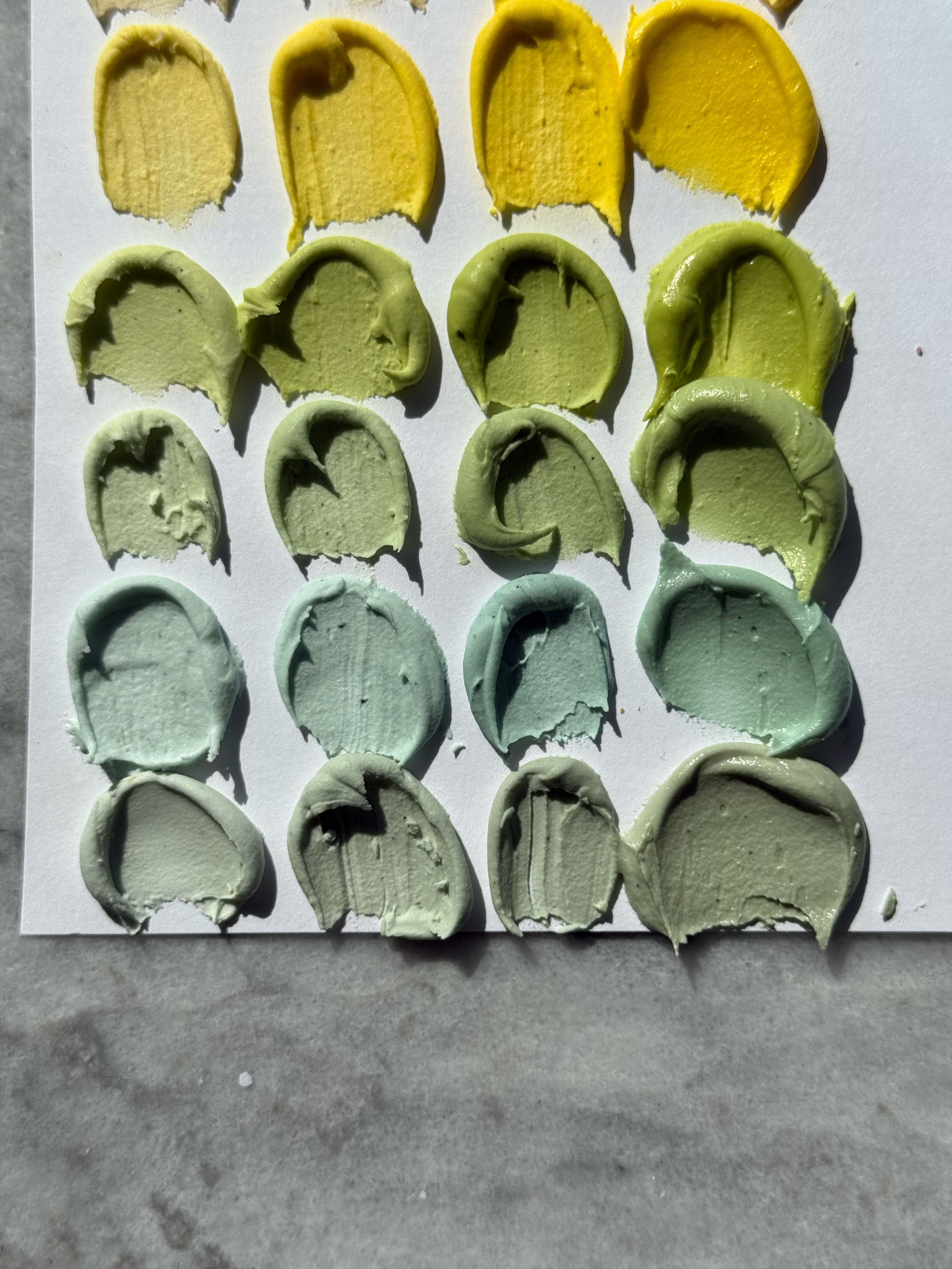
see the difference between the greens in these swatches- swatched at light, medium, dark, and after developing 24 hrs
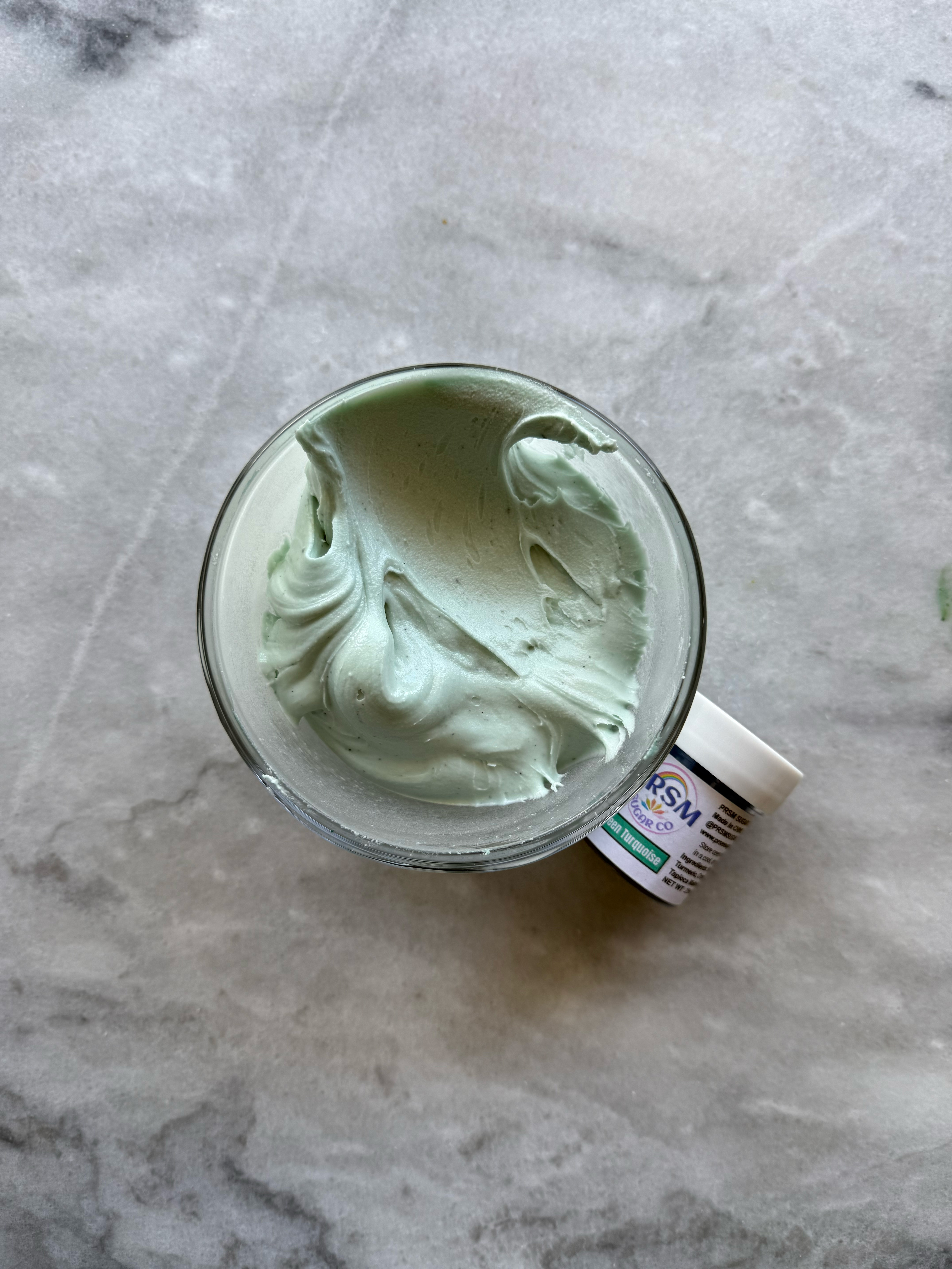
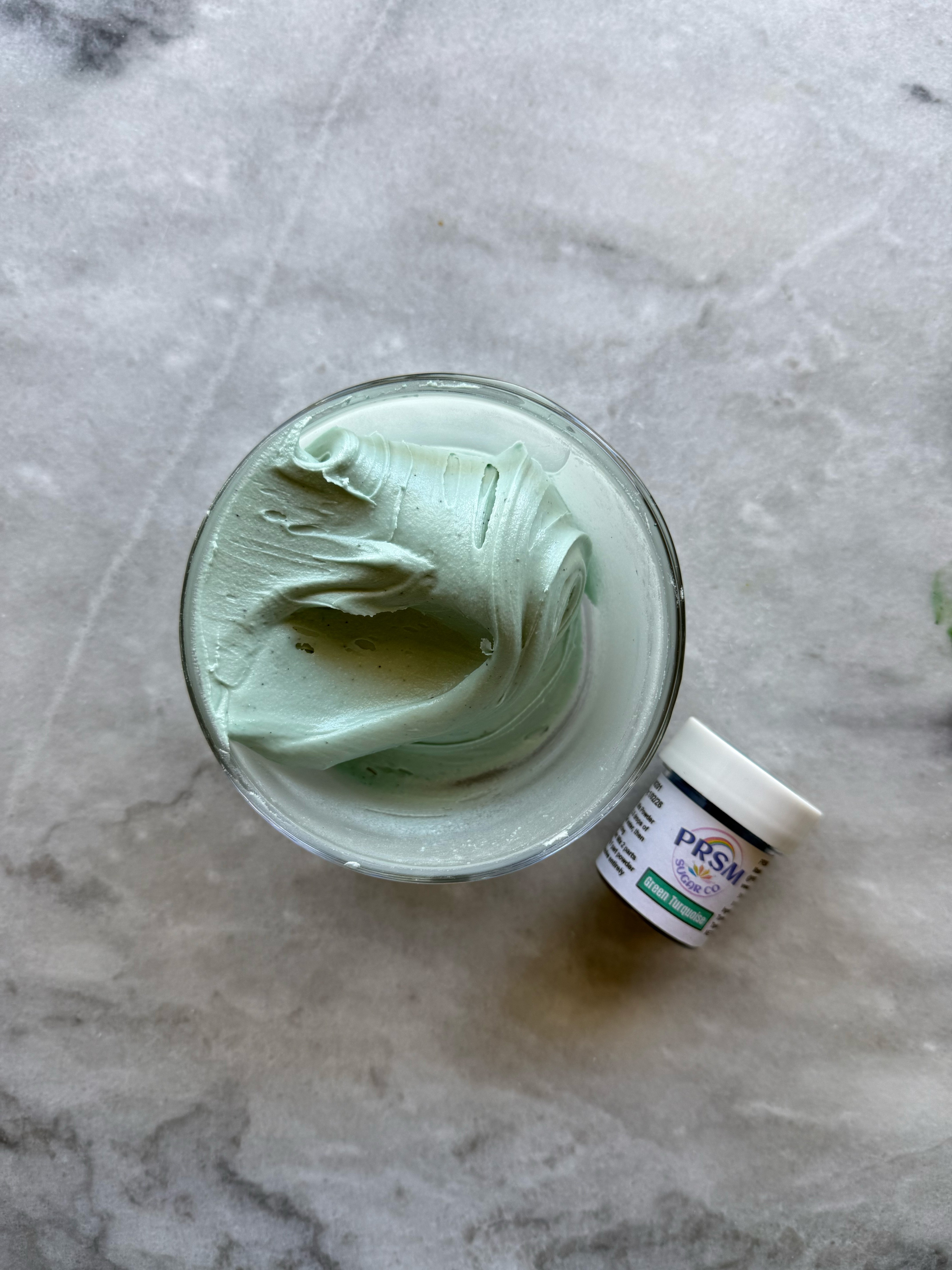
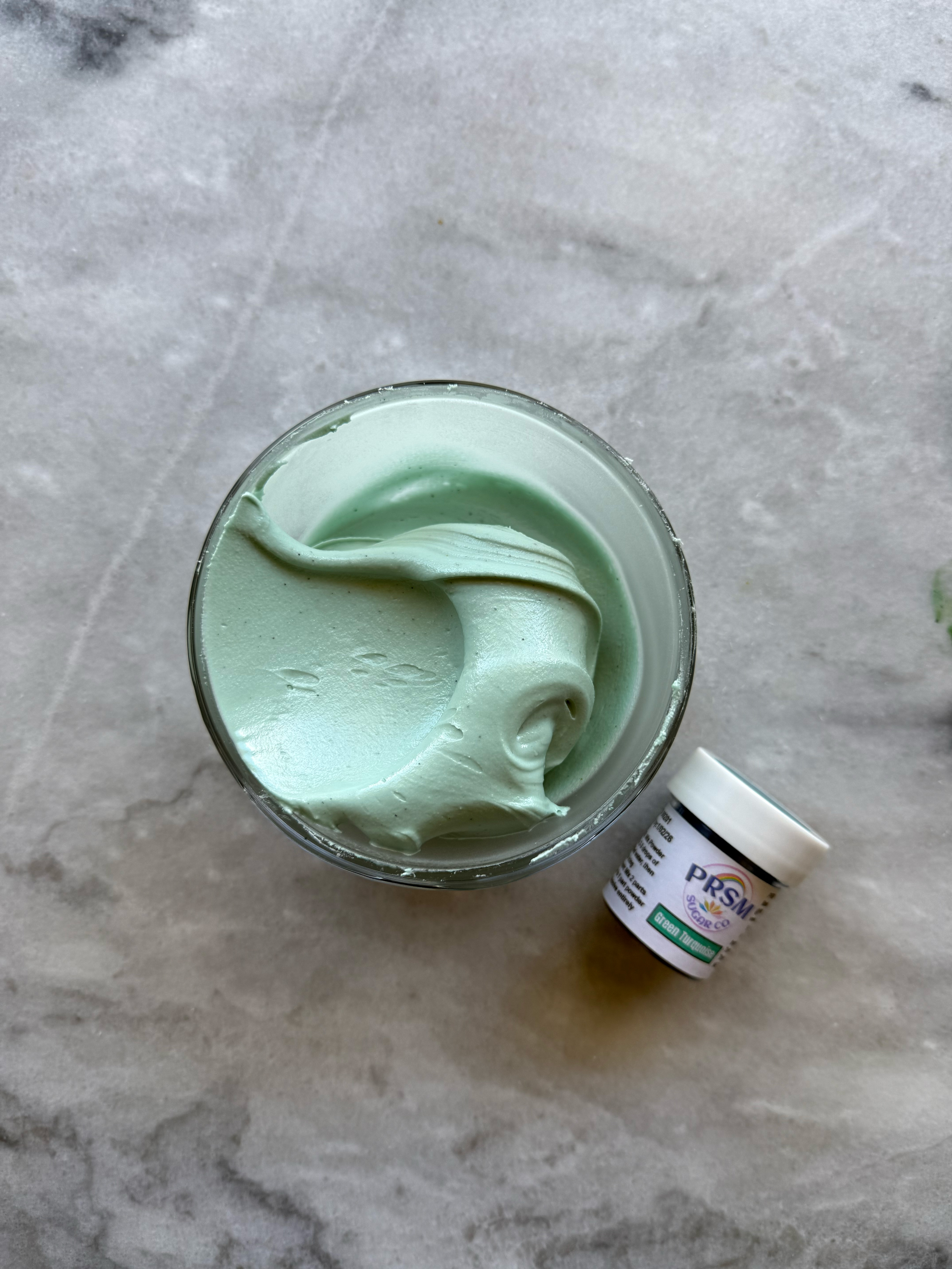
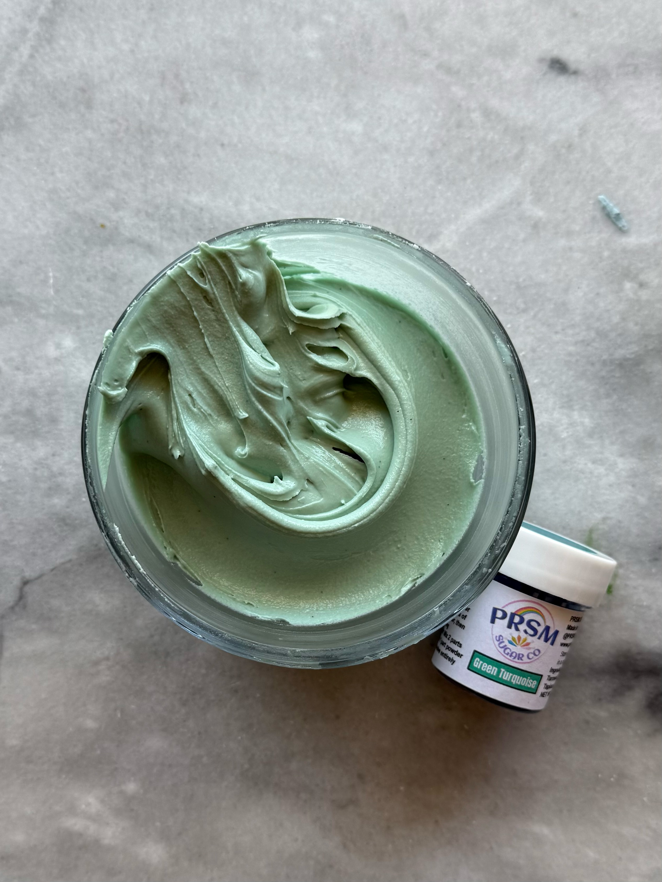
– green turquoise
This green is beautiful, although I suspect I could easily mix this color from emerald.
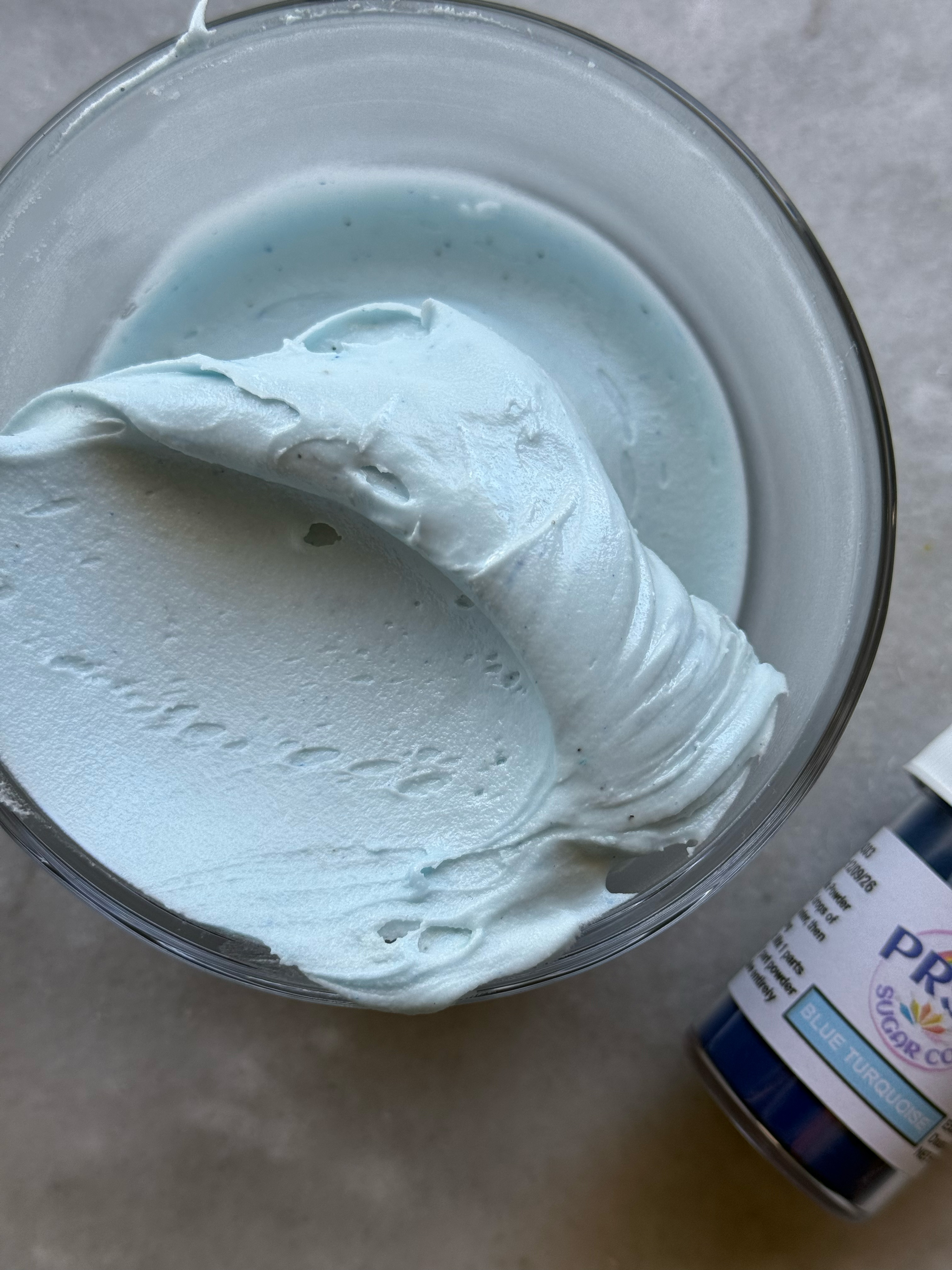
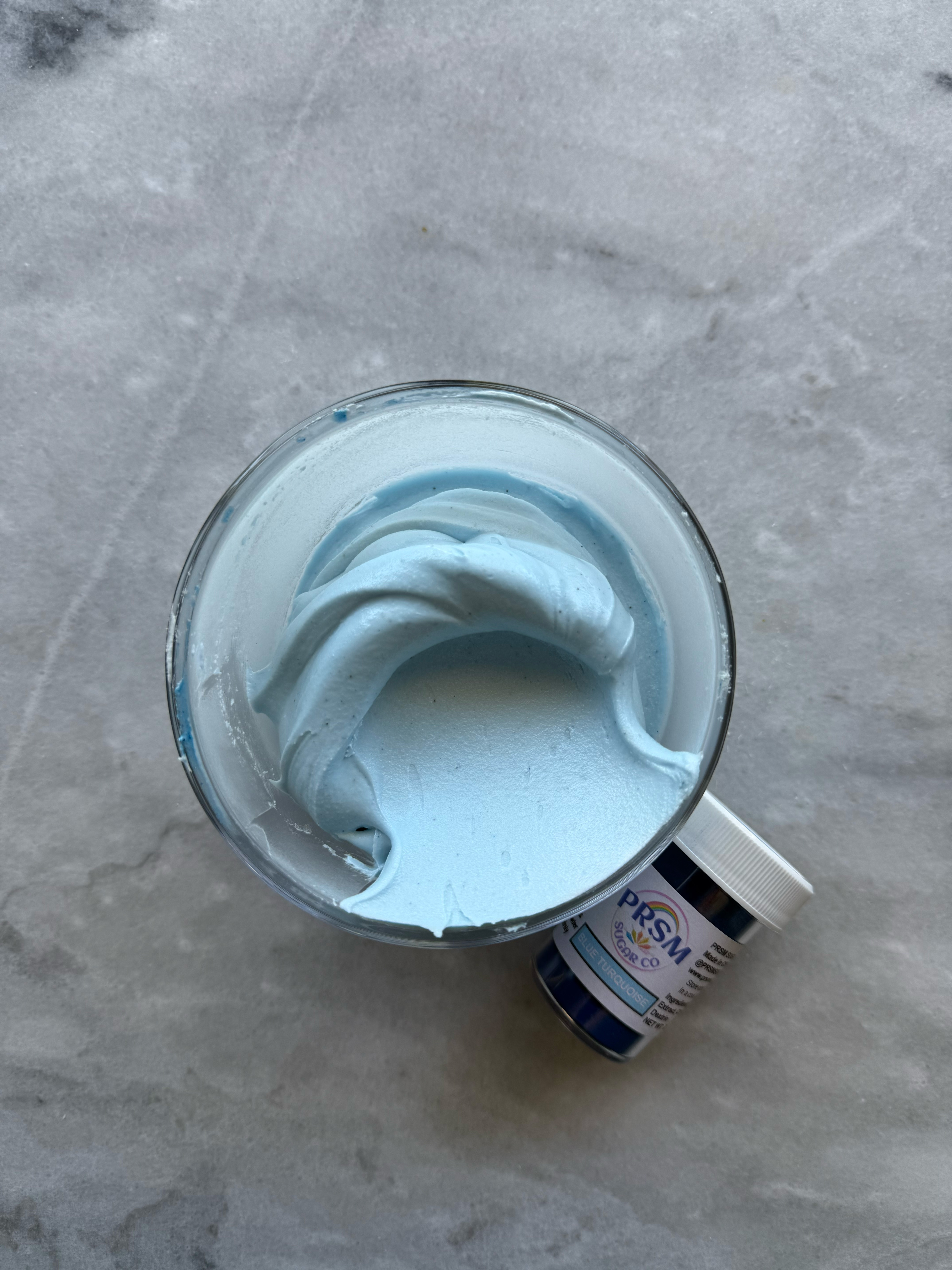
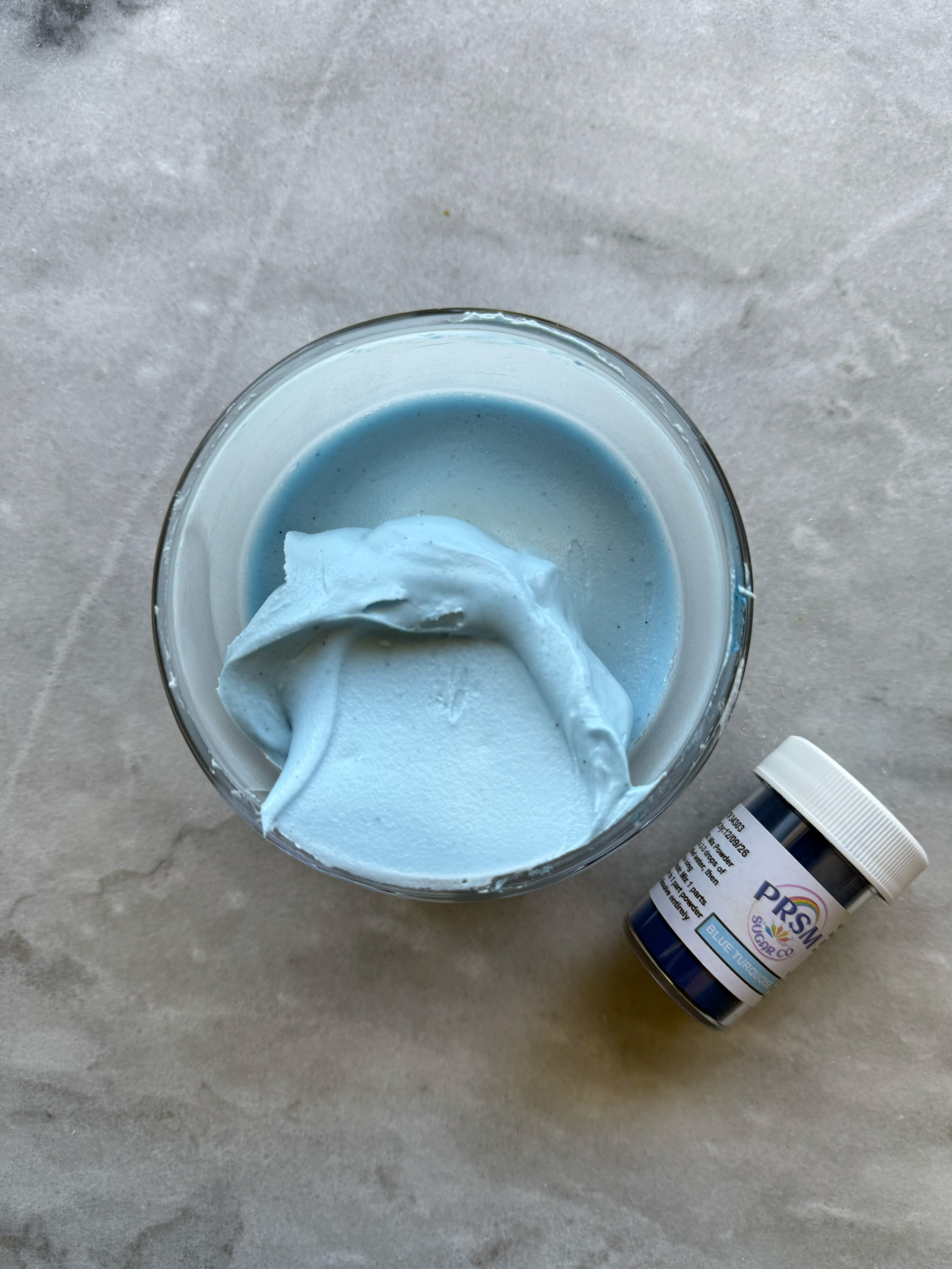
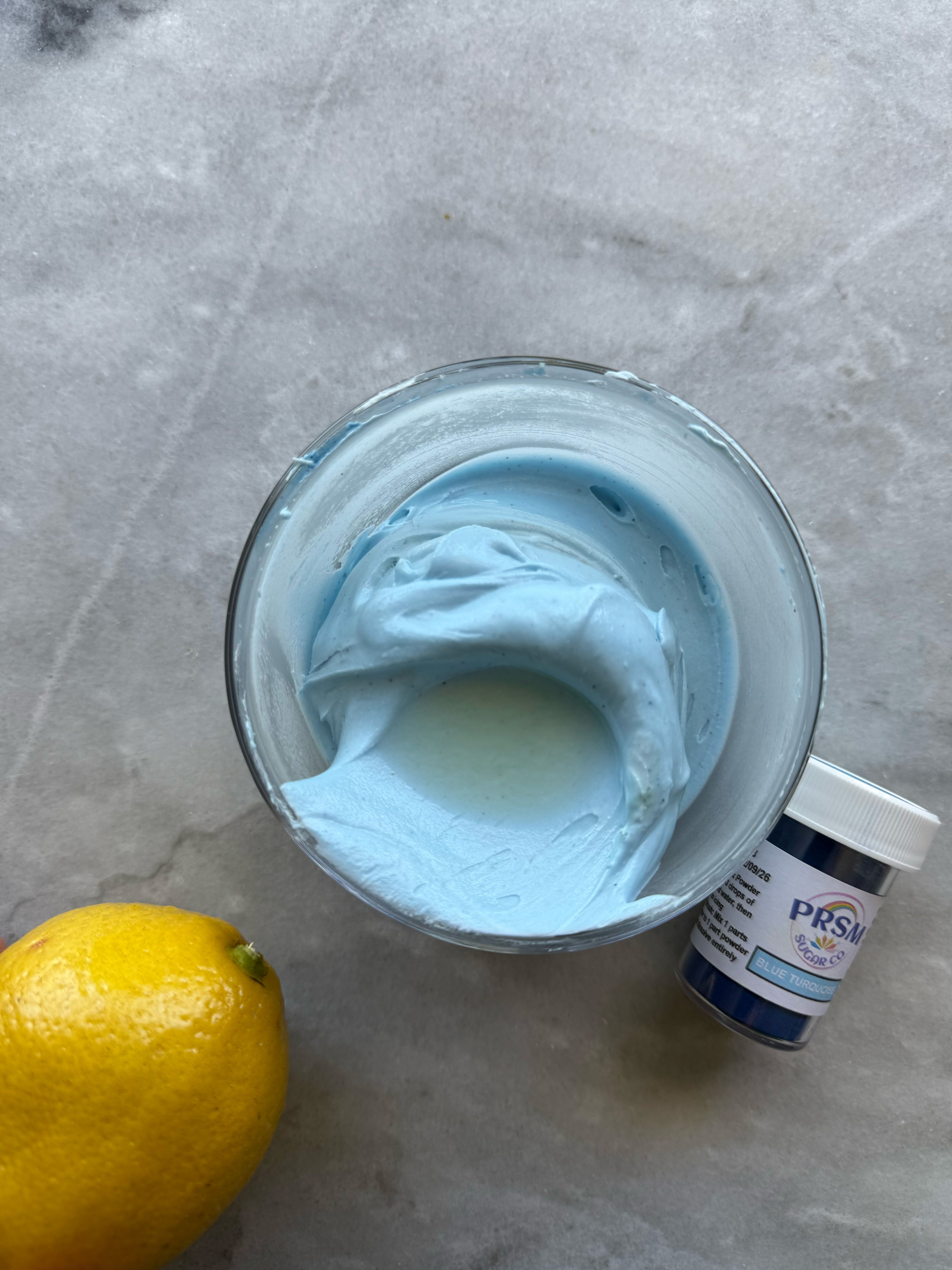
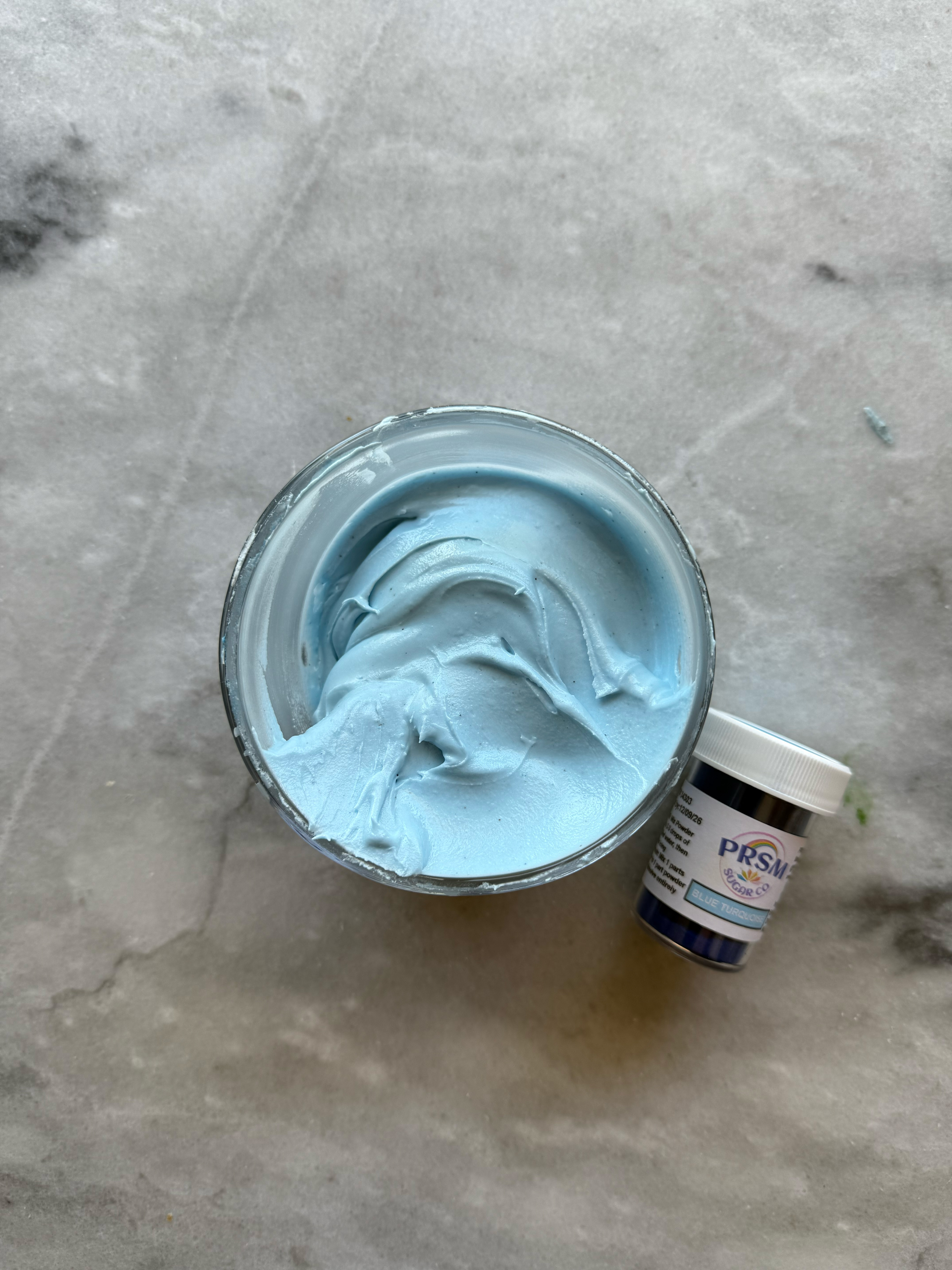
– blue turquoise
This blue is very similar to sky blue. I added a little lemon juice to see if it would react, but the color didn’t change drastically (or at all, really). It’s a beautiful, rich ocean blue.
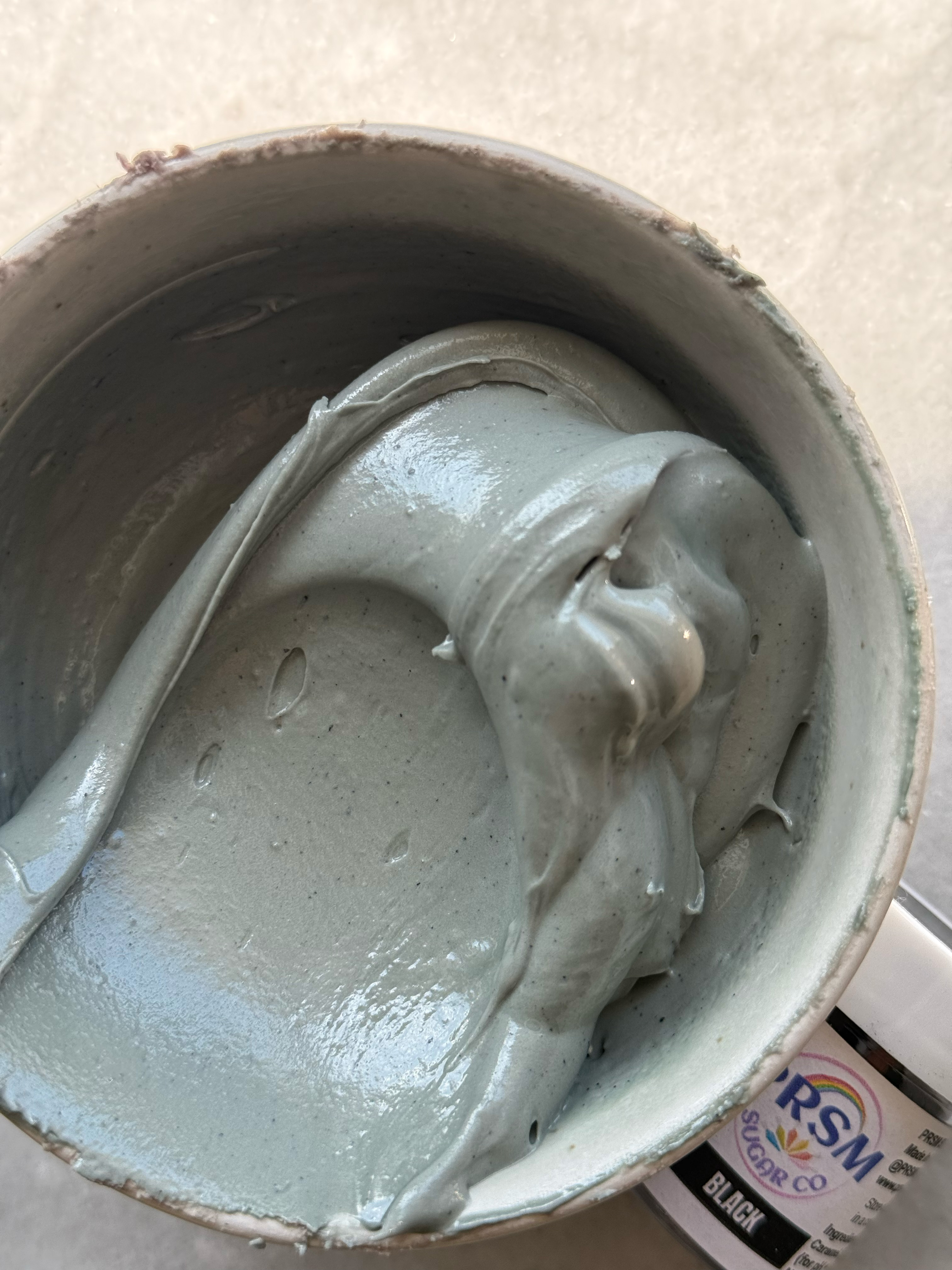
– royal blue
This color is EVERYTHING. The perfect periwinkle blue. You can easily adjust the tone with a little color theory, although I want to test this one out again to see how dark I can get it.
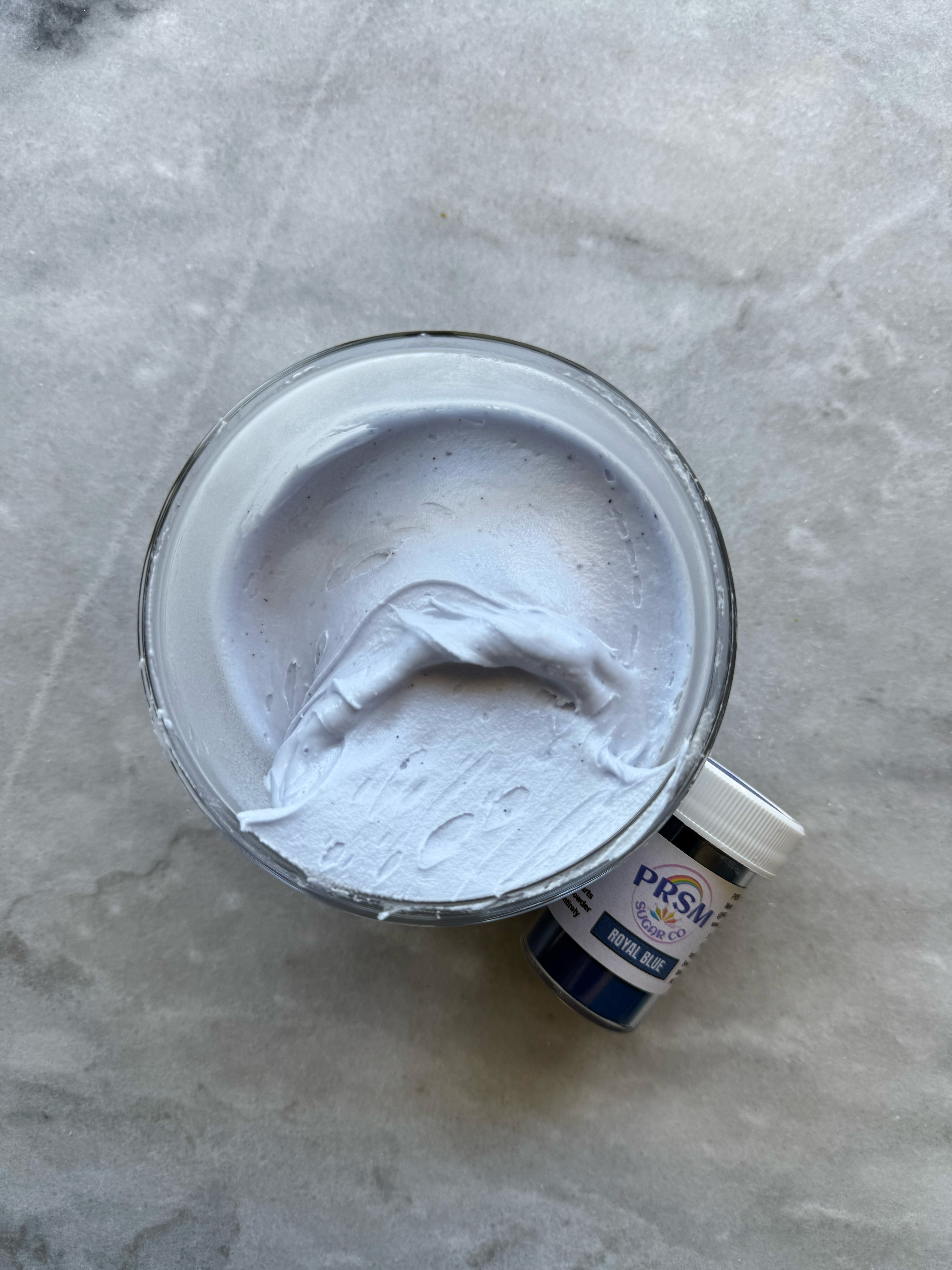
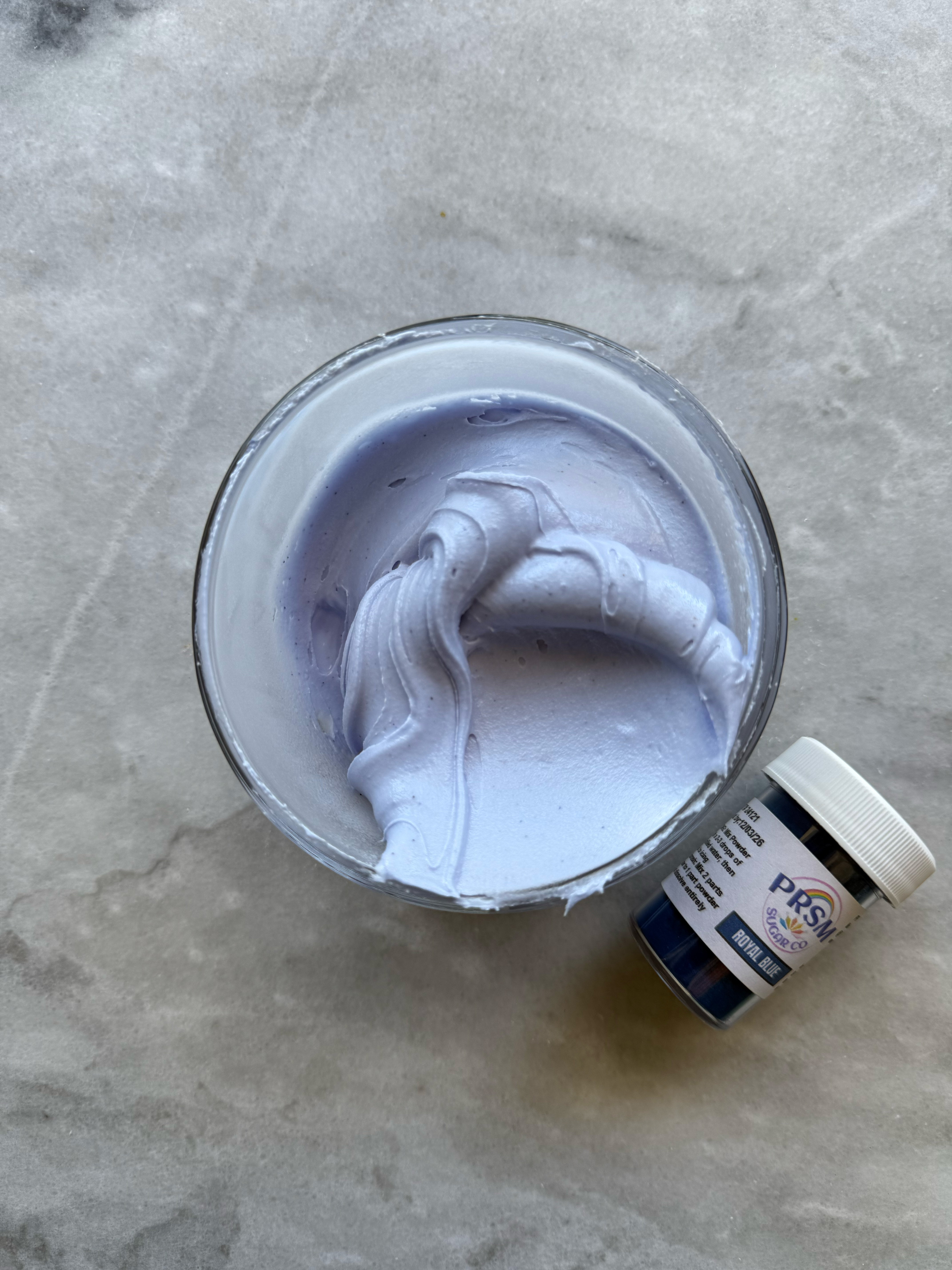
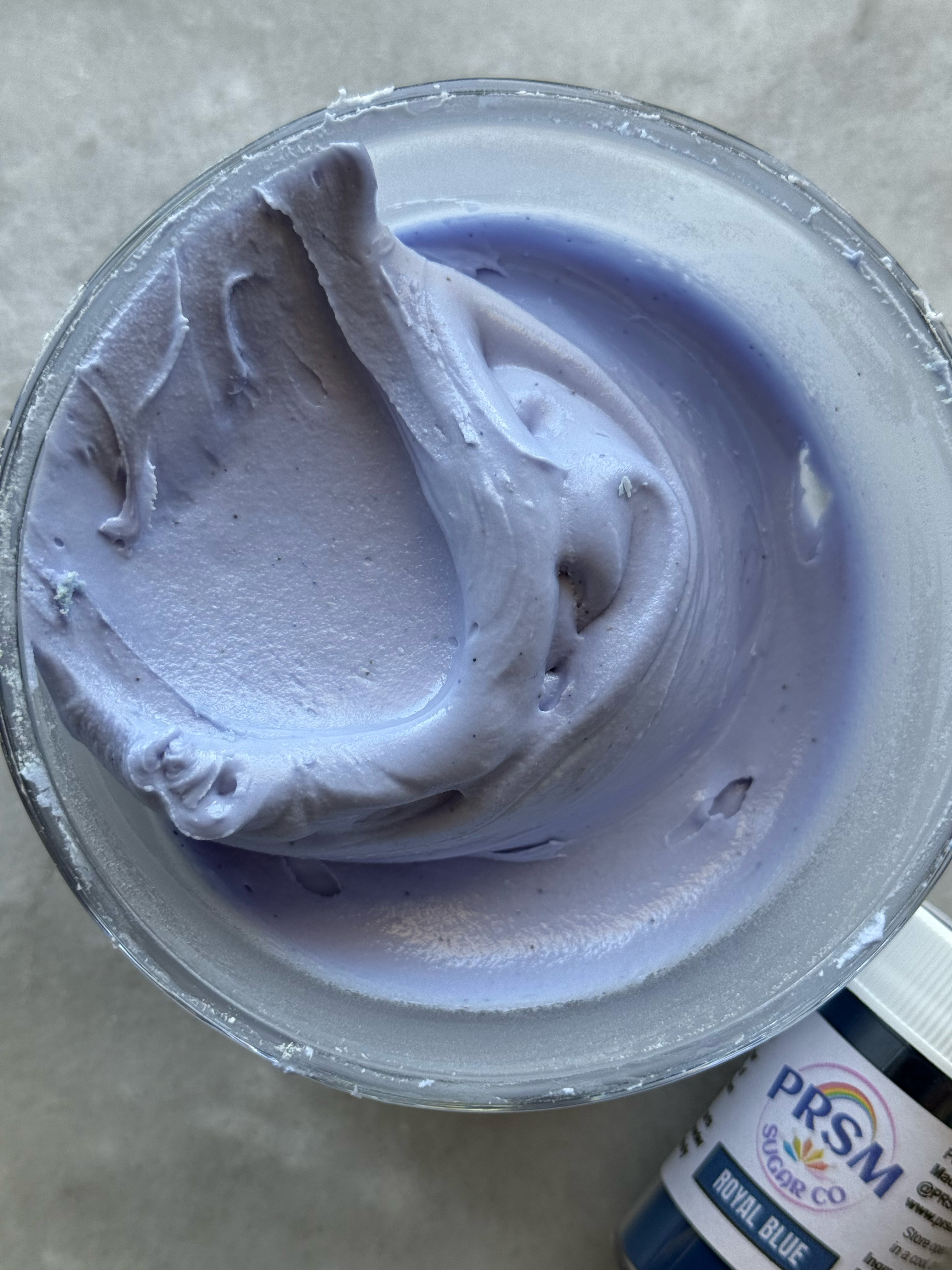
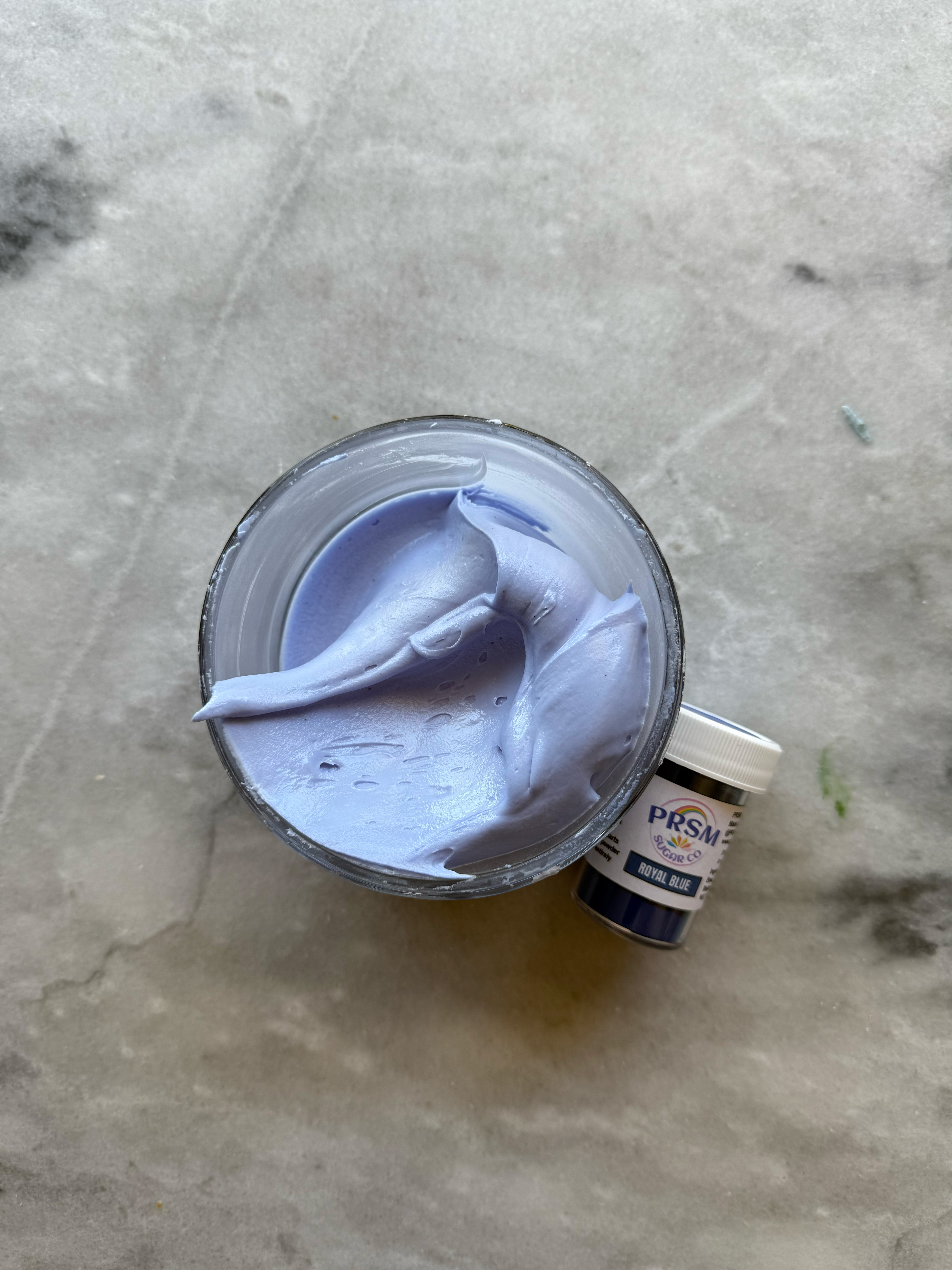
royal blue after developing 24 hrs
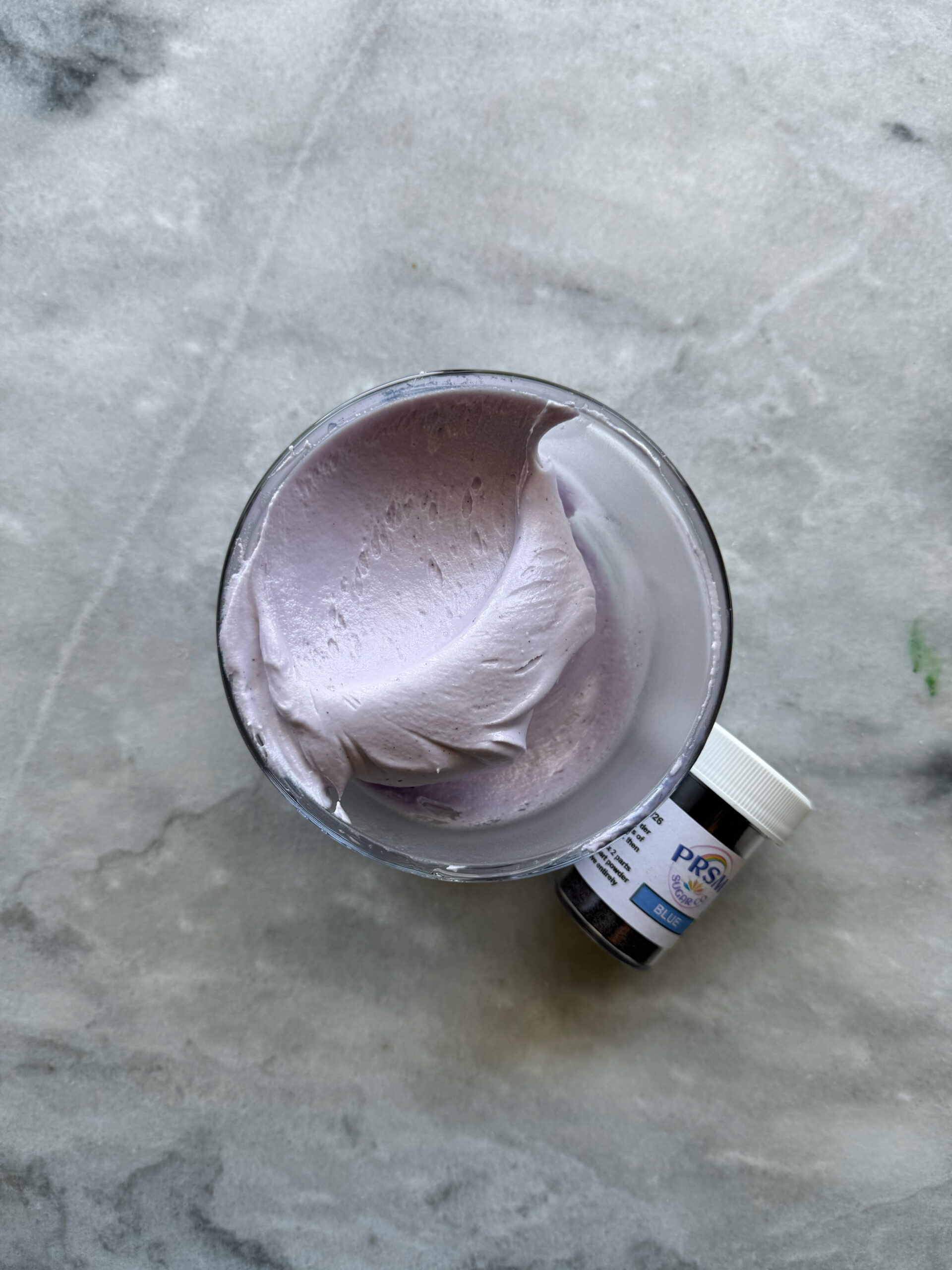
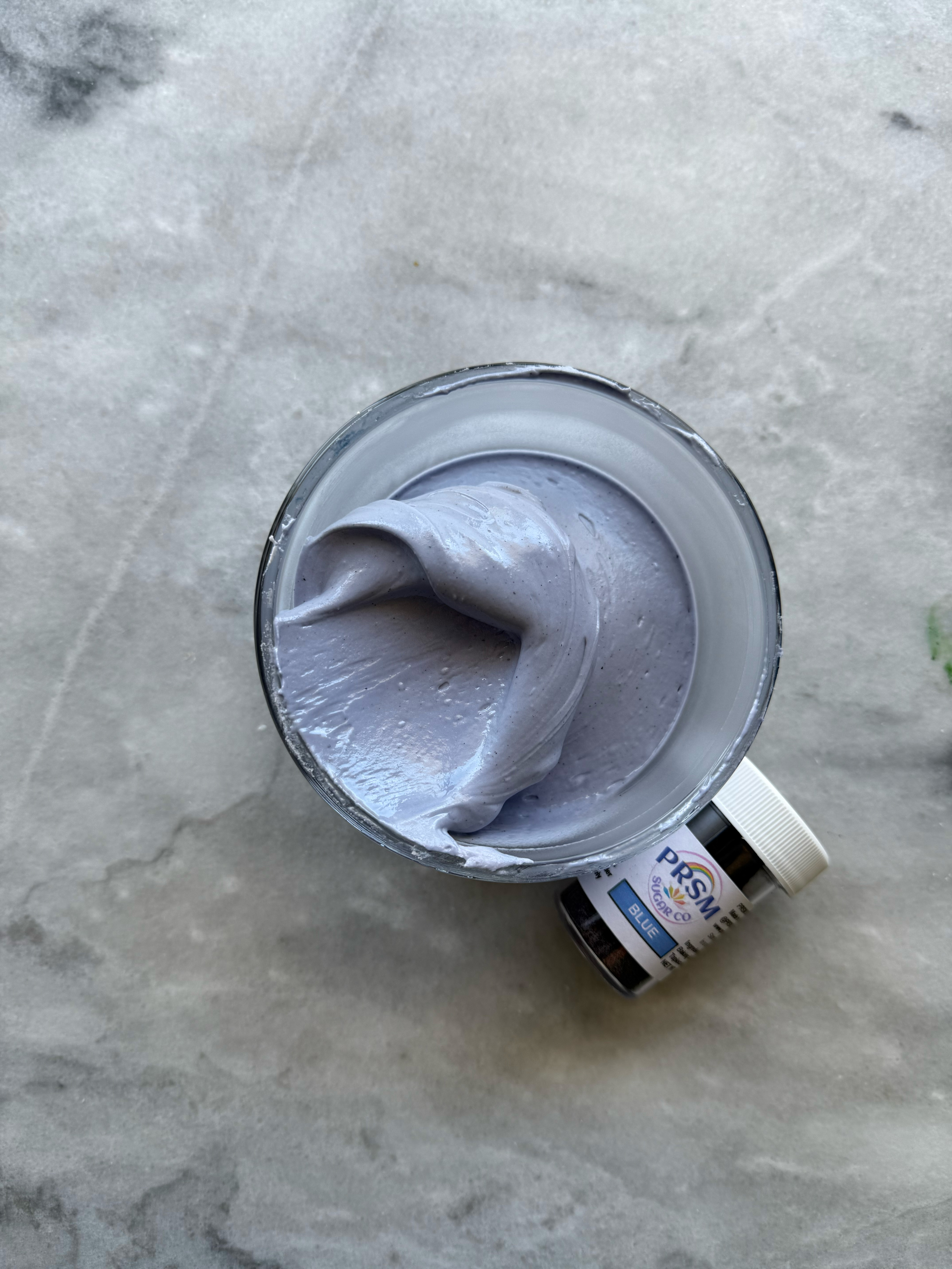
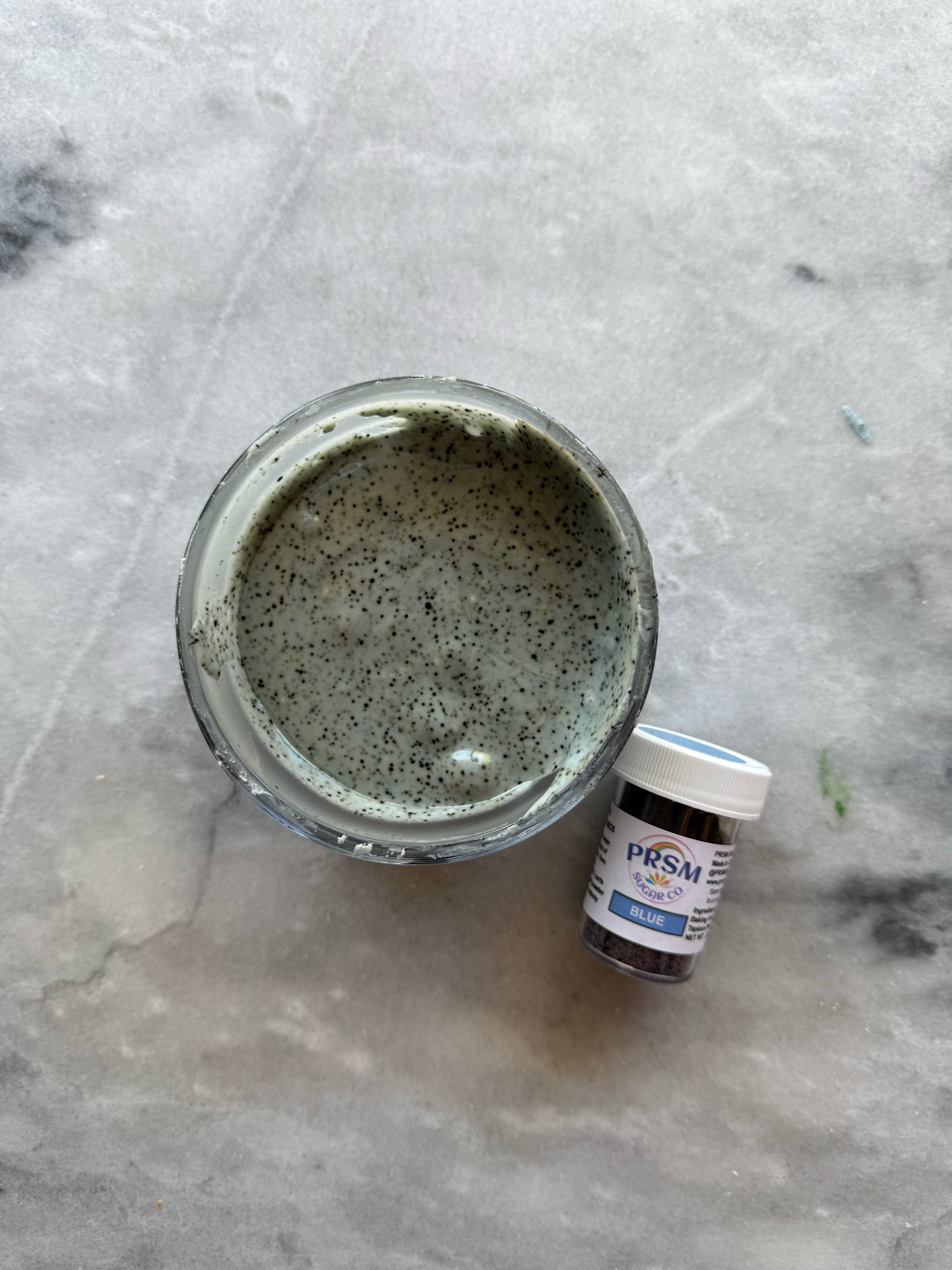
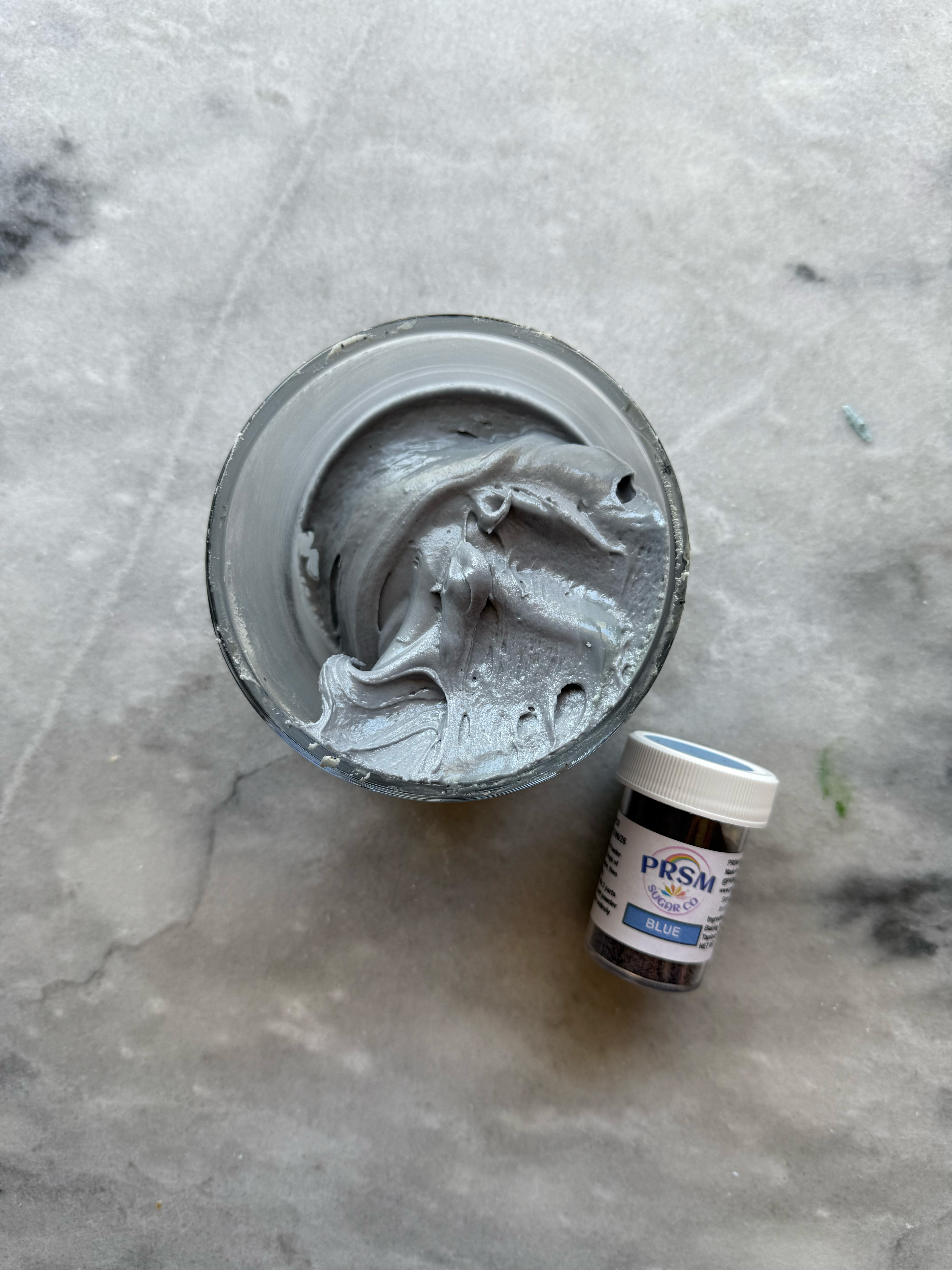
– blue
This color was a bit tricky. It starts out very purple, but as you mix and add more powder, it is very blue. However, as it sits and develops, it turned very gray. This one was also very unpredictable for me and every time I used it as a mixing color, the top of the icing would develop differently than the rest.
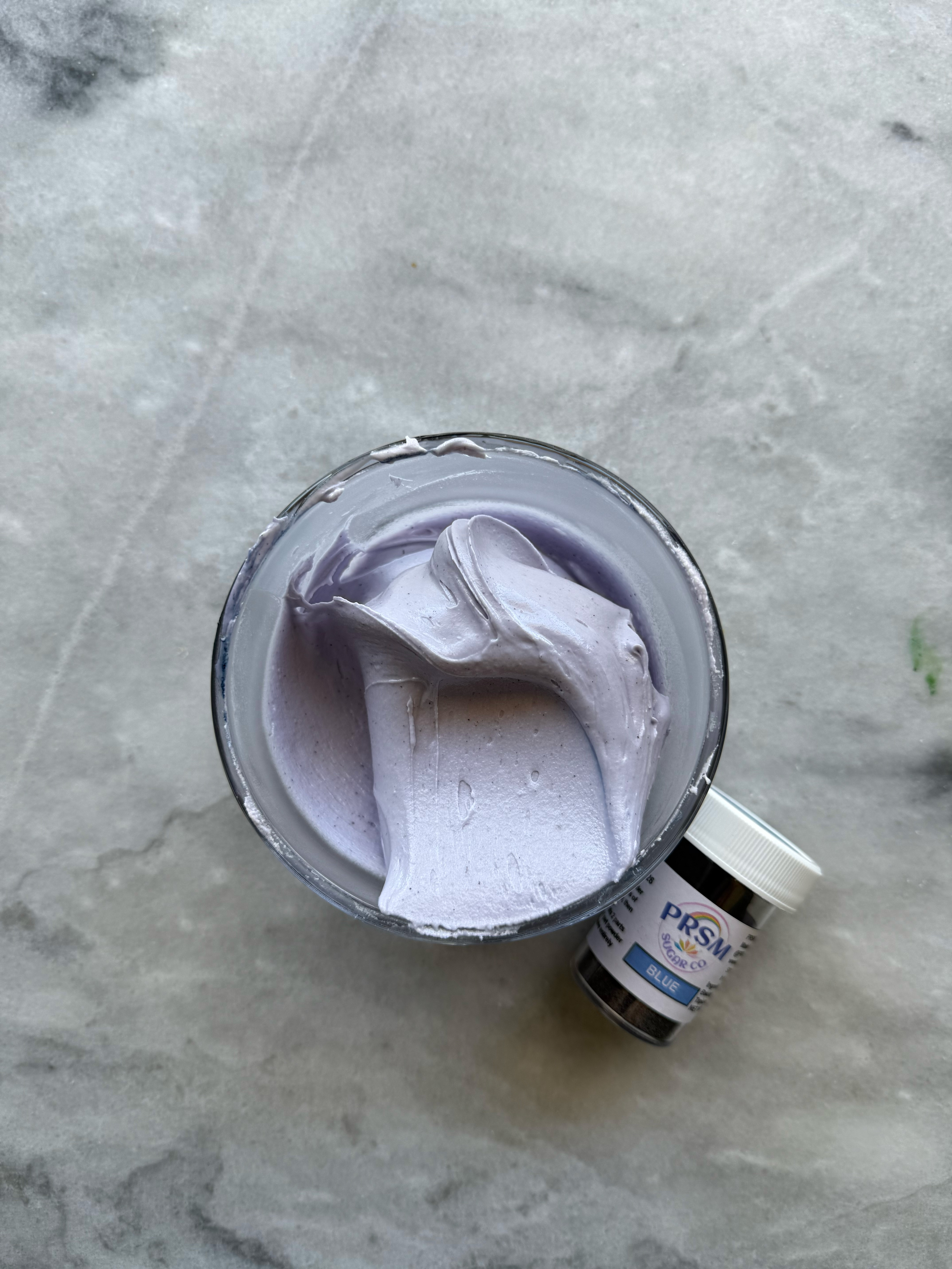
blue with ph changes- the pink (top left) has added lemon juice and the blue (bottom left has added baking soda, and the periwinkle shade (right) is the blue as is
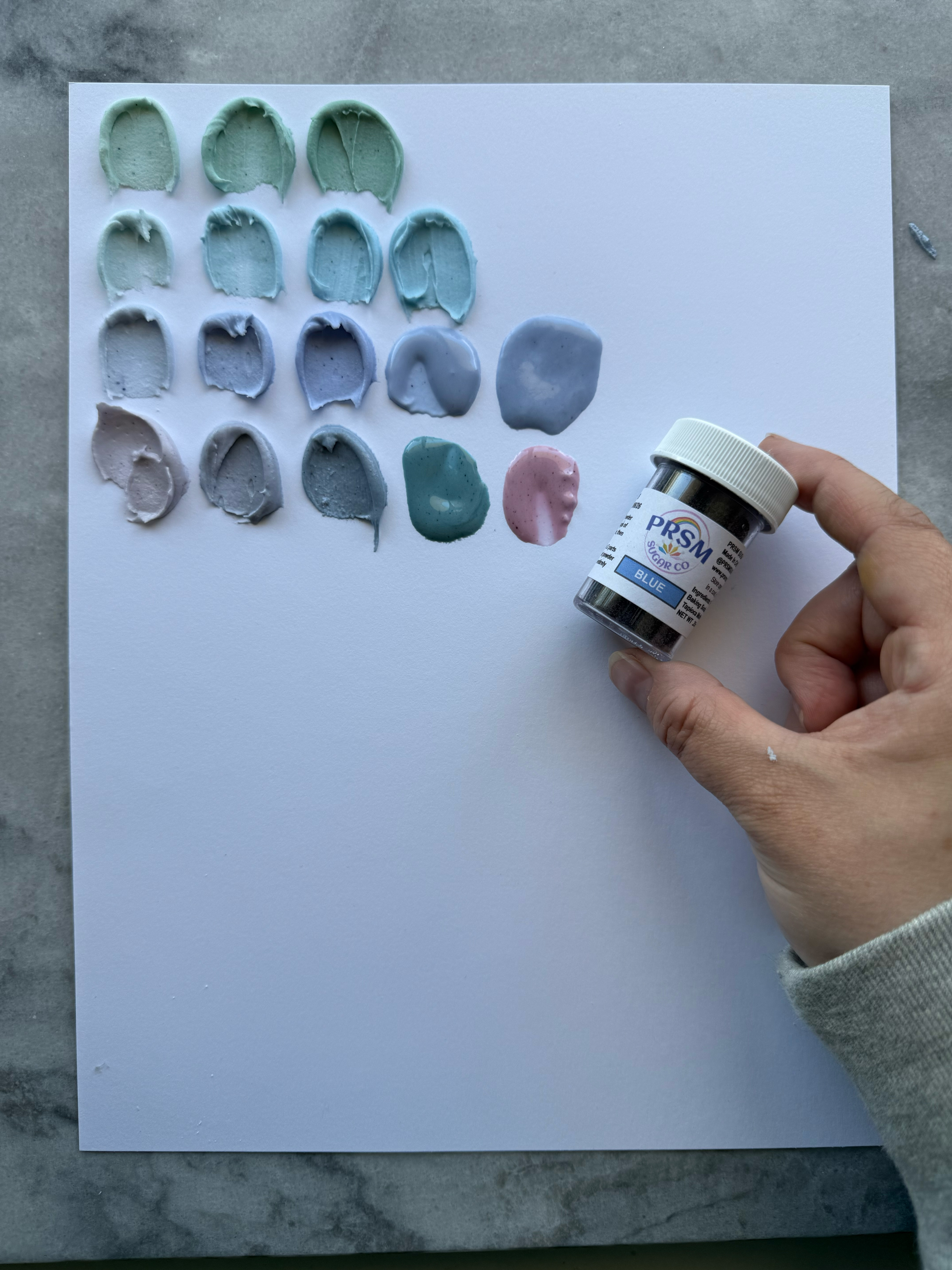
see the differences between royal blue and blue swatches (the bottom two rows)
– sky blue
This is a very nice, simple sky blue shade. It is easily adjustable with color theory.
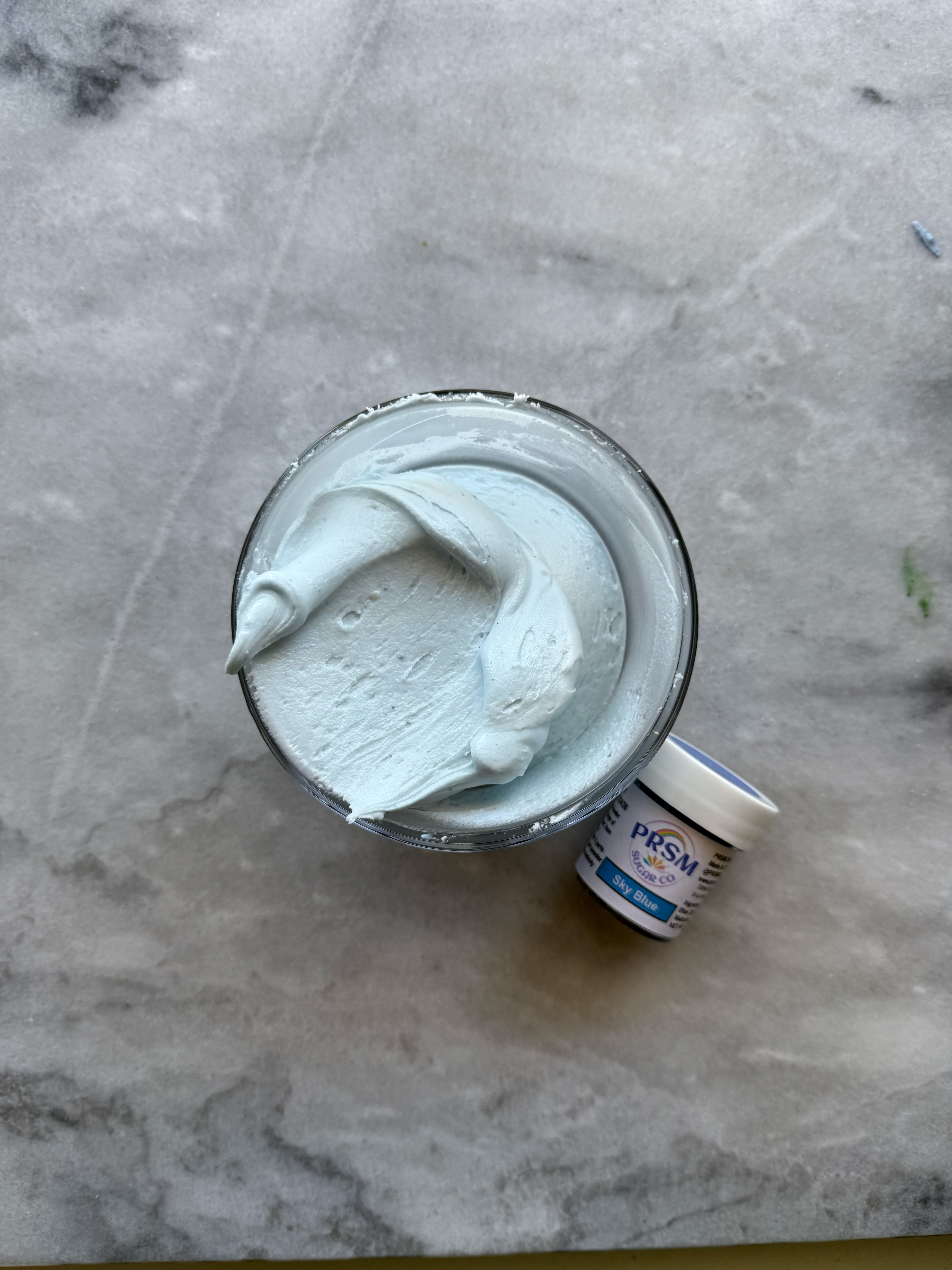
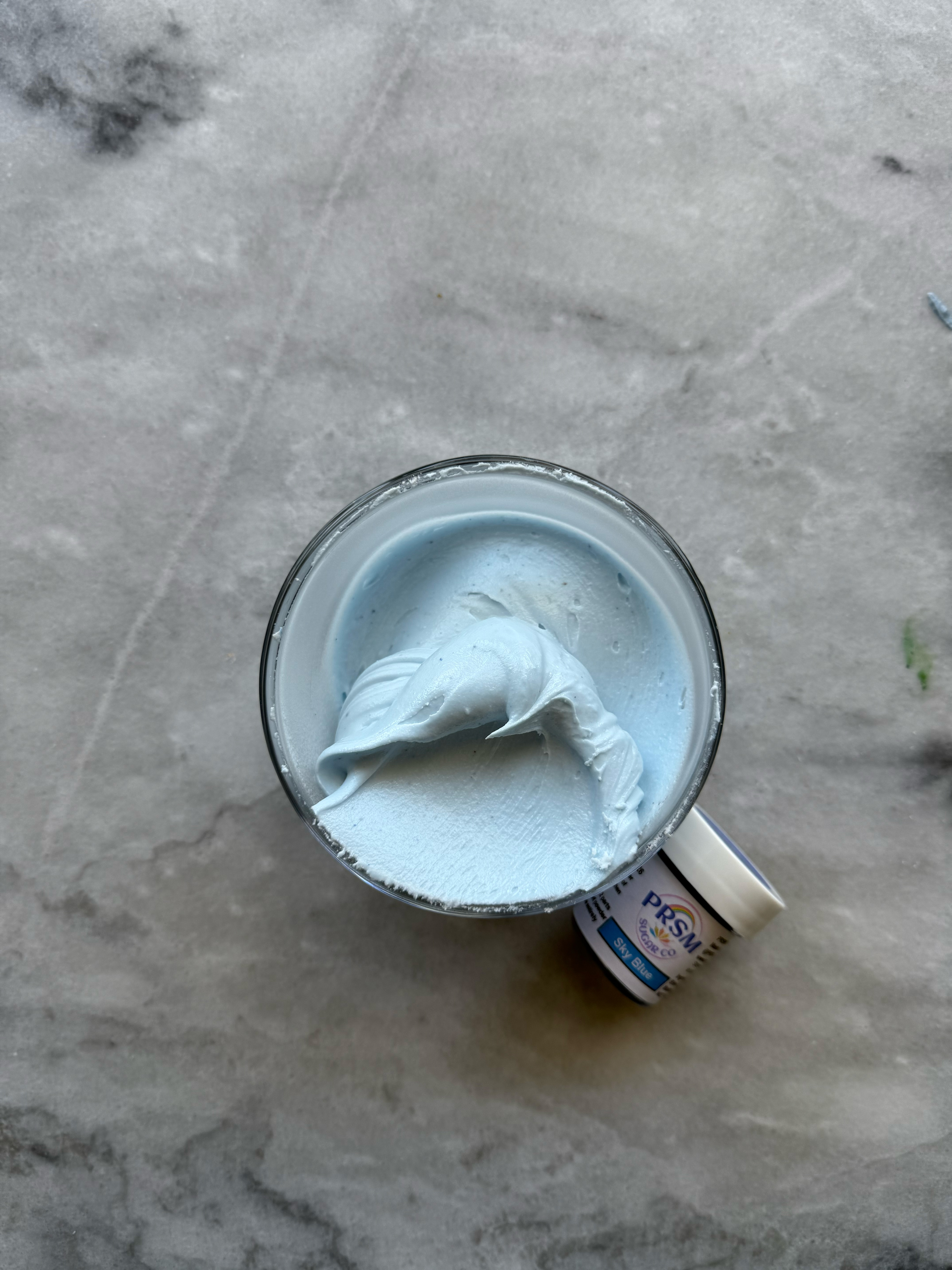
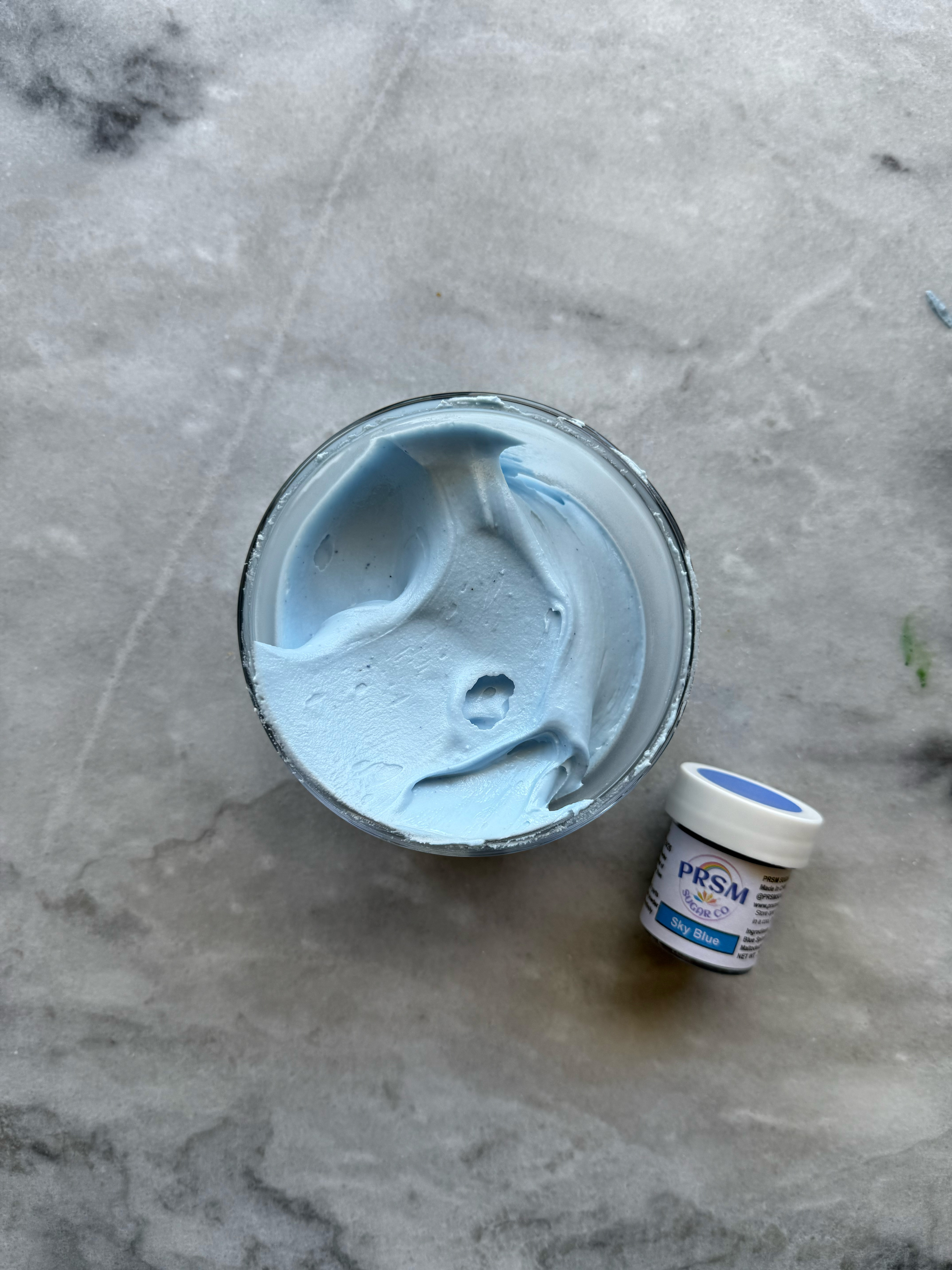
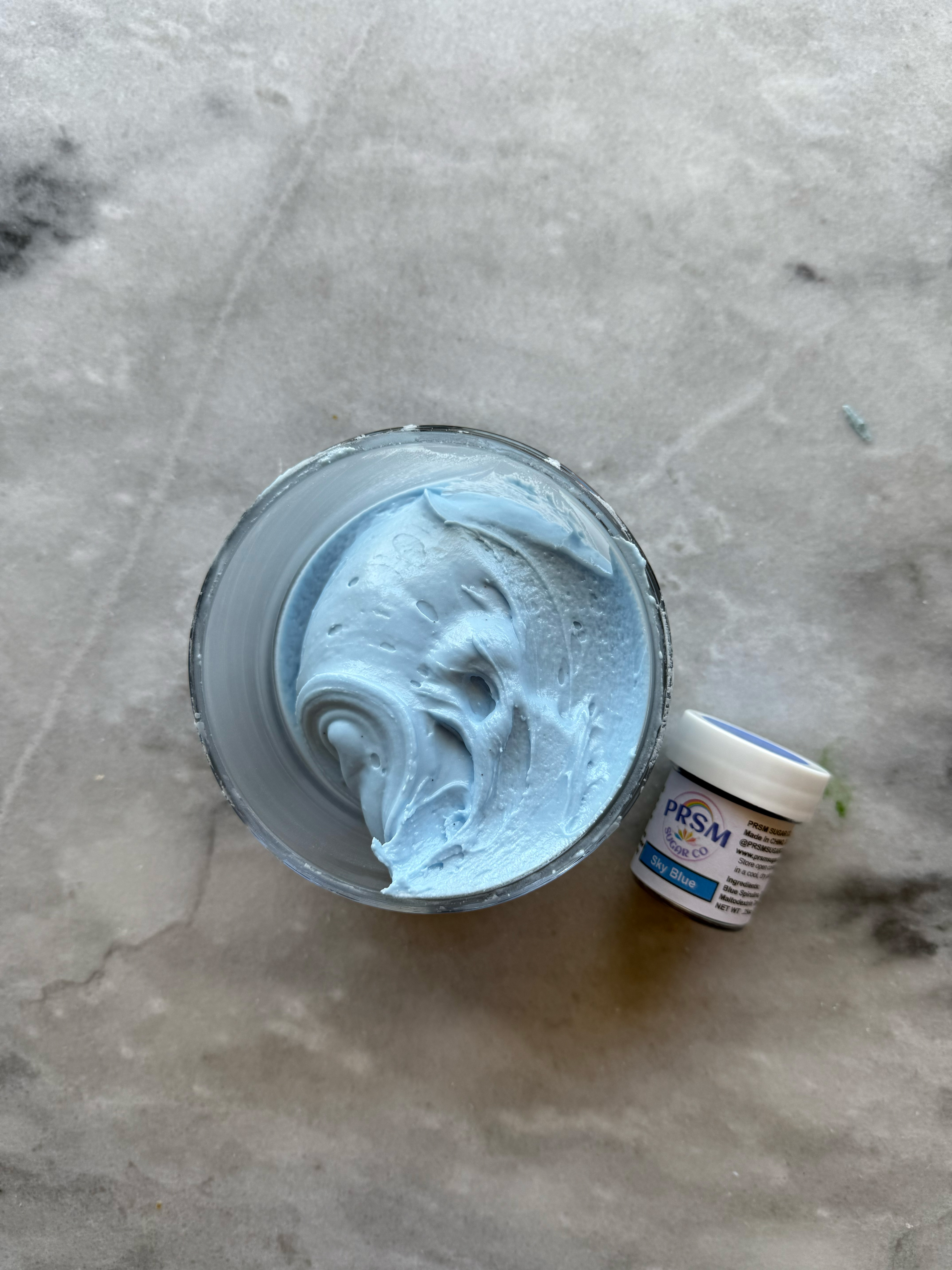
sky blue after developing 24 hrs
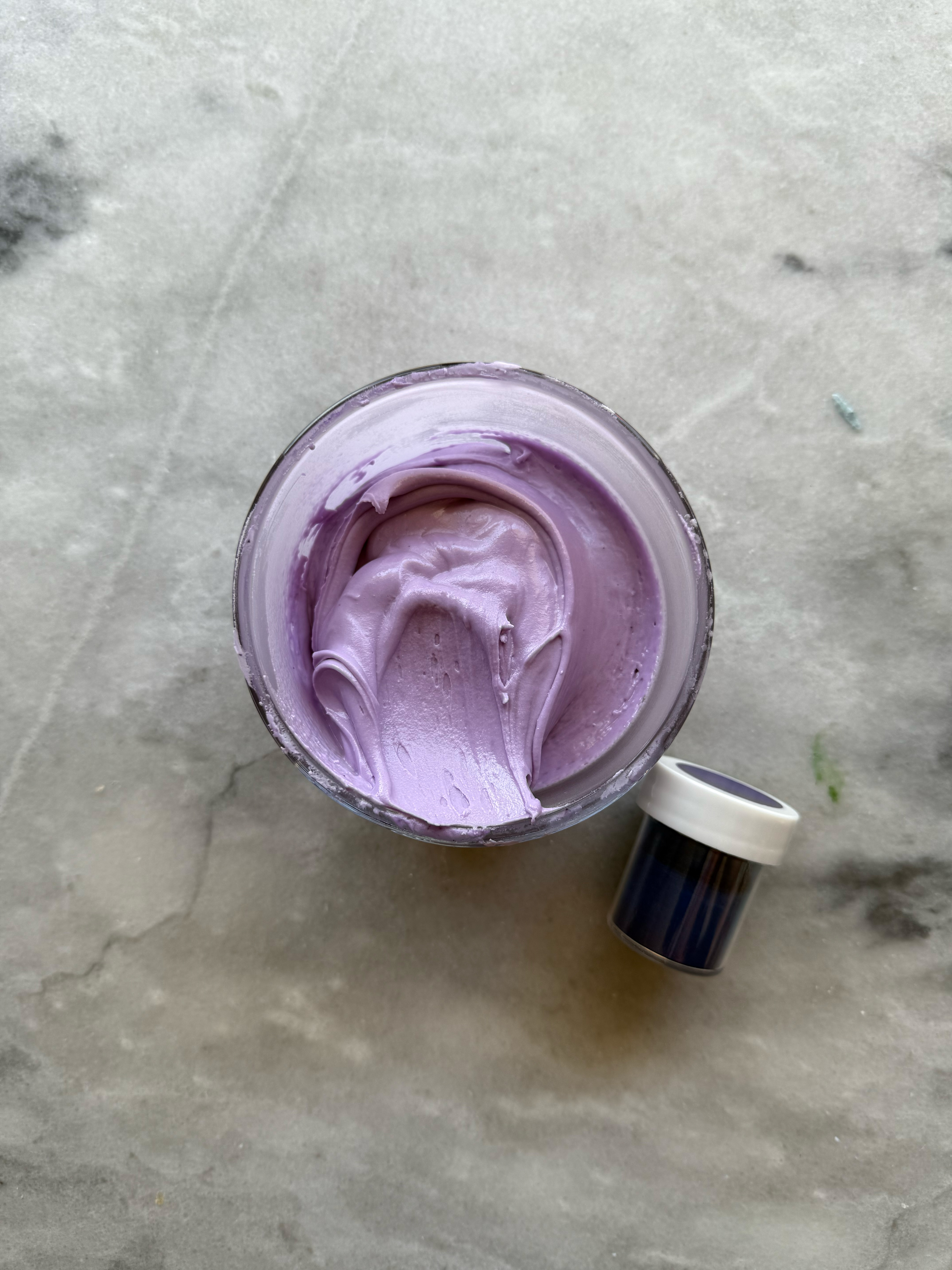
– violet
My favorite of the purples, violet is a stunning simple purple shade. It is the deepest shade of the purples.
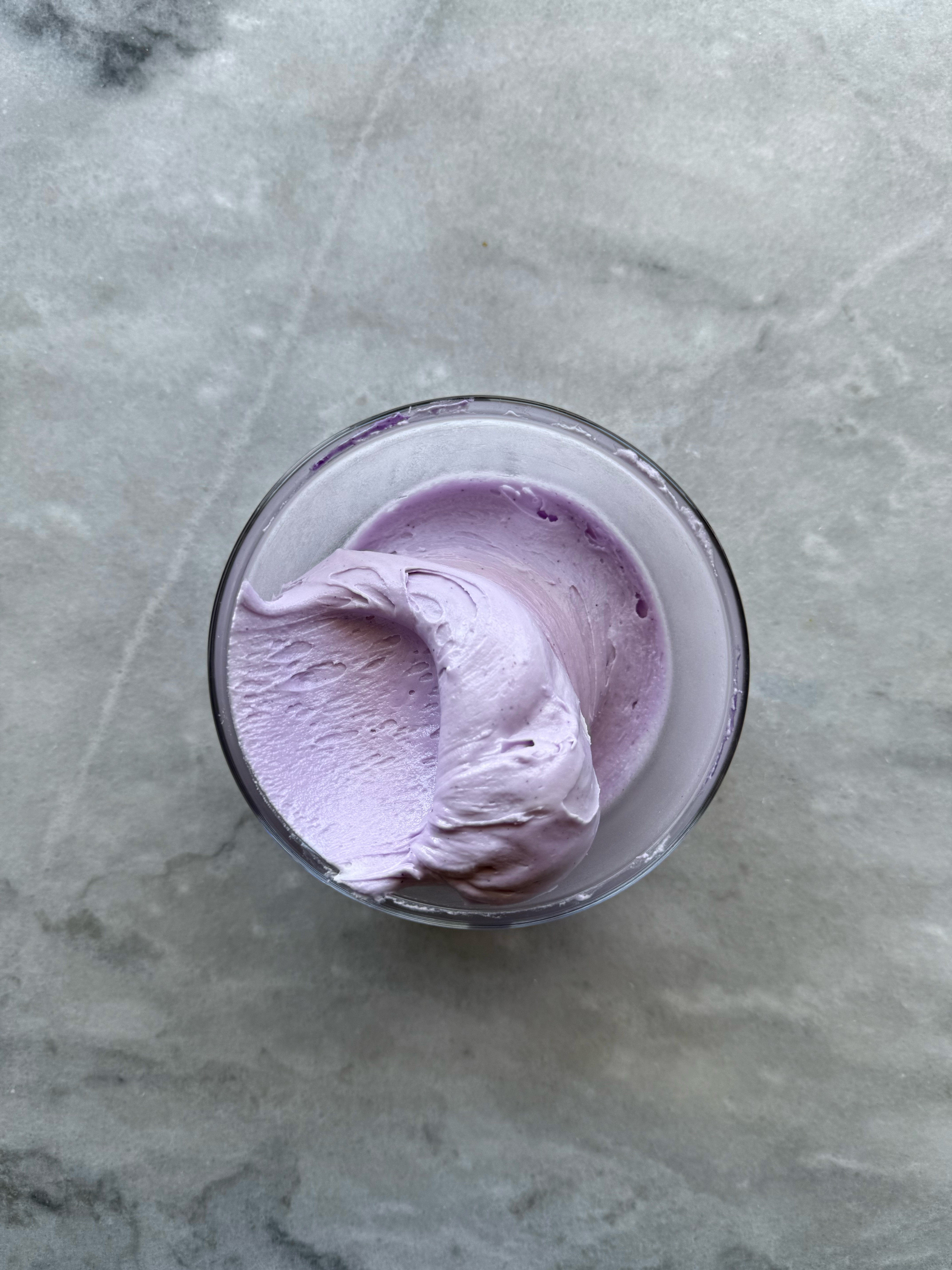
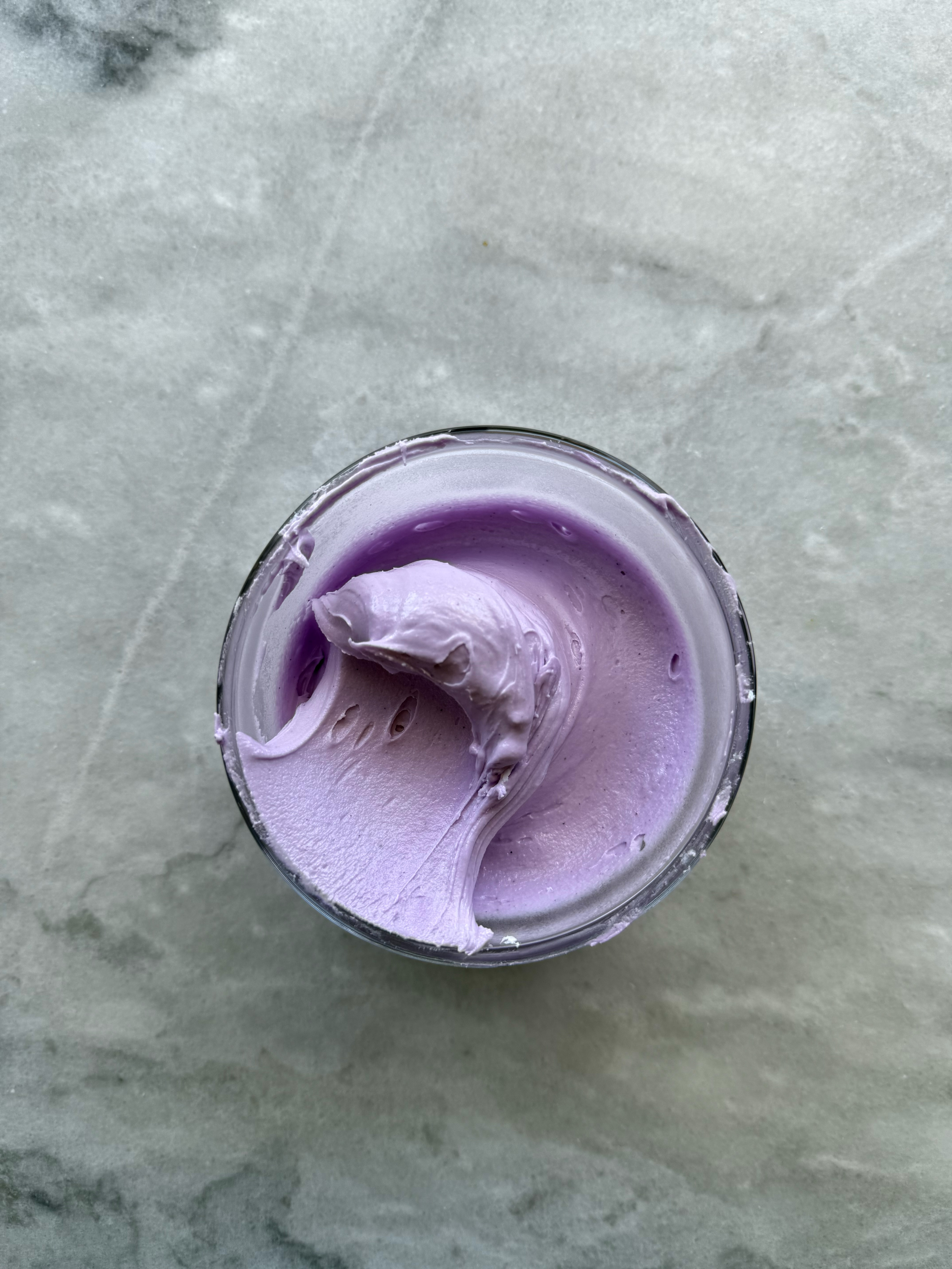
violet after developing 24 hrs, unmixed and mixed
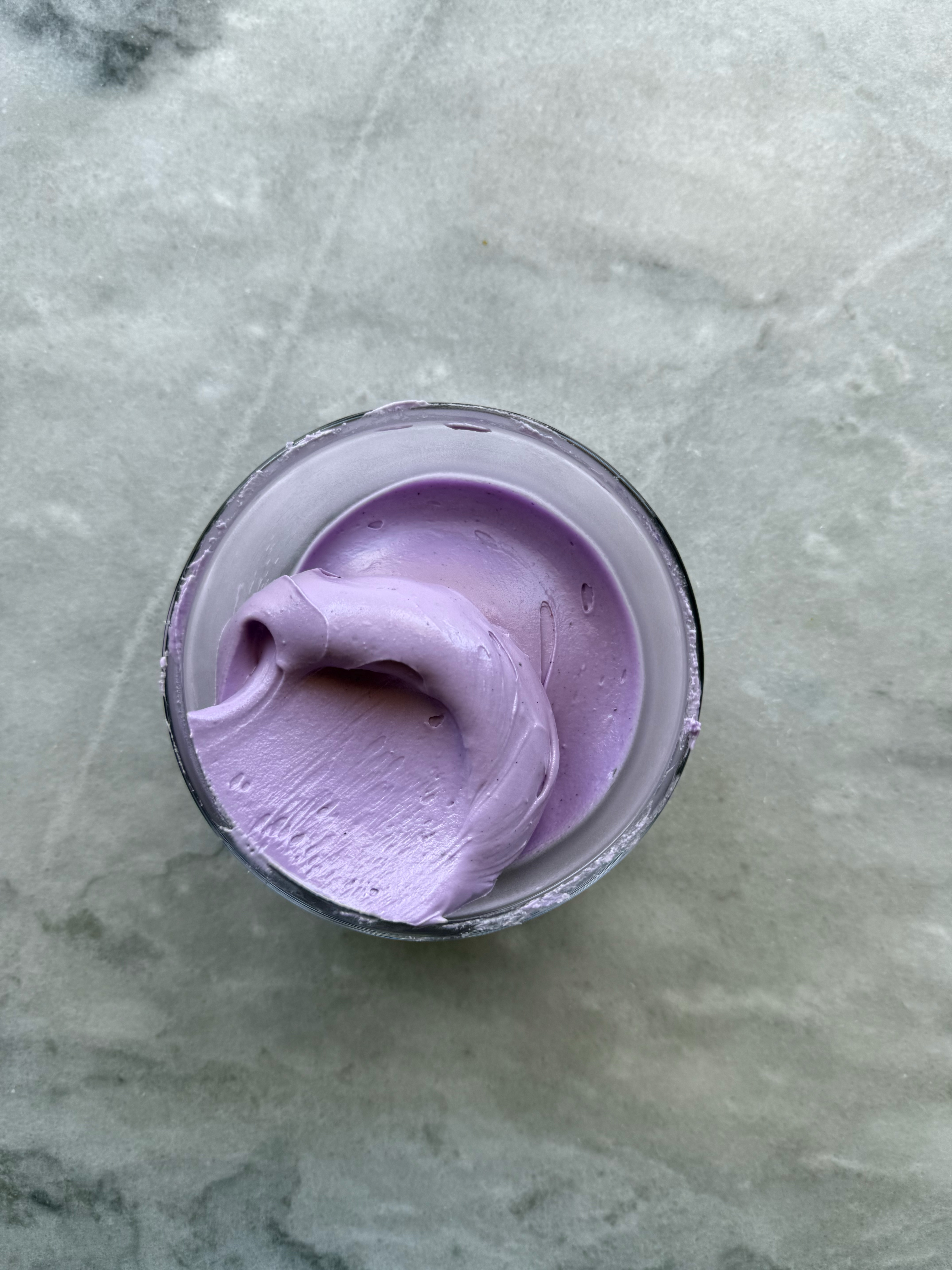
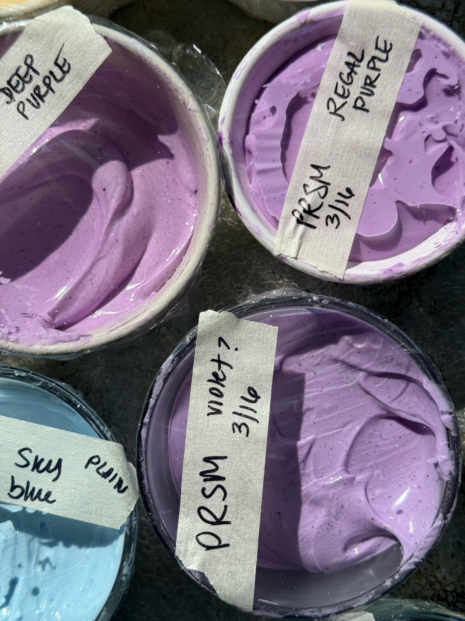
– regal purple
This purple is a little more warm, as it has a little more pinky/red in it.
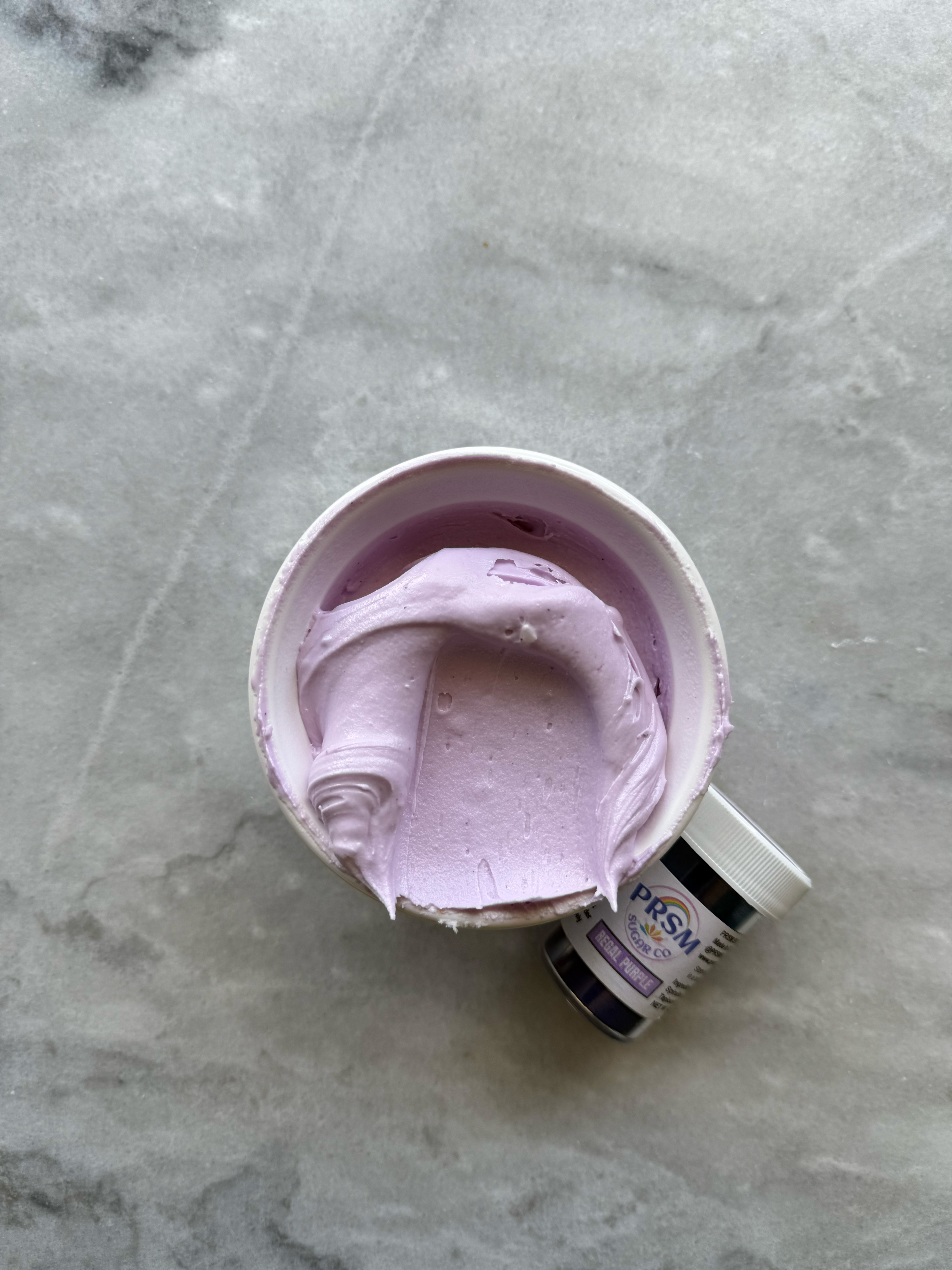
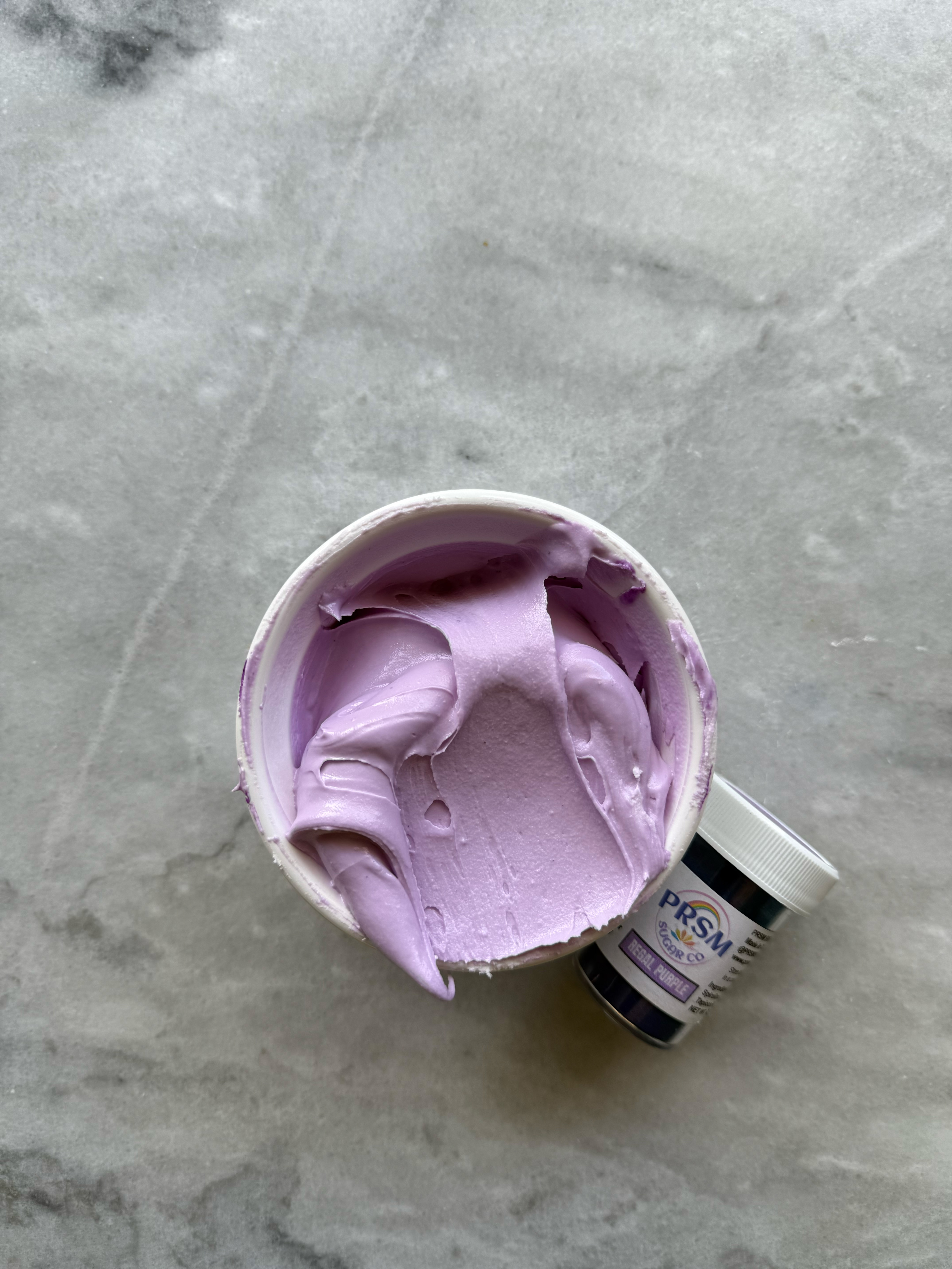
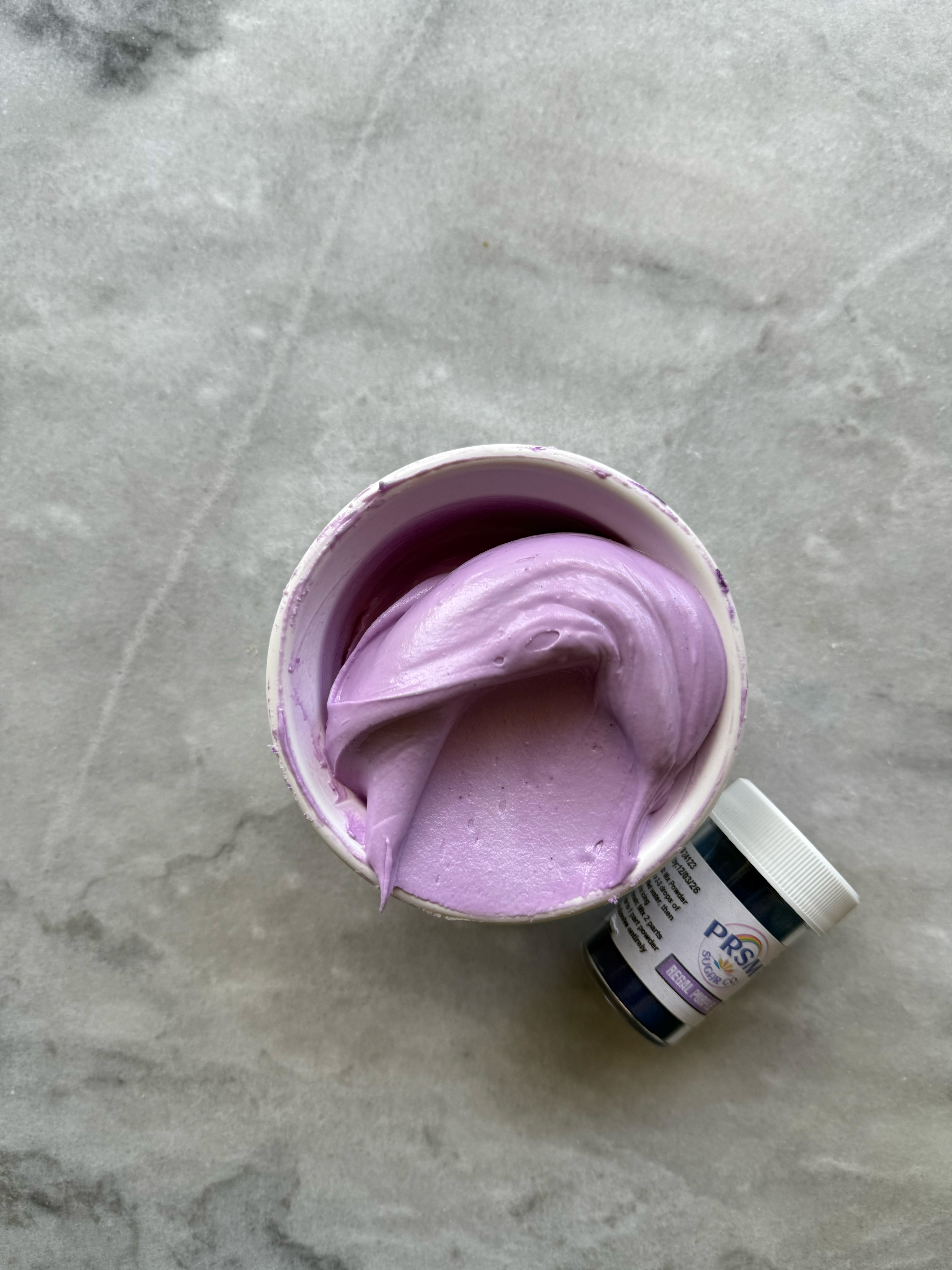
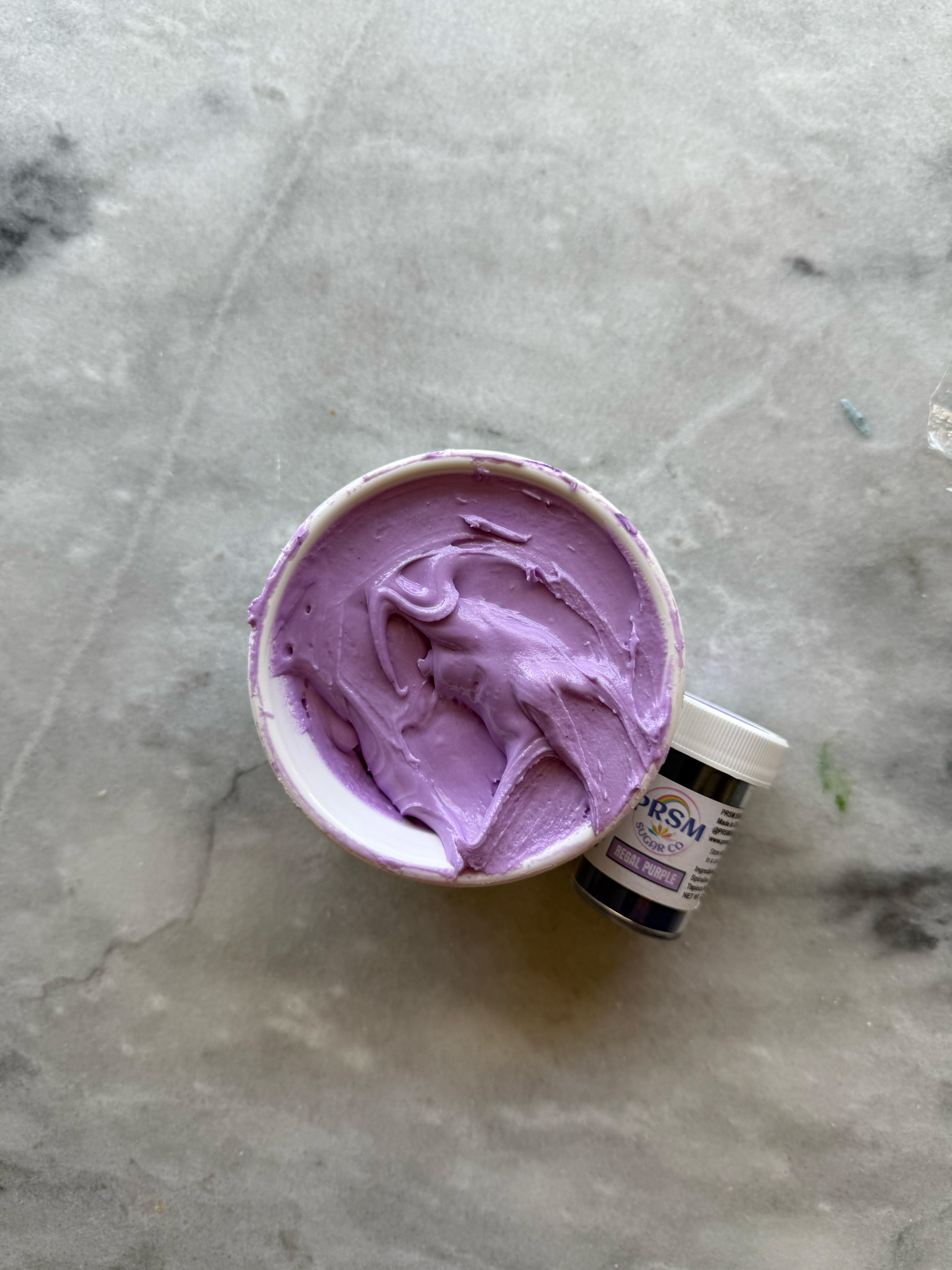
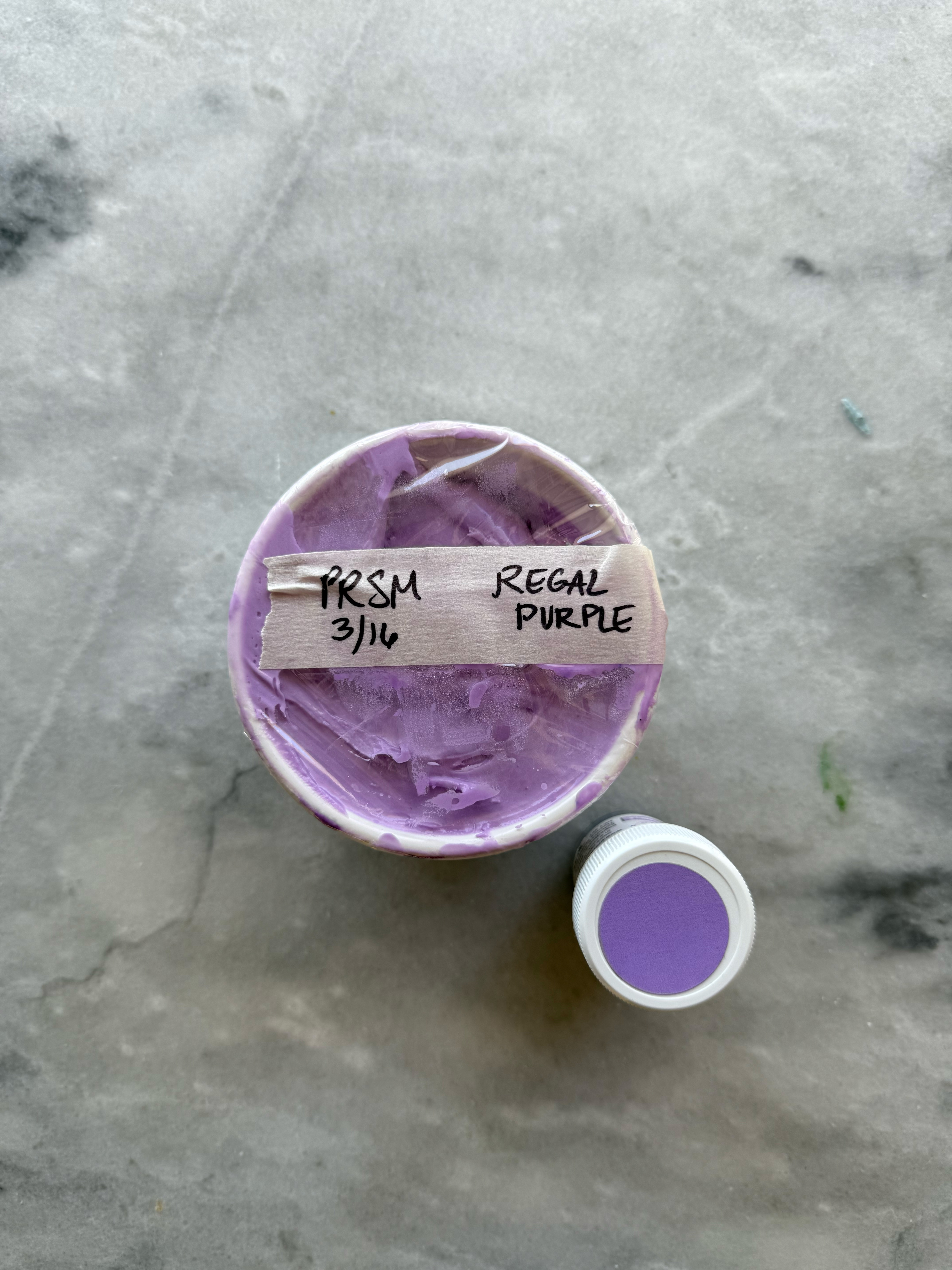
regal purple after developing 24 hrs
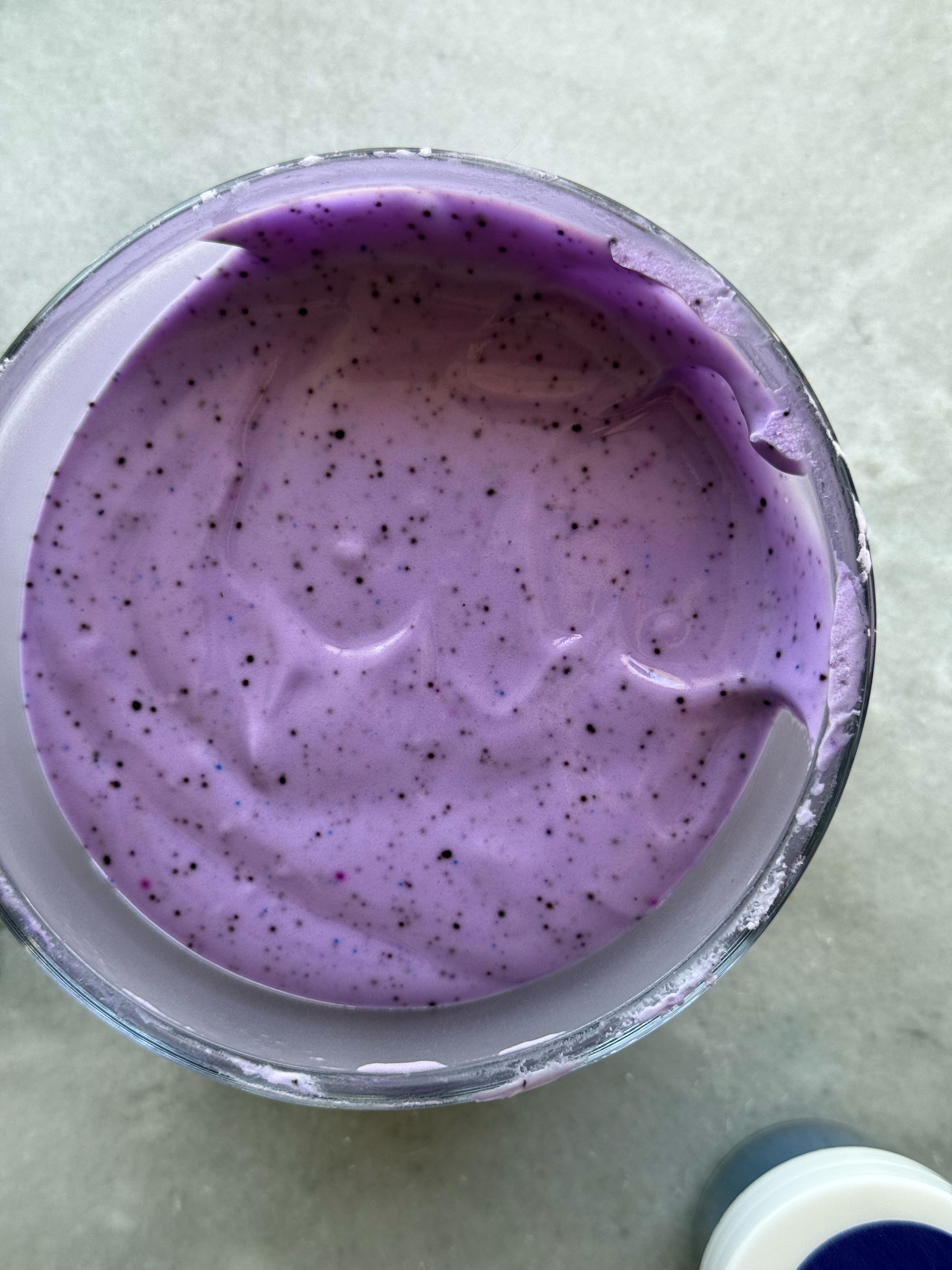
– deep purple
This purple is very pretty, although similar to regal purple.
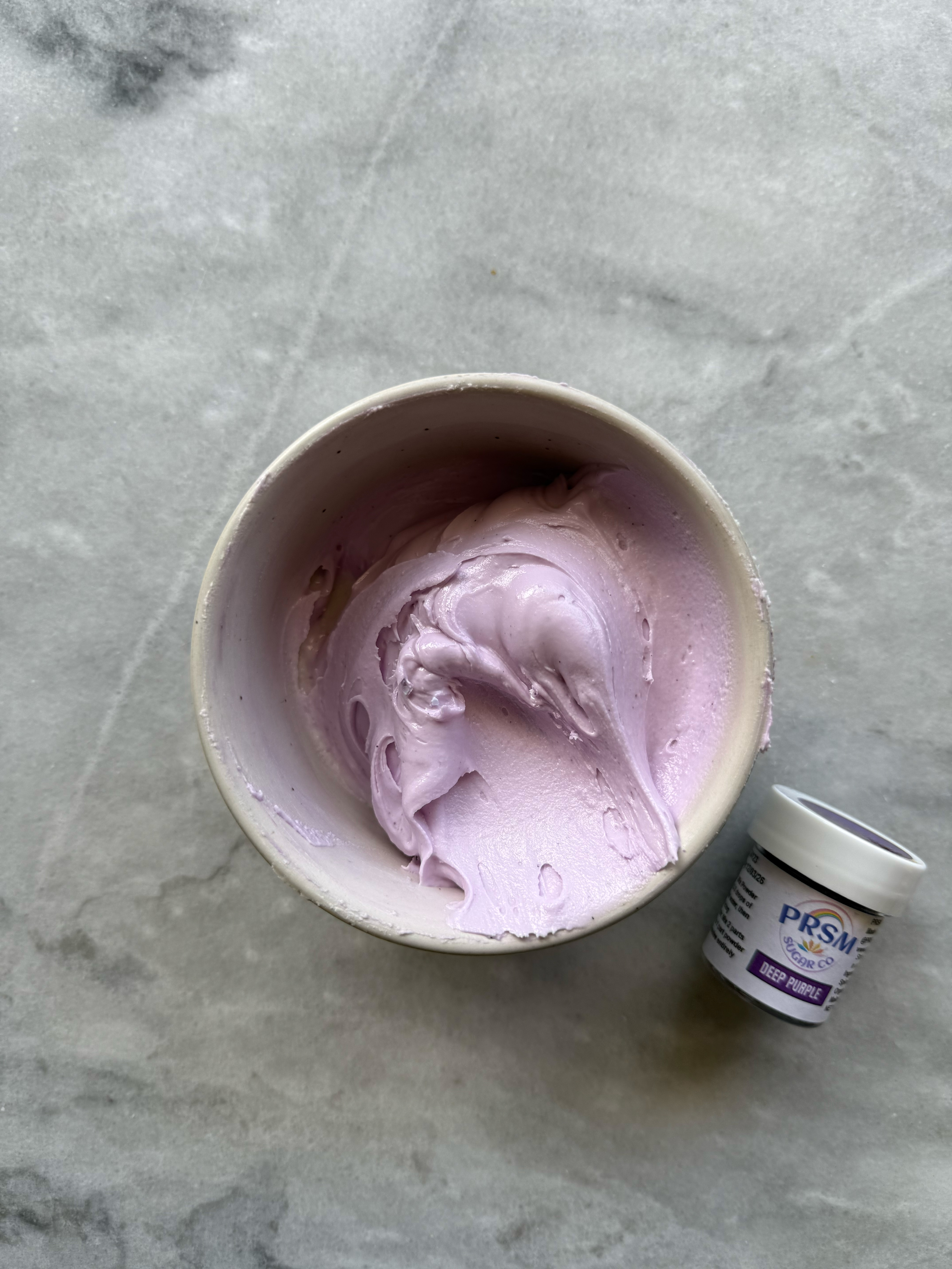
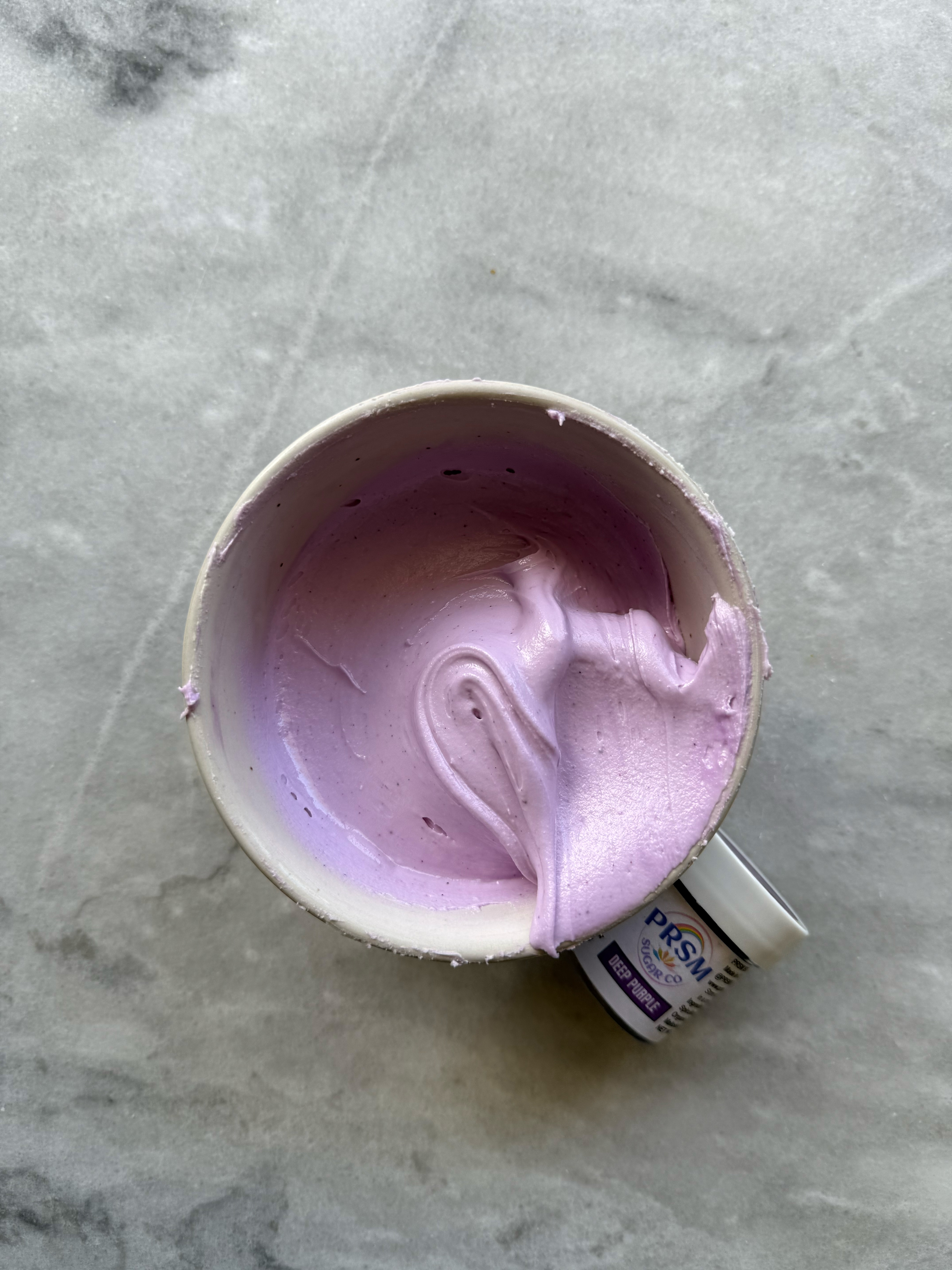
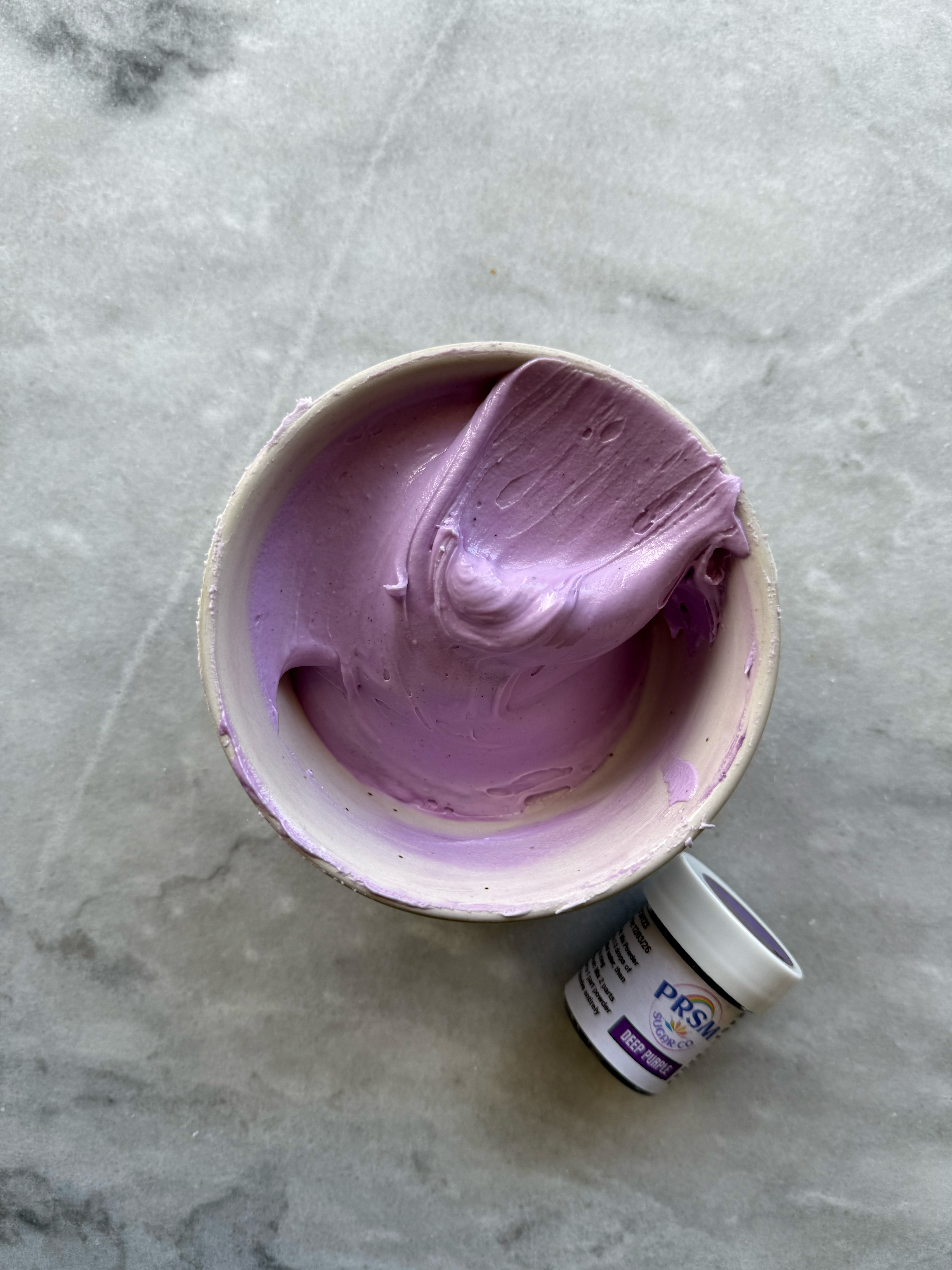
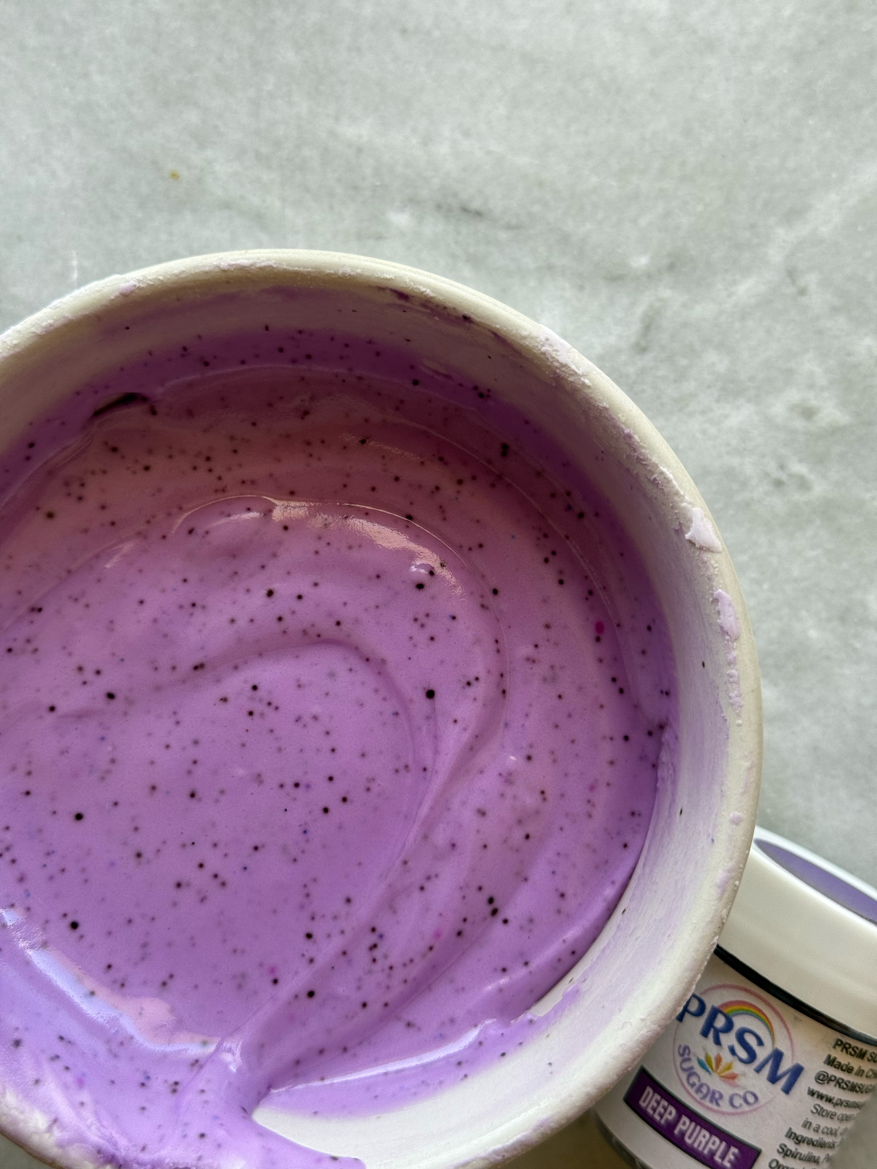
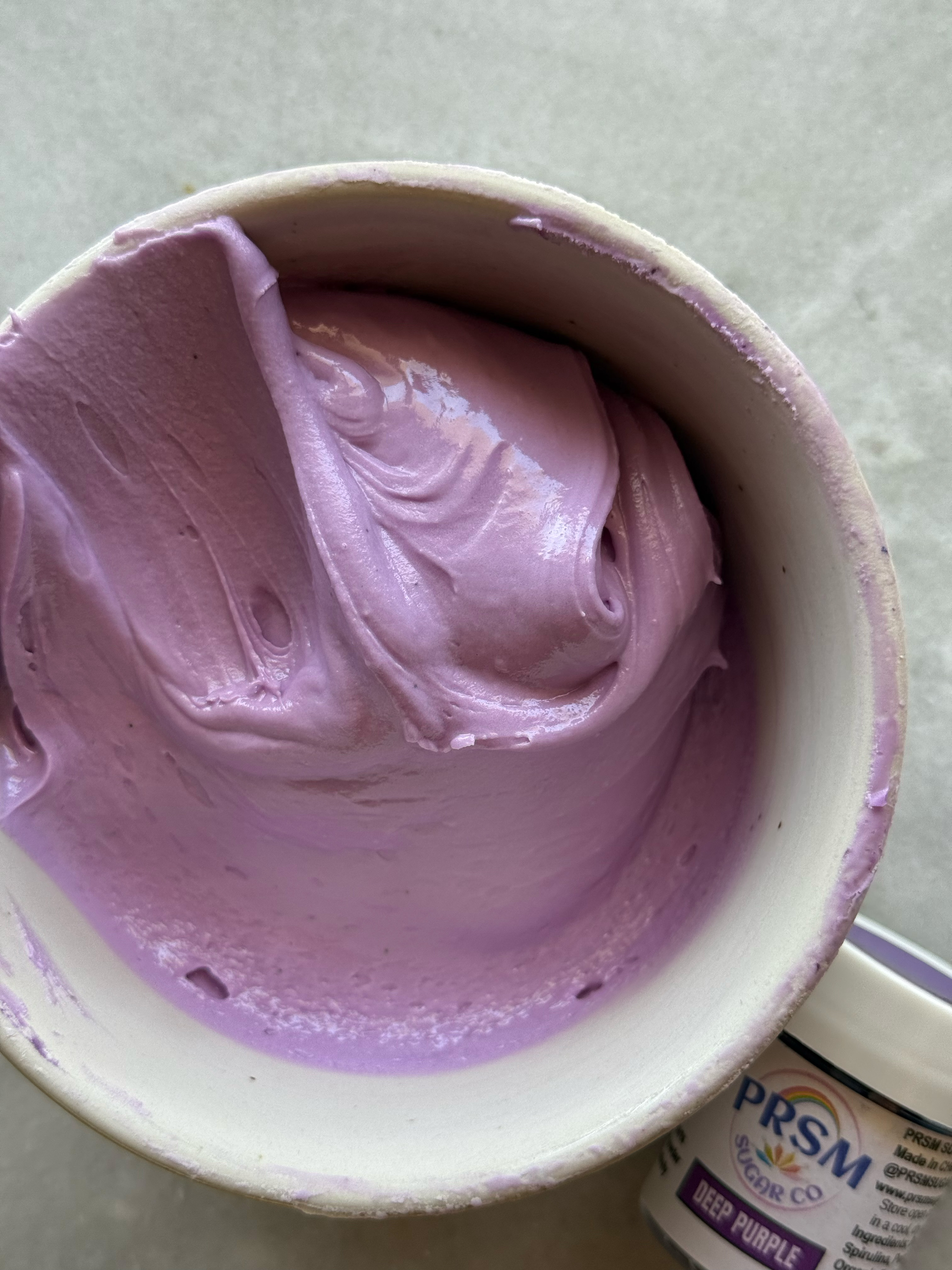
deep purple after developing 24 hrs, unmixed and mixed
comparison of the purples:
– fuchsia
This pink gets pretty deep, and it is very fuchsia, which is a purple-pink. More cool-toned than the reds.
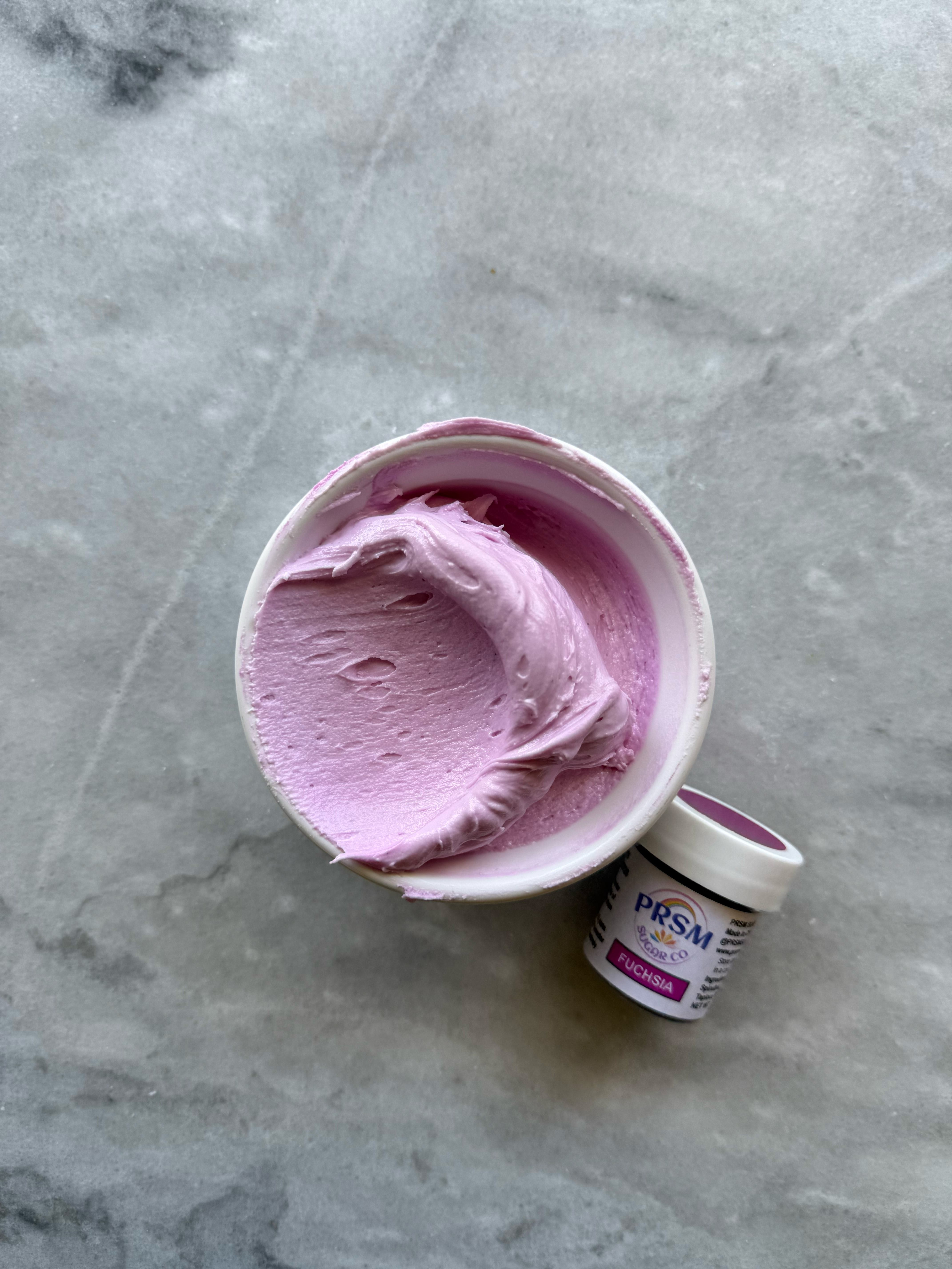
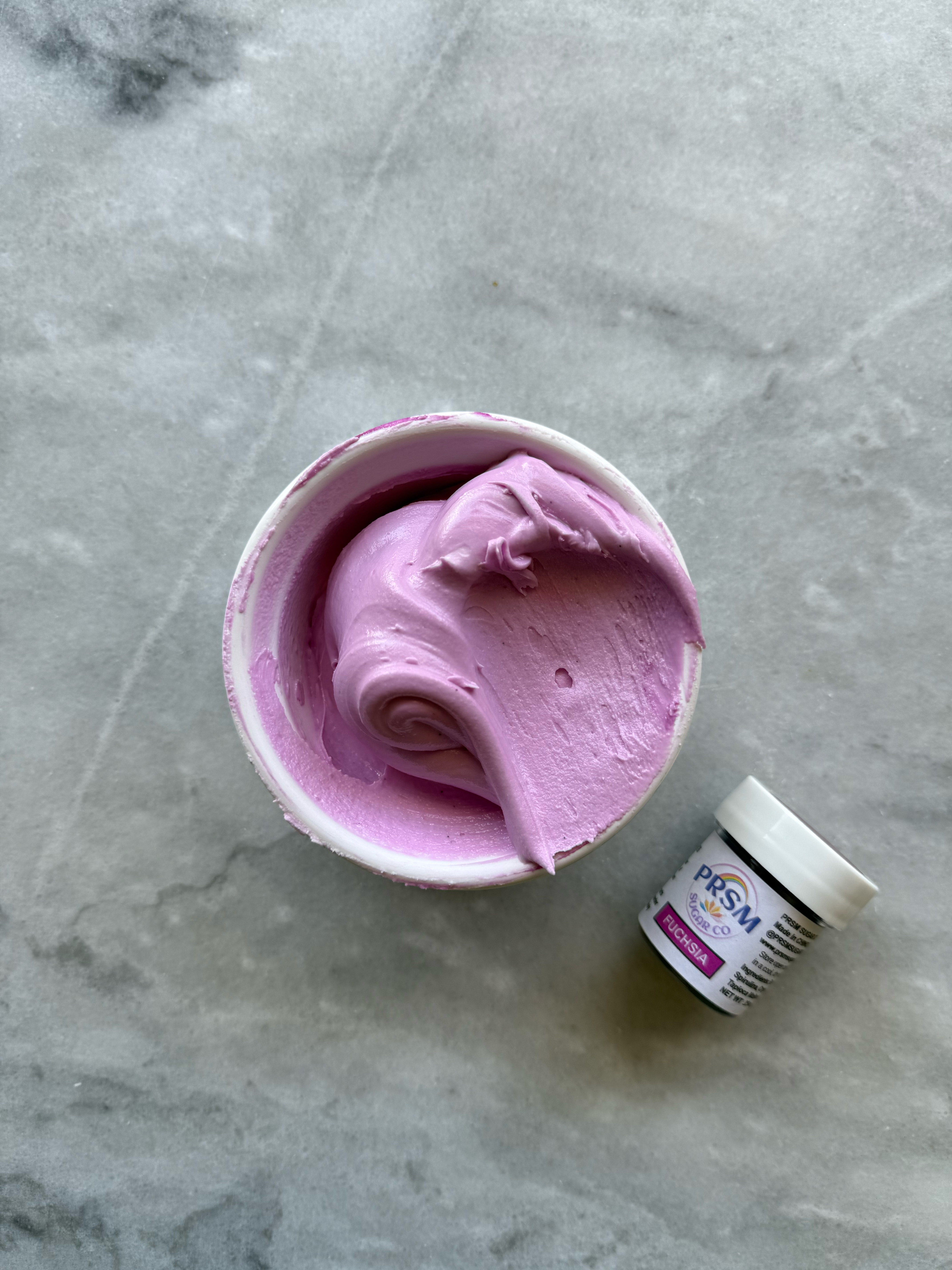
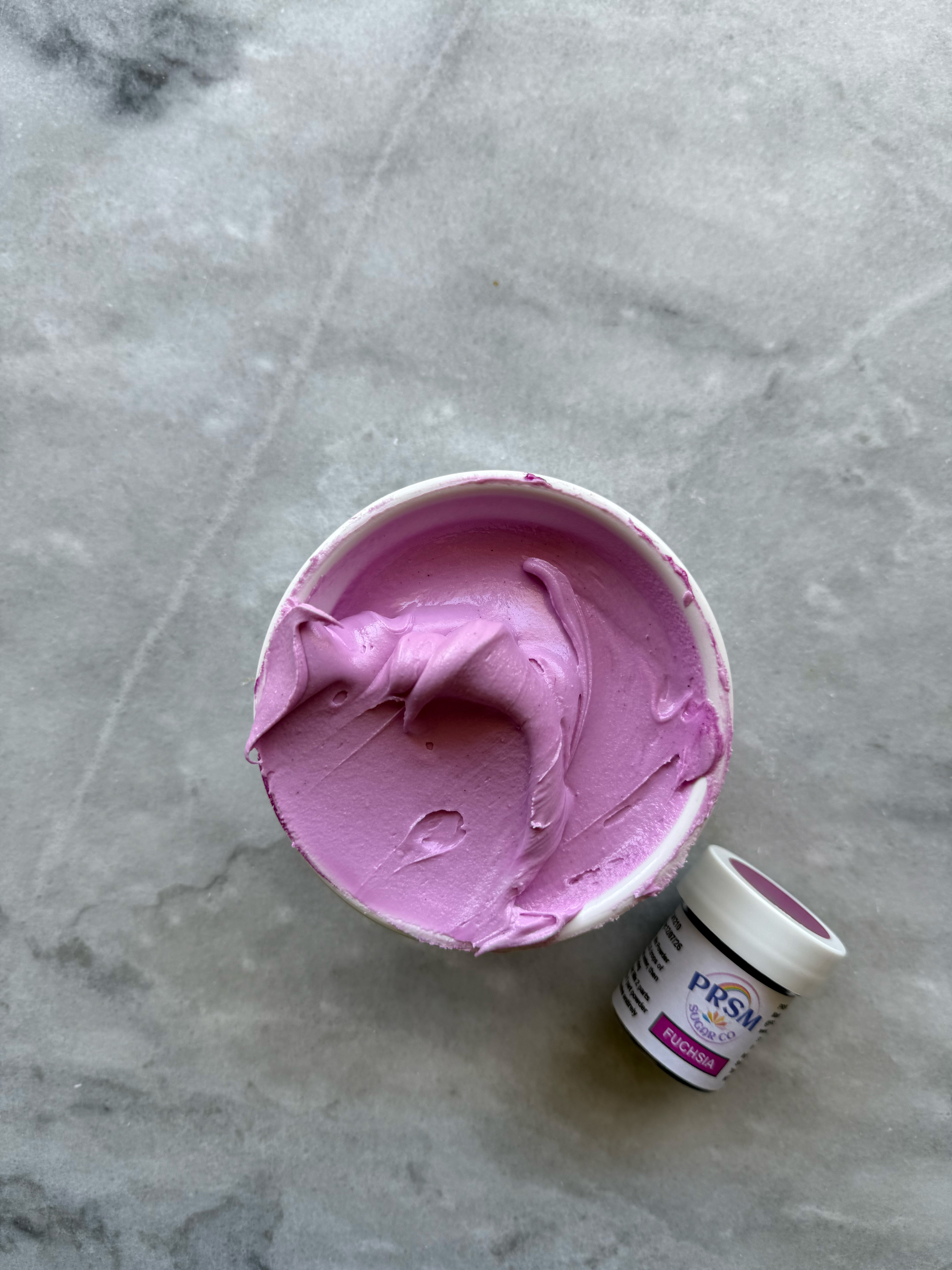
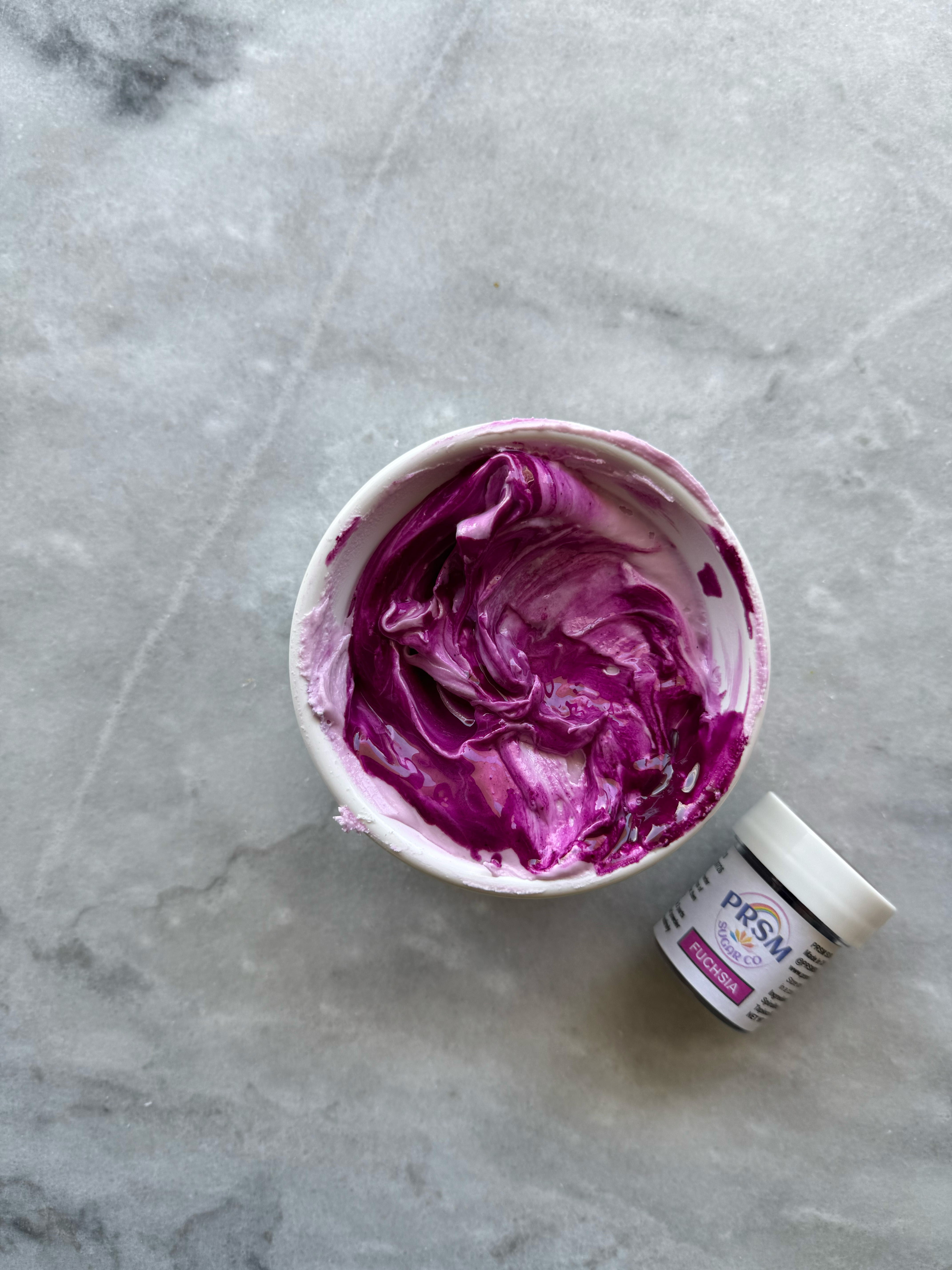
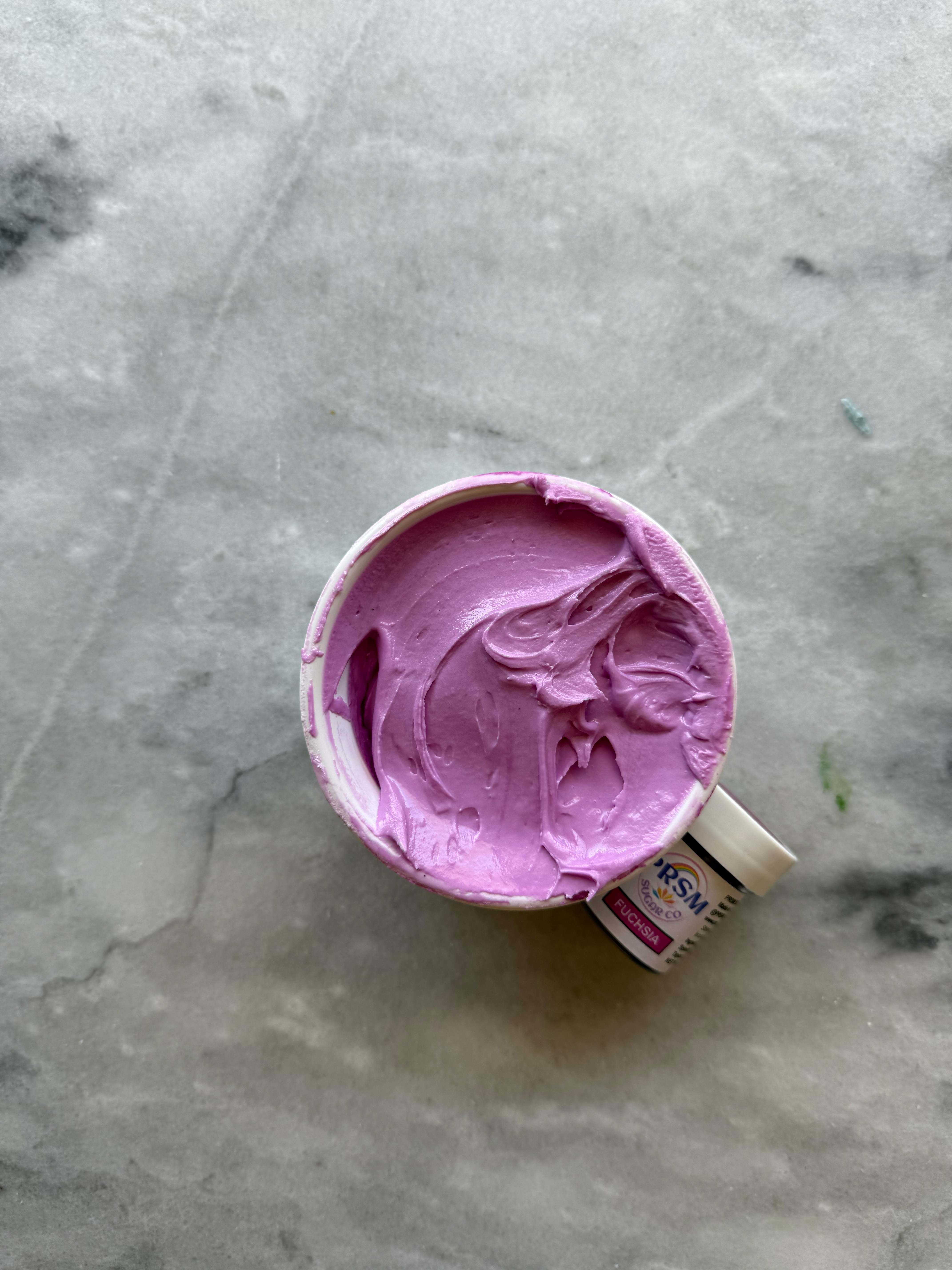
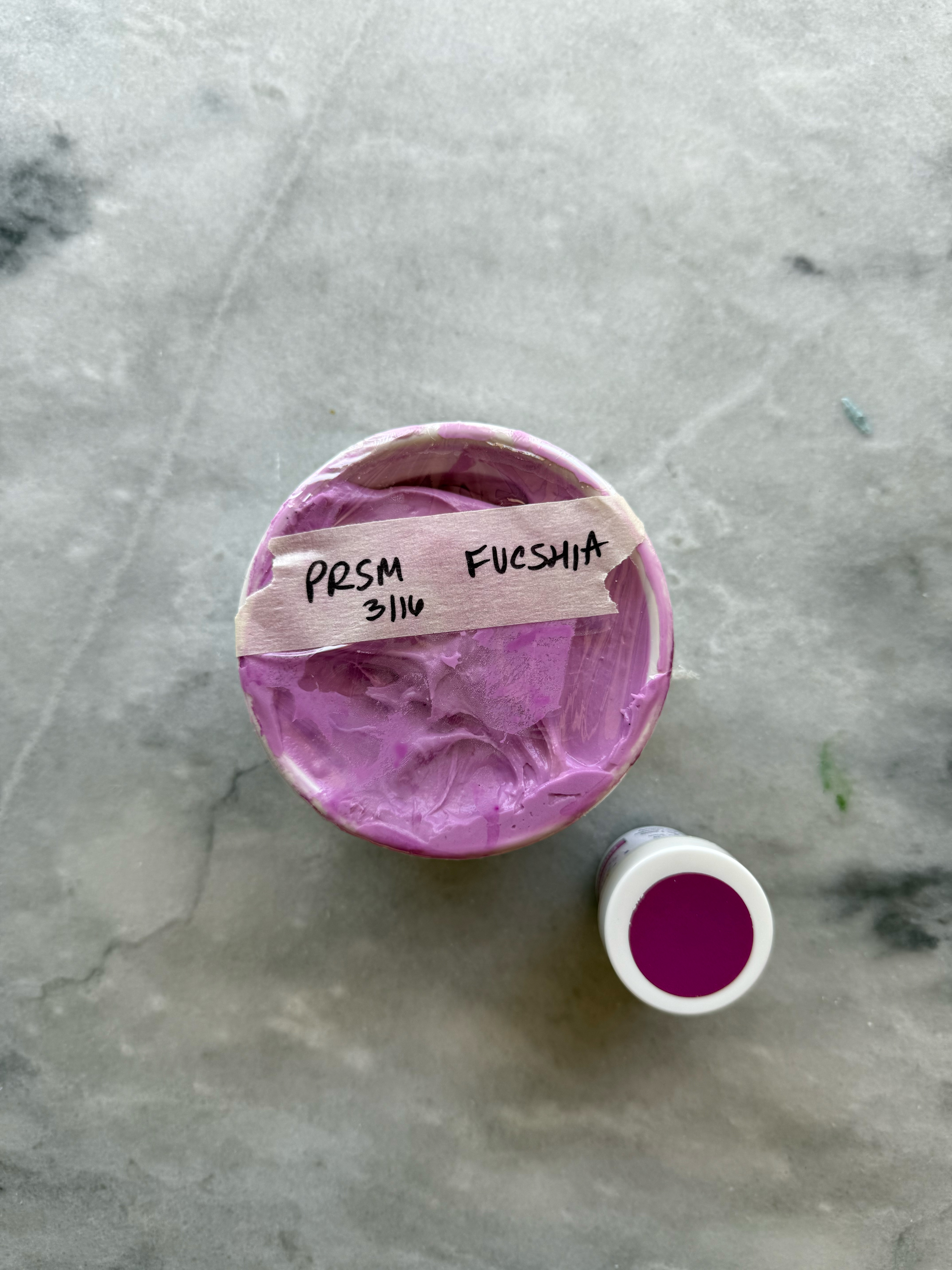
fuchsia after developing 24 hrs
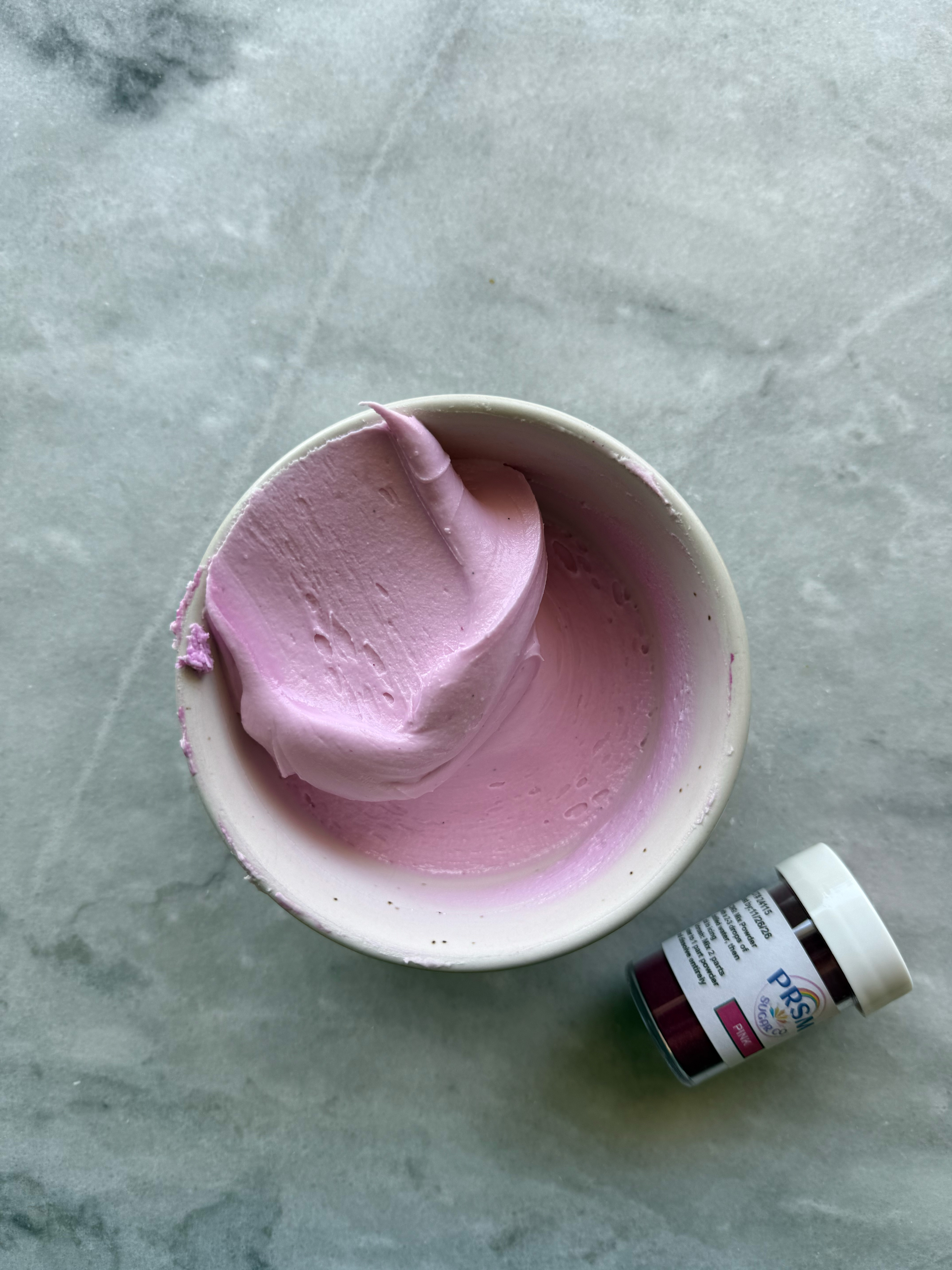
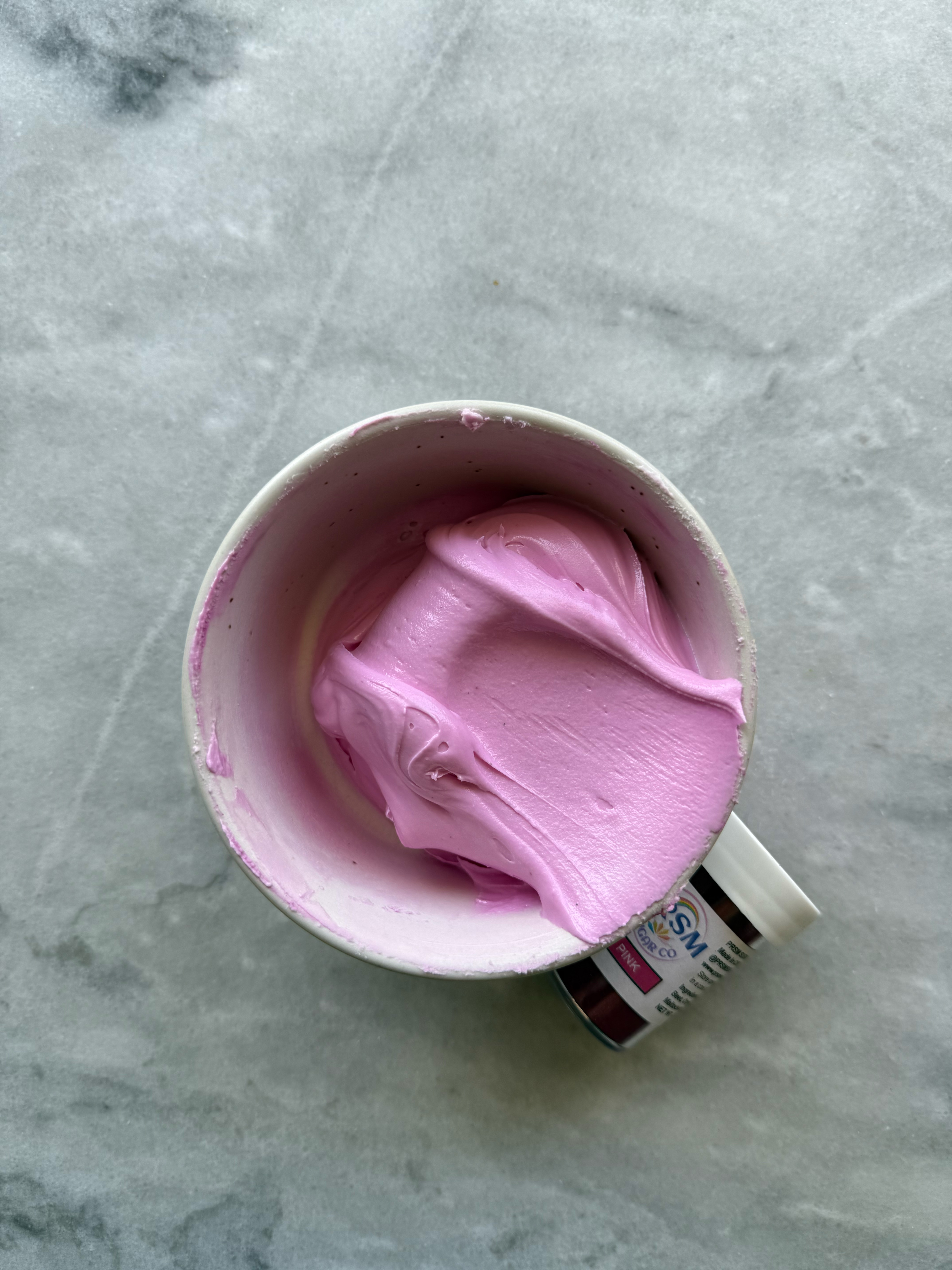
– pink
Classic bubblegum pink. More cool-toned than the reds.
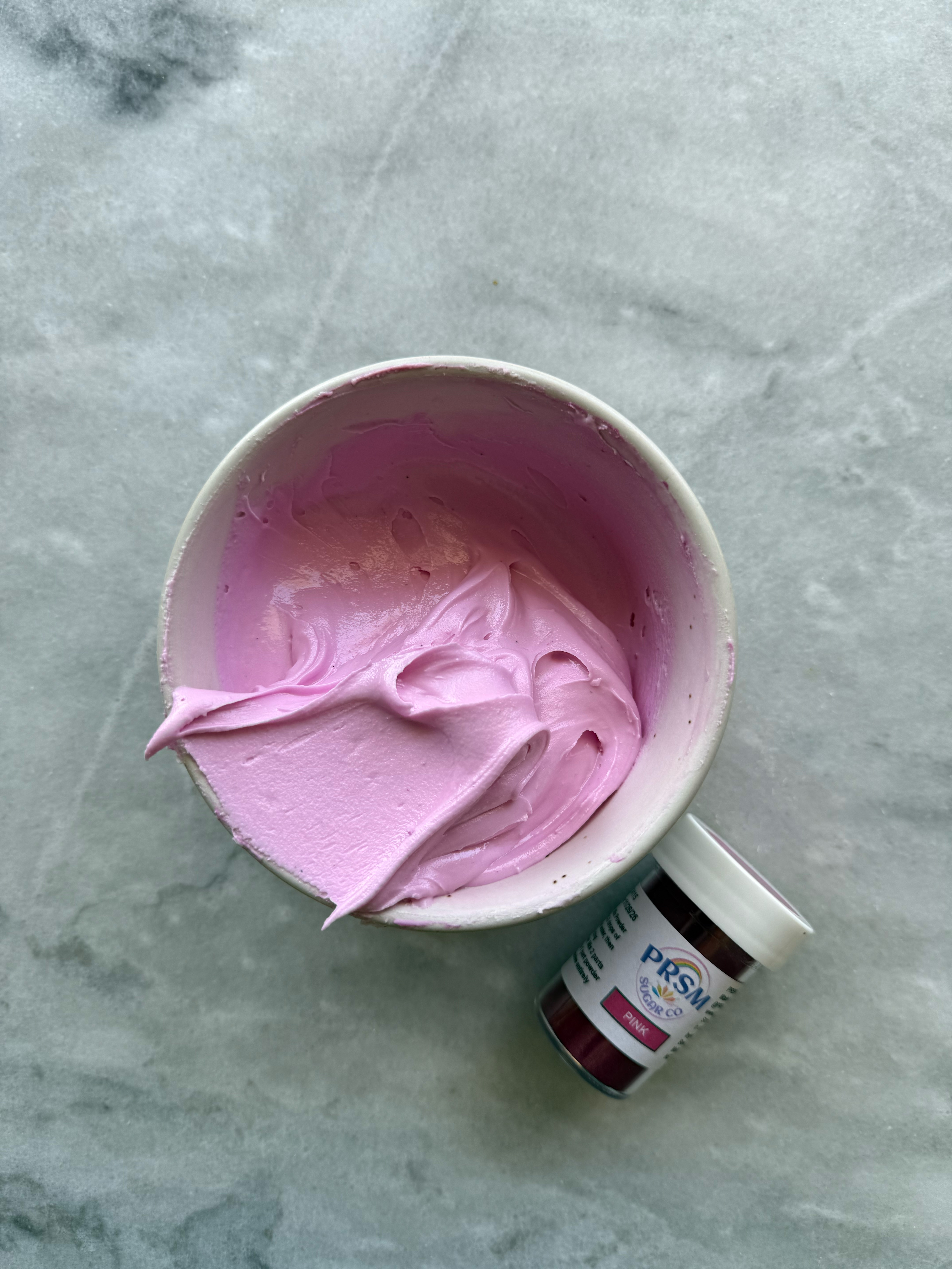
pink after developing 24 hrs
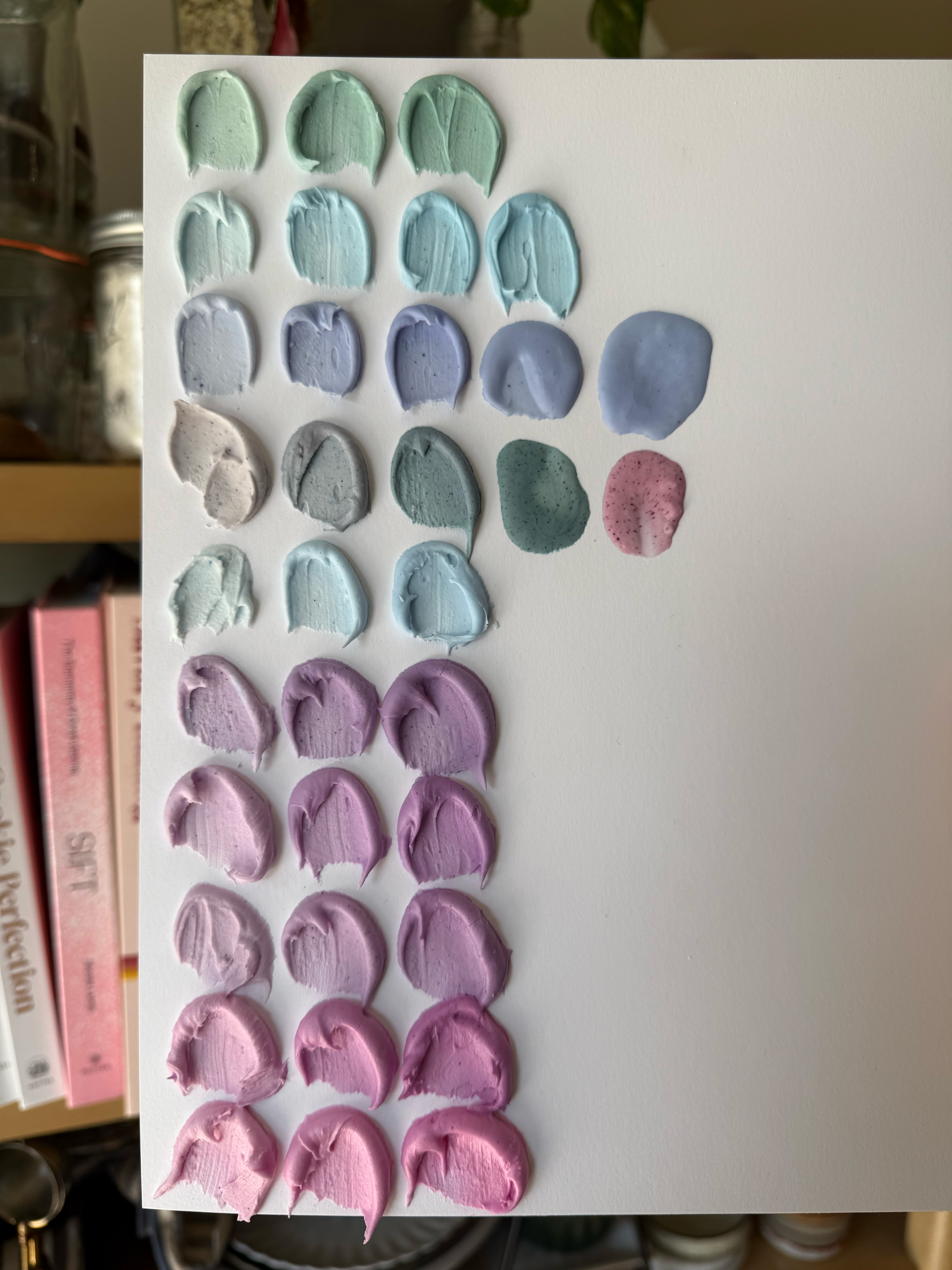
green turquoise, blue turquoise, royal blue, blue, sky blue, violet, regal purple, deep purple, fuchsia, pink
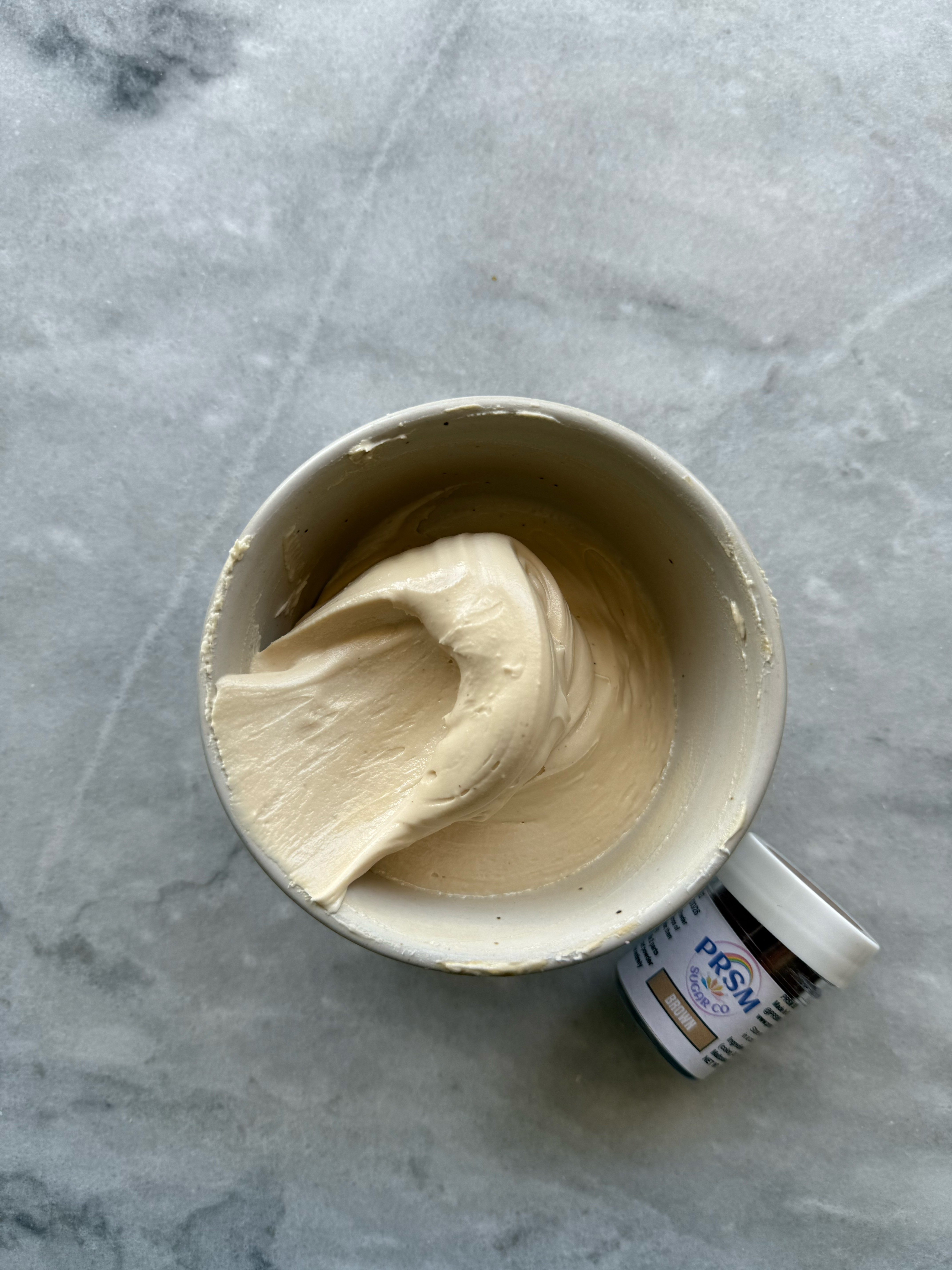
– brown
This is such a pretty, warm-toned beige. I usually achieve this color with Americolor ivory and taupe.
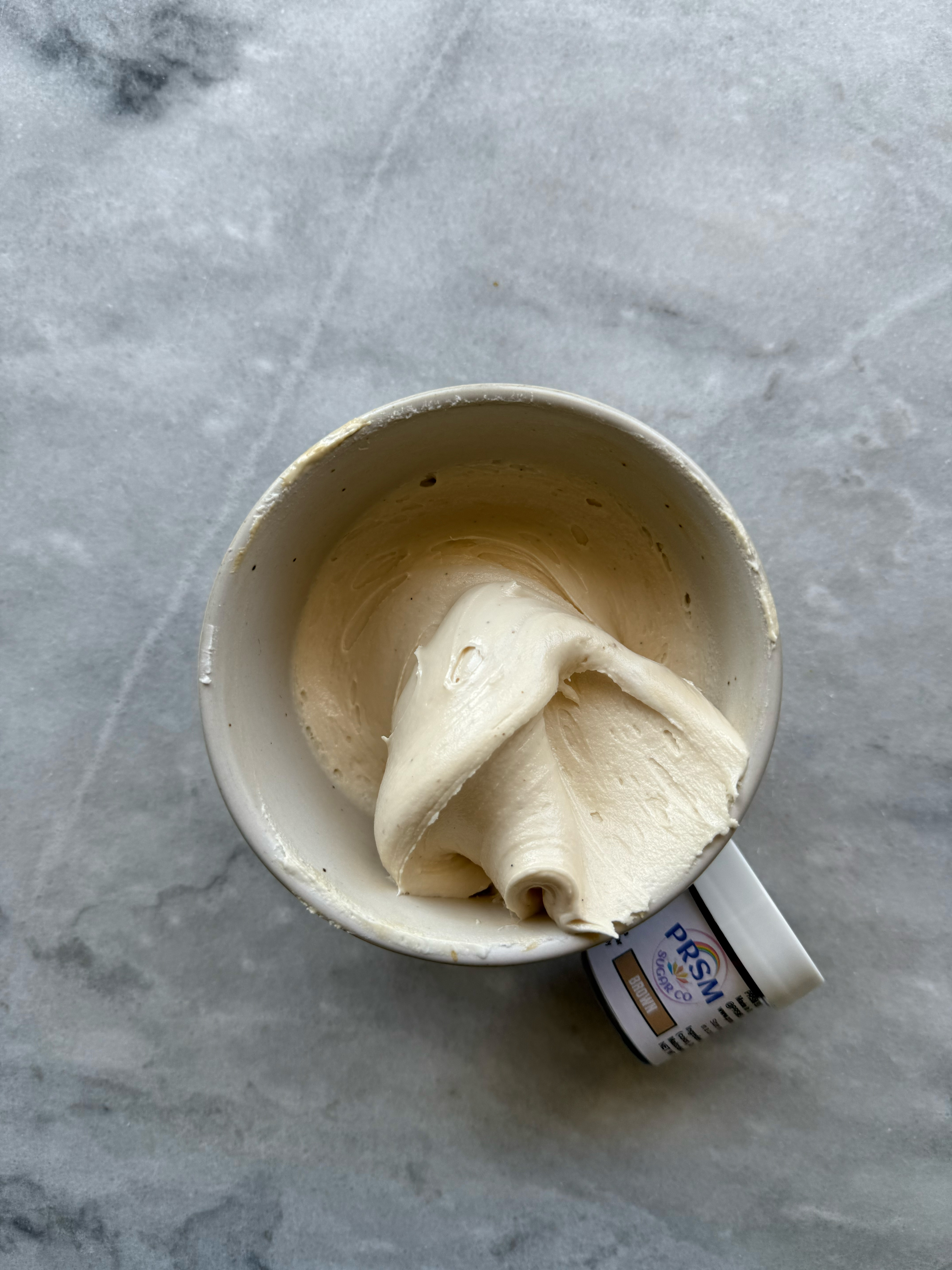
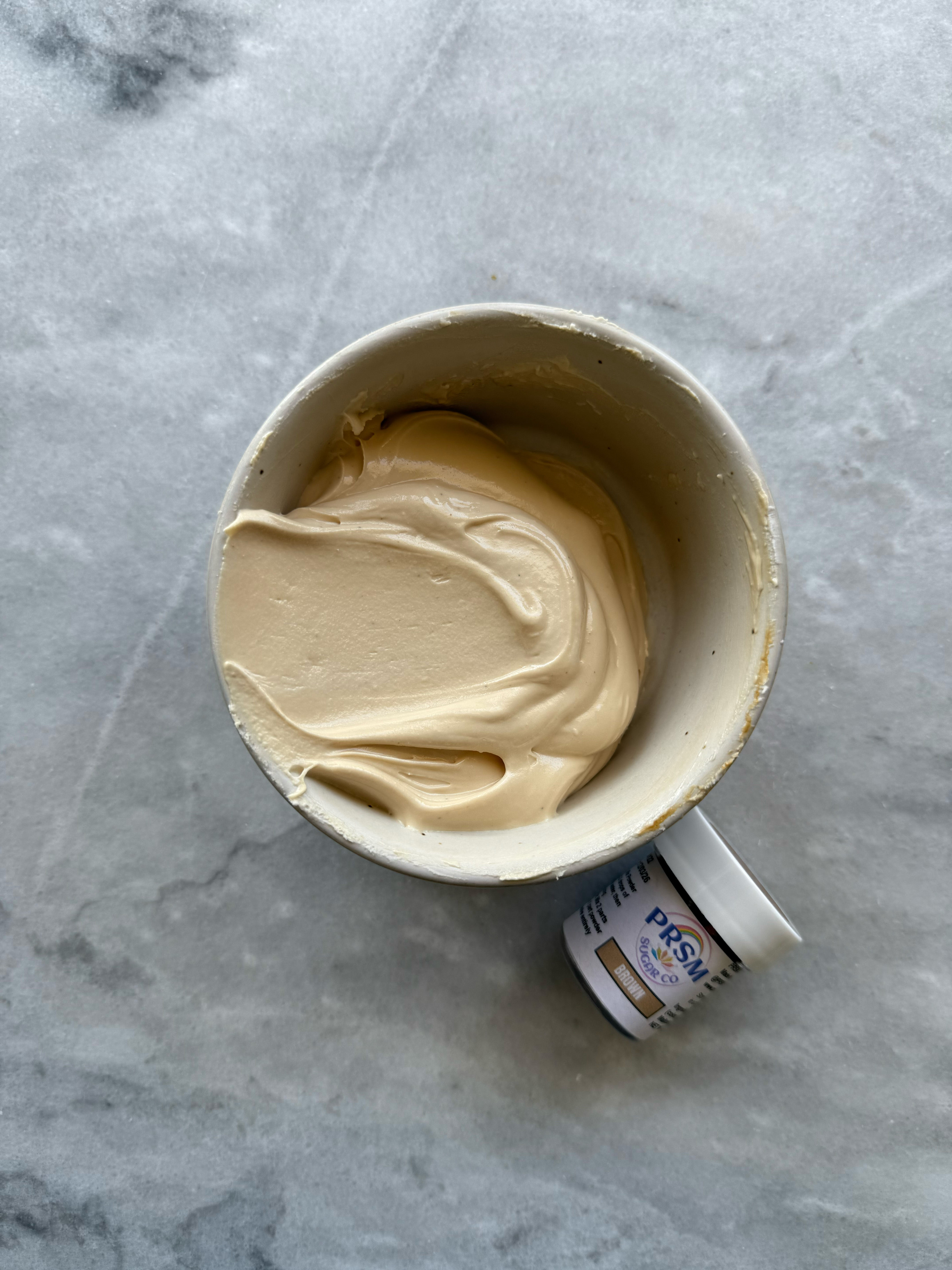
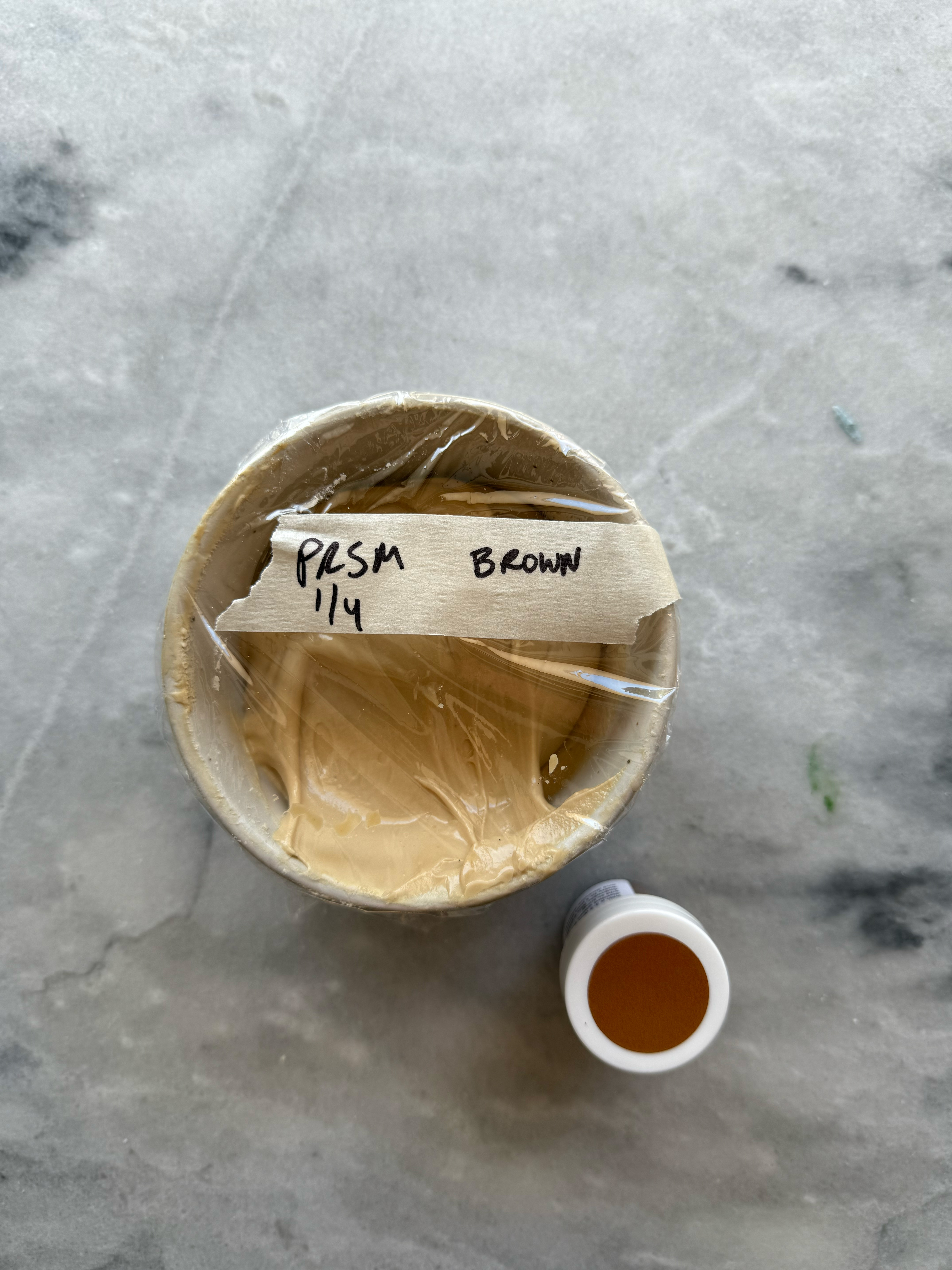
brown after developing 24 hrs
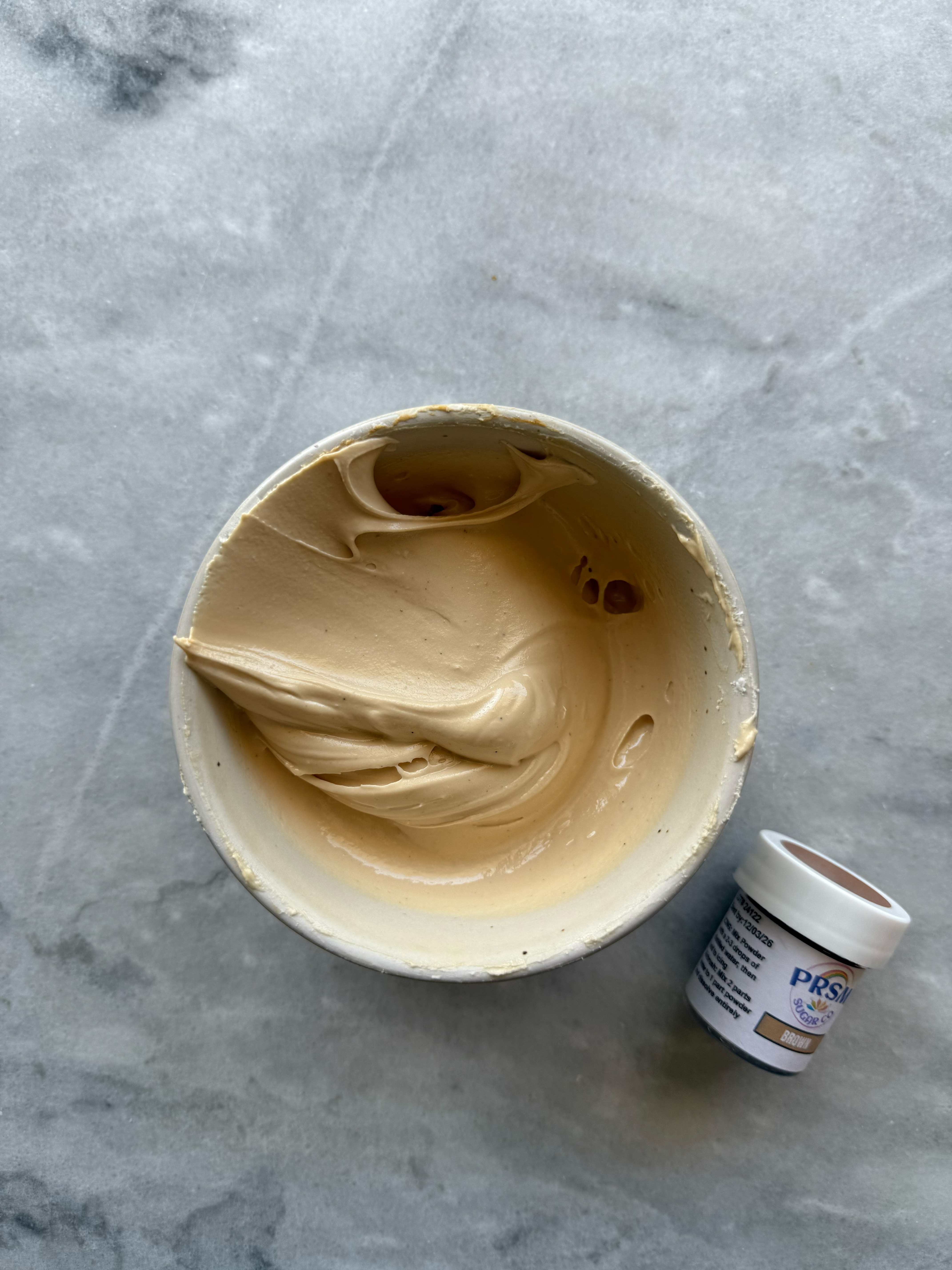
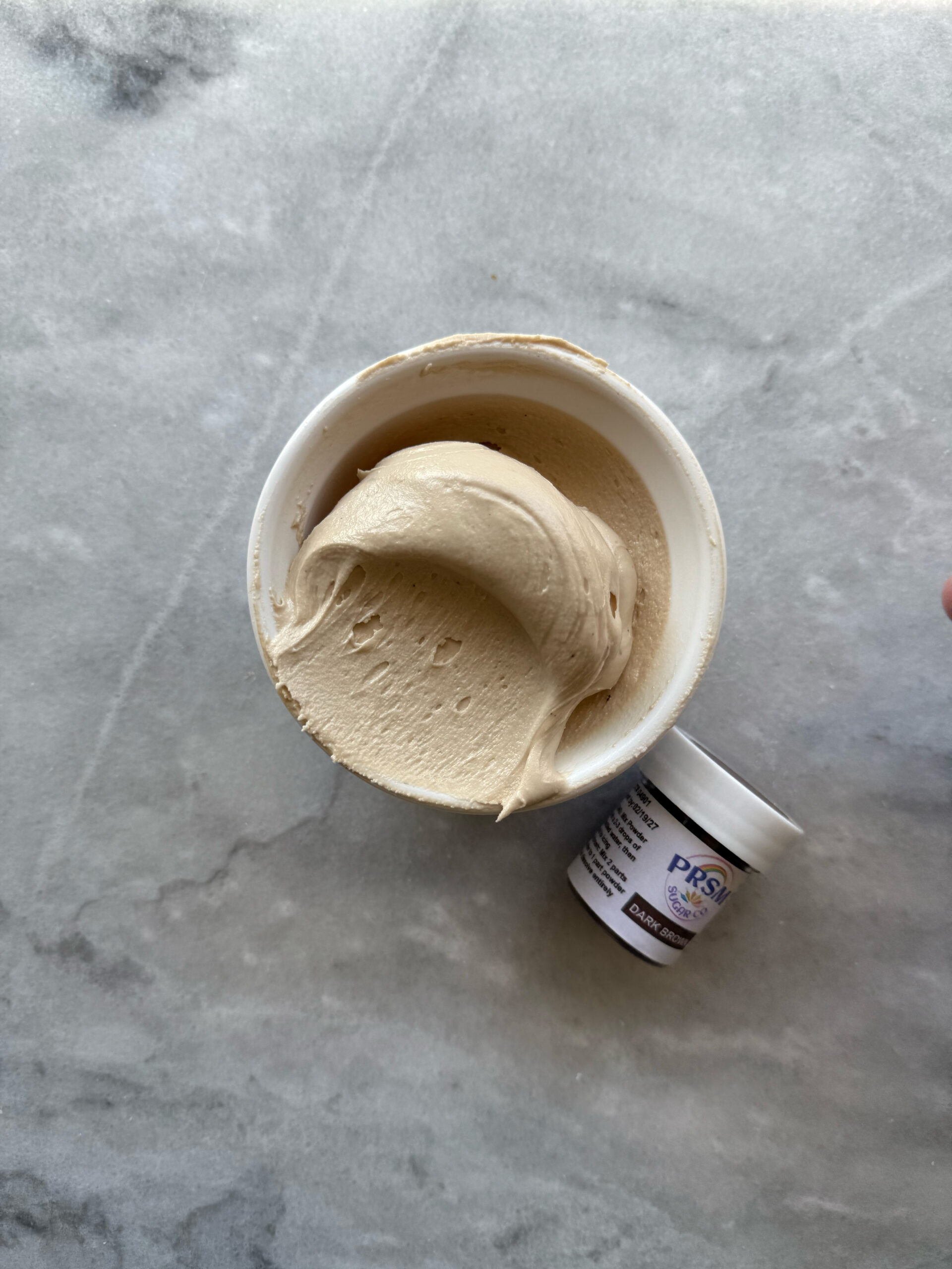
– dark brown
This shade of brown is so similar to a coffee ice cream. It’s beautiful.
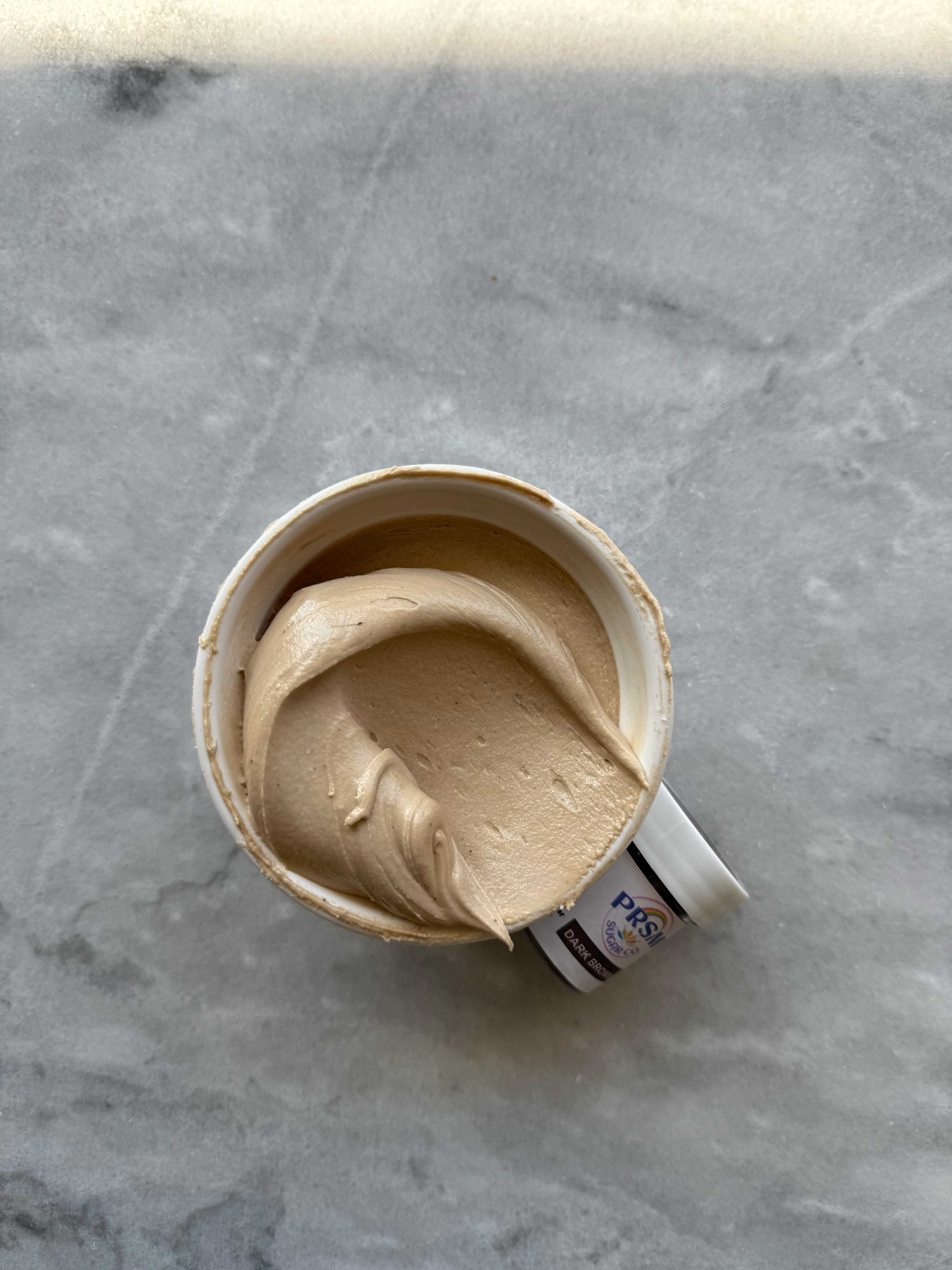
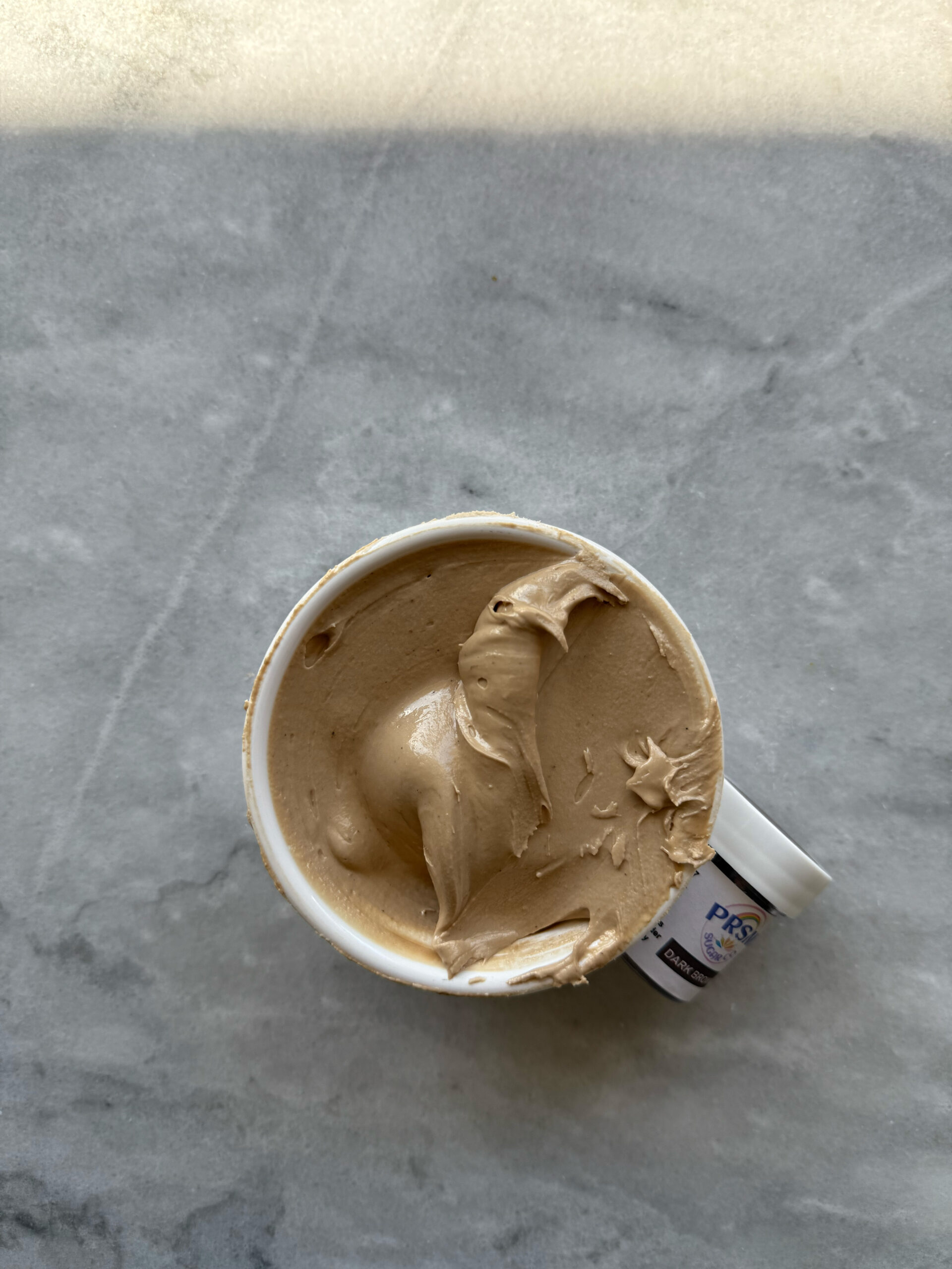
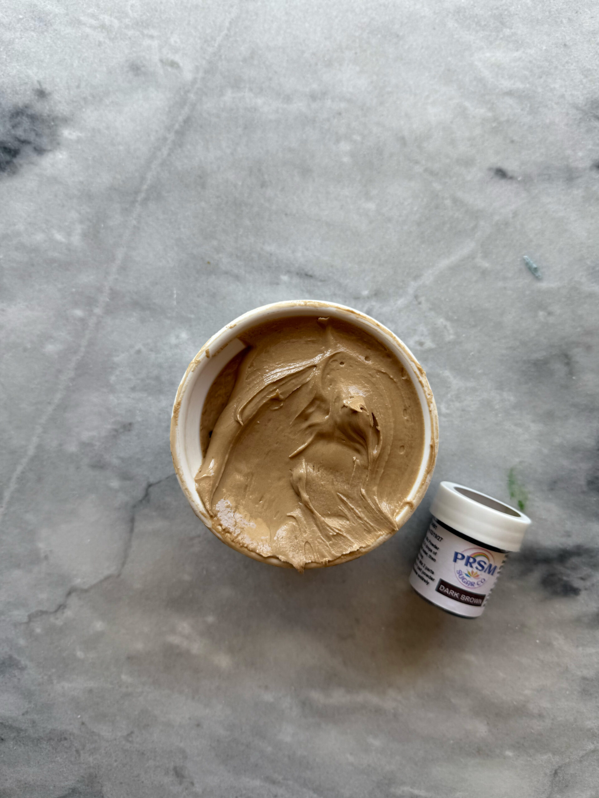
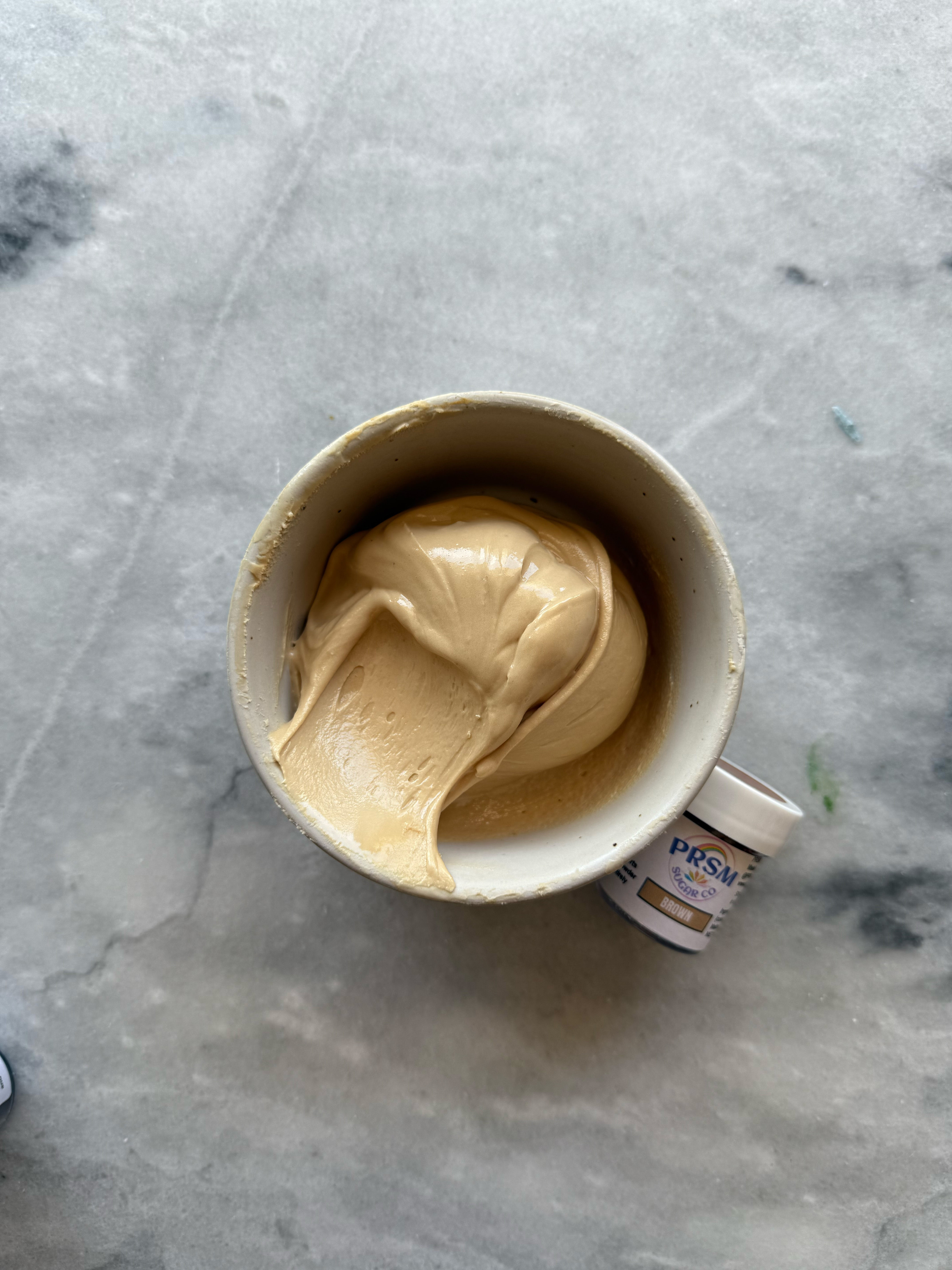
dark brown after developing 24 hrs
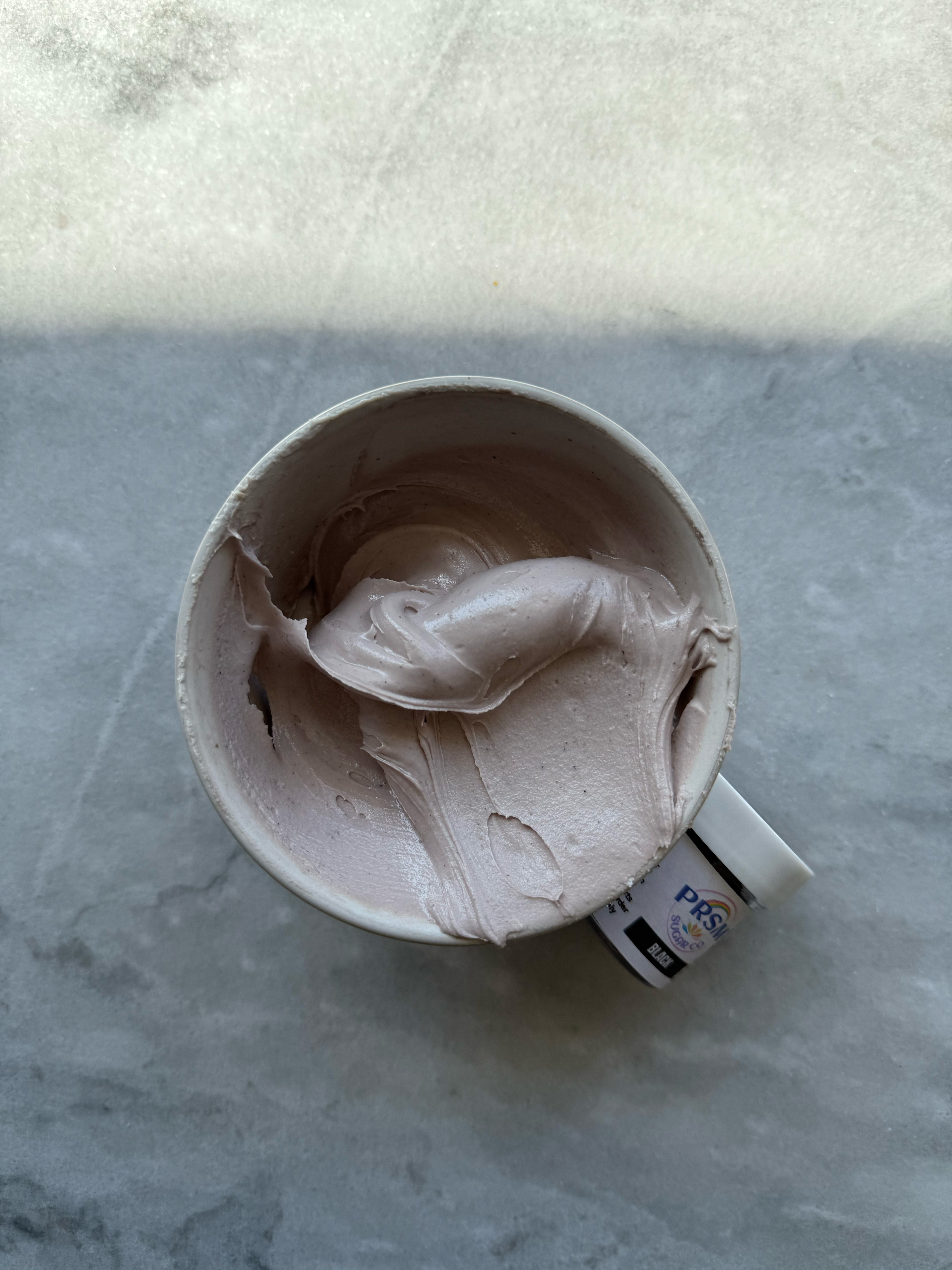
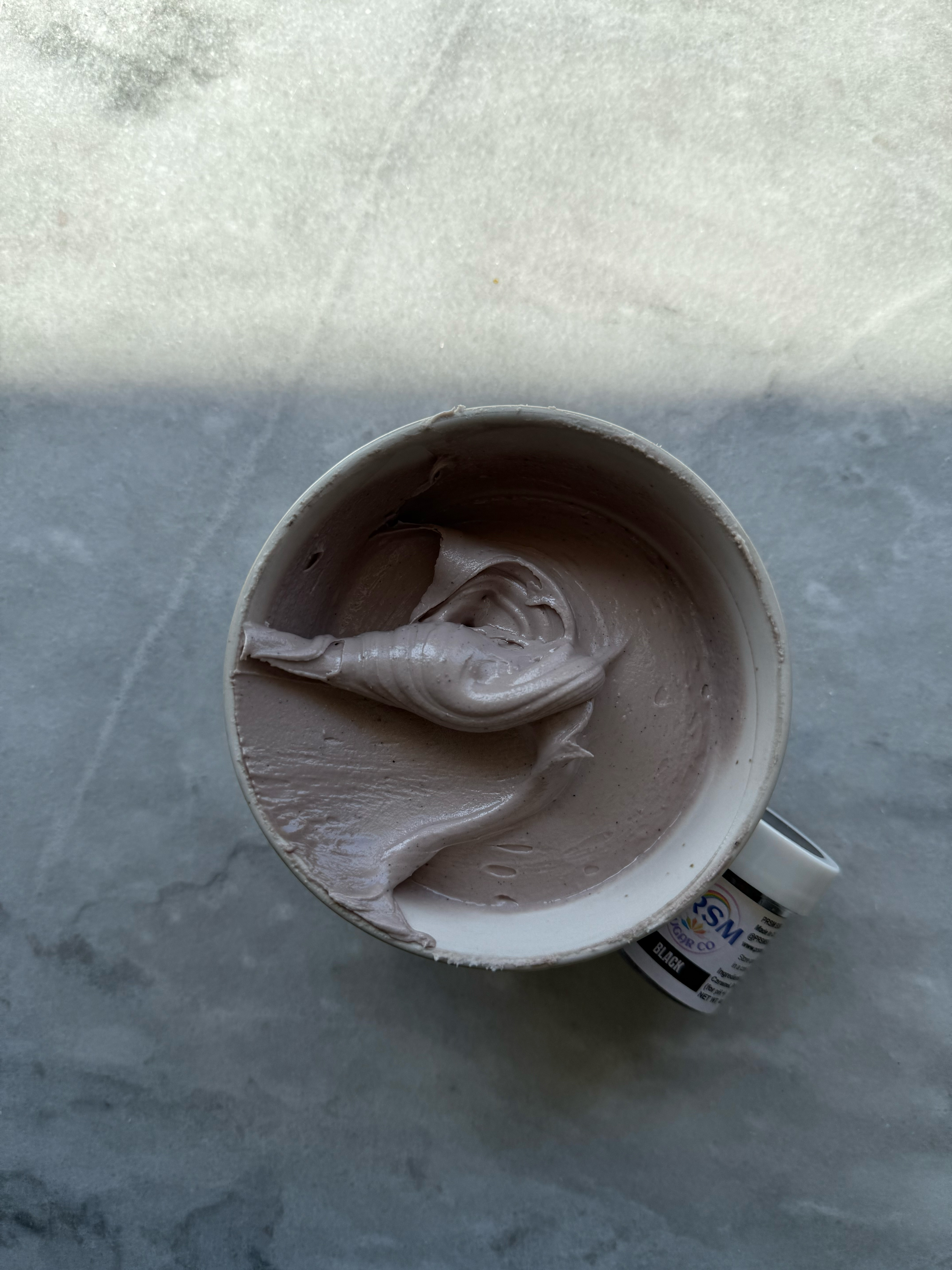
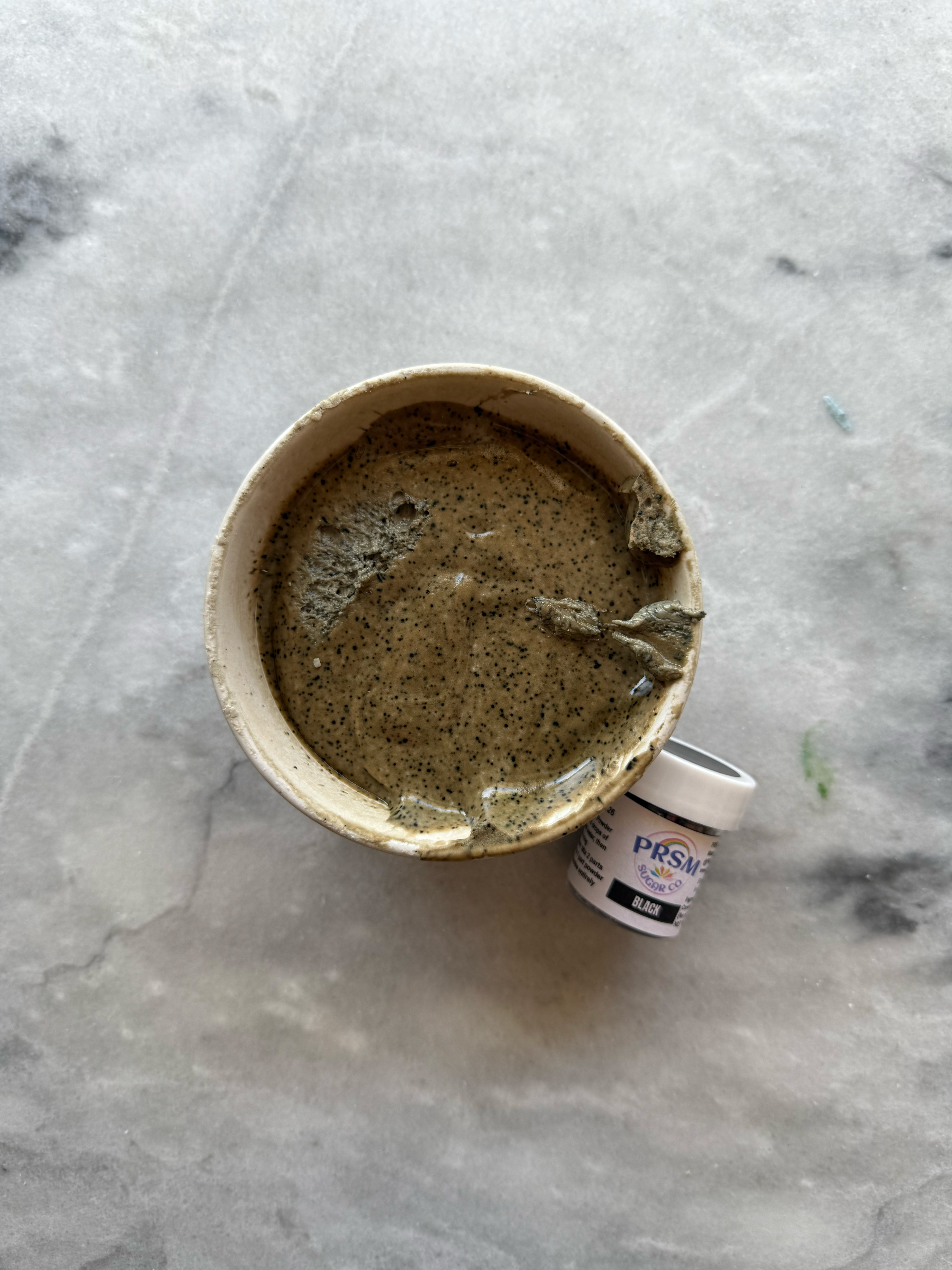
– black
This one was so interesting. It is very warm and brown, but when baking soda is added, it turns more charcoal. After developing, it definitely deepened into a color that could be used as a black. I think this color could also be used intentionally as a beautiful cool-toned brown shade.

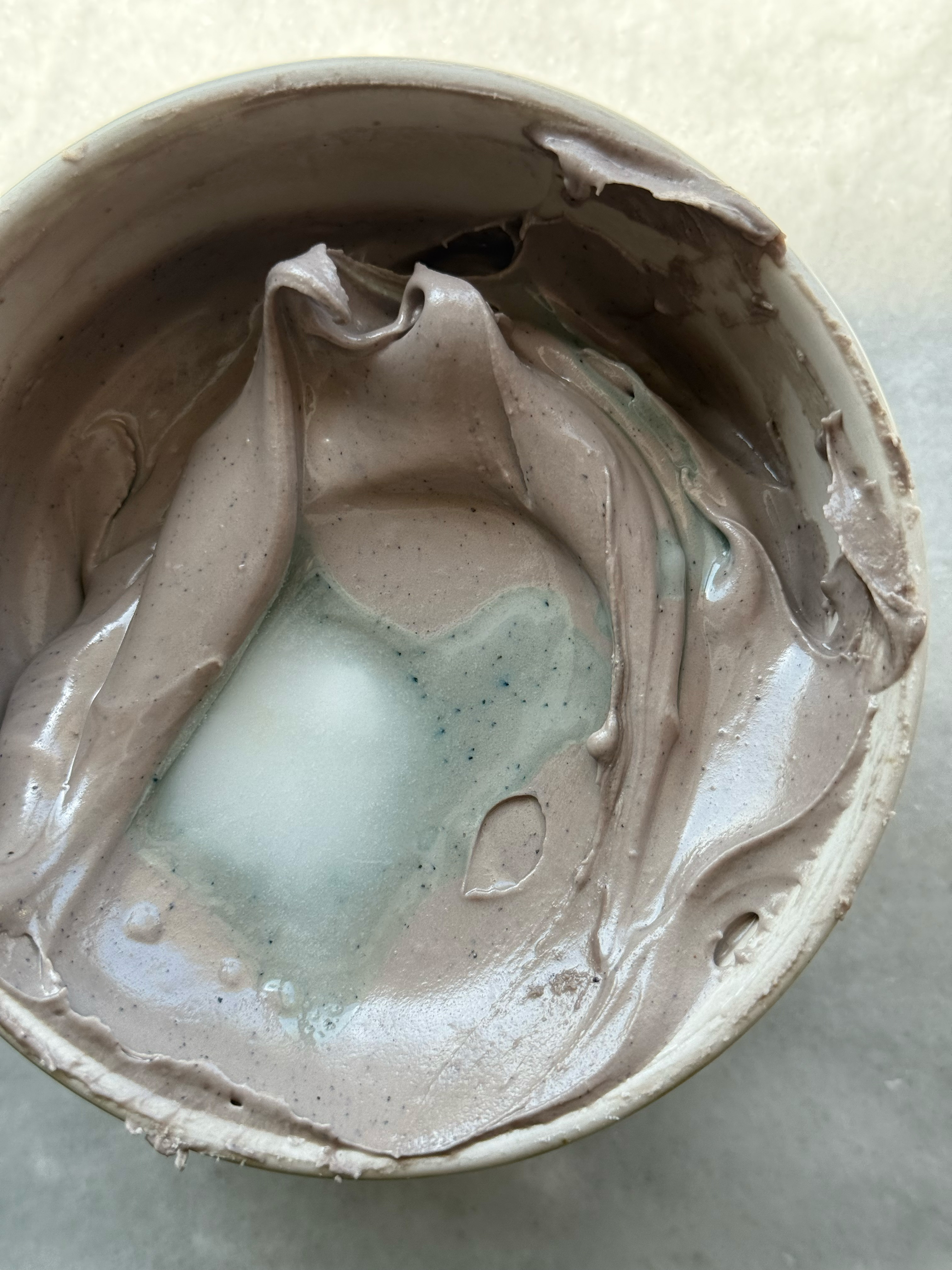
added a small amount of baking soda and water- notice the change from brownish-purple to charcoal
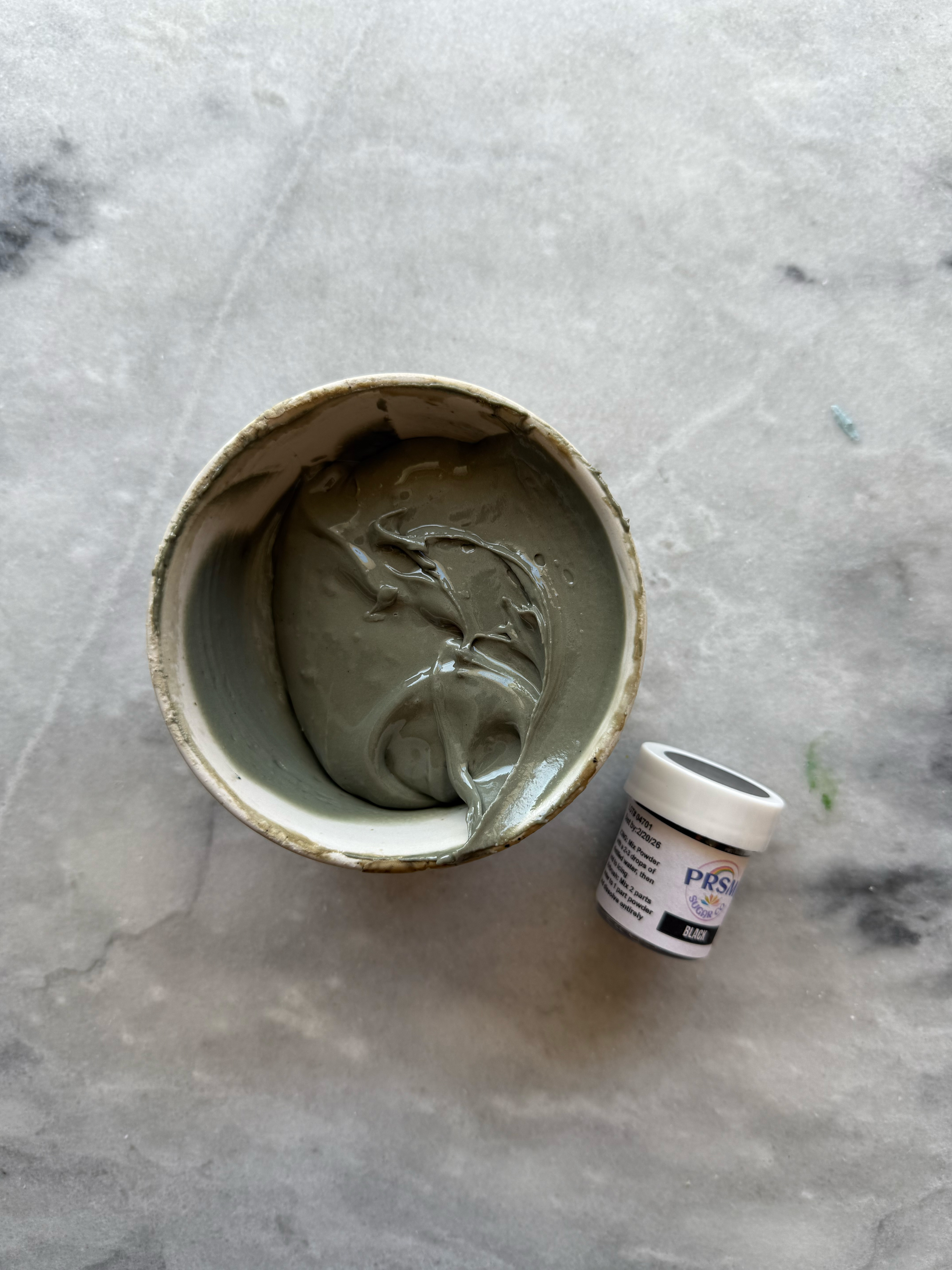
black after developing 24 hrs, unmixed and mixed
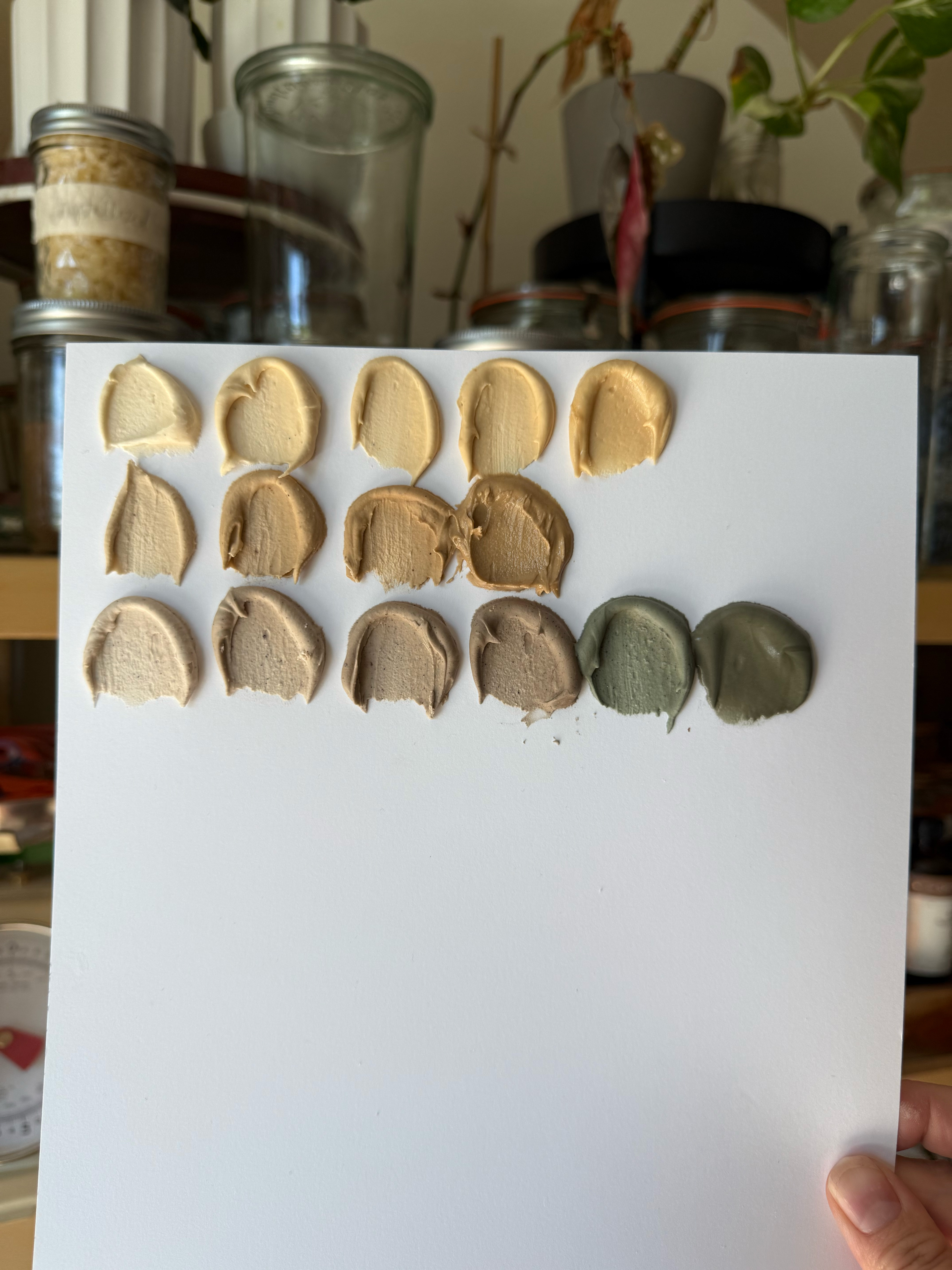
brown is the first row, dark brown is the second row, and black is the third row– see the difference between the two brown shades, and notice that the black is actually a shade of brown before baking soda is added to adjust the ph
a note on ph
Some natural coloring is ph sensitive, meaning that if you change the ph of the icing (making it more acidic or more alkaline) by adding lemon juice or a baking soda solution, the colors will change. The most ph sensitive colors from PRSM are blue, black, super red, and red.
tips for success
I will admit, these colors intimidated me at first. It’s a completely different method from what I am used to using (artificial gel coloring), but after swatching them all, I am extremely comfortable with using them. Whether you are interested in switching to natural colors, or you want to add them to your options for cookie orders, I recommend swatching each color you purchase so you can experience the process for yourself. It was the best way to see how these powders perform and to figure out a method that works for me.
Something I noticed right away the first time I tried these powders, is that the icing you start with will end up much looser after adding the coloring. That is because the powder coloring needs water to hydrate it, and all that additional moisture loosens up the consistency of the icing. To remedy that, start with an icing that is thicker than what you want. I adjusted my royal icing recipe to be just ½ cup of water per batch so that it would be even thicker than usual.
final thoughts, and what I would re-purchase
do I like them overall?
If you are interested in using dye-free food coloring, these are an amazing (and dare I say, perfect?) option. Once you get the hang of hydrating the powders, realizing that you need to mix icing colors a day ahead, and learning what the powders will look like once they’re mixed and developed, they are not difficult to use. For dye-free coloring, I love them.
is there a taste?
The red and super red absolutely can have a bad taste, especially if you add too much powder. I found that ⅜ teaspoon of powder in ½ cup of icing was the most I could possibly add before I noticed the taste too much. Everyone’s palate is different, though, so you might be able to get away with adding more. The taste with ⅜ teaspoon was minimal, and although I noticed it right away, it disappeared on the tongue very quickly. It is also important to note that I tasted it when the icing was wet, which will also highlight the taste more. The taste tends to go away more as the icing dries.
The other colors did no have noticeable tastes in the icing (with the exception of sunset yellow, which I’ll mention below), despite the smell being pretty strong in the jar and while mixing the icing. I was very happy to realize that even with dark colors, there wasn’t any bad flavors in the icing. To be safe, I would add a little extra flavoring to your icing when mixing natural colors.
Sunset yellow had the surprise of having a delicious taste that was kind of fruity.
the shades
I was extremely impressed with the vibrancy and variation of colors that PRSM was able to get from natural products. The colors are very bright, while I was expecting much more muted tones. They are actually brighter tones than I typically prefer for my icing colors, which is good news for those who love bright colors. If you prefer muted tones, it’s very easy to adjust them with color theory.
recommendations- what to buy
I recommend either buying the full set, or creating a smaller set by picking and choosing your favorite purple, pink, green, etc. If you’re looking to spend a little less, I would recommend choosing between sky blue and blue turquoise, regal purple and deep purple, leaf green and spring green (you could easily add a little yellow to leaf green to brighten it similarly to spring green), green turquoise and emerald, orange and bright orange (you could easily add a red or pink to orange to imitate the warmth in bright orange), and yellow and sunset yellow (you could easily warm up yellow to imitate sunset yellow).
The only color that I found to be consistently problematic for me that I plan to skip going forward is blue. It is beautiful, but it is unpredictable. I love how dark it gets, and that darkness would be incredible as a mixing color, but every single time I used it and mixed with it, the top layer of my icing was a different color than what was underneath. Maybe I just need a little guidance on this color, but for now, I am skipping blue.
my favorites
My favorites in the set were: super red, bright orange, sunset yellow, leaf green, emerald, beta green, royal blue, sky blue, violet. However, I would also need yellow and orange for the basic versions of those shades.
where to buy
You can buy the full set as well as individual colors on Etsy. It is also helpful to know that the brand SMoR Bake sells powder color that is PRSM. She offers a few different shades, including some that are exclusive to her brand.
do they fade?
These are three un-edited photos taken the first day, the second day, and the fourth day. I haven’t noticed any fading of the colors.
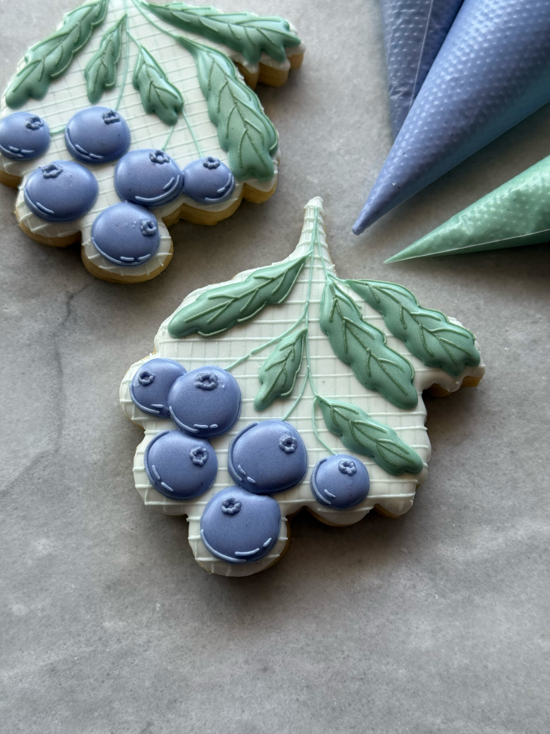
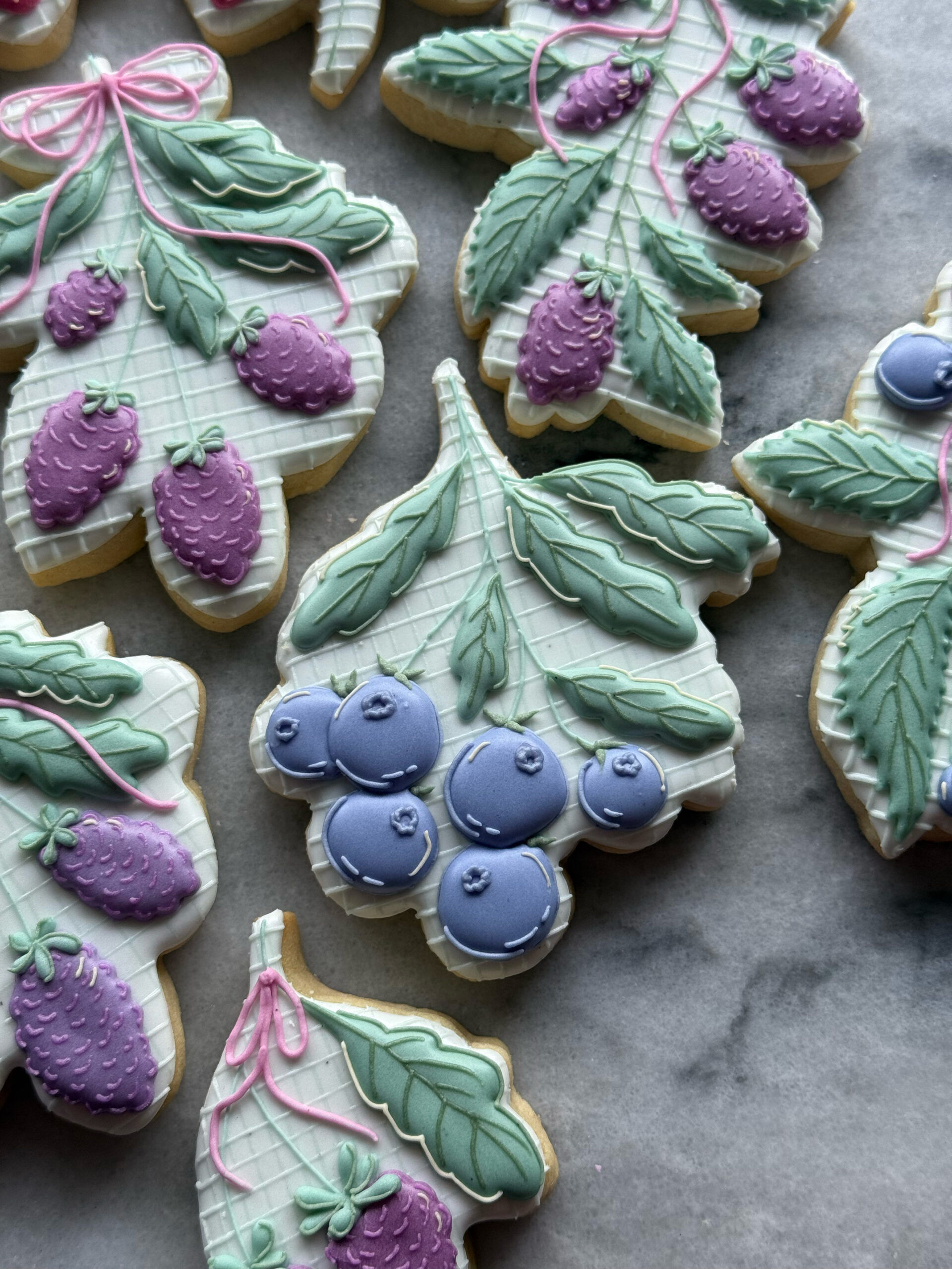
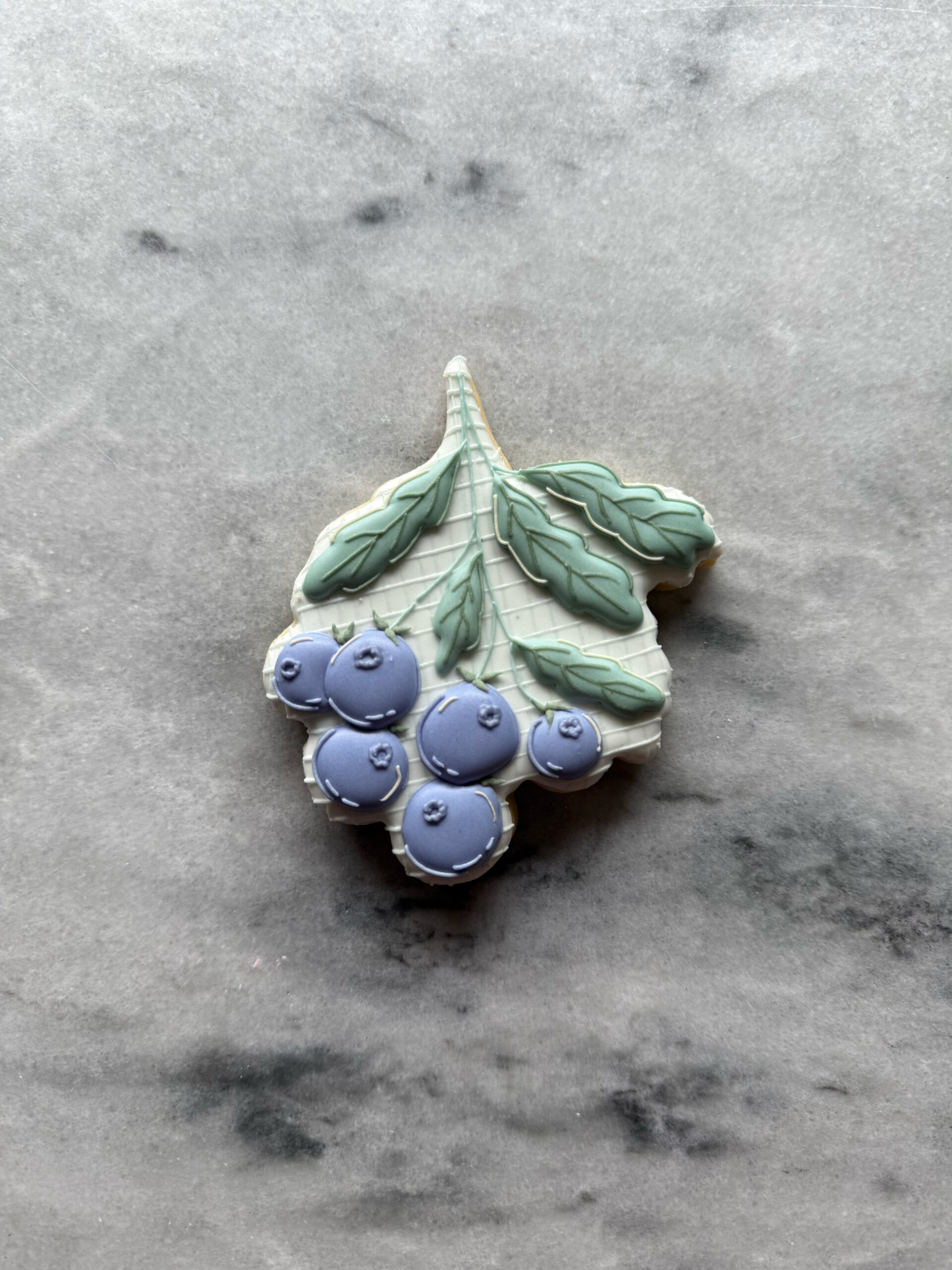
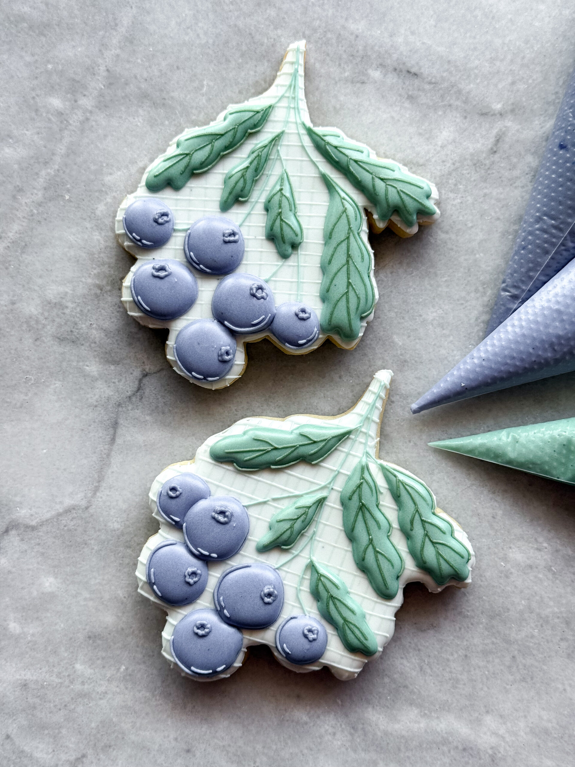
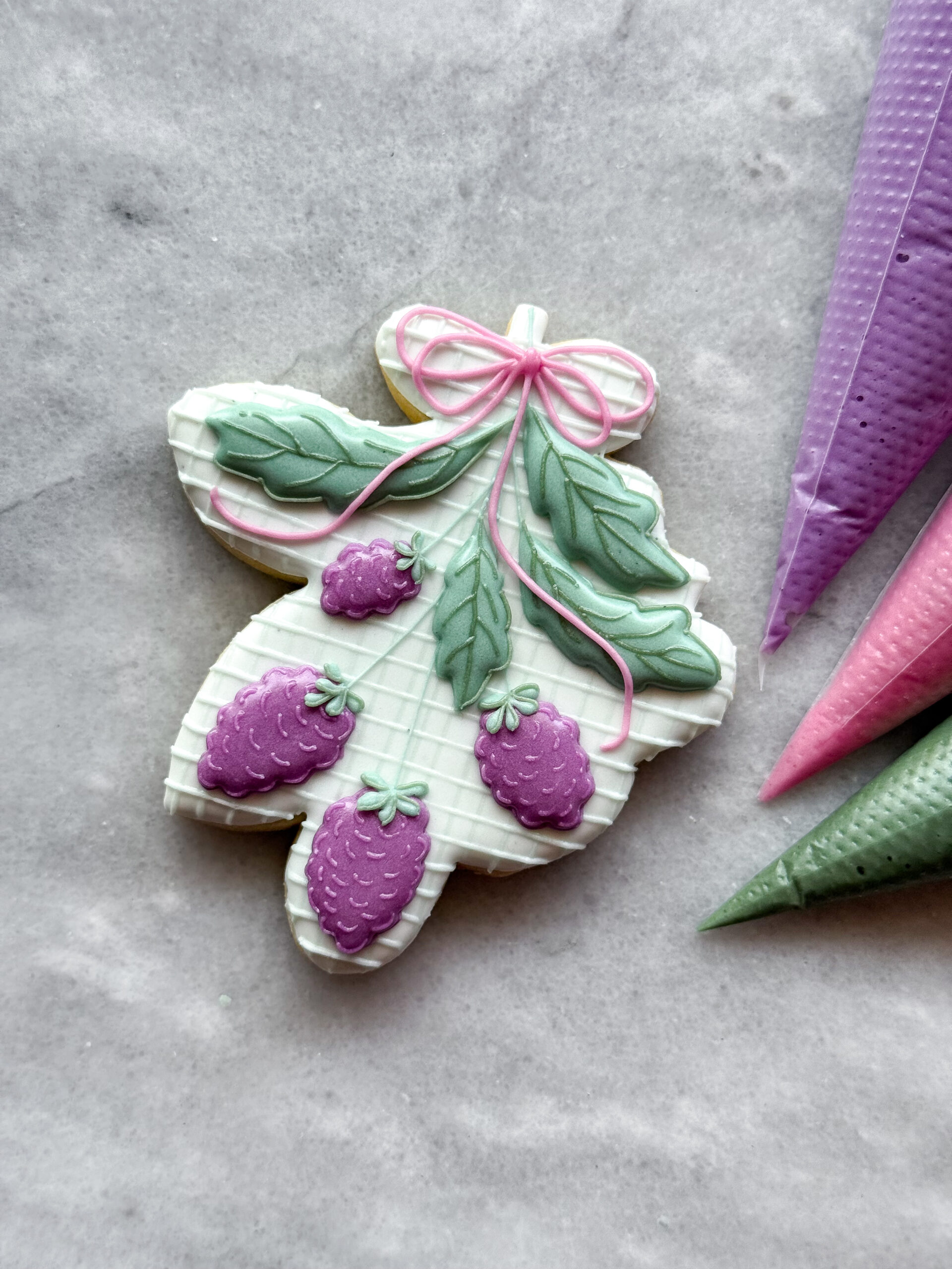
the colors in action
These colors were all mixed with the PRSM colors I mixed for this post. (You can watch the video of me making these at my Instagram Subscription.)
Lisa says
I’m so glad you did this!!!! I bought the small set about 2 months ago and HAVE NOT TOUCHED IT! I’m petrified of them! I’m a hobby baker so I don’t have as many opportunities to use them as professional cookier would….buuuut….. now I might not be so scared! I will use them on my next set!
I LOVE your berry cookies!! So beautiful!